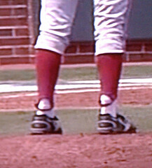
Last week I wrote about Stanford pitcher Mark Appel and his unique flaps-out stirrup stylings. As you may recall, I had hoped to interview Appel for that piece but it didn’t work out, so I had to construct an imaginary interview.
With Stanford’s season now over, Appel is pitching for Team USA this summer, and I was finally able to speak with him yesterday. Good thing, too, because it turns out that the story behind his flaps-out format isn’t quite what I had expected. Here’s how our chat went — this time for real:
Uni Watch: How’d you come up with that stirrup style?
Mark Appel: Before every game, I had my stirrups in, when I’d do my stretching and get ready for the game. But I guess my feet are so flat that they’d just come out. And I tried not to worry about it, so at some point I just said, “Okay, this is getting pretty bad, so I’m just gonna keep ’em out.” And that way I don’t have to worry about it, and they feel more like full socks, instead of stirrups.
UW: So they were just coming out on their own? It wasn’t something you did intentionally, at least at first?
MA: Right. I didn’t mean to intentionally leave them out. They just kept coming out. And I thought, “Well, I guess this could be my thing.”
UW: You decided to just go with it.
MA: That’s right.
UW: When I first saw it, I thought maybe you found it uncomfortable to have that extra loop of fabric under your foot.
MA: It can be a little uncomfortable, like there’s a little bump under there, especially because I have fairly flat feet. I personally don’t like wearing stirrups. But if a team needs me to, I have no problem with it.
UW: So it’s not like you were getting blisters or anything like that.
MA: No.
UW: I’m assuming the reason you and your teammates wear stirrups in the first place is that Coach Marquess requires it, right?
MA: Right, right. It’s part of the Stanford tradition.
UW: So when you went with the loops out, he was okay with that?
MA: He never said a word, actually. [Assistant] Coach Filter did come up to me one time and said, “We need to put some tape on your stirrups or find a way to keep ’em in,” but he was okay with it.
UW: Do you also wear them this way on days when you don’t pitch, when you’re just sitting in the dugout?
MA: No, I don’t. I keep ’em in. It’s only on days when I’m pitching.
UW: Had you ever worn stirrups before you arrived at Stanford, like in high school or Legion ball?
MA: No. Maybe like those socks that kind of have the stirrups, like, painted on or something.
UW: Right the two-in-ones, where it’s all one piece. But this was the first time you’ve had to deal with real stirrups.
MA: Right.
UW: Have your teammates had anything to say about this? Like, “Hey, how come you’re wearing it that way, while the rest of us do it the normal way?”
MA: Not really. A few of them thought it was pretty funny. And when we were playing on ESPN, I got a few texts from friends from summer ball, sayng, “Dude, you gotta get your stirrups in.”
UW: Any commentary from opposing players or umpires?
MA: Not that I’ve heard. Maybe a few funny looks.
UW: So now you’re on Team USA this summer. Are you guys wearing stirrups?
MA: No, we are not.
UW: And are you wearing your pants down at your ankles, or do you go high-cuffed?
MA: We can do either way. I prefer high. So I’m just wearing regular full socks. It’s a lot easier.
———
Faaaaascinating. One thing that doesn’t quite come through in that transcript is that Mark sounds like a really sweet, self-effacing kid. A peach. Here’s hoping he has a good summer with Team USA.
It’s a short way from good to stupid: I had mostly positive things to say about the Preds’ new logo set yesterday, but now their new jerseys have leaked — what a disappointment. Collarbone horns (one of them underscored by a completely gratuitous wordmark), Bettman stripes, the worst Ree-box yet — ugh. And while I loved the guitar pick-shaped alternate logo, putting guitar strings on the uni numbers and piano keys on the inner collar is a classic case of “If something’s worth doing, it’s worth overdoing” (plus I have a feeling the guitar strings won’t work so well on most of the numerals other than 1). Too bad.
In other NHL news, the Thrashers-no-more will apparently get their new name, and maybe more, later today. I’m betting on the Winnipeg Teebz.
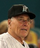
Jack ”¦ as in Mack: Wednesday’s PTI featured an interview with Marlins skipper and world-famous 1000-year-old man Jack McKeon. Reader Chris Falvey reports that the interview included an intriguing uni-related sequence, which he was nice enough to transcribe for us:
Tony Kornheiser: At your age, does it feel silly to wear the baseball uniform? Would you like to be more like Connie Mack and go out there in a suit?
Jack McKeon: Well, I thought that would be a change… change of scenery here. I tried to do that when I took over the San Diego Padres in 1988. I suggested it — why not be like Connie Mack or Burt Shotton? You know, I could get a deal with some clothing outfit that I could have some new clothes out here… and a nice straw hat and come out and be in — you know — a nice casual outfit. But they didn’t go for that idea.
“The straw hat part must have been a small joke,” says Chris, “but I’m pretty sure he was serious about the rest.” It’d be a fun stunt, but I’d rather keep McKeon in uniform — he’s one of the few Marlins to go high-cuffed.
Uni Watch News Ticker: This video game clip shows Colorado wearing a throwback helmets, like these. Not sure what, if anything, this portends for the upcoming season (as noted by Ross Shackelford). ”¦ Really love these old Spalding shorts, although the price tag is a bit ridiculous. ”¦ Gotta love this old St. Louis Browns letterhead (great find by Bruce Menard). ”¦ Here’s the kind of teeny-tiny detail that makes my day: As you know, the Phillies have blue faux-squatchee dots on their batting helmets. But Shane Victorino’s is outlined in white (genius catch by Andrew Dixon). ”¦ Remember Bethanie Mattek-Sands, the tennis player who wears eye black? She now has an eye black endorsement deal (thanks, Brinke). ”¦ As you’ve probably heard, a stadium conflict is forcing the Marlins to play a home series in Seattle this weekend. “They said on Wednesday night’s broadcast that the Marlins will probably wear black all three games, so they don’t have to bring their home pinstripes,” says Frank Mercogliano. “They’re a major league baseball team — is it that tough to take an extra set of uniforms?” ”¦ Nice little piece on stirrups in the College World Series (with thanks to Will Streit). ”¦ MSNBC’s Morning Joe crew wore Hartford Whalers caps the other day (with thanks to Dennis House). ”¦ What’s worse than bogus two-in-one stirrups? Bogus two-in-one stirrups worn with mandals (blame Don Gale). ”¦ I like baseball uniforms and I like jazz, so it makes sense that I’d like this jersey. ”¦ Well, that didn’t take long (thanks, Phil). ”¦ Well, this should make for an interesting NOB. ”¦ Who’s No. 50 in these photos? None other than recently deceased E Street saxman Clarence Clemons, who played football at Maryland State (with thanks to Calvin Farris). ”¦ The Bills are finally admitting what everyone else on the planet already knew: Nobody liked their uniforms. They’ll unveil their new set tonight. ”¦ Oh baby, check out this 1939 American Association All-Star jersey. “The Kansas City Blues earned the right to host the game by having the best record in the first half of the season, and the Blues squad faced an All-Star team made up from the rest of the league,” says Aaron Stilley (there’s an account of the game here). Aaron’s trying to figure out who wore this jersey — No. 22 — so all you research-y types, get crackin’.
Weekend plans: I’m traveling this morning and will be on the road through the end of the weekend (a combination of work and pleasure), so I won’t be providing immediate coverage of today’s Thrashers-no-more announcement or tonight’s Bills uni unveiling (which doesn’t exactly have a lot of suspense anyway). Phil will weigh in on those over the weekend, and I’ll offer my own thoughts next week. Please go easy on the Ticker contributions this weekend, as I probably won’t have time to deal with too many of them. Thanks for understanding.
Apparently the Predators think they’re the Blues now.
Yeah, Nashville has a musical heritage… and sabretoothed cats or whatever the hell animal they’re supposed to be have exactly nothing to do with music. Thus, it’s kinda stupid. I guess it’s the hockey version of the Golden State Warriors using a bridge for a logo. Sure it’s a decent design for the city… but it really fails when combined with the actual team name.
The new Preds’ jersey looks more like a soccer uni for some reason. Navy blue would work much better for a home kit, without all of that ridiculous piping of course, and the city name written like a Wikipedia “citation needed” superscript.
And make no mistake, the Blues have the worst Ree-box. Bar none.
the city name written like a Wikipedia “citation needed” superscript.
Genius description. I may need to steal that one.
Indeed – two Don Cherry thumbs up!
Not close to as bad as the Blues’ Ree-box: link
This one is at least built into the piping. It might be stupid, but it would still be there without the logo. St. Louis version is much, much worse, a pointless box.
Yeah, I noticed that they used the Blues’ Edge template on this one. The Bettman stripes and the contrasting bits at the shoulders beneath the piping look even worse without a contrasting shoulder yoke than they do with – at least with St. Louis, you get that they attempted to link their Edge jersey to its predecessor, only to come out with a clownish mess (that’s my opinion, anyway).
Take away the piping and the shoulder elements, and it’s not a bad look. As-is, it looks shoddy.
What’s offensive about the Preds prototype is that the Bettman stripes actually cross the traditional ones. Look at the away sweater. The piping overlaps the striping. On the home version it somehow meets the white piping on the hem, creating a box of sorts. Its part of the general trend with the Edge system of adding pipping that goes nowhere for no reason (Buffalo Sabres I’m looking in your direction). Plus many teams that started with Edge template looks have gone back on them recently (see Tampa Bay and Philly). Just save us the time and put out something better Nashville.
I’m guessing this is what happens when you give Reebok a few ideas and then tell them, “Okay, go do this for us–whatever you think looks best!”
This uniform is a major letdown after what we got a look at yesterday. It could have been so good, but they choked with the jerseys. How could they have done so well with one, and so dreadfully with the other?
I wonder if there are other examples of really good logos on really bad uniforms.
I dunno, I’d still count the new Preds uni as an improvement over the last one. Better logo, less color confusion (yellow and black are dominant, no more pointless silver to drown them out). No more stupid slanted numbers.
It’s still a cleaner, more striking look than the old one, in spite of there still being some unnecessary piping, stripes, and embellishments.
Great call on Golden State (and the Predators). I’ve felt that way about the Warriors ever since it came out. But I failed to put it in writing. Just a big disconnect between the logo and the nickname.
Another team to add to this list is the new Wizards. Although the logo is a wizard, the whole stars and stripes theme just doesn’t tie to Wizards. In fact, it doesn’t tie to Bullets either.
If Colorado went with a gold version of that helmet full-time, they’d find themselves comfortably among my favorite uniforms in sports. Sonofabitch, I love that helmet.
Ditto.
I’m sure everyone knows, but the silver helmet is a throwback helmet. The Buffs wore it a few years back (I believe against Colorado State).
As mentioned (I think on this site), the school colors are actually gold and silver (and NOT black). They’ve just mastered the art of BFBS so well, that it’s just assumed to be a uni color.
While I question the wisdom of having an 80 year old mgr; what about that half a season of plane ride/road trips still to go?!. . ..
That said: MLB as usual, is hidebound & lameass in its inflexibility. With so many licensed products, they could suit Jack up in something more age friendly. Would anyone mistake him for anybody else? really? Jags
I asked this question of Paul once a long time ago. He said, paraphrasing, that since MLB mgrs are the only coaches who regularly enter the field of play, they are uniformed personnel.
That said, I agree with your take (and Jack’s). A suited manager would be a good look, I think. I doubt it will ever come back, sadly.
Are we sure that’s piano keys on the inner collar? It appears (to me) that the word “Nashville” is sewn into the back of the outer collar.
Nay, they’re piano keys. The negative space for the black keys is in all the right places for a keyboard.
But the worst uniforms of the Reebok era? Not by a long shot. These are C-minus unis. Sure, they make gratuitous use of two silly template options. But the overall look is comparatively restrained, with the jerseys primarily defined by strong, classic stripes that don’t fit the basic Reebok template. They’re, you know, straight, like hockey jerseys are supposed to be but like Reebok tried mightily to prevent any jersey element from being. There’s been much, much worse since Reebok took over. Plus, the home and road jerseys actually resemble each other, which far too few NHL jersey sets do these days. Another way in which the new Preds sweaters are above-average, class-wise, for the Reebok era.
The strings on the numbers are very lame, however. If that pick logo were the jersey crest on the front, and if the team were named the Dreadnoughts or something music-related, the strings would be fine, but it’s not, so they’re not.
…what the hell do battleships have to do with music?
Jeff, speaking of battleships, have you checked out the new UFL team, the Virginia Destroyers?
Wikipedia can be your friend, if you let it:
link
I remember the logo leaking a while ago, but honestly I really haven’t been able to bring myself to care about the UFL yet. Five teams just doesn’t seem like enough to bother with. I’d watch a game if there’s nothing else on, but that’s about it at this point. When/if they get up to 8 teams (or if they put a team here in Columbus) I might start caring a little.
I did just google them since you mentioned it… unveiling the uniform as puzzle pieces… I guess I’ll give them a point for being different.
link
Thanks for that, DJ. I didn’t know it was a guitar body type.
It looks like the Dreadnought is essentially the generic acoustic guitar at this point… do people know the name well enough for it to work as a team name or would too many people think battleship first? I know I tend to think more of Explorers, Flying V’s and Warlocks when it comes to guitar styles.
“Plus, the home and road jerseys actually resemble each other, which far too few NHL jersey sets do these days”
other than the wild, and last seasons preds, how many other teams home & road jerseys don’t look the same?
B-Hawks don’t match
“Les Habitants de Montreal” don’t match.
No, the Hawks’ and Habs’ home and road jerseys are not “mirror images.” For that matter, neither are the Rangers, Red Wings and, to a lesser extent, the Bruins (and I’m sure others that don’t immediately come to mind). But their home and road jerseys clearly resemble each other.
I didn’t say it was the worst Reebok jersey; I said it had the worst Ree-box (the contrast-colored panel that exists for no other reason than to provide a home for logo creep).
It’s that big ugly pointless yellow area surrounding it that really makes an otherwise-OK jersey look stupid.
Come to think of it, they could redeem themselves if they moved the NOB to below the number, making it much more balanced — stupid panel and Ree-box, then the big number that should be the centerpiece of a jersey’s back, then the name.
Yes, and yes. At times I think they are shoving too much onto the uni’s, but then I think, we have a long way to go before this: link
also of interest: in the picture displaying the front of the away (white) jersey, is the shea weber jersey in the background on the couch. new alt? it doesn’t look like last seasons alt (i’m thinking… i could be wrong though)
link
It looks like the old Alt.
seems as if there’s a LOT of white missing on that jersey…
Yeah, BUT they’re getting rid of the skull logo so that makes me think they’re:
A. Fake (lets hope, if the couch Webber is fake, maybe these are fake too).
or B. An old, oddly folded Alternate.
I’m surprised anyone has had anything positive at all to say about the Predators uniforms past or present. I think they are (and were) flat-out awful, and no guitar pick shoulder patch is going to change that. Overwrought modern design at its near-worst.
Predators *never* had good-looking uniforms.
I’m still holding out that those Preds unis are fake. SOOOOO ugly.
And I hadn’t noticed the piano keys before, nice eye.
But there are just so many terrible design features on those unis, (I think I have some better ideas for the logos and unis here: link ) It’s like their made to go against everything Uni Watch stands for.
I mean:
Bettman stripes
ReeBox
Collarbone Horns
less than legible numbers (probably)
Off center location name
stripes that aren’t normal stripes (the sleeve stripes are at an angle and narrow)
It’s like the Uni Watch Kryptonite uni.
I really feel like link should be the main logo (I hate the link) link should be the secondary logo (if you’re going to use the link, get the link) and something like these – link and link – would be a much cleaner/timeless look than those Music City Mess unis seen in that leak.
If you’re going to use the state flag, get the colors right. Don’t be afraid to use a non-team color in your logo. It works great for some of the best unis around (Blackhawks, Cardinals, Steelers).
Cards? MLB Cards? Is it the baseball bat you refer to?
Yes the the bat & beaks.
Let me try that again.
Yes, the bat & beaks.
Unless the non-team color is black? :)
A little link isn’t always a bad thing.
I think the solid golden-yellow version of the logo would definitely be an improvement over what they’re actually using.
I’m not really sure what they’re trying to do with the yellow stripe-thing now… a reflective chrome hood ornament maybe?
link That?
Yeah, personally, I think all of my edits of the logo look better than that dumbass stripe (even this one – link – which i think looks stoopid).
You would think that if they went through all that addition by subtraction, that that stripe woulda been cut out or incorporated into a better stripe.
C’est la vie.
Yeah, that one… though admittedly it probably doesn’t work very well on a yellow jersey.
In the photo of Clarence Clemons, why does No. 73 have a “5” stencilled onto his pants? Looks as though Clarence and 65 have something in the same location on the hip, but it’s not clear what it is…
When I played football in college, the practice pants had #’s stenciled onto the thigh. It made it easier for the equipment mgr. to keep inventory.
Yep. We had numbers stenciled on everything (with the obvious exception of the jersey). I suspect that’s fairly common practice.
link
Trader Jack must be going to the movies.
Besides that, it’s Friday!
link
Oh man.
I haven’t heard that joke in ages.
Do people still tell it?
Anyway, thanks for taking me back 30 years.
How are those carpet tiles working out?
Don’t ask me to come up with anything new, Marty. Look at my tape collection and you’ll understand.
Carpet tiles. Yeah, we put them in the office last fall. Got a deal. On carpet tiles. Uh huh.
As a former clubbie, I think I can solve the Shane Victorino thing.
All the blank helmets come both without the logo, and with a white sticker on the top. The yankees don’t change it, so a lot of times you’ll see a white ‘bean’ on the top.
So, I’m thinking a clubbie just put a blue ‘bean’ on top of the white sticker.
Hope that helps…not sure if that’s it, but my bet is on that.
Re.:Tonight’s Bills uniform unveiling.
Will the lockout previsions be lifted and
current players be allowed to participate in the
unveiling?
I thought you were being WAY too kind with your praise of the Predators’ logo yesterday. Looked stupid before, still looks stupid even though it’s more streamlined. That scooped-out neck almost looks like the mouth of another animal facing LEFT.
The full jerseys look stupid too.
As a side note, I think you’d have to go back to the World Hockey Association Chicago Cougars for the last time a team’s home/road base colors were white and yellow (back then white was the home color)…. i.e. the non-white jersey is still a light color, not a dark color
-Jet
I tend to side with Jet that the Pred logo was and remains enduringly stupid. But I’m not fighting Scott’s C-minus rating, since it’s a bad design in an era of very bad designs.
The whole Predator symbolism, full of outsized stylized menace, is pretty damn tired. Angry birds with teeth, etc. Take a look at that St Louis Browns 1952 letterhead (cute, mischievous little elves) and follow the half-century arc to the 2012 Preds and their mega- incisor cat from hell…
Agreed, Jet and Connie.
If you have to go with a sabre tooth tiger on your jersey, how about something like this spare, minimal image….
link
Yeah, that’s a nice design. Wonder if they have anything in the mischievous adorable elf department…
In the third picture of that Predators jersey revealing… is that a Maple Leafs blue jersey thrown on the couch in the background?!?!?!
-Jet
link
Nope, something like that (there is a lack of certain white stripes that may mean it’s not EXACTLY that uni).
The shoulder patch is clearly the predator skull logo.
Good catch, Tim, I wasn’t even aware of that Preds alt…
-Jet
Daydreaming on the part of a Maple Leafs fan that Shea Weber signs with Toronto?
The announcement today from Winnipeg’s True North will be of Claude Noel’s introduction as head coach. I’m not aware of any uni-related announcement today. But the new name could be announced sometime on the weekend.
I take that back. There could be a team name related announcement today, before the draft starts in earnest.
Manitoba True North Teeb Voyagurs en cherche Owls or Falcons. Brought to you by [this space available].
I’m still holding out hope for the Winnipeg Winnipegs. Good enough for the Allan Cup champions of 1913 and ’31 — and the 1935 Grey Cup football champs.
For a team song, they could adapt Jonathan Richman’s “Here Come the Martian Martians”:
Here come the Winnipeg Winnipegs
And they’re riding on their Winnipeg bike
Well, we have to find out right now
What kind of ice cream do the Winnipegs like?
Here come the Winnipeg Winnipegs
Why staying in such a cheap hotel?
Maybe we should help out the Winnipegs
Looks like the Winnipegs ain’t doin’ too well.
I’m rooting for the “Manitoba Mounties”. Every time they go on the power play, they can show the opening theme to Dudley Doright.
Of course, I also wanted the Minnesota Wild to play up their association with Xcel Energy and Saint Paul and be the “Fightin’ Power Poles!”, so what do I know?
It’s the link, I’m tellin ya. Why else would they make the announcement in a different country rather than at home? Clearly, fan reaction in Vancouver has them spooked, so they’re dropping the out-of-the-box name from the safety of a hotel room in a foreign city on a Friday. By Monday, the Winnipeg police should have the city back under control, and it will be safe to return home and unveil the lumberjack-check unis.
Damn Canadians and their riots!
Winnipeg Legs.
I like Winnipeg Maroons, which has a historic link and could tie in with throwbacks to link – just make the crest upside-down.
TSN’S Darren Dreger & player Evander Kane have leaked out that the team will in fact be called the ‘Winnipeg Jets’.
Dreger is almost entirely right on these things, and yes, I’m disappointed.
There is a rumour going around that the name “Jets” was leaked to keep the real name off the radar, but I’m very skeptical of this reasoning simply because Dreger is in Minnesota, and they have announced that the name will be revealed shortly before Winnipeg makes its pick at selection #7.
That Colorado helmet was also in NCAA Football 11
And uniform
The Colorado throwbacks are from the 2009 game the Buffs played vs Wyoming to celebrate 150 years of Boulder: link
Read more here: link
I believe it was a one time only thing, and do not look for them to wear this look this season, or another.
I wouldn’t read too much into the video game. The video game was in Boulder, and the CU-Utah game for 2011 is in Salt Lake City.
Matt, I read about six months ago (or maybe heard it on the local news) that CU was spending a large chunk of change for a logo revamp. I only heard (or read) it once, and nothing since. Do you remember that at all?
My guess is that Colorado has new unis, and have told NCAA not to show them hence the wearing of the throwbacks. This theory is also supported by the fact that the NCAA 12 version of teambuilder will not go live until the week prior to the game’s release, despite the fact that the game has been finalized and printed (or whatever its called when a game is manufactured). In the past its been released a full month before the game (NCAA 10) and last year it was launched 2 weeks prior to the game (maybe earlier, I know it was leaked a full month before the release).
The “NASHVILLE” on the chest looks awfully similar to the conference/division wordmark on NFL coaches polos from a year or two ago.
Good call–and those were Reebok designs too, right?
what the hell is maryland state?….towson?
also, i kinda dig the new preds uni’s, especially the gold. except for the piping. yuck.
Maryland State College = link
ah. thank you
Really neat football photos of Clemons. And I’m kind of ashamed as a Marylander that I didn’t realize that UMES used to be named Maryland State College.
RE: Marlins home on the road…
“Is it that tough to take an extra set of uniforms?”
Yes, actually, it is. I was lucky enough to work as a ballboy in the NBA and one of the responsibilities would be to pack bags for road trips. I think it’s safe to assume that the NBA might have the lightest gear load of the major sports due to the number of players on the roster and the amount of gear that each player wears during a game (no pads, helmets, caps, things like that). Even so, a TON of gear needs to be packed for a road trip. Multiple sets of every uniform for blood gear or any “malfunctions”, practice gear… add in alternate uniforms and your gear for this trip has now doubled. And with some NBA teams wearing their alts at home, teams would have to bring whites on the road as well… even more gear to bring and a pain for only 15 people. You want the Marlins to now increase their full gear load by at least 1/3 for their 25 man roster and coaches just to add a set of pins for a pseudo-home series? I don’t think so. This error falls on the schedule makers, not the team for not wanting to increase the amount of equipment they have to bring, set up and tear down in every locker room they go to. I would say it might even be easier for a minor league team to bring the extra set since they usually only have one home and road per player and just do a lot of patchwork and maintenance on the sets.
Interesting. Thanks for sharing.
I would also think the road uniforms are kept in a separate space packed and “ready to go” on a road trip, where as the home uni’s would be in their lockers, etc? Much easier to take the packed and ready road uni’s than breaking down everyones locker and taking the home set.
Now, I am unaware, what is the stadium schedule conflict?
blame bono
It all evens out. He saved the Montréal Alouettes.
Wait a minute. The Als have an iron grip on the CFL East title every year. My Argos don’t stand a chance.
Blame Bono!!
U2 are playing Marlins/Dolphins/Canadian Insurance Company/I’m Having Trouble Calling It Joe Robbie Stadium.
link
Why, back in my day, a touring act not only didn’t displace the home team, but they’d play a ball game on the day of the concert!
When the Jays played at Exhibition Stadium, they’d often have home stands during the Canadian National Exhibition, which ran for the last two weeks of August. If you had a ticket to the ball game, you didn’t have to pay admission to the fairground – and there was at least one year when you could buy a reserved ticket down the right field line for less than the CNE admission fee.
The CNE organizers would also book major concert tours into the stadium during the “Ex.” Some acts would just use the portable stage that they kept stashed behind the outfield wall, and which would be rolled into place to face the north grandstand. You’d get about 25,000 out for those shows.
But bigger acts would play the full stadium. Including floor seats, you could get about 60,000 to 70,000 in there. Those shows could only go off when the Jays, football Argonauts and soccer Blizzard were out of town.
Except in 1983. David Bowie’s Serious Moonlight tour was booked into Exhibition Stadium for the Saturday and Sunday of the Labour Day weekend. Thing is, the Jays were on a homestand that ran from August 29 through Sept. 11!
I can recall being at one of the early games of that homestand (either Baltimore for the two-game Wednesday/Thursday set, or the Friday doubleheader against the Detroit Tigers), and being able to see the crew putting the finishing touches on Bowie’s stage, way out beyond the outfield fence.
On the two days of Bowie’s shows, Saturday and Sunday, September 3 and 4, the Jays played day games (you could look it up), while Bowie performed at night.
Now, get this: in order to turn the stadium over, those two games were played under a curfew.
The Sunday game was tied at three after the ninth inning, and the Tigers didn’t score in the top of the 10th. In the bottom of the inning, Ernie Whitt hit a two-out, three-run homer to send everyone home.
Dave Stieb went the distance. According to Retrosheet, he gave up 8 hits and 5 walks, faced 43 batters, and adjusted his cup an American League record 87 times. (Yeah, I made that last one up. But if you saw Stieb pitch, you know what I mean.)
Yup, we did things different in the ’80s.
Will the Mariners wear their away grays at home opposite the Fish and their black jerseys?
Speaking of wearing the same color pants – white on white at the CWS last night
link
Cal’s gold jersey and sani’s looked pretty cool together, IMHO.
maybe they’ll wear their teal…err forest green alts all three games
OK, my turn to name the Artists Formerly Known as the Thrashers: The Winnipeg Aces. Tips the cap to the Jets name, and has a hockey history (albeit in Eastern Canada). I think the team colors should be blue and gold like the Blue Bombers.
Awesome 1981 Tidewater Tides jersey (signed by Jesse Orosco!) on eBay:
link
So I noticed this quote in the story on the Bills:
***********
The NFL likes teams to use their throwbacks only occasionally. Using them permanently was not an option.
***********
Apologies if that was already explained, but why? Different helmet logo? Also, does this mean other teams with throwbacks (i.e. the Vikings) would be prohibited from returning to their looks full-time? And, why is this any different from the throwback looks by the likes of the Browns, Giants & Jets?
That excuse sounds like Bullshit to me. More likely they just didn’t want to go back to the standing logo full time, but don’t want to say that to the fans.
It can’t be any different than the Giants or Browns. Hell, the jerseys were already being produced for the fans, so if anything it should have been easier to switch to it rather than designing a completely new uniform.
If there is a real NFL rule against it, then that’s just beyond stupid on the NFL’s part.
It seems to me that instead of not wanting to go back to the standing buffalo, perhaps NFL Properties stepped in. If they promote the alts, they only introduce one new jersey. Ergo, only one new jersey to sell. By introducing two new jerseys, the public’s options increase 100%, provided they are forced to scrap the alts this year.
That line caught my attention, too. We know there are rules about how many times a team can wear an alternate, or throwback, but is there something that prohibits making an alternate/throwback the primary? Like, could they have picked a different uni for the throwback and just made the current throwbacks their primary uniform? I wonder.
Maybe we are just reading too much into it. Maybe he meant that you can’t decide to wear your throwbacks for all eight (home) games a year, while keeping the old unis as your now de facto “alternate”. Of course, if that were true and they REALLY cared what the fans think, they could have indeed made the throwback the main uniform and introduced another alternate in a year or two. Who knows, but I have a hard time believing the NFL simply forbade them from using the “standing buffalo” uniform full time. I could, of course, be totally wrong about the NFL though.
The 49ers famously got permission to keep wearing their throwback uniforms during their last championship season in 1994.
Actually they didn’t get permission. They were fined each time–Eddie D. didn’t give a damn though, he just kept paying the fine.
…at least, that was the story at the time. I haven’t found evidence to support either version. Except for an un-sourced line on Wikipedia that claims they petitioned the NFL, but I digress.
While at Nationals park yesterday I happened to notice on the Frank Howard statue they included what appears to be the old ABC logo on the back of his batting helmet (barely visible here: link ).
I came here to check and see if it’d been noted before, and came across a note from 2009 that the statue was a bit of a uniform anachronism: link
In doing a bit of online searching to see, I came across one admittedly non-authoritative source that said the ABC 3 man logo wasn’t introduced until the early 70’s (link ). Anyone know more or is this another uniform anachronism on the same statue? Anyone know more?
I don’t know but that’s one of the all-time cool logos.
The Predators uniforms are indeed a let-down. Such potential in the steps they took with the identity update, wasted on downgrading the uniforms. Although, I do like the idea of wearing yellow as the home set.
great interview with mark appel today paul!
thanks for taking the time to track him down and get the full story, and for sharing it with us
Suit of the night in last night’s NBA draft had to go to Kawhi Leonard:
link
An appropriate choice for Kawhi, it would appear, because the Pacers traded him to the Spurs. Looks like one of their old warmups.
And here’s a shot of Boston’s bow-tie-clad Marshon Brooks:
link
Other than that, the rest of the bunch looked pretty standard.
link
As for the players already on the rosters, they have their own fashion statement to make:
link
On a scale of 1 to 10, how do you rank this draft class, link?
Wow…you found Carrot Top’s long-lost twin!
Quote from Bill Simmons’ draft diary:
“…every prospect dressed like they’re in the 1930s. We’ve decided the theme is either ‘We’re entering the Depression’ (literally, there’s a lockout coming), or ‘We wanted everyone to dress like it’s an Amar’e Stoudemire press conference.'”
Marshon Brooks is looking good, especially since he’s heading for Beantown. Take off the hat and he’s ready to lecture at Harvard Law…
Actually, Brooks is headed to Newark
I just found some of the histoical pieces at fangraphs….They made a HOF’er dress like that ….
link
“Does this make me look fat?”
“Yes, yes it does.”
Seriously, though, the more I see monochrome baseball unis, the less I object to them. Might be that every exposure kills a few brain cells, and now I don’t have enough left to maintain any standards of good taste. But I think it’s mainly that white and gray are traditional, but tradition isn’t everything. If monochrome gray is OK, why not monochrome in an actual team color? And if that’s OK, then why not wear it at home?
Once you step back and attempt to establish non-arbitrary design principles, it gets really hard to maintain any objection to team-color monochrome unis as such. The objection boils down to the wholly subjective level of “I don’t think it looks pretty.” Which is fine, but that doesn’t actually count as criticism, and it’s not sufficient to guide a design process.
Plus, I’d almost rather see a team in bright red pants and a gray jersey than the reverse.
“I’d almost rather see a team in bright red pants and a gray jersey than the reverse.”
~~~
oh…you had me until that point
as im sure you know, i’d love to see some (and by some, i mean like one or two per league, tops) teams try monochrome on occasion — but ONLY mono — and by introducing colored pants, you’re opening up the one can of worms i am seeking to avoid — mix & match, or softball looks…
it would be EQUALLY bad to have bright red pants with a bright white or dull gray top and to have a bright red top with gray pants…one is no better than the other
of course, unless teams start showing proper hosiery, long, dark pants (of any color) will look even worse than pajama white/gray
“Almost.” Key word there. Like “virtually,” it means “not.”
doesn’t look like the new winnipeg team will get a logo or uni today, but they will likely get named
from that article:
Apparently right before they make their first selection at the NHL Entry Draft.
“I personally don’t like wearing stirrups. But if a team needs me to, I have no problem with it.”
That is refreshingly old-school. Best of luck to you, Mark Appel!
But no one NEEDS to wear stirrups, it just makes them look all pretty.
looks like JETS will be the
oldnew name for the winnipeg puck teamlink
Should we believe it?!
BTW. Work is slow as molasses today, hence my
Heavy presence online today. Damn rain.
this just in, and it must be true because it’s on the interwebs:
Will keep the name ‘Jets.’
Did a journalist seriously get paid money to write that sentence? “Keep?” Does this person have any idea what the word “keep” actually means? I suppose there are several words that could satisfy the definition, “to begin the use of a thing not previously in one’s possession,” but “keep” isn’t one of them.
But it does point to the happy situation the Expos were in when they relocated. Since the first big-league team in Washington was so hazy about its actual name for so long, the Expos could satisfy all the bring-back-our-old-team-exactly-as-it-was nostalgiots without actually using the twice-accursed “Senators” name. The Thrashers don’t have it so easy.
and finally…
they’ll be called the winnipeg jets (as opposed to “manitoba jets”)…at least according to the globe and mail
/where the hell is teebz?
I wonder, is Manitoba the kind of place where a team named “Winnipeg” alienates people who don’t live in the city itself, or is it the kind of place where people in the provinces rally around a team named after the metropolis?
Like, it’s always seemed to me that naming the Rockies “Colorado” was meant to avoid a certain strain of anti-Denver feeling in other parts of Colorado. But in other parts of the northern Plains and Rocky Mountain states, Denver has a more positive connotation as the regional metropolis, while Colorado is kind of a rival state.
Is anybody else disappointed with the lack of creativity? Manitoba falcons (or something) woulda been cool.
Disappointed? No.
I’m saving my disappointment for the uniform unveiling.
Creating a sports identity is all about minimizing risk. You know there would have been a large amount of people saying, “Why not the Jets!?” if they had gone with something else. Let’s face it, there’s not really that many people (outside of the small contingent of Uni-Watchers, Creamer Boarders, and Icetheticians) that would say, “Is anyone else disappointed with the lack of creativity?” when they unveil the ‘Jets’ name. People are nostalgic by nature and ‘Jets’ appeals to that large group of fans.
The NHL already owns the ‘Jets’ trademark, so getting it expedited through legal approval wasn’t necessary (this was the problem with the other name True North had in mind). For a project that normally is 2+ years in the making (logo/uniform development, sampling and production), using something that’s already cleared (legally) is a big convenience when you have to do the whole thing, start to finish, in a few months.
Basically what I’m saying is you can’t always live in concept dreamland, Tim. The real world is different, and not in a good way. Development costs, production time, legal clearance, etc. are things that your average sports design hobbyist generally doesn’t think too hard about. Creative thinking is great, but sometimes it has to be brought back down to Earth by a lightning bolt of reality. Those people are called creative directors and team ownership ;-)
Andy, I understand your points but two quick notes:
1. You say, “there’s not really that many people (outside of the small contingent of Uni-Watchers, Creamer Boarders, and Icetheticians) that would say, “Is anyone else disappointed with the lack of creativity?” when they unveil the ‘Jets’ name.”
To that I respond, “That’s why I asked that question in the comments section of Uni Watch. Durp.”
2. In the real world, the ‘New’ Jets (if the rumors are true) will be named the jets and everyone will be happy – that was the locals’ popular choice.
BUUUUUT… In the real world, the ‘New’ Jets don’t own any of the history or tradition of the ‘Old’ Jets since that will still be property of the Phoenix Coyotes. All the ‘New’ Jets will own is the name and iconography. “The Golden Jet” will always be a Phoenix Coyote, if you catch my drift. THAT’S why it makes sense to go a new route.
…That and the NHL version of the Jets stunk (or at least weren’t very good).
Speaking as a Cleveland Browns fan, I am glad that the new NHL team in Winnipeg will be named the Jets!
I’m working the phones in terms of confirming this information.
Again, I am deeply disappointed that True North succumbed to public pressure for the name. I get that Jets jerseys would appear all the time at AHL Moose games and would be worn all the time at NHL games this season, but they needed to brand themselves as something new.
No confirmation yet, but my sources on the inside have said that it came down to two names.
I want my apology, Teebz. (just kidding).
Have to respectfully disagree with the notion that Winnipeg made a mistake returning to the Jets name. I do agree about the rebranding concept, but that works best when relocating to a new city, i.e., Houston Oilers to Tennessee Titans. In this particular case, the Jets are returning home, and next year, the Coyotes may become the Hamiliton Steel Cats for all we know.
Visually, with the logo and uniform, the Jets have it all over the Moose. Although fierce, a moose is a clumsy animal, and I don’t know how you could skillfully incorporate hockey elements into the logo. Put a puck in the mouth of the creature?
Of course, the tradition of the winning ways from the WHA Jets reign supreme over any new nickname. And lastly, if they conducted a poll in Manitoba, wouldn’t the nickname Jets win easily over any other competitors? I think the people have spoke, power to the people!
The Jets ARE NOT returning home. The franchise is still playing out its days in the Arizona desert. This is a completely new franchise with no history in Winnipeg whatsoever. The Thrashers are doing exactly as you are describing: a franchise to a new city. The Jets v1.0 moved to Phoenix and continue to play there. Jets v2.0 are formerly the Atlanta Thrashers – they ARE NOT the Jets in any way, shape, or form.
If they are in fact dubbed the Jets it creates a very confusing situation as Teebz described since the team formally known as the Jets still exists. Granted the Thrashers did not have a long or glorious history to look back on but whose history will the Jets II identify themselves with their own, or as Teebz described the team still playing in the desert. Frankly the Jets name in itself in a way represents the “failure” of a team in that market.
They really should have went with another name despite the pressure. Falcons honoring the history of the sport in the region or even something like Aces which would allude to the former name but create a new identity for the new team.
I feel for Winnipeg and their loss of the Jets but this is a new team and a new moment and if the fans are as hockey made as they claim (and proved with the season ticket sell out)whats in a name. Embrace the new team and the new moment after all
What’s in a name? that which we call a rose, By any other name would smell as sweet
Couldn’t agree more with the technical statement that the original Jets franchise is in Phoenix right now, I implied that in my original post. And technically, the new Jets are the old Thrashers. Either way, there wasn’t a large amount of old Winnipeg Jets fans in Phoenix, and there wasn’t a large number of Thrashers fans in Winnipeg.
But since the name Jets has been returned to this club, it does restore the memories of the old Jets, that’s exactly why the name was chosen. The history, memories, and good times are always linked to the city where those moments happened. And by wearing Jets uniforms, that bond will be reconnected with those Winnipeg fans.
I’d love to hear from any old Winnipeg Jets fan who prefers to reject the Thrashers, and wait for Phoenix to fail for good. I don’t think there’s any confusion at all, just excitement for those Winnipeg fans. Let’s also remember the old Thrashers weren’t exactly a memorable franchise, how many playoff series did they ever win? So the memory of the old identity of these Jets will fade. How many people can recall the old Cleveland Barons?
Good news today, I’m looking forward to the new uniform set as well.
Why is this disappointing? The Browns did something very similar, and I’m glad they did. Jets fans didn’t want their team to leave, and they’d love to root for the Jets again. Why punish them? Plus, “Jets” is a good nickname. Better than some weird singular name, like Minnesota brought us with the “Wild.”
I don’t get the disappointment, either. Jets is a great name – better than any other suggestions I’ve read. This seems like a completely easy decision. Winnipeg lost the Jets, and now starting next season they’ll have the Jets again. Who cares what franchise plays in Phoenix!
once again, it’s a legacy thing…
yeah its a good name, but the ‘New’ Jets don’t own any of the history or tradition of the ‘Old’ Jets since that will still be property of the Phoenix Coyotes. All the ‘New’ Jets will own is the name and iconography. “The Golden Jet” will always be a Phoenix Coyote, if you catch my drift. THAT’S why it makes sense to go a new route.
bobby hull will always be a coyote?
what?
Gotta disagree with you Tim. Bobby Hull never laced up his skates in Phoenix, so he’ll never be considered a Phoenix Coyote in the hockey universe. In fact, I’ll pay you one million dollars for proof of Hull playing in a Phoenix uniform. So technically yes, player records are transferred wherever that franchise moves to, but Bobby Hull will always be emotionally connected to Chicago and a lesser extent, Winnipeg for those fans.
I think you know what i mean…
Listen, His number is retired by the ORIGINAL Jets/Phoenix Coyotes. Whatever they’re called or wherever they’re located, that’s the organization he played for.
… And my’Hawks. w00t.
ALSO,
link
MILLION DOLLARS PLEASE [/ColbertHandGrabMotion]
Sorry, Tim. I need to see Hull playing in a Coyote uniform, but nice effort finding that photo.
Likewise, I will give you my car and house if you can find a photo of Earl Campbell actually playing for the Tennessee Titans.
link
Bills look to be returning to white helmets today. Here’s an interesting story about why they were red in the first place.
Pardon me if I’m retreating old stuff, but was there ever a final conclusion to the Uni Watch Sniglet for Mr. Appel’s stirrup styling?
retreaDing
I know this has probably been answered before, but why doesn’t a single NHL teams wear white pants?
The Capitals did in their first year in the NHL, and they found out what a lot of people already know: white is impossible to keep clean, they become more transparent as they get wet, and you need that block of colour to break up the uniform and socks so you don’t get a monochrome look.
The one picture I saw of the Caps in white shorts made me think the guy was wearing a diaper. So there’s that, too.
OK, Gusto already said that down below.
Because they all wear shorts?
(not that wearing shorts while playing the only major sport on ice makes any sense at all)
Also interesting (according to link) is that in the NHL, there are only SIX pairs of shorts that are NOT blue or black!
much as the concept sounds good, the reality is that the white pants did not execute well at all
that’s just one of those “looks” that you go…”um, no…just, no”
link to me. I’ve heard of a visiting team’s mascot “joining” the home team’s mascot race, for those teams that have mascot races. But the home team asking the visiting team to just bring their whole mascot race with them for every game of a series?
Hopefully, Anahei- er, Los Angeles is paying the Nats some cash to have the Racing Presidents come west, because the current Racing Presidents fuzzy heads are badly in need of refurbishing.
White hockey shorts also look like a diaper, and read somewhere that description was used when the Caps trotted out that look in the mid 70s.
In terms of hockey shorts in general, it seems like more imagination could be utilized in that area. Don’t understand why teams like the Sharks, don’t returning to stripes. If not stripes, what about a logo(or secondary logo), instead of plain blue or black? Both the Flyers and Bruins should consider this.
The Bruins have a small spoked-B on the right leg of their breezers.
You and I find ourselves in an odd limbo where we wish NHL teams would be more creative with the breezers, yet more tradition-minded with the sweaters. The solution is to use a photo of the league, c. 1967, and say, “make ’em look like this, only in our colors”.
of course, we’ll find out soon enough, but is this the new bills uni?
just a p-shop of course (not mine) but im not completely digging it…at least the roadies
Ugh, I hope that isn’t accurate. The numbers/striping on that road are navy. At least they are on my monitor.
Just got home from work to find my new blackhawk stirrups waiting for me! link
First pair of ‘rups I’ve ever owned.
For God’s sake, man, put on some sannies!
First pair of ‘rups I’ve ever
ownedruined.~~~~
(fixed)
jason’s right bro…
DO NOT DISRESPECT THE RUP
I JUST got home from work – construction. I disrobe in the garage I’m usually so filthy.
Just be glad that’s the photo angle, cause all I’m wearing other than those are my boxer/briefs.
I’m calling you “TMI E. O’Brien”…
watching the new bills uni streaming live, believe it or not.
link
Definitely like the uniform; a major upgrade.
Using military personnel in place of actual players due to the lockout? Meh. Rendered somewhat less meh by presence of all-timers.
No blue pants? Surprising; road uni might have looked better with them. Indifferent.
Overall, best NFL uni upgrade since Tampa Bay.
To be honest, I’m ecstatic that the road uniforms don’t have blue pants. It only would have been a matter of time before someone decided to go all blue. This eliminates that danger.
Good point.
I agree. I was thrilled to see that they don’t appear to have any blue pants. That would have created a serious danger of an all blue combo. Love the uniforms, one of the biggest upgrades in sports history.
link
The LA Kings white away being worn by some kid at the draft. Looks gorgeous.
What do you know, another kid wearing the new Florida Panthers jersey.
link
Love it too, back to basics, much better than the blues.
On the downside, the Panthers’ red jersey is still pretty similar in basic design to their other unis. On the upside, though, NO BETTMAN STRIPES DOWN THE FRONT!
Another downside is that the Panthers’ new uni still has a Ree-box. >_<
Too much Bedazzle.
The Kings have had that glitzy silver since adopting their current design philosophy in 1998. Personally, I’ve never been a fan of that paradigm, and prefer the Gretzky-era silver-and-black and the old “Forum Blue”-and-gold eras.
About the only thing I’d give the current Kings paradigm an edge over are the 1996 “Burger King” thirds.
oh boy…at least there are no blue pants (so far…)
home jersey
road jersey
Reebok’s techfit (or whatever they call their version of it) makes the stripes look awkward, but for those who choose a more traditional cut it will look great (just like all other teams who have the tech-fit available).
Can’t wait until Nike’s Pro Combats become the special cut next year, their gimmicks are often misses, but their new technology doesn’t distort the sleeve/shoulder stripes.
THEY STINK!!!!!!!!!!!!
Well, I think the Bills have officially gone from having some of the worst uniforms in the NFL to having some of the best. They look great.
Sometimes you gotta go through Hell to get to uni-stardom. The Bills are living proof.
Huge upgrade for the Bills, but it was my understanding blue pants from the circa 1974-81 era was part of the deal.
Yeah, that leaked video-game shot had them in blue pants on the road. I would have MUCH preferred that paired with the road white jersey. Maybe it’s just me, but I absolutely HATE the storm-trooper all-white look, not matter what team it is. Browns, Colts, Dolphins, etc., it just looks awful to me…so add the Bills to that list, though even that is an improvement over their last generation of unis.
Bring back the blue pants!!!!!
here they are
2011 Buffalo Bills unis
Some of them will play in khakis and jeans?
Wait…are those the Bills or the Patriots?
Are some of them part-robot?
locker shot
love that gray facemask!!!!!
I know not everyone agrees, but a white helmet with a gray facemask is absolutely the best look in football.
Not a fan of the logo above the nameplate. Not a fan of the tapering helmet stripe.
Also, note that the “11” jerseys the military guys are wearing don’t seem to have the navy outline around the numerals as the all-timers’ retail jerseys do.
Nonetheless a huge improvement and a very, very good uni.
Does anyone have a pic of the tapering helmet stripe? I’m not seeing that.
I also noticed the navy outlines on the all-timers uniforms–very strange. I think it’s pretty clear that the real uniforms don’t (and won’t) have any navy.
After looking at all of the official pics, it’s clear that the helmet stripe is NOT tapered at all.
i haven’t seen the full back of the helmet up close, but no way in hell it’s tapered
why would they do that, anyway?
The description says the stripes get wider toward the back.
RE: New Bills uniforms.
Am I the only one that thinks the sleeve stripes look stupid that high on the sleeve, causing that arch? And the black (or dark navy) outlines on the numbers is ridiculous. The away jersey isn’t as bad on that front, but the dark outline on the blue jersey doesn’t look right to me.
There is no dark outline on the numbers. It was just included, apparently, on the uniforms for the “legends”. If you look at the real uniforms, you’ll see there’s no dark outline.
Saw some Little Leaguers out at lunch today… they were all wearing solid red socks (they were also wearing sandals, presumably keeping their cleats in their bags), but three of the four kids had their pants properly bloused, at least. The fourth kid’s pants were down to his ankles.
Kind of funny that a year ago, I wouldn’t have paid attention to that kind of detail…
I meant the fourth kid’s pant LEGS… dear God, I didn’t think of how that looked when I submitted that!
link
According to the Bills website both home and road jerseys have numbers outlined in navy
link
“The white numbers on the blue jersey and the blue numbers on the white jersey have always been outlined in red and that continues with the current edition, but there is also a thin navy blue outline outside the red outline. The purpose is to make the jersey numbers stand out more prominently on television.”
Watching the Red Sox at Pittsburgh, just turned it on to catch PIT 3B Chase d’Arnaud’s first career hit. Am I seeing his last name on his uniform correctly as d’Arnaud, with an upside-down capital P serving as the “d”? Or did they custom-craft a lower case d? Either way, welcome to the bigs, young man.
Good news Bills Fans:
for the price of 1 cent you can get $10 off one of the new jerseys.
link
not bad, but still more than it cost for me to purchase my first replica in 2000 (when they ranged from $39.99 to $49.99 depending on the supplier) hell its more than what they cost when reebok first took over (when they jumped up to $64.99)
If I had enough income to spend on a team not that wasn’t one of my favorites I’d definitely pick up one of these. Man the Bills are going to look good next year.
Okay so huge improvement over the old ones but I really don’t like the way that the shoulder stripes truncate on the new Bills unis. It would have been better if the stripes were either up higher on the shoulder or further down the sleeve. They’re just kinda hanging out there in the middle of nowhere. Every other element of the unis are pretty darn good.
that’s the cut, if they were lower they wouldn’t be visible on reebok’s cuts.
They’ll look great on those who opt for the old cut which isn’t stretchy
Let’s hope that when Nike takes over we lose all of the truncated striping due to stretchy fabric.
Much as I’d like to see the return of sleeves, I don’t think Nike, or any other lifestyle company, is going to make it happen. Players seem to like the current armholes, and that’s probably what we’ll continue to see.
I’m sure someone has mentioned it before but the matte garnet South Carolina batting helmets are possibly the best I’ve ever seen in college baseball. The only thing that could possibly make them better would be fletching.
This game is amazing by the way, I won’t spoil it for anyone who can’t watch tonight…
Indians at Giants sporting the beer league softball look tonight. Sun glasses needed.
Coming from Copiapo, Chile tonight
I’m not sure why the NFL feels so obligated to include a two colour outline on numbers these days – it rarely works in my opinion – I like it on Tampa Bay white uni – the rest in my opinion in most cases, creates unnecessary clutter.
It’s kind of ironic , in keeping some link to navy blue, they’re paying homage to truly one of the ugliest uniforms in NFL history.
link
Sliding under the radar, the Oilers are gunna look great on the road again…
link
No more Bettman bib!
bettman bib? Fuck that noise.
Classic Hockey Uni Pattern. link
Read that wrong, my bad…
So lemme get this straight:
~~~~~~
>The Predators looked promising with their new logos, but dropped the ball on at LEAST the jerseys if not the entire uniform set
>The
Atlanta ThrashersWinnipeg NHL team brought back the ‘Jets’ moniker>The worst-kept secret in the NFL is what we expected sans the blue pants
>The best-kept secret in the NHL is revealed at the Draft
~~~~~~
Yeah… pretty mellow past two days here at Uni Watch.
Yeah, how the fuck did this just sneak up on everyone when so much other stuff (Red Panthers Jersey premiered tonight too) was so talked about.
Busy day.
and here’s confirmation that those are not fakes and are very real – link
***confirmation that the PREDATORS are not fakes and are very real
Oh AND the Kings Shield Road Uni premiered too…
Well, if it’s officially the Winnipeg Jets: link
rumor is they are going to have different colors, they’re certainly going to look different, here’s the new owner’s quote:
The name is the same, but the look of the jerseys will be completely different.
“I would tell you that it will be a very, very different look than when the team left back in ’96,” Chipman said.
Glad they decided not to slap Atlanta in the face again by calling them the falcons which was one of the other names being seriously considered.
Why the unitard look (blue pants & blue sock tops) for the Bills road unis? Could someone here please head this off at the pass?
Assuming you’re still awake, if you look at the socks for the road uniform:
(link)
you’ll see that they have some blue half-stocking on top of the sock followed by a white bottom stocking (that is not the white oversock mandated by the NFL) that holds two royal-blue stripes outlined in navy and red. I’ve yet to see the blue pants, but in this shot:
(link)
you’ll see that the two men kneeling in front have that particular sock paired with the home uniform, which makes no sense. But the road uniform-clad gentlemen are wearing the alleged home socks (blue stocking holding two white stripes outlined in navy and red), which also makes no sense.
My guess on the way the road socks are in that format is (assuming that they even have blue pants) to give the illusion of players wearing their pants below the knees, an art lost in the NFL and NCAA D1 Football. But if that’s the case, then why didn’t they put a supplemental pant stripe on the sides of the socks to avoid an embarrassing case of Stripus Interuptus? Plus, why didn’t they do a white pants version for the home uniform?
The plot thickens…