Our story so far: Last Thursday I Ticker-linked to this article, which stated that Rays coach Don Zimmer “was the first player to try on a Mets uniform.” On Friday I figured out that the source for that claim was Zim’s official Rays bio, which states, “Was the first player to try on a Mets uniform, modeling it at Huggins-Stengel Field in St. Petersburg before spring training opened in 1962.”
This was all news to me, so I made arrangements to interview Zim on Friday afternoon. But before I spoke to him, I received several communiqués from Uni Watch readers responding to Friday’s Ticker:
• Todd Radom wrote in to say, “Zimmer told me the same thing himself, in the Yankee Stadium dugout in 2000 (I designed the cover for his book and art-directed Neil Leifer’s photo shoot).” Good story, but all it really confirmed was that Zim believes he was the first uniformed Met. It didn’t confirm that he’s right.
• Then Mike Hersh pointed me toward a passage from the book Tales of the New York Mets — scroll down a bit on this page. This added a bit more detail to Zim’s story, but at this point it was still only Zim’s story, with no independent confirmation.
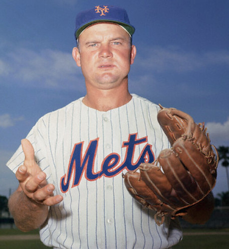
• The kicker came when Hersh and Cork Gaines found two similar but distinct wire photos that appeared to confirm Zim’s tale — one from the AP and one from UPI. As you can see, the captions both refer to the “new uniform.” One of them ran in a newspaper on Feb. 13, 1962, and the other on Feb. 12, which means the photos were probably taken on Feb. 11.
At this point, I was convinced: Don Zimmer was the first player to wear a Mets uniform.
I was disappointed to see that they’d dressed Zim in a road uni, however. As many of you know, the Mets’ home uniform was originally supposed to look like this. That mock-up was unveiled on Jan. 19, 1962 (confirmation of the date can be found here) — only 23 days before Zim’s photo shoot took place. So they must have decided to revise the home design at some point during that 23-day period.
My interview with Zimmer ended up being pushed back to Saturday morning. Here’s how it went:
Uni Watch: So how did you come to be the first player to wear a Mets uniform?
Don Zimmer: Well, I lived in St. Pete. And that’s where the Mets trained — or where they were going to train. They called me and said that the uniforms were sent down, and would I come down and put on a Mets uniform.
UW: Because they needed someone to model it?
DZ: That’s right. And I had my son with me. And when I went down, I had the picture taken with him on my shoulders. And that’s how it happened.
UW: So this was before spring training actually started. And they called you because you were already there, because you made your home there.
DZ: That’s right.
UW: Did that make you feel proud, or excited, to be part of something new?
DZ: At that time, yes, no question about it. Casey Stengel was the big show.
UW: Was he there for that photo shoot, or any team officials?
DZ: No, no. And there was no other players there.
UW: In the photos I’ve seen, it’s a road uniform, with “New York” across the front. They didn’t have a home uniform?
DZ: I don’t know about that. I just wore the uniform they gave me.
UW: Also, the photos I’ve seen only show you from the chest up. Were you wearing the full uniform, including the pants and all that, or just the jersey?
DZ: I couldn’t tell you that for sure. Honestly, I can’t remember that.
UW: Did you end up keeping that uniform? Do you still have it?
DZ: No, no, it was just for the photo.
This still leaves one tantalizing question: When did the home uniform — the real one, not the mock-up design that was never used — make its first public appearance? A clue may lie in the caption to this photo, dated March 6. Spring training had opened on Feb. 25, so did the Mets have to wear road attire for the first week-plus of their uniformed existence? Apparently so — that would explain why several of the spring training shots in the 1962 Mets yearbook show Stengel and his staff in road uniforms.
I’d still like to see an additional confirmation of that March 6 date. But it looks like we’ve untangled a fair amount of Mets uniform history here.
Incidentally, I realize some of you probably rolled your eyes and said, “Geez, another Mets story on Uni Watch” when you saw today’s topic. But believe me, if Zim’s bio had said he was the first player to wear, say, a Colt .45s uni, or an Angels uni, I would have pursued the story just as vigorously. So if there are other examples out there of “[this guy] was the first player to wear [this team’s] uniform,” let’s start compiling them.
One other thing: In case you were wondering, Don Zimmer is a total peach. Really enjoyed speaking with him.
UPDATE! Today’s entry had only been up for a few hours when reader/commenter Dwayne (no last name given) posted a photo from the 2/12/62 edition of the St. Pete Times showing that Zim wasn’t the only player suiting up for that photo shoot. Turns out pitcher Bob Miller was in uniform that day as well! Just goes to show that someone’s story, even if confirmed, isn’t always the whole story.

Contest reminder: I’m currently sponsoring a design contest to create a logo for the Baseball Project. Full details here.
Membership reminder: The membership enrollment fee will go up to $20 at the end of this month. If you want to sign up at the $15 price, there’s no time like the present.
Spring cleaning reminder: While poking around in my basement, I found an extra box of T-shirts promoting a certain protein-based foodstuff in the design style of a certain team. Once they’re gone, they’re gone — so if you want in, speak up.
Uni Watch News Ticker: A slightly less prominent Mets distinction: D.J. Carrasco has become the first Met in team history to wear team-logo stirrups. Ron Mazzola took that shot on Friday. ”¦ Here’s a cool site devoted to record label design (thanks, Kirsten). ”¦ You don’t often see photos of the Pirates’ 1947 uniform — an odd design that they wore for only one season — but Gordon Blau spotted one. “It immediately made me think of Bethany Heck’s Eephus League,” he says. ”¦ St. Paddy’s Day is now far back in our rear-view mirrors, yet I keep learning about additional NHL teams that wore green warm-up jerseys for the occasion. The latest example: the Thrashers. “At least this is way better than the green game uniforms they wore a couple of years back,” says Mike Powers. ”¦ Meanwhile, Chris Hernandez reports that a bunch of AHL teams wore green jerseys for the holiday as well. You can see several of them in this gallery. ”¦ The recent video clip showing Michigan football practicing in white pants inspired a Wolverines fan site to write about the time the team went white-over-white (big thanks to Gary Streeting). ”¦ Two items from Phil Johnson: Boston College is still using the old NFL logo on its media credentials, and who is Little Nickey, and why is he wearing a three-digit uni number? ”¦ More tales of mis-tagging, this time from Mack Abbott: “I saw this Wisconsin Badgers sweatshirt with an NFL tag at a local bargain store. They had a whole rack of NCAA sweaters with the NFL tag — North Carolina, Iowa, and about a dozen others.” ”¦ We’ve talked about the Mariano Rivera going high-cuffed this spring, but Robert Tusso notes that another prominent Yankee has made a lower-leg adjustment as well, and not for the better: Derek Jeter, who in the past has always cuffed his pants right where they meet his shoes, is now in full-blown pajama mode. Disappointing. ”¦ On Friday I noted that umpire Gary Cederstrom was wearing a matte-finish mask. But Eric Hill points out that Braves catcher David Ross has been going matte-finished at least since last season. ”¦ Reprinted from Friday’s comments: I hadn’t realized that the White Sox had experimented with gold-trimmed prototypes after winning the 2005 World Series. ”¦ Tim Tebow is now America’s newest underwear model (thanks, Brinke). ”¦ Bill Mitchell sent me this shot of South African cricketer Hashim Amla and his tremendous beard. I was wondering if this might be the Cricket World Cup equivalent of a playoff beard, so I asked cricket maven Peter Della Penna, who said, “No,he’s a devout Muslim, so the long beard is for religious purposes. Interesting fact regarding his jersey, though: In Test cricket, South Africa is sponsored by Castle Lager, but he doesn’t have the Castle logo stitched onto his shirt because drinking alcohol goes against his strict beliefs.” Hmmm, if I were on a team outfitted by Nike, I wonder if I could use a similar rationale to avoid wearing the swoosh. ”¦ Oooh, check out this family tree of telecom logos (nice find by Paul Lee). ”¦ Interesting take on disaster tribute symbols from Travis Cuomo, who writes: “I was a student equipment manager at Florida in 2005, when many teams wore those helmet stickers for Katrina. We chose not to wear them because many areas of Florida had been devastated by hurricanes that year as well but didn’t get nearly as much publicity. We weren’t going to wear a sticker for Alabama, Mississippi, and Louisiana when people in our own state were suffering.” ”¦ Jerry Wolper found a 1984 newspaper story about the Astros’ equipment being stolen, so they borrowed gear from the Giants. ”¦ Here’s a nice Howe family portrait. “Never seen Pucky on the front of the jersey before, or FiNOF either,” says RJ Myers. ”¦ Here’s something I’ve never seen before: In Saturday’s NCAA Midwest Regional hockey game between North Dakota and RPI, the RPI players had some sort of rear-leg strips. Is that padding? Something else? Details, please (as noted by Brandon Boemann). ”¦ Shelvin Mack’s NCAA patch fell off during Butler’s game on Saturday, but a teammate helped put it back on (screen shots by Ronnie Covert). ”¦ More Charliegate fallout: With disgraced former Mets equipment manager Charlie Samuels still being investigated for gambling activities, the Mets have decided to scrap their in-house NCAA bracket. ”¦ Although the Adidas logo isn’t permitted on NBA uniforms, Paul Lee notes that the logo from the compression undershirt often shows through on white jerseys. ”¦ Yet another NHL team that wore green warm-ups earlier this month: the Caps (with thanks to Jason Gilmartin). ”¦ Here’s some rare footage of CFL vs. NFL games (great find, Ricko). ”¦ Also from Ricko: Color footage of Sammy Baugh! ”¦ Buncha stuff from Jeremy Brahm: (1) Here are the uniforms for a charity soccer match between the Japanese national team (top) and J-League All-Stars (bottom) on March 29. (2) Here is the 2011 NPB Futures team uniform for the Eastern League (AAA level in Japan). (3) The La New Bears in the CPBL in Taiwan have rebranded themselves as the Lamigo Monkeys. (4) A catcher in a Japanese high school baseball tourney was wearing an unusual helmet — and yes, he also lost a tooth after taking a ball to the chops, but the helmet is more interesting. ”¦ “Since at least 2003, Indy Car driver Orial Servia has featured artwork by fellow Spaniard Salvador Dali on his helmet,” writes Mike Edgerley. “This weekend the helmet had extra significance because the St. Pete Grand Prix went past the new location of the Dali museum.” ”¦ Ron Yaworski recently returned from spring training in Arizona and shot some photos of the abandoned Brewers spring training park known as Compadre Stadium. ”¦ Further info on Compadre here. ”¦ Michael Orr is now tracking MLS kits on a weekly basis. He also adds, “One of the projects I’ve been working on is an exhibit at the Oregon Historical Society on the NASL-era (1975-82) of the Portland Timbers. We’ll have game-worn shirts, shoes, track jackets, etc., plus lots of other cool stuff. I’ll send you a link when we open, mid-April.”
Nice interview with Mr. Zimmer. But was really bummed when looked at Ron Yaworski’s picture set of the Brewers’ abandoned spring training site. Businesses can be such wasteful turds. The only salvation is it was a privately funded facility. No tax money was spent developing Campadre Stadium.
What’s really sad is to take this postcard picture of Compadre Stadium in its prime….
link
..and compare it to its current image in Google Maps.
link
Seeing stuff like this always breaks my heart. It is one thing to tear down an old park but to just let it go disused is just wrong.
If we were anywhere but in Arizona, it could have been used by now by an independent league team, who could have gotten it for a song. But baseball here in the summer is problematic.
Seems a lot more wasteful to water a giant lawn all year in the middle of a desert. But I guess there’s plenty of that going on across the street at the golf course.
There’s one more tantalizing question I wish Zimmer had answered: what number (if any) was on the back of the jersey?
Was it the 17 he wore during his bried stint with the Mets in 1962? Or, it being his ninth year in baseball, maybe it had number 9?
I don’t know the significance of #208, but I assume that Little Nicky is a reference to the Adam Sandler movie where he plays the son of the devil, since it’s a Devils uni in the picture.
I have seen multiple Devils fans with similar personalized jerseys. The three digit number is the section they had season tickets for at their previous home in the Meadowlands.
I was thinking the same thing as soon as I saw it.
BTW, I love your handle!
link
Thank you! Nice to see someone catch the reference :)
There’s a good photo illustrating Amla’s refusal to wear the Castle Beer logo here: link
I wonder how much the team had to lower its asking price when it told Castle it had a player on the team that wouldn’t advertise alcohol for religious reasons. Or would there be a clause in the sponsorship deal similar to team equipment sponsors that allow for players who have individual sponsorships to get out of having to wear the corporate brand for legitimate reasons?
I hope that the sponsorship cost did NOT go down because of Amla’s refusal to wear the logo. How many media outlets (like this one) would never mention the team or the sponsor if not for the refusal? It’s GREAT advertising for both!
It’s a foreseeable, but minor breach of the contract. There has to be some provision for it, like taking the per-match value of the contract and taking out the value of one player for every game he bowls. That’s the most equitable arrangement. Not everything having to do with sponsorship contracts is a matter of corporate douchebaggery; sometimes it’s just a matter of finding the most equitable way to balance everyone’s interest. Lowering the value of a deal by a fraction of a percent is definitely equitable, since in the end Castle is paying for advertising and being denied that advertising for a legitimate, foreseeable, and uncontrollable reason.
I was thinking the same thing. Advertising is about recognition. In this case people are recognizing that it is missing which creates the same result.
Don’t know for sure, but I don’t remember anything about Castle asking for a discount when the Amla story was in the news. The impression I got (admittedly from far away) was that they were happy having their name in the press for free, and believed that Amla’s stand was principled, which it was. That said, I agree jdreyfuss that Castle almost assuredly had a colorable claim under the contract.
A somewhat similar story from Spanish soccer is Frederic Kanoute’s unwillingness to wear a jersey with Sevilla’s Asian betting sponsor’s logo (888.com). Kanoute, the club and 888 eventually worked out some sort of settlement of that tiff.
I think so many nhl teams wore st pat’s stuff this year is because the league really pushed them as a marketing gimmick. I giot the new nhl merch catalog a month ago and first 5 or 6 pages were all st. Pat’s shirts and jerseys.
yeah, but why wouldn’t they offer the style of st. paddys jerseys that the players actually worn in warm-ups? that’s where i think the big money would come from. weird…
Ugh. I was down in Boston for St. Paddys a few years ago, and the Bruins store at the Garden was rife with green “O’Lucic” t-shirts. I didn’t know he was Serbo-Fauxirish-Canadian.
If they had one for Manny Fernandez (who was Tim Thomas’ backup at the time), I would have bought one, just for the lulz of O’Fernandez.
Personally, I have no desire to have a Green Wings jersey.
Not a fan of the logo stirrups. Mets would be better off ditching the black (where’ve we heard that before) and put three orange stripes on royal stirrups. If you look past the fact that he’s not wearing UNIFORM issued stirrups, at least Mr. Carrasco is wearing them correctly. Perhaps Mr. Reuss could enlighten young players with a weekend tutorial that could be circulated among the teams and colleges.
great bit with zim!
much as i’d love the mets to wear blue hose with three orange stripes (as seen in casey’s sketch), im not loving carrasco’s look…he really needs to learn that pants are not clamdiggers; they need to be lowered (and bloused) by about 3″ … and he could also use 4″ openings, not 7-8″
Not to mention that a person could suggest those might have been great socks the New York Giants, but not for the Mets.
I mean, they ARE black stirrups with an orange “NY” logo, right?
(Yes, yes…yet another passive aggressive assault on the unecessary-for-any-purpose-other-than-retail-sales black Mets garments).
—Ricko
That was my first thought too. The “NY” logo for the Mets is, of course, an exact replica of the one for the old New York Giants. Any reason the Mets can’t wear the old New York Giants cap now, too?
Other than that they aren’t the Giants, you mean? :)
That team plays in San Francisco now.
Although sometimes it almost feels like the Mets would just as soon change to black and orange, with maybe a little royal blue thrown in, doesn’t it.
—Ricko
You are right, but the only team left with an orange “NY” logo and black as a color is . . . the New York Mets. I like the logo and colors, but they belong to a team that no longer exists.
By the way, when I asked if there was any reason the Mets could not wear the old New York Giants cap, I was speaking tongue in cheek. By wearing the stirrups that way they seem to be paving the way to wear that cap too, if they so chose. But that would be wrong.
I often wear an old New York Giants cap and almost always have people comment on the Mets!
I know you were kidding, ntw. :)
If figured we’d just kick it back and forth between us.
—Ricko
Mr. Powers I have the same NY Giants cap, and every time I wear it someone asks if it is a Mets hat. My favorite thing is when the kids in the LIDs store ask where I got the sweet all black NY Mets cap ugh…..
Is it me, or does the umpire in the NY stirrup shot not look totally professional and as sharply dressed as usual?
link
And would it be awful to remove the numbers from the front of the Mets road jersey?
Little known fact. Damn near anybody can ump the basses in spring training.
One of the 55+ softball players I knew in Boca Raton umped Cardinal games. He’d heard they were looking for umps, got hold of the Cardinals, took a rules test (I think) after an interwiew, and worked 2 or 3 games a week. Not sure if any of the “amateurs” ever work balls & strikes, though.
—Ricko
A well-respected veteran umpire in my association travels to Florida this time of year for business and acquainted with a few MLB umpires.
Last year, he was asked and agreed to work a Spring Yankee game.
Hell, I get amped for Summer Connie Mack games, I couldn’t imagine calling a game behind the plate with real MLBers in front of me.
Last year, we had a highly touted HS pitcher in our county who would normally have 25 to 30 scouts at each game…The senior umps in my associateion often mentioned that it was just as nerve wracking for them with MLB guys watching!
“Damn near anybody can ump the basses…”
I sure hope they leave the link to the pros.
BTW, I can envision #29 getting hammered by a foul ball!
the rear leg strip on that hockey picture of north dakota and rpi reminds me of the stretchy stuff on the back of old shin guards.
The Strips on the RPI socks are tendon guards. Some sort of material stuck on the socks.
It’s added protection for the Achilles tendon, I believe. I have heard that the tape is supposed to protect lacerations. I’m trying to find a product right now.
What’s it made of that can protect against slashing? Kevlar?
The tape is made from a kevlar material. They already have socks and suits made of kevlar that are used in hockey and speed-skating.
i have typed in tendon guards for hockey like 12 times and only get tips on how to repair skates.
I don’t think it’s protection. Certainly not tape of any sort, kevlar or otherwise. It’s part of the sock. I’ve seen them play in person and gotten an up close view (from the front row, where I manged to get myself a seat for most games this year). The material is very thin, and you can pretty much see equipment and leg right through it. The rest of the socks are a very thin, stretchy material too, they’re nowhere close to the traditional knit socks that most NCAA teams still use.
I’m pretty sure it’s just additional ventilation for cooling. I’m pretty sure it’s just Warrior’s (who sponsors RPI) version of the RBK edge sock, the pro version of which has a similar, lighter weight bit in the back. In the edge version, that’s a lightweight airknit that’s somewhat tougher then the much stretchier material that makes up the rest of the sock, on the warrior ones it looks just as stretchy as the rest of the sock, but lighter.
No idea why they left it white though. It might just be similar to what we saw with the isles socks for the first few months of the edge uniform where the back panel didn’t have striping becuase of a factory screw up.
Come to think of it, the back panel might not exist on Edge socks with the flat, traditional striping. Let me check on that…
trying to navigate the warrior site gives me seizures.
It’s just mesh. Here’s a close-up photo of the RPI socks: link
Also, just noticed at a brief glance that Notre Dame has uni numbers embroidered on their socks. Never seen that before. If they bother keeping socks with individual players at all, the number is written on sharpie at the top. Often, with knit socks, they’re all one size, thrown in the wash together and randomly distributed again.
In the NHL, things are probably different. The pro edge stuff comes in sizes, and players would have their own. So those would have to be kept straight.
Looking at the telecom family tree is like looking at one of European royalty. Which one has haemophilia? Habsburg lip?
AT&T/SBC is either the Hapsburgs or the Bourbons.
I haven’t decided which house the United Telecom/Sprint is, but probably Hanover or York, since it forced its way into a large system and let it go to waste.
Vodafone/Verizon is Windsor, since it’s a major German company that gained power in this part of the world relatively recently.
Do you mean T-Mobile (Deutsche Telekom)? I’m pretty sure Vodafone is British and Verizon is American.
I thought Vodafone was German, too. I guess I was wrong. Verizon is Vodafone’s US arm though, not a separate company. T-Mobile certainly fits that profile of the German house that rose to power recently. Hmm, so what is Vodafone/Verizon?
Mannesman were German.
Vodafone bought them, which is when they became the major competitor for Deutsche Telekom in Germany.
I worked in the telecom industry until recently. Started at NYNEX, and five name changes/CEOs later, I’m done.
My “family tree” went like this:
NYNEX, Bell Atlantic, Verizon, Idearc Media, SuperMedia. Granted, I worked in the publishing end (we printed the yellow pages), but the point is there.
As far as I understand, Verizon sold off a part of its network. Northern New England is now served by Fairpoint Communications. The Upper Midwest and the Viriginias are served by Frontier Communications.
And I think Connecticut is still serviced by Southern New England Telephone (SNET)…it always seemed immune to the monopoly.
So I’m not sure how old the map is. Might be about two years old by this point.
You’re close. The website’s URL leads me to believe that it’s three years old. I found the original webpage’s URL.
link
link
There was even a disclaimer, which kind of answers my question about the absence of Cincinnati Bell on the graph:
Note: Despite its size, this family tree chart is woefully incomplete and grossly oversimplified. Not shown are the various minor subsidiaries, independent local phone companies today and the hundreds of early phone companies that had gone out of business trying to compete with “Ma Bell.”
Since the very first telephone companies were founded, it seems that telecommunication companies never do business as just one entity when ten would do. Whatever the reason – be it compliance with local regulations, taking advantages of tax loopholes, obfuscation or simply fondness of complexity – subsidiaries and complex corporate structures are the raison d’être for these companies.”
New logo for the new/resurrected Ft. Lauderdale Strikers, with a lot of “connecting” mumbo-jumbo in the release about it:
link
Also, “complements,” not “compliments,” bozos.
Why is there a Torah scroll on the crest?
Would it hurt you to put a Torah scroll on the crest?
It’s okay, I’ll just play in front of an empty stadium. No one has to come see me, I’m just your soccer team.
Sadly, that scroll is the nicest part of that crest no matter why it’s there. That plain square box around the text just seems half-assed to me. I also agree with the post below about the fonts, those do not go well together at all.
They’re columns, not scrolls. It’s mentioned in that press release, but it’s worded very poorly.
I saw that. I just couldn’t resist the Torah joke given Ft. Lauderdale’s demographics.
That script “Ft. Lauderdale” just does not go with the rest of the logo, does it? Reminds me of the old link logo sans the airplane…that or the title card of a ’70s sitcom.
It should – it’s a holdover from link.
That gives even more credence to teenchy’s point — that the script “Ft. Lauderdale” looks out of place alongside the block “STRIKERS” and “FOOTBALL CLUB” . The new logo is just a half-assed attempt at combining modern with retro.
~~~~~~~~~~~~~~
Memo to US-based pro soccer franchises: it’s not football. You want to call it football, play in another country. Otherwise, get over it and call it soccer.
They had football first. We should either call the game on our shores American football or Gridiron or Concussionball or something else. Seeing as how most people hold punters and kickers in such low regard, I don’t know why they insist on calling it just football.
Agreed MotherVilker! This country just won’t give the beautiful game the respect it deserves.
That ship has sailed, fellers.
Calling it American football overseas? Fine. But in this country, it’s just football.
I could even maybe get on board with “football clubs” that play in appropriately-named leagues. But you want to call your team a football club when it plays in the North American Soccer League or Major League Soccer? Pick a lane. Or at the very least, refer to it as “association football.”
And this isn’t the only country that calls it soccer.
Not being from NY, I thought the term Amazing Mets was coined during their World Series run in 1969. I had no idea that the team was referred to the Amazing Mets from their inception as mentioned in the article about Stengel and Hornsby.
Yes, it had a decidedly different meaning when first used.
Rmember, Ol’ Satchel Paige was the origional Astro! link
That is interesting about Zim. Love how he is tied so deeply with baseball history.
And those are some spiffy dress “cleats” he is wearing.
Damn near wearing pajama bottoms, too.
Scandalous.
—Ricko
I like anything having to do with the Mets, Jeremy Brahm, or Sammy Baugh, but I really dug two of the non-sports items today: Kirsten’s link to the 45RPM record labels (and 33RPM album covers); and Paul Lee’s Telecoms graphic.
Nice to see the Cubs going back to the right Meats in the poppy-seaded bun.
link
seaded? ugh
Too bad their rivals on the South Side have dropped the ball when it comes to pizza. Ditching local deep-dish favorite Connie’s for DiGiornio??? Did they settle on DiGiorno after talks with Tombstone broke down?
I didn’t see anything about DiGiorno’s on there. It said the Cubs are switching from Connie’s to D’Agostino’s. Either way, no one tell Broadway Connie. It’ll break his heart.
It’s in the graf right after the one discussing the Connie’s-D’Agostino’s switch. If Connie’s did something to piss off both parks well so be it, but they could’ve at least switched to another local vendor like the Cubs did instead of going with a national frozen-pizza manufacturer.
Check the 9th paragraph down.
This a calculated blow to to forename honor. A no-fly zone over the North Side will be imposed as soon as the Special Forces on the ground return to base.
Good news on the hot dog switch. But who the hell gets pizza at a baseball game?
Have you been to a baseball game recently? EVERYONE looks as if they’ve had a few pizzas.
Checking the St. Petersburg Times of Feb 12, 1962, it shows Zim and Bob Miller modeling the new Mets uniforms. The caption states that they both are St. Pete residents and the new uniforms arrived “yesterday” which would be Feb 11th.
It is on page 20 if the link doesn’t work correctly.
link
Whoa — great find!
So Zimmer wasn’t really the first — he was ONE OF the first!!
I’ll run an update tomorrow.
— P.
Paul:
I guess I’m on a “Ricko Roll”.
I passed on the article about Zim and the 2005 White Sox gold-trimmed prototype WS Champs jerseys in the same week!
Life is grand! LOL
“Spring training had opened on Feb. 25, so did the Mets have to wear road attire for the first week-plus of their uniformed existence? Apparently so – that would explain why several of the spring training shots in the 1962 Mets yearbook show Stengel and his staff in road uniforms.”
It is a good bet that, yes, the Mets did wear their “road attire for the first week-plus”. My memory is, in spring training, teams always worked out in their road unis and reserved the home whites only for picture days (and Topps) and home exhibition games.
Great interview with Zim. I really miss him in the Yankee dugout.
I think you’ve nailed it. The Mets’ home uniforms were indeed issued on March 6th, according to link:
“The white, pin-striped home uniforms, with Mets across the chest, were issued for the first time…”
I mentioned this in the comments on Friday, but the absolute first home uniform was reportedly sent to Casey Stengel at his off-season California home so he could pose for publicity photos. Don’t know when that was, as link comes from April 13th, after the players got theirs, but it would have to have been before February 17, when Casey reported to Florida.
Interested in photos of record labels and jackets? Then please check out…
[url]http://www.recordlabels.smugmug.com/[/url]
password is “labels”
link
There you go Drew. This isn’t Proboards; you don’t need url tags.
Thanks!
Great Casey quote in that Hornsby article:
He said he would probably only manage one year, and when asked if he could be enticed to go longer…
“That would depend on my health. I’m 70-odd, which we won’t go into. If I saw my health wasn’t good I wouldn’t go out there and work. But they’ve got contour seats and escalators and maybe it wouldn’t be too hard for me.”
Vintage.
-Jet
Just something so…melancholy…about abandoned ballparks and stadia, isn’t there.
link
—Ricko
I…did not…know that.
link
Not far from me, as it turns out.
It is certainly fascinating. I remember when the Brewers played in Chandler. I guess it was just a stadium that was built at the wrong time, in between trends. A sad sight indeed.
Okay – my sarcasm detector might be way off – but we do realize those St. Paddy’s “gamers” for the Thrashers are Photoshopped fakes, right?
link
Wow… that gold-trimmed ChiSox jersey is REALLY nice. This would be a great every day look for them. I wish MLB had a team in black and old gold (or am I missing someone?). The Pirates’ colors are great, but that ain’t gold to me. It’d be cool to have an MLB team look like the Saints.
Before either The Jeff or Ricko has a fit, the medium-value, high-brightness shade of yellow that the Pirates (and a lot of other teams) wear is referred to in uni jargon as “athletic gold.” The duller, metallic yellow that the Saints wear is called “old gold.” With a little more brown in it, it becomes “Vegas gold,” which is worn by the Pittsburgh Panthers.
The White Sox trim appears to be either Vegas gold or pale gold.
Oh God, here we go. . .
“The Pirates’ colors are great, but that ain’t gold to me.”
Has been for, what, 90 years or so in the sporting goods/uni-world?
And literally thousands of years for most cultures before that (that’s we so much has been written about “beautiful ‘yellow’ sunsets”, right?)
But, hey, have it your way.
What bother to learn the language of the community that interests you. You’re the authority. Just walk in and tell them what they’ve had wrong for so long.
—Ricko
I really don’t feel like getting into this today. So, instead, here’s a picture of a different Zim in a Mets jersey: link
So let’s say Zim is Fred Wilpon. Does that mean GIR is the GM? Because suddenly their personnel moves make a lot more sense.
That would make Tak the Yankees and it fits so well too, what with the Yankees being so much more competently evil.
“But, Daddy, I don’t CARE what it’s called, I think it should be called YELLOW.”
Thank you, Veruca Salt.
link
—Ricko
Metallic Gold-trimmed White Sox unis? I have to say, I’m oddly intrigued by it. It’s certainly more interesting than the bland & dated black & silver look. They could have kept it like the Celtics did to their logo for their 50th anniversary.
I wonder what the rest of that set would have looked link. I’m really digging that alternate version; reminiscent of the original alt design without all that extra thick double trim.
What about using sand/khaki/tan/whatever you want to call it for the road uniform instead of gray?
link.
That still looks pretty damn gray to me.
Fewer things on earth look worse than an Atlanta Thrashers uniform in any color…
Don’t worry, pretty soon you’ll only have to see those on the link merchandise shelves.
I took a photo of the RPI hockey socks up close when the Engineers came to visit NH this winter. The alleged “tendon guards” appear to be nothing more than light-colored mesh that presumable allows the socks to be better ventilated: link
Thrashers is spelled wrong in the ticker.
I would just like to thank our sponsor for selecting “Kim Kardashian in Leather Pants: Our Look of the Day” (from Style List) for us.
And, of course, I’m kidding.
Re: 1947 Pirates uniform
That was a weird, one year design, which was also different because the red had been dropped from the uniforms. In 1948, the Pirates would switch over to black and gold officially, with new uniforms. Recreations of the 1947 hat make it appear to be black, but dark blue seems to be the real color.
Interesting cast of characters on the ’47 Bucs besides Ralph Kiner. Hank Greenburg in his final season, along with Rip Sewell, Preacher Roe, and Gene Mauch. The hitting instructor was Honus Wagner.
Want the hat?
One of several sites offering it…
link
—Ricko
Black and gold? I thought they were black and yellow. (I don’t know what we’re making, but it should be pretty evenly mixed by now)
The striping, edges on numbers and letters and the hat logo on the original Pirates’ black and gold in the late ’40s and early ’50s was metallic old gold.
Changed to athletic gold when they went to vests in ’57, then to the mustard gold (non-metallic old gold) with advent of doubleknits, then back to athletic gold with the bumblebees.
Lotta ways to represent gold. Such a universally precious metal is bound to have numerous color versions evolve, owing to our need to have it represented in every media possible, from artwork to jewelry to fabric.
And we called them all “gold” because of the almoust universal regal connotation. Is that really so hard to understand?
—Ricko
Yes Ricko, we all understand why it was done. That doesn’t mean we need to keep doing it.
If you paint a car the same color as the Packers helmets, no one is going to call it a gold car.
Forum Blue isn’t blue. Athletic Gold isn’t gold. Is that really so hard to understand? The technological limitations of the past do not need to dictate the language of the present.
Thanks again, Veruca.
link
“If you paint a car the same color as the Packers helmets, no one is going to call it a gold car.”
I believe the discussion of automotive colors is taking place at, oh, I dunno, an automotive website which (big surprise) probably has its own terminolgoy particular to that construct.
—Ricko
Yes, because as we all know, hugger orange, hemi orange, and tor red are definitely not all the same color.
I bought a midnight blue Fender bass and the damn thing turned out to be purple.
“If you call a tail a leg, how many legs has a dog? Five? No, calling a tail a leg don’t make it a leg.”
– Abraham Lincoln
I figured some of you might find this interesting, courtesy of the Sport Clips Haircuts Facebook page…
Congrats to MVP Moment Trivia Winner ____! He answered the following question & won $100!
Q: What does the letter “G” on the helmets of the Green Bay Packers stand for?
A: Greatness
…groan
I wonder if Tiki Barber knows those original Broncos vertically striped socks were bought from a prison team.
Really. The Longest Yardbirds, they were called.
—Ricko
The G is flexible. The Packers are the current champs, so the G stands for Greatness. When they’re 10-6 and losing in the playoffs it only stands for Good. When they’re 4-12, it’s God Awful.
And, lol, as we’ve mentioned, at 2 wins or less, “Gouda.”
The G stands for gold. They put in on the helmets so people would know it’s not just yellow…
/“Geez, another
Mets storyyellow/gold discussion on Uni Watch”Has anybody thought that perhaps the G stands for Green Bay!
That’s no fun.
stands for “got lucky”
(sorry… steelers fan ova heaa boss)
One of the Baseball Project’s best songs (and one that I don’t care for quite as much) is available for free download, today only:
link
Which one? “Fair Weather Fans” or “Don’t Call Them Twinkies”?
I really like “Fair Weather Fans.” Never liked minor-key songs, so “Twinkies” doesn’t really work for me. But that’s just me.
Not ragging on you, but that kinda eliminates like half of all modern music!
I definitely prefer the Twins song.
But I like Craig Finn, so there you go.
Could somebody give me a quick tutorial on how to link photos in your text versus copy and pasting a web address in your comment post. It would be greatly appreciated.
basic html to place a link inside text
This is only a test
link
Another test
link
You’re making things testy around here.
I wanna link
Still learning……that was supposed to only link to the UGA “G” picture, not the entire site…..
oh well, maybe some day…
link
Phil,
How can this same technique be achieved in an email format? I understand how it works within a web page, but can’t get it ot work on an email. Thanks for your help.
Remember when you all thought universities going after high schools for using logos was crazy? NC State has taken that thought to the obvious insane level.
link
They have filed a lawsuit against Loyola University over Loyola using the nickname ‘Wolfpack’.
Well, if only NC State can use “wolfpack,” then what are supposed to call that fleet of submarines that roamed the North Atlantic shipping lanes during World War II?
I know, I know, that’s submarines, not sports.
But “wolfpack” is a fairly generic term, in the “lower case” sense. I can see litigating over similar logos and such, but what next, someone’s going to claim ownership of “wildcats” or “bulldogs” or something?
—Ricko
Eventually, somebody’s going to claim Pirates or whatnot, and start suing elementary schools.
Sorry, but generic mascots are generic. Wolves are a common enough choice of mascot. They travel in packs.
Am I the only one who thinks that pretty much all of our IP laws have gone completely wacko?
It’s the GCs of the schools that have gotten out of hand. Our IP laws are written so that anyone can attempt to copyright something that’s not already registered in order to foster more creativity. The Patent Office and federal court system always have the option to deny a copyright, but that’s not to prevent someone from trying to register it.
Copyright terms these days are insane too. Shitloads of old music, for example, is completely and totally unavailable. The artists have died, the owners of the copyright, the heirs of the artists, have no idea that it exists or is still valid, in some cases where studios own the music, they don’t see a profit in taking the effort in putting it out for sale… So it’s sat on and forgotten. Basically, Disney has written our modern copyright laws, and in their protecting of stores they ripped off from other people, they’ve screwed over people who want to access smaller works that not aren’t still commercially viable.
Patents… Well, read up on patent trolling. It’s an issue.
Way too generic to copyright the name. It’s not like Hilltoppers or something. Hell, even Fighting Irish is too generic to copyright, as at least one Catholic high school in any midwestern city can probably tell you.
Of course, the nature of copyright law is such that anyone can claim a copyright and attempt to protect it in court. In this case, no federal judge will consider a quiet title action on such a generic name, so it’ll die out.
NC State suing a university over a FAIRLY GENERIC nickname? All of that Adidas gear must’ve caused some SERIOUS decay of the brain for them to do this…
This is how disasters like the Connecticut Whale come about.
New logo for the “new” NASL:
link
Pretty neat article on how an equipment manager preps for opening day (and not by running the NCAA pool)
link
Sad sujbect, but nice photo of final St. Louis Browns road uni…
link
Colorization, anyone?
—Ricko
Damn, I’ll be this earlier Browns unit looked pretty good in person.
link
For some reason, the Bulls are in español again tonight, in red at home. They’re also loosing at halftime by 16 pionts. Hmmm…. maybe “Los(s)” shouldn’t be on the jerseys.
I suppose it would help if the Sixer’s would also be Spanishized. Replace “Sixers” with: Seis(ta’s). Get it?
Nice to hear from original Mets. My favorite Don Zimmer story occurred when he was a coach with the Cubs and Jim Frey was the manager. Dallas Green Cubs GM had just fired Frey and one of the Cubs announcers asked Zimmer about his close friends dismissal. “God couldn’t win with this team” he said.