One of best things that happened to me in 2010 was that I had my first experience with curling, culminating in my participation in the House of Hearts Bonspiel back in March.
A few weeks after the House of Hearts, I got an e-mail from Katie Moorhead, who described herself as a fourth-generation curler. “With all the recent attention you’ve given to curling, I’m surprised you haven’t mentioned the pins that get handed out by clubs and at bonspiels,” she wrote. “I’ve got about 50 years’ worth of these pins from my great-grandmother, grandmother, and mom, but unfortunately I am away at college, so I can’t send any pictures of them now.”
That was more than eight months ago. I’d forgotten all about Katie’s note until earlier this week, when she got back in touch: “I recently went home for the first time in a while and was able to take pictures of what is left of the collection. ”¦ Unfortunately, both my great-grandmother and mother passed away when I was much younger, so many of the stories behind the pins were never passed on to me.”
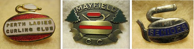
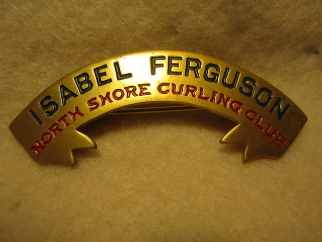
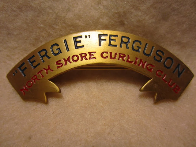
Even without the backstories, the pins are magnificent. There are nearly 150 of them, which means Katie must have spent a lot of time photographing and annotating — impressive.
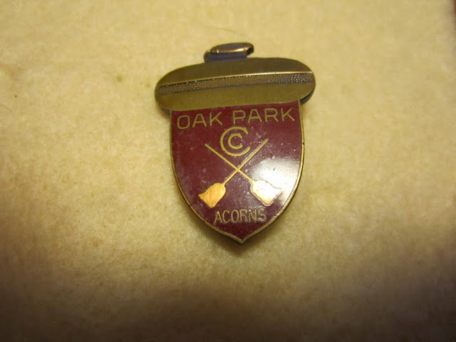
But not as impressive as the pins themselves, many of which are minor masterpieces of design. Some of them feature the standard curling iconography of a rock or a rock and brooms, but others are much more interesting. Here are some of my favorites from Katie’s family’s collection, beginning with one that cleverly turns the rock into the cap of an acorn:
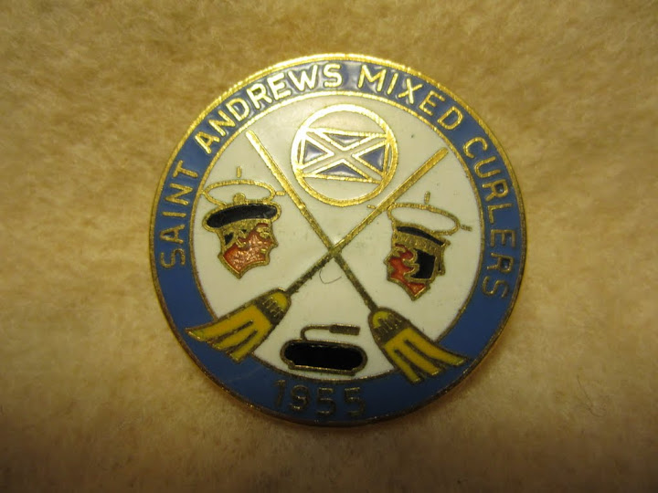
There’s a lot going on in this next pin, including the Scottish flag and two faces in profile:
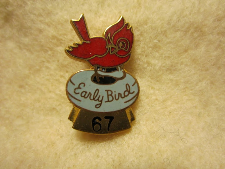
I have no idea what the “Early Bird” prize was for, but the winner sure got a nifty pin:
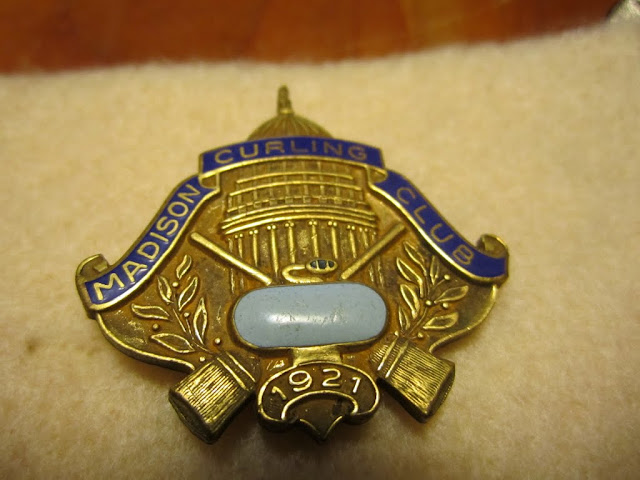
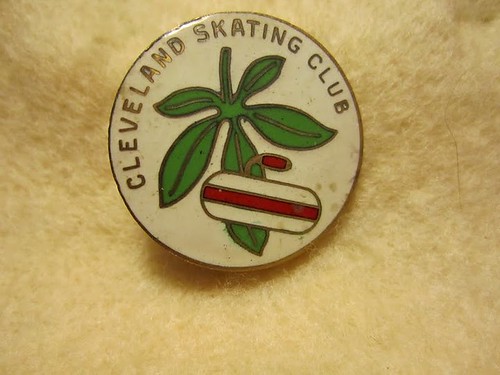
Madison is the state capital of Wisconsin, so it makes sense that this next pin’s design included the capital dome:
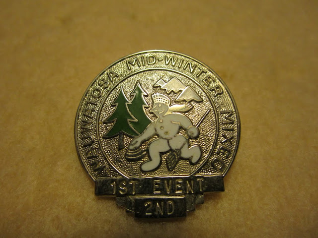
Thanks to the blizzard, I’ve seen lots of snowmen here in Brooklyn lately. But I haven’t seen any of them curling like the one on this pin:
One thing I noticed while looking at Katie’s collection is that the women’s pins tended to have more playful, entertaining designs, like this one:
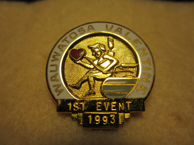
It turns out everyone loves curling, even Cupid:
We’ve all seen buckeye leaves plastered on Ohio State football helmets. But I’d never seen buckeyes with any connection to curling — until now:
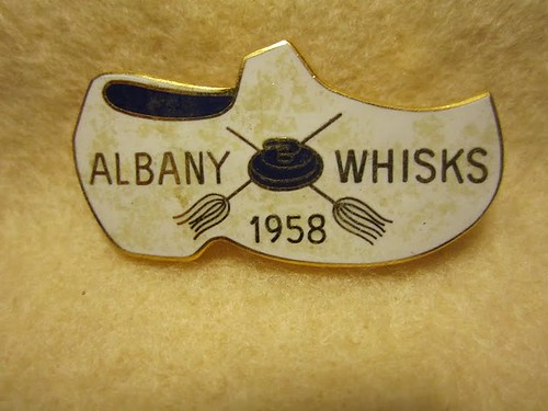
Curling is very popular in the Netherlands, which presumably explains why this pin is shaped like a Dutch clog:
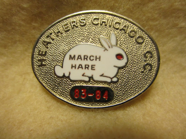
The March Hare is an annual bonspiel held at the Chicago Curling Club, with what the club describes as a “coveted bunny pin”:
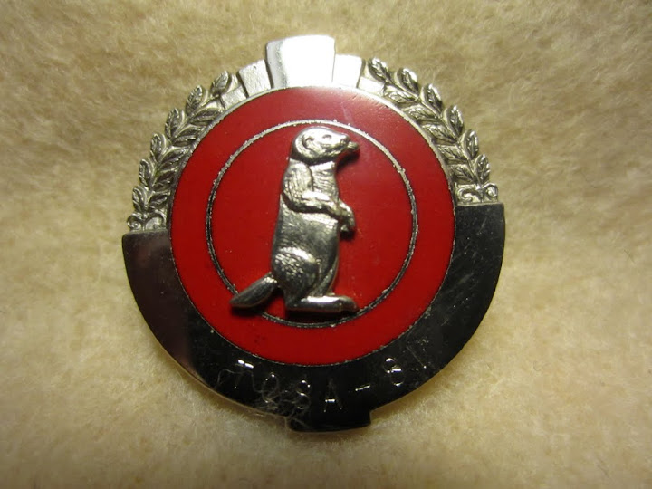
Speaking of animals, there’s no getting around the fact that anything is cuter with a beaver on it:
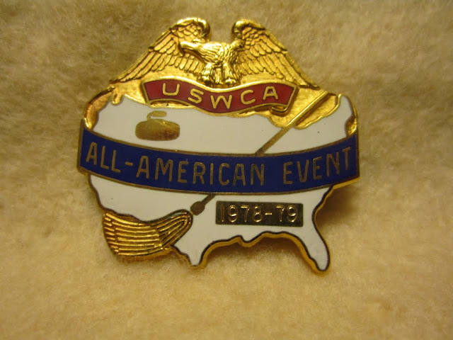
Most curling pins stick to local or regional themes, so it’s sort of striking to see one that depicts the entire lower 48:
I really like how this pin is three-dimensional instead of flat, especially the protruding rock:

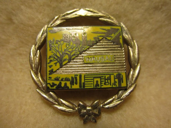
As you may know, the Wausau Insurance logo is based on a photo of the old Wausau train station, which in turn is depicted on this pin:
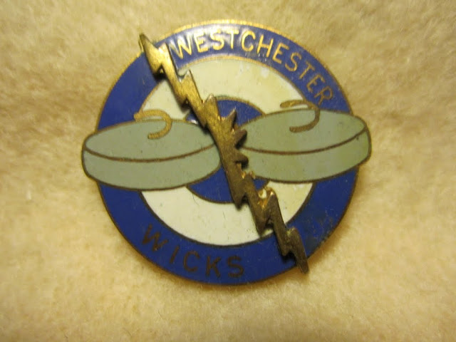
The Chargers aren’t the only ones who can make graphic use of lightning bolts:
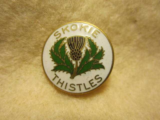
I’m fairly certain curling is the only sport that could use “Thistles” as a team name:
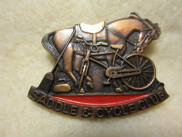
I’m also fairly certain I’ve never seen a design before that includes a horse, a bicycle, and curling equipment:
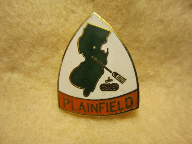
Hey, here’s a pin from the Plainfield Curling Club in New Jersey, where Phil and I curled back in February:
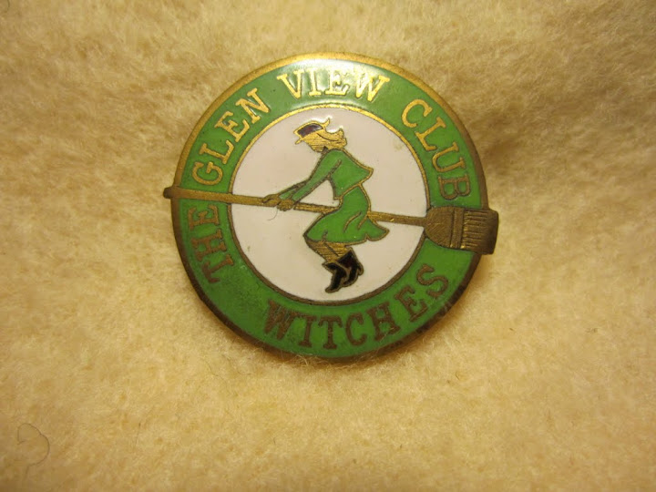
Given the broom’s central role in curling culture, it makes sense that a women’s team would come up with a design like this one:
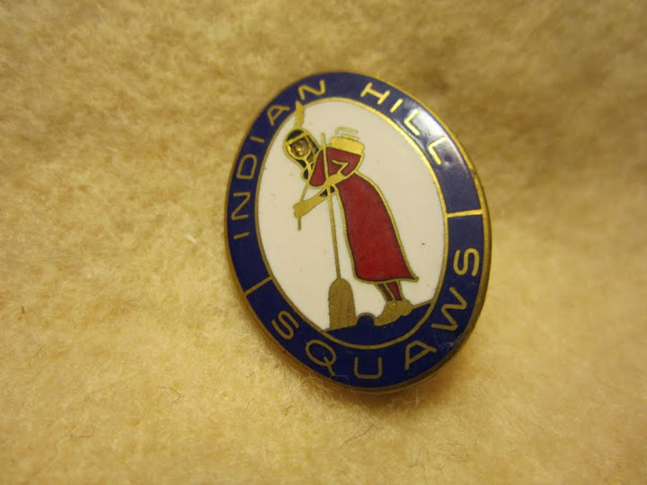
I don’t think curling was ever part of Native American culture, but that didn’t stop an Illinois club from coming up with this design:
And so on. I could keep going, but you get the idea. If you want to see more, check out the full set of Katie’s photos.
Finally, let’s hear it for Katie and her family, including her great-grandmother and great-grandfather, who had their own special name pins:
Uni Watch News Ticker: Headgear switcheroo in last night’s Pens/Isles game, as reported by Doug Keklak: “Right at the end of regulation, there was something wrong with Sidney Crosby’s helmet, so he skated to the bench and grabbed a different one — Chris Conners’s No. 18. But the break in the action gave him time to get his regular helmet back, so he actually didn’t play while wearing Conners’s helmet.” ”¦ Check out the homemade shin guards. That photo’s from a huge trove of old Texas A+M sports photos (big thanks to Chris Smith). ”¦ Looks like Washington will be going BFBS in tonight’s Holiday Bowl. Sigh (with thanks to Brian Terreson). ”¦ Meanwhile, in the Chicken Salad Bowl, or whatever the hell it’s called, South Carolina will be wearing these cleats (with thanks to Beau Franklin). ”¦ The MLB centennial Jim Beam whiskey bottle in yesterday’s Ticker reminded Tracy Ruckel of this KC Royals commemorative bottle of McCormick Whiskey. “It was handed down from my grandfather a few years ago,” says Tracy. “It has remained unopened all this time, but my brother and I have agreed that when the Royals win it again, we will crack that baby open.” ”¦ Day-Glo Conspiracy note from Erik Johns, who writes: “I was watching Back to the Future, Part II last night. At the beginning of the movie, when Doc takes Marty to 2015, he gives him some new attire to fit in with the local youth, including some Nike shoes, which were in this tube thing. It looks like all of this day-glo design is just an attempt to align with the world of 2015 as presented by the movie.” ”¦ Liverpool memorialized former teammate Avi Cohen, who died earlier this week after a motorcycle accident, with armbands made from black electrical tape. “Strange that they couldn’t get actual black armbands in time,” says Michael Orr (who has prepared yet another EPL uni roundup, by the way). ”¦ Jay Lackey notes that the Pinstripe Bowl logo features something that’s probably never existed in real life: a pinstriped football uni. … New court design for Idaho State, and hoo boy is it a stinker (with thanks to Frank Mercogliano). ”¦ Ryan Alexander says he hears that SMU will be wearing a “17” memorial decal for Don Meredith in today’s Armed Forces Bowl. ”¦ Anyone know why a Maryland player was wearing a wrestling-style belt on the sideline yesterday? “Not sure if Under Armor is giving these out as standard issue or if he had to beat Ric Flair,” quips Eric Vieira. ”¦ The mighty Fleer Sticker Project has come up with a new (to me) photo of Brooksie in the O’s orange uni, along with an old Baltimore Sun article that describes the uniform as “about four shades more lustrous than a ripe autumn pumpkin” (they don’t make sportswriters like that anymore, my friends). Check out the full entry, which gathers all the known photos of the orange uniforms, here. ”¦ RIP, Dr. Taylor. You’ll be missed.
Phil will be pinch-hitting for me tomorrow, so this is my last entry of the year. I’d like to thank everyone for helping to make 2010 a very good year for Uni Watch. Have a great New Year, and I’ll see you in 2011. — Paul
Great post today. The curling pins are awesome. Nice Texas A&M flickr set.
There is a hockey team named the Thistles. In Kenora, Ontario. link
Also, way back before the Stanley Cup was NHL exclusive, the Kenora Thistles won the Stanley Cup. It’s a name that’s been used since around 1885 in Kenora.
Formerly the Rat Portage Thistles, one of my favourite team names of all time.
Around the turn of the 20th century, there was also a soccer team in Toronto called the Thistles. Won the Ontario provincial championship a few times.
Curling is thought to have originated in Scotland, and the thistle is a national symbol of Scotland. Which would explain the preponderance of curling clubs named after the flower.
The Thistle Curling Club of Hamilton, Ontario, was a provincial power in the 1930s and ’40s. Winnipeg’s Thistle club goes back to the 1880s.
That is correct..
Oddly enough, the name Kenora came about because a flour company didn’t want the word Rat appearing on their product. So The settlements of Rat Portage, Norman, and Keewatin joined to get Kenora.
I was reluctant to suggest this, but given that there was another Cleveland pin, the “Mayfield” one that she said was from an unknown location my be Mayfield Heights, Ohio.
Was she a neighbor of the Cleavers?
Being originally from Chagrin that was my first thought too.
The best part about the Idaho State hoop court is the web site states that the court “was put down on Wednesday.” I’d say, based upon the UniWatch ticker, it’ll be put down on Friday, too.
Thank you! Please tip your waitresses, but don’t tip them over!
Okay, not exactly Shecky Greene (not even Lorne Greene).
You’re right Paul, sportswriters don’t use that kind of prose any longer.
And I’d just like to remind everyone that the O’s Orange uniforms were not “doubleknit” stretch nylon but rather a 50% Stretch Nylon/50% Durene Cotton plaited-knit fabric. The uniforms were made by Powers Mfg. of Waterloo, Iowa in 1971. Powers used their No. 39 cloth from which they made basketball jerseys and shorts and football jerseys. With the inception of the knit baseball uniform craze Powers followed pioneer Rawlings’ lead by also using the Stretch Nylon/Durene knit fabric.
The Oakland A’s were actually the first to use a true “doubleknit” fabric when they switched for 1972. The A’s uniforms were made by Stall and Dean for Tim McAuliffe. Stall and Dean made the A’s pants out of Yarrington Mills’ No. 110 Heavyweight Doubleknit Stretch Nylon and the jerseys from Yarrington’s No. 157 Medium weight Doubleknit Stretch Nylon. Yarrington is located in Hatboro, Pa. near Philadelphia.
We sold for both Powers and Stall and Dean in those days. We put both companies knit baseball uniforms on the University of Rochester and Rochester Institute of Technology in the 1970s.
One thing I remember about those Orioles’ orange unis was that they evidently hurried them onto the field, because no one’s pants were tapered. And that was the era of the tighter pants,. Early in it, but still was the look. That made the “bagginess” of them stand out. Looked “old-fashioned”. Always thought that may have contributed to the overall negative reaction to them at the time.
Same thing when the A’s later went mono kelly.
—Ricko
Interesting how the O’s shelved those unis but brought back the orange jerseys three or four years later. LOVED that jersey as a kid, along with the matching cap. It just shows that when teams fiddle around with a look that they quickly get rid of, the seeds of a good-looking uniform may be there.
Also, Terry — I thought the Pirates were the first double-kint team, in 1971?
Although the Pirates typically get credit for the first double-knits, that is not accurate. They were the first non-flannels, but they were NOT double-knits — they were synthetic stretch-knits. Further details in this ESPN column I wrote earlier this year:
link
Right, I remember that now. Sorry about that.
Bet you will see a return to the Orioles’ orange jersey one day soon.
By the way, my dad used to call that color “Chinese red” for some reason. But I think it was due to the coloring on our TV. It’s really orange. I bought a replica of that jersey in 1980 and the matching cap, even though I was always a Red Sox fan.
if you look at all the “known” color photos of the o’s all orange uni, it sure appears reddish/orange and not the orange we think of when we picture the orioles in later iterations
so chinese red may not be a bad descriptor
Your dad have an art background?
My dad, who was a commercial artist, often referred to “Chinese White.”
Never was sure where it came from.
Wish I’d asked.
—Ricko
Dad did not have an art background. He was just a sports fan. Not sure where he got that term, especially considering he grew up in the white and grey flannel era of baseball. ;)
Phil — just to be clear, the jersey he referred to was the one they started wearing in 1975, not the earlier version. But I think even that jersey appeared reddish/orange in photos and on TV.
— G.
Interesting that they were rushed out (non-tapered look), someone (s) must have been excited , thinking they were onto a great new look.
As to reddish/orange – in my opinion I believe the Philadelphia Flyers were the same, as well as in the early 1970’s the Denver Broncos. I find it disappointing that when a team adopts orange today – they all go for the same shade that truely is 4 shades brighter than a ripe autumn pumpkin.
Yeah, those first Broncos orange pants (Floyd Little, Steve Tensi era) were almost the color of a tomato.
—Ricko
Ricko — I’m doing my dad a diservice by saying he was just a sports fan. He worked in sports public relations for over 20 years. Just wanted to clarify that one!
The Pirates broke out the non-flannels on July 16, 1970, their first home game at Three Rivers Stadium. I remember this distinctly for a few reasons.
a) Roberto Clemente, the lone Pirate rep in the All-Star game played just two nights before, was the last Buc to wear the vested uni in game action.
b) No one, not even the “Gunner”, Bob Prince, knew in advance what the new uni was to look like. But we knew the Pirates were going to break out new unis once Three Rivers opened.
c) The Pirates were going to televise locally the Three Rivers opening. Up until that time, the Pirates – with apparently one exception – NEVER televised a regular season home game.
d) The only item that didn’t change was the batting helmet. It remained black for the remainder of 1970. They would switched to the mustard gold helmet to match the mustard gold cap in 1971.
The reason for the baggy pants was because you’re right, these uniforms were hurried out the door by Powers. The pants were cut using Powers’ old flannel patterns, in which everything was baggier to help compensate for the lack of stretch in flannel. Also note that the pants had conventional belt loops, pocket flaps and a fly front-all throwbacks to the flannel era. And where the sleeve-end trim on Los Piratos’ uniforms was knitted right into the sleeves on the O’s jerseys it was a 3″ piece of braid that was sewn on to the shirt. Note the approximate 3/4 to 1″ of Orange at the bottom of the sleeves.
These uniforms were as much a “work-in-progress” prototype of knit uniforms for Powers. They eventually figured out how to make the knits with new, tapered patterns, knit-in stripes and waistbands. Every other manufacturer was playing “catchup” to Rawlings in those early years.
Speaking of the Oakland A’s, referring to a June 27th, 2010 Uni Watch post by Matt mentioning the all-yellow A’s monochrome look on Ken Holtzman’s 1974 Topps card, was probably shot on July 22, 1973:
link
There’s a few more all-orange Orioles on Getty Images in 1971 & 1972 – I’m sorry for the source & if any of these have been already submitted
link
link
great stuff mark!
i’d never seen that holtzman or the first orange o’s pic ever before…
i had seen the second brooksie, but it’s always great to see it again
That looks like Cleveland’s stadium. They must have worn the orange on the road. Which is weird, because when they debuted the orange jerseys with white pants in 1975 they wore them only at home.
That looks like Cleveland’s stadium
~~~
what gave it away chris? the caption: “CLEVELAND, OH – APRIL, 1972: Thirdbaseman Brooks Robinson #5 of the Baltimore Orioles gets ready for the next pitch at his position during a game in April, 1972 against the Cleveland Indians at Cleveland Municipal Stadium in Cleveland, Ohio.”
;)
Doh! Didn’t read the caption, but it would have helped.
Guess I thought it was Municipal Stadium because of all the empty seats. ;)
In honor of curling season coming back around (great pins, by the way), I offer link which, coincidence or not, is the only curling song I know.
“Anything is cuter with a beaver on it”. That’s a contender for line of the year, right there.
What an incredible collection of pins. It’s great to see the creativity, design, and effort put into making these. Makes me wish curling would have found a way to catch on down here in the south, just so there could be some pins floating around that would be more geographically relevant to me. Still, this is the best post in a while. May not be uni-related, but definitely FUN. And that’s what I like to come here for. Kudos to you, Paul, and to Katie for taking the time to photograph and then share her collection.
Curling is starting to catch on in the South, including some extremely unique pins. For instance, the Curling Club of Houston features an oil rig, armadillo, and astronaut!
All the posts about commemorative bottles reminded me of the 1972 Dolphins Dr. Pepper bottle at my parents’ house, somewhere. It isn’t displayed anywhere, as we’re Jets fans, so i found a pic online: link
Speaking of commerative bottles, my parents have a Bear Bryant commemerative Coca-Cola bottle. We’re Razorback fans, so it isn’t on prominent display, but I’ve always thought it was the coolest thing. A quick image search shows what the bootle looks like: link
Hey! I’ve got that bottle! And still full of brown liquid that used to be Coke.
And while not being a nickname, there is a Scottish footie team named Partick Thistle
And Buckie Thistle.
The wooden shoe pin from Albany is almost certainly a reference to the role the Dutch played in the history of New York State. You’ll see evidence of the same in the colours on the flags of New York City and Albany. Orange and blue are also the colours of Nassau County. Don’t know if the Albany Patroons are still playing basketball, but patroon was a word of Dutch origin which, in the Dutch colonial era, would’ve been applied to the equivalent of a feudal lord.
It is also represented by the County of Orange, of which I am a resident. All of the orange goes back to the House of Orange. The Dutch influence still lingers around these parts with many family names such as Schoonmaker, Hassenmyer, Van Beuren, Van Sickle etc, all still hanging around.
The wrestling belt on the Maryland sideline was a gift to head coach Ralph Friedgen, who was coaching his last game after being forced out by a new Athletic Director. A bit more on the belt and a better picture here: link
Go to the 59th photo in this slide show and be amazed.
link
Whoever this St. Joseph football team is, they’ve suddenly outpaced the Caribous of Colorado, Stade Francais, and the U.S. 1999 Ryder Cup team.
Wow.
Direct photo link:
link
Salute to Potpourri, was it?
—Ricko
The perfect camo pattern, if we ever have to send the Army to fight a war on the surface of the sun.
Wow. Looks like they lost a food fight before taking the field.
Great article. How wonderful for Katie to have such a link to her family heritage.
What’s the story with that 1993 Wauwatosa Valentine? I had a friend who curled in the Milwaukee suburbs about that time.
Coach K’s 880th win came in a color vs. color matchup:
link
Congrats to Coach K. =) That being said, as a Lakers fan, a yellow vs. any dark color match-up in college is kinda unexciting to me. I see it all the time.
Now, hypothetically speaking, had that 880th win come against Syracuse and the Orangemen decided to wear orange at home because the game was, hypothetically speaking, in Syracuse, NY, THEN we’d have an exciting game, gameplay wise, AND uniform wise.
Again, I don’t understand why people get excited when a college basketball team wears gray, silver, gold or yellow uniforms at home. It’s quite common and hardly constitutes “color vs. color.”
Thank you, Paul. Thank you, Katie Moorhead. Maybe the post of the year.
Charming, delightful and clever. Some minimal, some detailed, all good.
A limited canvas demands restraint and imagination. Modern sports designers should be inspired by these timeless beauties.
Via Chris Creamer’s twitter feed–big knockoff sting: link
To commemorate the first night game at the Big House, Michigan and ND will be wearing “throwback” uniforms and sideline apparel for the game. Rumor has it ND will have the gold helmet/green shamrock. Michigan’s apparel will include the old skinny M in the blue circle. (CCSLC)
Two things:
1) Is this the first night game at the Big House in general, the first in a certain amount of years, the first in a bowl game, what?
2) What is “CCSLC”?
CCSLC stands for Chris Creamer’s Sports Logo Community.
I should’ve known…
Thanks, BTW =)
According to link this will be the first ever:
For the first time in team history, Michigan will host a night football game at Michigan Stadium when it welcomes rival Notre Dame on Sept. 10, 2011.
Thanks =)
Lloyd, i was about to say the same thing about that Albany pin. The city was originally a Dutch colony (Fort Orange) and there’s still quite a bit of Dutch influence in the area.
The Patroons, it would seem, have finally bitten the dust. it’s a shame, Paul would’ve appreciated the color scheme.
link
Ricko-
Here’s what Encyclopedia Britannica has to say about Chinese White.
link
Eric
Ah, thanks.
Makes sense. He used it when retouching black and white photos for newspaper ads, etc., as I recall.
—Ricko
He probably used China Markers (or grease pencils) then. I’ve used them to mark up proofs.
link
Some jersey news from Scottish soccer: Rangers will honour the victims of the second Ibrox Stadium Disaster on Sunday, the 40th anniversary, by wearing a “commemorative shirt with a special badge”
link
Based on a past instance of the Manchester derby in 2008 where United honoured the 50th anniversary of the Munich air crash by wearing 1958 reproductions ( link ), it’s possible they will go the same route ( link ) and go NNOB. No word on Celtic doing the same ( link ) which would be hard to imagine as that would involve going NNONOB…no name or number on back.
Do my eyes deceive me, or is SMU wearing black in the Armed Forces Bowl?
Ah, right, sure.
Sorry, I should have posted that reply beneath the one that says they are wearing black to honor Army. In other words, yeah, sure, and never mind that they’re trying to be cool and sell more jerseys.
SMU wearing black today to honor their opponent Army.
Well golly gee isn’t that nice of SMU
sheesh
And to be extra nice they fumbled away the ball for a fast Army TD.
Aw, man, make it stop.
Although what’s even scarier is that Nike now apparently is telling us that neon colors are neutral. REF: Kobe’s shoes on Christmas Day; pretty sure they don’t match the Laker color scheme…and all the orange Nikes in this year’s World Cup, regardlesss of a team’s colors.
What the hell, black got declared neutral, I guess, so anything’s possible.
White, though, remains universal…by dint of the rulebook (for most team sports, anyway).
—Ricko
Kobes shoes weren’t meant to match the Laker color scheme. That’s why they were called the “Grinch Who Stole Christmas” edition
Honoring an opponent by wearing their colors? W.T.F.???
Maybe Sunday in Detroit the Lions and Vikings should both wear white—indoors at Ford Field—to honor the snow that pancaked the Metrodome roof?
And also to celebrate the time white-on-white happened to them at the old Met back in’64. Y’know, a traditional 46th Anniversary Celebration?
Lest anyone think the ripples of the Metrodome collapse don’t continue, remember the place gets used for LOTS of other stuff. At this point, for example, literally hundreds of high school and college baseball games scheduled for late February and March already are being cancelled or looking for new places to play. Not to mention, I would imagine, a whole mess of tractor pulls, monster truck rallys and trade shows (including the likes of home shows, boat shows…).
—Ricko
Yeah, and the Vikings should wear white socks to honor Antoine Winfield’s 10,000 fine from 12/20/10, purple pants to honor Brett Favre’s purple hand from his shoulder injury, and then switch to purple jerseys for a monochrome purple look, to honor the overall ugliness of their current uniforms. Oh, wait… they already did that.
link
link
$10,000*
SMU wearing BFBS in the Armed Forces Bowl “to honor Army”, according to ESPN
*ESPN commentators
SMU should wear GREEN camos at least they could claim they were honoring Army AND the old Pony EXCES$ backfield : )
It would have been better if they let Army wear their colors and just one of their awesome sets (since they would be wearing white I would suggest the white jersey with the blue pants).
This would scream money ploy but SMU was a small fish in a big pond even when they were winning and on the payroll. 20+ years removed they are even less relevant in the big scheme as they are now in a lesser conference. There’s not much money to be gotten out of this stint, I’m guessing its a legitimate attempt to honor Army, but not as good as conceding the home team status (in terms of uniform choice, as its better to be the ‘away team’ in a bowl game as you get the coin flip).
SMU is definitely in black unis. Why would a team with great unis ruin that? And as I write this, SMU fumbles, Army recovers and returns it for a TD. Karma has been served.
Loved the pins, amazing collection. I actually don’t hate the Idaho State hoops floor. I like that it isn’t painted with opaque paint. It appears to be stained in different shades to separate the different areas of the floor. Only the center court logo is painted but the key is stain that matches the teams logo color, nice. Not thrilled with the bengal stripes in the key but I don’t hate them. Anybody else like it?
Funnily enough, I seem to be the one person in the world who actually likes the bengal stripes on the NFL Bengals unis, but I absolutely hate them on the Idaho State floor. I do like the different shades of wood stain, but man, the tiger stripes in the key just rub me the wrong way.
I’m a Steelers fan but I don’t hate the Bengals helmets either. I hate their uniforms. They are a mess. I’m not thrilled with the stripes on the floor but I would like them better maybe if they were more bold.
Love the helmets, hate the current unis. The Anderson/Esiason-era version was perfect.
link
@Jim Vilk: I have a solution for the science experiments that the Bengals call their uniforms:
link
I’d wear that!
Syracuse or KSU should have worn a modified version of that for the Pinstripe Bowl.
I’d play on that. It certainly looks better than Oregon’s new floor.
As for the curling pins, I’d trade all three of mine
link
for that snowman pin:
link
re: SMU
not anywhere near a tv, so i can’t see the spectacle unfold, but here’s why (and my 5-9 record on bowls so far proves it) i should never pick games based on past uni wearings…
“Up until this year, Army was guaranteed (well, almost) to be in black and gold, and they could be counted upon to don a golden dome. But they have broken out full camo and a “dress gray” uni with a black helmet. The Mustangs always look good. In what should be a nice looking bowl game, I will side with SMU.”
unless, of course, they decided to go BFBS…
SMU today is classic example of a pretty good looking uni…but wrong for the team wearing it.
On Northern Illinois or someone would be absolutely great (y’know, assuming all the royal were changed to black, pf course).
—Ricko
So can anyone let those of us stuck at work know if SMU’s BFBS has red trim or blue?
Trim(sriping) on black jersey is red and white. Numbers white edged in red.
Helmet and pants same as always.
A pic of the offending shirt:
link
What a great pin collection!
Love how the pins depict the old rock designs (with the delicate handles) and the straw brooms…a lot has changed! And how elaborate the name pins are – neat!
Thanks for sharing Katie and Paul!
SMU bfbs today in Armed Forces bowl. We live near West Point and follow Army. My young sons are confused that the team in black isn’t Army.
Maybe they were trying to confuse the Army QB, but, do they even throw passes at the Academy? ;-)
The mourning stripes made from black electrical tape instantly reminded me of one other instance when those were worn. In 1979, the Orioles played the Yankees just after Thurman Munson’s death. To honor Munson, the Orioles wore mourning bands on their left sleeves made from electrician’s tape.
The only pictures I remember seeing were from Sports Illustrated: link
As you can see, some of the stripes looked better than others (Ken Singleton’s on an inside story page was not as good as John Lowenstein or Dennis Martinez).
Paul and Phil, thanks for another great Uni Year!
don’t forget one of the other great electrical tape jobs/memorials
Yes, SMU has red stripes on the sleeves of a black jersey. Helmet has royal blue stripe but I don’t think I see any other royal blue on the uni. they are wearing black socks.
pic on the front of espn.com is currently wrong – that’s not what they are wearing.
ESPN does say you can watch the bowl game live – realize there are often technical issues with that but if you want to check out SMU’s unis you might try it.
I’m with Ricko – it’s not that the uniform itself is bad – in fact it’s quite great, the Atlanta Falcons should take pointers. It sucks because it’s the wrong color for the team, much like AZ Cardinals wearing black. The uni is good, the team and reason are not.
dear corn, they are not “honouring” anything with the bfbs, it is stupid, and looks stupid plain and simple. but if they wanted to honour army and the corp of cadets, loosing to them by 30 would be quite a tribute to their grandeur, and this game is well on its way to going that way.
I’ve never heard of a team honoring their opponent by wearing their colors. Not a fan.
You are exactly right, Dwight.
If SMU is wearing black to honor Army, are they going to wear navy blue when they play Navy? And why again is Washington wearing black tonight in the Holiday Bowl? To honor Nebraska’s black shirt defense? Um, yeah.
Said this higher up: Vikings and Lions should both wear white Sunday in Detroit to honor the snow that flattened the Metrodome roof.
That doesn’t make sense?
Since when is it supposed to make sense?
—Ricko
Just want to thank Paul for the great day/visit yesterday at Uniwatch HQ, and wish all Uniwatchers a Happy New year!
Paul, I found this link on how to make one of those groovetube/pixelator.
link
Through a Twins’ spokesperson, Harmon Killebrew has announced that he has cancer of the esophagus. The Killer is 74.
—Ricko
That sucks.
Armed Forces Bowl Breakdown:
Mascot Edge: Black Knights v Mustangs. It’s only a flesh wound. Black Knights ride Mustangs. Advantage Army.
Uni Edge: SMU normally have brilliant unis and even though they still look pretty good aesthetically they went BFBS and lose their edge to Army.
for anyone, like me, stuck at work and without a teevee…
here’s how SMU looks in their bfbs top
A good-looking uni for a school with those colors, which would not be SMU.
So as it stands today:
Schools honoring Army 2
Schools honoring SMU 0
hahaha
Wow, that’s just…OK, just, wow.
Are we sure they aren’t secretly honoring the Death Penalty that kept SMU away from bowl games for so long?
Cuz, y’know, finally getting back into the bowl picture certainly is no reason to proudly wear your school colors.
—Ricko
Best analysis of the day, Ricko.
— G.
eric dickerson approves
New rule in college football coming: One team has to wear black and the other white. Doesn’t matter waht your school pride says. Back to the black-and-white TV era, in a way.
You mean like the NHL?
About the pinstriped football unis… Of all the teams in the NFL, who would have thought THE PATRIOTS would do it? Yes, I’m referring to their ’93-’99 home uniforms here. No, I am not making fun of the Bears’ 1994 throwback.
Pinstripe Bowl Breakdown:
Mascot Edge: Wildcats v Orange. Wildcats are by nature carnivorous and would not eat an Orange. Wildcats has always been too ambiguous and overused to me. Advantage Syracuse.
Uni Edge: both of these sets of unis are very nice. I give the edge to Syracuse over Kansas St due to prefering their Navy and Orange color scheme. The Wildcats jerseys uni set reminds me too much of the Cowboys but in purple.
As someone who was born & raised in Wisconsin, I really enjoyed some of those pins. Particularly, the Kettle Moraine and Wausau pins. Good stuff.
Another year, another shot at the Chickfila Bowl. I can set my watch by it. Why does Chickfila continue to be singled out, when every other bowl game also has a sponsor? Most sponsors are far more obscure than CFA, and most don’t pull off as good a matchup, have as high a payout, give as much to charity, entertain the teams and fans, and have as good a product. Must we go through this year after year?
A few thoughts here:
1) Let’s say you’re right (you’re not, but let’s just say you are, for the sake of argument): Right, all the other bowls get a free pass, when in fact they’re all just as bad as the Chain Restaurant Sandwich Bowl. Does that make the Chain Restaurant Sandwich Bowl any less pathetic? No, it doesn’t.
2) There are several reasons why you’re wrong, but here’s the biggest one: Most sponsored bowls follow the naming format of [Sponsor] + [Nominal bowl name]. You know, like the Foul-Tasting Corporate Snack Chip Fiesta Bowl. There are two parts to that — “Foul-Tasting Corporate Snack Chip” and “Fiesta Bowl.” But the Chain Restaurant Sandwich Bowl is JUST the Chain Restaurant Sandwich Bowl. It’s not a bowl name with a corporate sponsor; it’s a corporate bowl name, PERIOD.
And that’s why it will always be the butt of well-deserved ridicule.
damn you to HELLLLLL meineke bowl
stupid rip off of chick-fil-a’s gig
You offended me, Phil. I care about Car Care.
Paul, I agree that if you’re going to put the sponsor’s name in the title, the best way is to go with [Sponsor]+[Name]. I live in Charlotte, and every time they change sponsors they have to start the branding process all over again. Hello Belk Bowl in 2011. I wish they’d just call it the Belk Carolina Bowl, or something like that.
Anyway, you’re argument that Chick-fil-A is in the minority is only technically correct. Of this year’s 35 bowls:
19 use [sponsor]+[name]
12 use [sponsor] only
4 use [name] only
(Of those that use sponsor only, in my opinion the goofiest names are the BBVA Compass Bowl and the Beef ‘O’ Brady’s Bowl.)
To single out Chick-fil-A for something that a third of the bowls do is unfair. On the other hand, the Chick-fil-A Bowl is the best/biggest bowl out there that uses the [sponsor] only format. So that does deserve some criticism.
Correction
19 use [sponsor]+[name]
13 use [sponsor] only
3 use [name] only
I’m still waiting for the Ti-D-Bol Bowl..
Much of it is because it was, as I recall, among the first have a sponsor’s name attached while the generic name went away.
Also because it wasn’t a true national brand back then, it was a goofy-sounding name to those who’d never heard of it.
And—and this is both its blessing and its curse—Chick-Fil-a has sustained its sponsorship while other bowl sponsorships have come and gone. That makes it a handy target, when it probably shouldn’t be.
(The Poulan Weed Eater Bowl comes to mind.)
—Ricko
I’m totally with you, Paul, on corporate names on bowls. However, if you ever have a Chik-Fil-A sandwich, you will soften your tune, even if you hate doing so. I’m not a fast-food guy, but that sandwich is just so darn good. And their service is good.
That said, there’s no reason they can’t go back to calling it the Peach Bowl and stick their corporate name in front.
I didn’t say anything bad (or good) about the quality of the food. I simply referred to it as a chain restaurant sandwich, which is what it is.
Geeman’s right. This is not your typical fast food place. Freakin’ awesome sandwiches and great service.
They should do it like the Rose Bowl, though. Call it the Peach Bowl, sponsored by Chick-Fil-A.
Better yet, they should just go back to the Peach Bowl, but we know that’s not happening, so I’d settle for what I just said.
I honestly don’t see what the quality of the product or the company has to do with any of this. Paying to have a football game named after you is the very definition of corporate douchebaggery. If a company I admired — Apple, say — did it, I’d be just as annoyed.
Oh, I agree. Well, I guess I’d be slightly less annoyed. But I’d still be annoyed.
The Apple Bowl Probably should be played in Washington or something. Too similar to the Apple Cup though.
Although, given Chik-Fil-A’s history in—and association with—the South, I never have understood why it couldn’t have been the “Chik-Fil-A Peach Bowl”.
I miss those geogaphic “hints”. Really hate to need to listen for where the frack the game is taking place or trying to recognize the venue.
Names like “Sun” or “Tangerine” or even “Pinstripe” at least help identify where the hell the game’s being played. Location, I would think, is a big deal to the promoters and municipalities.
“Humanitarian Bowl”? They could play that in a different city every year.
I mean, I’ll even buy “Emerald Bowl” because of the wonderful nightime setting overlooking SF Bay. I have some kind of visual, or something, to attach to it. The almonds just come along for the ride. But “Emerald By The Bay Bowl” would be even better. Don’t care that it’s long, it works.
—Ricko
Two bowl names I miss hearing – the Peach and Bluebonnet.
The reason for this type of naming is that it makes it much more likely that people will mention the sponsor’s name when speaking of or writing about the bowl. It’s easy to talk about the Sun Bowl or the Holiday Bowl or the Orange Bowl without even knowing who the sponsors are, but trying to talk about (or write a news article about) the Meineke Car Care Bowl or the Outback Bowl without mentioning the sponsor is not so easy.
It used to the Chik-Fil-A Peach Bowl. They dropped the Peach a few years ago.
A good columnist for a local paper here in North Carolina has always called it the Car Bowl, or Tire Bowl when it was sponored by a tire comopany.
Loved the Bluebonnet Bowl!
And where has the Citrus Bowl gone? Poor thing — it’s now the Capital One Bowl and it’s played on artificial turf. Used to be one of the best games of the year and I guarantee you I will not watch much of it anymore.
Paul/Ricko/etc: I do agree with most of what y’all say. I’m right there with you about corporations bringing out the worst in sports, particularly dragging down uniforms. I will hate it if FSU & SC have to wear big, ugly bowl patches.
Thanks for pointing out, along with Dave, that 31 of the other 34 bowls are guilty of the same thing.
You may be happy to know that here in Atlanta, most fans still refer to the game simply as the Peach Bowl, even by Chickfila lovers. The Peach name was dropped after the 2005 game.
Let’s not forget all of the chickens that gave their lives for that game. Perhaps the participating teams should have worn black.
Amazing Texas A&M pictures. Thanks Chris Smith
My my, that Pinstripe Bowl is pretty:
link
yes…but the refs just GAVE the game to cuse
i was rooting for the orange, but betting on the cats…
the losing streak continues…
GASP! A sold-out pre-New Years bowl game?! Say it ain’t so!!
Ps: Tennessee’s jersey color matches NOTHING ELSE that is orange in that stadium, let alone the helmets and pants. They look terrible.
Came here to say this! I’m usually not uni-nitpicky but the helmet stripe and “T” do not match the jersey. On a better note, the gridiron numerals are trimmed with each schools colors for half the field. The 50 yard line has one numeral in blue, one in orange. Nice touch!
Agreed, the field looks great. UNC makes me grin with happy stupidity, seeing as blue is my favorite color =) And would it kill Tennessee to match up their oranges?
For a school that makes a big deal out of “Tennessee Orange”, the orange-orange that they use for the helmet decals and pants stripes paired with the pale orange used for the jerseys is embarrassing. But then again, it IS Adidas, so I’m not surprised at the consistency fail…
That being said, the overall game looks good. Maybe it’ll make Jim’s possible bowl game edition of the 5&1? Rooting for North Carolina, given my Michael Jordan bias.
Agree that the oranges could be improved, but I like the fact both teams are sporting colors that aren’t necessarily considered agressive. The look, while it could be improved, is terrific.
Helmet stripe and power T have been a darker orange for years. At least ten+. They match the orange used in the Orange numerals for the road white jerseys(Which have a black outline). As a UT Alum it has always bothered me that the Football unis don’t match, much less the other odd and incorrect shades of orange on the rest of the sports teams(basketball Vols haven’t been in true UT orange since the 90’s) Pantone 151 is the correct orange. The newest Adidas jerseys, introduced half way through the season is even lighter in color than usual, not too mention, tighter and for some reason arm pit-ier.
I just wish they would 1)match the orange. 2)Go back to grey facemasks 3)Lose the NOB
North Carolina is intentionally wearing double blue and Tennessee is un-intentiionally wearing double orange. It amazes me , with all the money to be made in sports merchandise, that there is this sloppiness.
If you’re talking about UNC’s navy blue, it’s an official secondary color for them.
Yeah, I’m just pointing out both teams are wearing two shades of the same colour , in one case North Carolina – it’s intentional (Columbia (?) and Navy), and in the other case Tennessee – it’s unintentional (yellowy -orange, and even more yellow-y orange).
My bad. Just did a quick read of your comment, instead of a detailed one.
I just wish they would 1)Match the orange. 2)Go back to grey facemasks. 3)Lose the NOB. 4)Switch to Nike.
/fixed
Yeah, Nike’ll get that color-match thing just right.
Just ask link.
LOL, I was just saying that Tennessee would look better overall if they would switch to Nike IMHO.
Exhibit A: Michigan as a Nike school
link
Exhibit B: Michigan as an Adidas school
link
Not that much difference, but enough for Nike to get the nod from me. And would it kill the University of Nikessouri to match their golds? We don’t need ANOTHER Dallas Cowboys situation in college football.
link
I know that it’s probably difficult to match colors as they appear on different types of surfaces, but still it can be done.
link
Tonight, the helmet logos nearly look red in comparison and the TV numbers and NOB look like they were sewn on by kindergartners. The only things that are missing are the pants stripes that stretch all the way around the legs and ghosted Adidas logos.
Well..now I’m just hoping there is a riot when this one’s over.
The Chickfila Bowl is sold out…for the 14th straight year. It has the third longest bowl sellout streak, after the Rose Bowl presented by VIZIO and the Tostitos Fiesta Bowl. The Chickfila Bowl is the best attended non BCS bowl game.
Do you work for Chik Fil A?
No.
Do ya just plain like their chicken?
Yup. And I like to pull Paul’s chain…he sure pulls mine by blasting CFA every year. Maybe that was a poor metaphor. Just pointing out that as far as corporate douchbags go, the family-owned CFA runs an excellent bowl. Sellouts, as opposed to the thousands of empty seats in this meineke bowl, or the Shreveport bowl, or others. Not only are the corporations a big part of the problem, but these too-many bowl game that can’t sell tickets are basically made for TV events. Sorry, Toledo and Tulsa, I don’t want to watch you play. You probably don’t want to watch my GT Yellow Jackets’ ugly uniforms, either.
But hey, great comments about that NC/Tennessee bowl. Let’s talk unis!
And if you need food for a bowl party, Chickfila has some great chicken nugget trays and ice tea. They’ve got a lot more than that sandwich!
link
Seeing if this Texas A&M Baylor photo will work. Nice close action shot of dirty unis
Music City Bowl Breakdown:
Mascot Edge: Volunteer v Tar Heel
I’m pretty sure that a volunteer fighter would be able to beat a ram in a fight. I’m assuming that’s what a tar heel is because of their logo but frankly zi don’t know.
Uni Edge: I was looking forward to the great uni color contrast of this match. Carolina blue and the light orange of Tennessee but the Vols ruined it by having mismatched colors. Their uni doesn’t match the color in their helmet and pants.
Side note. I caught the end of the Pinstripe bowl and since when is a salute excessive celebration. First off the excessive celebration rule is stupid to begin with. Your playing a game that is intended for entertainment purposes for thousands of people. That being said I know it’s a rule but how in the world is saluting “unsportsmanlike conduct”. Get a grip.
I’d love to see that rule in the NFL. “No calling attention to yourself”….first game under the rule would result in more penalty yardage than total offense.
College football should be about the extra-curricular experience for students, not the entertainment of fans. (Yeah, I know that ship has long since sailed.)
Look at the HUGE 44 on this Aggie player and he too has shin guards
link
Look at the facemasks in this one. Clear and the guy on the left seems to have something else??
link
West Virginia set to become Elitists… HYPER Elitists, that is:
link
Ok so here is an interesting debate. Most people are either a bowl loving college football fan, or they think the system sucks and we need a playoff. I tend to lean in the system sucks category pretty heavily. So here is where the debate comes in. The biggest and perhaps best argument for bowl games is tradition. So it stands to reason that those who want them tend to enjoy the more traditional bowl names. In light of the fact that more and more bowl games are going all corporate cazy and going from the Peach Bowl to the Chick-fil-a bowl how can you still use the argument that we need to keep bowls for the tradition of it?
yeah…people tend to have some pretty strong opinions on that…
and when texas christian beats sconnie, we’ll probably revisit the argument again
I think that is a lock if you picked Wisconsin. Just saying!
you ain’t kiddin’ tod
started 1-6, climbed back to a respectable 5-6…and picked wrong on every game since…so, i’m 5-11 right now…with a pick on tennessee, who, shockingly, are losing
at least nebraska over warshington is a lock, right?
You would think! You predicted a big Mondale comeback in the 84 election, right!
Washington 7, Nebraska 0
Given the way the 2010 season has gone, can it be used as an arguement FOR a playoff? Probably, but not a really good one. Teams kept eliminating themselves, the way they have in most years past.
—Ricko
Biggest missed opportunity there in sports – I made this point in the Uni watch edition Phil has copied, but there is simply no way that the NCAA basketball tournament should be a bigger overall TV event than NCAA football – considering how deep Football runs in American culture – and yet it is.
The Bowl games whch use to get some interest up here, are now met with one big yawn. The NCAA has come up with the worst scenario -a Play-off system that invites 2 teams – which makes one game meaningful – and 30 others meaningless.
When the NHL ratings on New Years overtakes college football, then there will be a problem. The comparison to college basketball isn’t very good since a lot of people wage money on the tournament.
Huh, they wouldn’t bet money on a football tournament? The comparison with the NHL is a bit silly, if the Bowls ever fell to the level of the NHL – then the frog truely did die in the bath. NCAA football – if done right – would be easily the second biggest annual sports television event – and would give the Super Bowl a run in some years – instead we get inflicted with a parade of meaningless games.
One thing that Tennessee DID do right: they have switched to white socks for the Non-Music Company Sponsored Music City Bowl.
Too bad the Sun Bowl isn’t tonight.
link
wouldn’t that make it a moon bowl?
Most likely but I was more excited about the chance of a bowl game in the snow. Like if the Pin Stripe Bowl had been Sunday.
Sun Bowl should win an award as the retro bowl of the year – CBS televises it (now if they can only bring back Lindsey Nelson) – how unique, it’s not ESPN, no sponsor name (this year?) – great old stadium.
Well, there is a sponsor name…it’s the Hyundai Sun Bowl. But you pretty much hit the nail on the head with the other stuff.
I could go on about this bowl…well, maybe tomorrow…
what good are these new concussion proof fancy pants helmets if the players can’t keep them on their heads? anybody see that unc player?
aesthetically speaking i can’t stand big 12 shotgun no back offenses, and i find it amusing that their conference defenses so hell-bent on stopping the 2 yard pass can’t seem to stop the run even when it is a fourth string big ten back or a middle of the pack big east school. i can not lie about how happy i am that 3 of the 4 big 12 teams have had their hats handed to them. from an aesthetic standpoint, to me, it isn’t that much different then when a pro-combat clad team loses.
I saw… OUCH!
and the funny thing is terry d., there were two hats on the ground on that play. it happens way too often, there must be a good reason they pop off so easily.
and trax, errrrrrr…in this case mr. wang, link
There was one in the Pin Stripe Bowl where the K-State lineman jump to deflect the pass and his helmet came off. Could have been on that good if that happened.
I did not see that play but at the exact same time I read your post a Tarheel lost his helmet
we should track this instead of the ducks. seriously, it seems almost epidemic. perhaps there is something to the helmet not being so rigidly attached that prevents concussions? i can’t say, i have not studied the topic in depth or anything, it just seems to me there is a hat on the pitch on every other play, and that does not seem so safe.
If my choices were to wear a Revo Speed or suffer a career ending concussion… I would choose the latter.
You could call me crazy, but I would soon reply, “I know you are, but what am I?”
Holiday Bowl Breakdown:
Mascot Edge: Huskies v Cornhuskers
my guess is that if a wild husky attacked a farmer husking corn that the husky would win.
Uni Edge: Nebraska has very nice traditional looking unis. Washington has a great color scheme which they neglectected this evening for BFBS. Advantage Husk”ers”. Even though the black does look pretty good with purple and gold. Why oh home state university why did you have to wear black.
“my guess is that if a wild husky attacked a farmer husking corn that the husky would win.”
Yes. Because huskies are renowned for their vicious dispositions. Hardly a day goes by that I don’t read about a husky attack. Parents, if you love your children, then for God’s sake, keep them away from that Iditarod.
Aw, crap, it’s not just black – it’s monochrome black:
link
A farmer husking corn could very well have a gun. Gun beats Husky.
Mayfield C.C.
Is Mayfield Country Club in Lyndhurst, Ohio.
They curl out of the Cleveland Skating Club (one of the other pin)
Cleveland Skating Club is multi-purpose rink, which means the curling lines are painted on a full size ice rinks. I used to coach youth hockey for them. We used to have all kinds of play set along the curling lines, opposing teams hated our rink.
Next time I’m back in Ohio I will sure to send some pics. It’s one of the most interesting rinks in the country.
I hate when bowl games have sponsors that have absolutely nothing to do with the name of the game. Hyundai Sun Bowl? I could almost see the Rose Bowl being sponsored by FTD or 1-800-FLOWERS though.
Still waiting on the Nike Pro Combat Bowl. Would be a perfect chance for them to show off those god-awful unis.
Don’t give them any ideas!
Although I hope Miami wears their Toy Combat unis.
“Yes. Because huskies are renowned for their vicious dispositions. Hardly a day goes by that I don’t read about a husky attack. Parents, if you love your children, then for God’s sake, keep them away from that Iditarod”
Yes! someone finally made a comment about my ridiculous bowl breakdowns. I’ve totally been throwing crap like that in all of them waiting for someone to actually call me on how ridiculous it is when you compare teams based upon mascots. I do the uni edge too but we all know that grown men posting on a message board about the aesthetics of sports uniforms is in no way ridiculous. Funny comments by the way JTH.
Enjoyed his comment, too, and I’ve been enjoying your breakdowns. Keep ’em coming!
I think Herbie Husker shops for his clothes in the husky section.
Who was in the Headless Chickens? Was that Syd Barret? The Peach Bowl should now be called the Chik Fil A Syd Barret Bowl.
Oh my. Syd Barret? It’s Thom Yorke. The Thom Yorke Bowl… sponsored by Chik Fil A. Don’t mind this 4:09 posting. I’m in Mountain Time. It’s only 2. This time tomorrow… it will be 3.
Those curling pins are phenomenal.