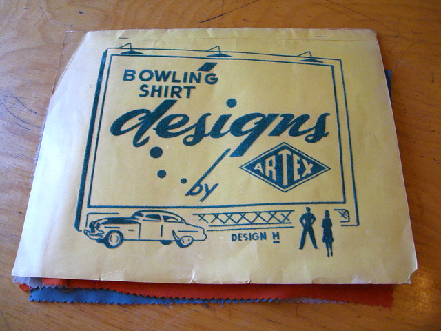
I’ve written many times about my library of uniform catalogs. But the one shown above, which I just scored on eBay a few days ago, is different. For one thing, it’s devoted exclusively to bowling shirts. For another, there’s no printing — by which I mean ink on paper or on some other substrate — anywhere in the catalog. Instead, all the type and graphics are flocked.
Flocking, as many of you probably know, is the process of adhering tiny fiber particles onto a surface, usually to create a slightly raised area and/or a velvety-smooth texture. Remember how Manny Sanguillen’s helmet had that matte finish? That’s because it was flocked — it was covered in a felt-like coating of fibers that were supposed to mimic the effect of a cloth cap. (Here’s a better example, courtesy of Phil.) And flocking can also be used for graphics, instead of screen-printing or embroidery. In the case of the bowling shirt catalog, if you take a closer look at the cover, you can see the textured flocking. It’s really satisfying to the touch, too.
But the cover is just the start — let’s take a guided tour through this catalog, beginning with the other side of the cover:
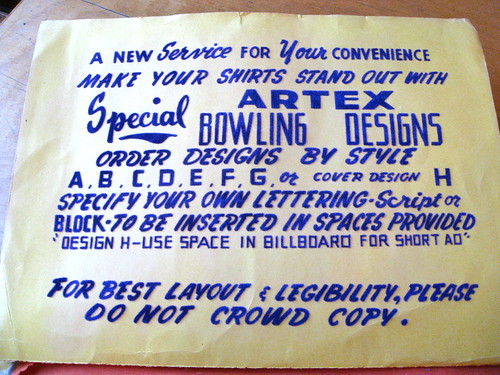
This just blows me away, because it’s really just a page of terms and instructions — you’d expect that to be printed. But no, they flocked it! Almost all the fonts used throughout the rest of the catalog are shown here. With so much lettering on the page, the fibers create their own little landscape.
And that’s just the front and back of the cover — the actual catalog is comprised of big fabric swatches with sample designs. Here’s the first one:
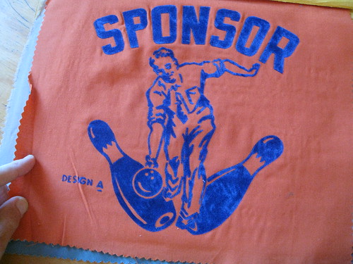
So much to like here (esp. if you look at a larger version). I especially love that the guy is wearing a dress shirt and a tie, which would seem to defeat the whole point of the catalog, no? He should be wearing a bowling shirt!
Next page:
Hmmm, that “M” looks awfully wide. Love the “R” and the “E,” though. And speed lines always look so damn cool.
Next page:
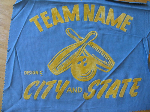
Take a close look at this one — notice anything weird? Not only is “Team Name” radially arched, but it looks to me like the two “M” letterforms are radially arched as well. In other words, the two vertical strokes on the “M” aren’t actually vertical or parallel — they’re slightly V-shaped. Bizarre.
Next page:
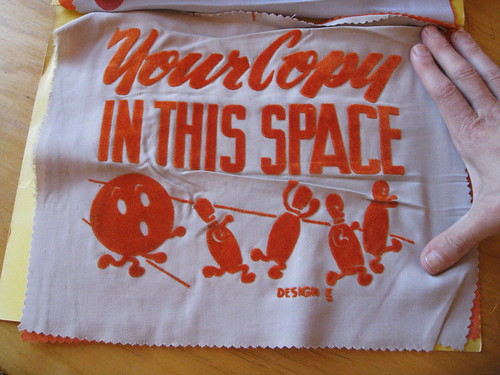
Oh no the pins are getting away! I’ve been a bowling nerd for a long time and have never seen anything like this image.
Next page:
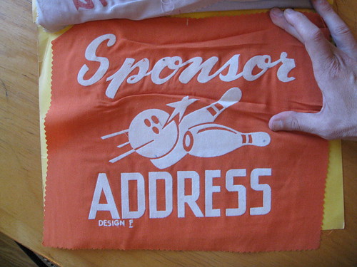
Simple enough design. Anyone else find it odd that one pin looks so much bigger than the other?
Next page:
This is the back cover, so the design is printed flocked on cardstock, not fabric. But it’s my probably my favorite design of the bunch. I love all the different angles, I love the bowler lurking off to one side, and I especially love all the flocked lines on the lane. The big problem here is that I feel compelled to touch those lines, to feel the texture, to rub my fingers over them again and again, all of which will eventually wear away the flocking.
That’s one of the problems with flocking, actually: It can sometimes flake off. That’s another reason why this catalog is so remarkable: All the flocking appears to be intact. As you can see, many of the fabric swatches are creased or wrinkled, but I’m going to do some careful work with an iron to take care of that.
Flocking, incidentally, is big in the craft world and even has its own trade group. It could definitely add a new dimension to DIYing. Any of you homemade jersey guys wanna take a stab at it?
Uni Watch News Ticker: Good pictorial history of Bullets/Wizards uniforms here (with thanks to Alan Chewning). ”¦ Here’s a video clip of the Manchester Monarchs’ red line being painted with a very cool pattern (with thanks to Erik Little). ”¦ Ever wonder about the evolution of the Batman symbol? Me neither, but here it is anyway (interesting find by Brian Sharp). ”¦ Matt Cunningham was surprised to find a football motif on his mattress tag. ”¦ Mike Shanahan doesn’t much care about uniforms (with thanks to John Muir). ”¦ The Texas Longhorns are retiring Colt McCoy’s number. ”¦ New hoops uniforms for Missouri and BYU. ”¦ Reprinted from yesterday’s comments: vertically striped sock alert! Those are the 1967-68 Taylor County (Ga.) Vikings. ”¦ Aaron Rich notes that Tim Hardaway Jr.’s NOB includes the “Jr.” ”¦ Here’s a good article on the company that makes most of the uniforms for sports-themed Hollywood movies (with thanks to Warner Bailey). ”¦ All of you who think Penn State’s uniforms are too boring will enjoy this article (with thanks to Chris Flinn. ”¦ Josh Shope found this amazing jacket seven years ago in a Niagara Falls Salvation Army and finally got around to sending in photos of it. “I can’t find anything online about the team, and the manufacturer’s tag has also been ripped out, so I don’t know who made it,” he says. … Here’s a really interesting video about how lapel pins are made. Highly recommended viewing (great find by Ben Traxel). ”¦ The Sabres will be wearing white at home tomorrow (as reported by Spencer Seaner). ”¦ Bit of controversy about the footballs with the pink ribbons (Chris Flinn again). … Reprinted from last night’s comments: Check out this awesome Mickey Mantle board game. Pretty amazing-looking, despite the red uni number.
Read this blog or we’ll shoot this kitten: The good news is that I am doing something so incredibly cool this afternoon in Manhattan, it practically defies belief. The bad news is that I’m not allowed to tell you about it. But I will say this much: It involves kittens — lots and lots of kittens. (And no, I’m not getting a new one.)
Details eventually. For now, let’s hope Tucker and Caitlin don’t freak out too much when they smell all the kitty cuteness on me once I get back home.
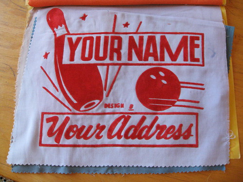
Where is design “D” you tease?!?
best ever pic i’ve seen of helmet flocking:
roy face
I suppose that was done to make the helmet look more like a regular cloth hat?
Exactly.
indeed…you might think paul would have covered this before, and you’d be right (see 5th graf):
go to the article for linkies, although all but 3 of them have link rot
Not to be nitpicky (and certainly not on this board,) but that Batman “evolution” is pretty poor. There’s several that are missing, and most are in no particular order. And I got so excited when I saw it mentioned in the ticker…
Hear hear. A proper diagram of the bat-logo’s evolution would be terrific, but that’s just a mashup of logos. Though they’re nicely re-rendered to a single scale, which is something at least. That graphic would be a good starting point for an actual “evolution of the bat-logo” piece.
I just thought it was interesting that the Louisville Bats seem to be using the one on the far right, second row.
I had no idea there were that many different bat logos. I knew it’d varied a bit, but I didn’t know it was anywhere near that much.
Then again… I don’t read comics and the only Batman movies I acknowledge the existence of are Batman & Batman Returns – the ones with Michael Keaton.
Billy Blaze?
Oh alright, substitute “multiplicity” for “evolution.”
I don’t think anyone was complaining about you, Paul! Anyway, I wasn’t. Just wishing the folks you linked to had approached it a bit differently.
As to the wide variation, two factors are at play. First, DC has revamped the Batman franchise a number of times over the years, and each time they’ve marked it with changes to the bat-logo that range from tweaks to transformations. Second, Batman appears in between two to about eight monthly titles, each usually with different artists, and each with artists that change every few months or years. Multiply that by 70 years and there’s just a lot of different artists drawing Batman’s logo, and each draws it slightly differently.
I think my favorite was a single issue of Detective Comics in the late 1980s or early 1990s where the artist (Keith Geffen? Norm Breyfogle?) switched from the then-current skinny black bat in yellow oval to a thick yellow bat. Lasted all of one issue, but it was at the time when DC was moving away from the 1970s yellow oval logo back to the “grittier” black-on-gray bat logo.
Batman … Multiplicity … Michael Keaton … oh the great circle of Hollywood life.
… and, to answer your question, I HAVE actually wondered about the evolution of the Batman logo. Same thing with the Bat-suit as well. I agree with the others that are disappointed by the evolution as provided through the link.
I’ve spent hours going through different websites, and the article on Wikipedia about the Batsuit is by far the best guide to its history. It even has information on the suits worn by other heroes besides Bruce Wayne that have been referred to as “Batman,” including Dick Grayson and Jean-Paul Valley.
link
I think it would be interesting to give the multiple Batman logos this treatment:
link
On the other hand, I suppose there might be too many, and they may be too varied, for one composite image to make sense.
Would the newer version(s) of the Bat Suit be considered BFBS Batman?
There’s actually some uni-content in the Batman thing… in the comment section someone likens the bat-symbol to the logo of Valencia, the Spanish soccer team.
although it does look like there’s lots of variations for Valencia too. link
Levante, the other La Liga team from Valencia, also incorporates the bat in their crest in an inconsistent manner link
Valencia link not working- try this
link
The hockey Jacket is from a team associated with the St. Davids Lions CLub. link St. Davids is a small town near Niagara Falls.
So would the team have probably been a youth league team or something like that? I”m 6’3″ and the jacket fits me in a sort of “modern cropped” way, but it seems too big for a youth team. Or maybe the Lions Club members had a rec team?
It’s a (relatively) little-known fact that most of North America’s grape juice comes from fruit grown in the western portions of New York State and the southeastern portions of Ontario. Hence “Grape Bandits” is a logical (and cool) name for bowling team near Niagara. I gotta think the jacket is for a grown-up: probably a team of guys in the Welch’s bottling plant.
The Toronto Black Jays class-A affiliate used to be in St. Catherines and was called the Stompers in reference to the “grape belt”. Here are a few logos:
link
link
My girlfriend is originally from Westfield NY, on the shores of Lake Erie (Welch’s used to be huge in that town). We were just up there for a wedding in mid/late September… I could actually SMELL the grapes in the vineyards as I drove around.
At North East (PA) High School, just south of there but still in the general region, they’re the Grape Pickers:
link
sweet
Hah, well done.
So I wonder how many copywriters, when North East beat someone handily, wanted to type,
“The Grape Pickers did the stomping…”
or write a headline about someone feeling…
“The Wrath of Grapes”:
—Ricko
I clicked through it twice to make sure I wasn’t dreaming, but it’s true. The Washington Post history of Bullets/Wizards uniforms neglected to show the greatest basketball uniform ever. Incredible.
link
unreal!!
-Jet
Let’s get some colorizers on this case. Now!
Here’s the road uniform; link
(Recognize the Knicks player?)
Home Uni;
link
More Bullet’s uniform history;
link
Pure funk! God, I used love NBA uniforms.
(…And to not mention the uniform they wore when they played Milwaukee for the title in ’71. Editor??)
1971 Finals;
link
link
augggghhhhhh! i so want an actual bowling shirt, dress, or jacket with the generic “your name here” graphics!
these flocked designs are SO great. Thanks for sharing.
A couple of things about flocking. From the end of WWII until the late ’60s it was the preferred choice for screen-printers, especially on bowling shirts, t-shirts and sweatshirts. The process began to fall out of favor in the early 1970s. As plastisol inks and the heat-transfer industry began to evolve flocking began to be looked on as old-fashioned.
The development of knit fabrics helped kill flocking as well. The base flock “adhesive” as it was called was like paint. When it dried it was hard to the touch and wouldn’t stretch at all. Now this was OK on a woven-material bowling shirt, but no so on knit softball or basketball jerseys. As garments evolved, so did the printing process.
And there was a health concern. Some longtime workers who breathed in the flock particles developed lung and breathing problems. In the old days no one thought of the long-range effects of breathing that flock dust. Wearing a mask was not even considered.
All in all, flocking was a messy process and was limited to one color. Like most things it served a purpose at one time but was eventually replaced by a more-modern process.
BTW-John Olerud wore the flapless baseball helmet in the field because in college he suffered a brain aneurysm that required surgery. It was worn for protection. Dick Allen wore his for protection as well-from the fans.
Love all the Artex designs except for C. I’d may have to commission someone to make design E.
I dig that proposed Penn State helmet. link
“I wonder how many of you Penn State fans secretly feel the same way but won’t out yourself publicly for fear of being shouted down as sacrilegious.”
Very interesting statement. You can probably remove the PENN STATE and enter one of many different teams Pro and College that have alwasy worn the same look.
As a Yankee fan the thought does cross my mind…and I always think ” that would be almost sacriledge”!
i think they should remove that garish stripe from the current helmets. too flashy. plain white helmets right off the shelf is all they need.
I’m a penn state fan and I am definitely against any changes
I wish Penn State would remove those sleeve and neck stripes. I always thought those stripes were too garish in their own right (too thick, right?), and it just wasn’t “plain enough” for Penn State.
I liked this line.
I’m talking about this purely from a design sense. Ugly is ugly and the Nittany Lions’ uniforms look like 1950s milk bottles. I wonder how many of you Penn State fans secretly feel the same way but won’t out yourself publicly for fear of being shouted down as sacrilegious.
Ugly is Ugly
State Penn should return the numbers to the sides of the helmets and take them off the sleeves (since sleeves are going the way of the Dodo bird these days)… Also, how about navy blue pants with their white road jerseys… Just my $0.02…
Agreed.
The day the Yankees adopt that reverse-pinstripe road uni is the day Penn State should adopt that proposal.
I know there have been subtle changes over the years, but in general it’s the same uni. And was the reference to 1950s milk bottles supposed to be an insult? I liked those bottles, so I took it as a compliment.
I’m fine with putting numbers back on the helmet, maybe a blue stripe down the pants, but that’s it. And always keep them NNOB.
Milk botttles aside, white helmets, white jerseys, AND white pants end up looking like link… My $0.04…
Guess what guys? The biggest winner in the new NFL-Nike deal is… Jordan Brand. Can’t wait for more Lukas’ Nike bashing on that one.
I don’t get it. Could you please elaborate?
perhaps he’s planning to play football in 2012?
Paul: interesting pics. the second page you feature (Design B) with the “speed lines” it looks as though the pin is moving BEFORE being struck by the ball. Sorry if someone else posted this earlier.
It is attention to detail like that that is the reason I come here. I am not alone.
thank you for your affirmation. that was the first thing i noticed in that picture. I am not OCD (washing hands) :)
maybe the ball already struck the pin and is knocking it back…
No screencaps, because I don’t know how to do that sort of thing, but last night the Nationals/Orioles TV network MASN broadcast the final game of the 1983 World Series. Which I watched simply because the burgundy-era Phils are just about my favorite baseball uniform ever. Anyway, I kept noticing how little standardization there was in the “P” logo on Phillies merchandise. We all know that the jersey version lacked the inner swoop of the cap version. But I saw several types of dugout and warmup jackets, and each had a noticeably different P logo. One was the cap logo, but scaled up to the jersey size. Another was similar, but the inner swoop was flipped, so it had acute angles instead of a continuous curve, and the stem of the P seemed thinner and longer than the other chest versions. Really looked odd.
And of course the fan gear was all over the place; all in all it looked like nobody was even trying to enforce a consistent team logo on merchandising in the early 1980s.
Kind of sweet bit at the end where literally just a couple of minutes after the game ends, Orioles suits are in the dugout collecting the rickety old World Series trophy, and they get a call (on an old black Bakelite phone, natch) from President Reagan. And then the TV cameras stay on the podium as they pass the phone around for what seemed like 10 minutes so everyone could talk to the president. Meanwhile, a mosh pit of still photographers is snapping away, and every few moments one of them turns around and hands a film canister back to colleagues behind him. One photog in the center was wearing a backwards Brooklyn Dodgers fitted cap; made me wonder how a person got his hands on a faithful fitted repro throwback cap in 1983, when it was darn near impossible to find on-field caps for existing teams, much less defunct clubs.
The flocked catalog is amazing! Thanks for sharing.
Nice article in the San Jose Mercury News about goalie masks:
link
Beyond the bizarre red jersey number on the cover of that Mickey Mantle baseball game, click on one of the other pics that shows the inside content here:
link
The Mick is pictured here with a RED cap with YELLOW “NY”!!!
WTF?!?!?!?
-Jet
Does that mean that all of the various colored Yankee hats of today are actually rooted in history?
little known fact:
the mick invented the fashion cap
Mantle licensed his name and likeness, but had no authority to do so with the Yankees’ logo? My guess. And they had to do something before Photoshop was invented.
I don’t know much about graphics or printing today and much less what was possible or not 40 or 50 years ago…but if the cap was intentionally colored red & yellow because of licensing issues, wouldn’t it have just been easier or made more sense to just color the NY blue and just make it a plain blue cap.
Sort of like they do in all of those TV and print commercials where players wear a uni with no logos ( Jordan in a red and white uni etc ).
It’s pink. For cancer.
What I love about that flocking catalog is that all of the lettering is done in old signpainter’s hand-lettered style fonts. (I’m an old signpainter) :D
-Jet
Then you, sir, are a divine being. Still in the business?
Sure, but I do my signs mostly in computer-cut vinyl now. Still do some hand-lettering. I’m only 52, not a dinosaur yet…
-Jet
Interesting you bring that up. The talent, I mean.
Just last night I was thinking about how some have described the wordmarks on the cream throwbacks of the Astros and Twins as “kitchey”.
Does that mean handletter is TRES old-fashioned and bad, and that anything designed on a computer is inherently better.
So, last night I go to thinking. The uni workmarks and/or images on the chests of following teams all were originally drawn by hand, either in paint or by an engraver who designed the font (where you think fonts came from before computers?)…
Giants, Athletics, Dodgers, Royals, Cardinals, White Sox, Cubs home, Twins creams, Reds home, Tigers, Pirates, Braves, Phillies creams, Red Sox, Mets and Yankees (not sure how true the Indians’ script is to the late ’40s-early ’50s version).
Interesting how many of them are always near the top of “great baseball uni” lists. So I guess hand-lettering isn’t so awful or dated after all, huh.
—Ricko
Oh, and the Twins’ home, having been designed for first use in ’87, may have been essentially hand-created, too.
Hand-lettered ≠bad, and computer-rendered ≠good.
But conversely, hand-lettering is not, in and of itself, good, just as computer-rendering is not, in and of itself, bad. The 1961 Twins lettering, for example, is among the worst script lettering ever to appear on a big-league jersey. Not because it’s hand-drawn, but because it’s link. It’s full of the kinds of inconsistencies – random angles, random descender lengths, inconsistent letter connection styles, unaligned strokes, and so forth – that even an amateur calligrapher would recognize as mistakes.
Absolutely. Well done is well done, and badly done is badly done, no matter the medium.
I just didn’t think hand-lettered should be dismissed, well, out of hand.
re: First Twins logo. Knowing Calvin’s perniciousness, he might have taken something sketched on a napkin and used it…rather than pay an artist to render it correctly. Or, he may have thought a sketch was a sketch, what’s difference? If you ever saw the way Calvin dressed, it was easy to tell he was not long on esthetic concerns and artistic practices.
As to the Twins new logo of 1987…Come to think on it, that either one of the last mostly hand-lettered ones, or one of the first of the computer designed.
It, too had some flaws, mostly in the kerning. The “cleaning up” of it recently I still believe had a lot to do with the realization that those “goofs” would be amplified magnificently when the logo would be rendered HUGE in the new ballpark, so they took the occasion to fix them. Wasn’t so much a re-design as a necessary mid-course correction.
—Ricko
I suspect your “cocktail napkin” hypothesis isn’t too far from the truth – if nothing else, Cal would certainly have tried to have any work done in-house by someone he was already paying rather than paying an outside professional to do the job.
Putting aside every single other thing the Twins did to their uniforms last winter, all of which rank among the worst downgrades of a baseball uni in history, the Twins home uni tweaks are some of the best and smartest I’ve seen. Most fans probably didn’t even notice the improved letter spacing and the adjustment to the “WIN” underline, but more than the improved serifs those made the new Twins home script something very close to perfect.
I couldn’t disagree more, RS. I’m not sure what constitutes bad hand drawing, and I work in an elementary school. There is no perfect. Everybody’s is different, some more extreme than others. There’s illegible handwriting, of course, but the Twins script is certainly not that.
If it was hand drawn on a napkin at a restaurant after a few drinks, that makes it an even better story.
Totally unrelated to anything:
Has anyone else linked to this Jamal Lewis FNOB jersey?
link
fiiiiiiinally the last of the lst stirrup order was mailed out monday and tuesday(including another wedding), so everyone should have everything by the weekend. i hope to have a monumental order put together soon that i think the faithful will enjoy.
grrrrrreat week paul
okay, back to packing and working and packing and working and packing…dang! my boss just called, apparently they over paid me, is it legal for them to take it back? especially since i am not sure they did.
that was quick, they ain’t takin my greenbacks back.
Yeah, sure, whatever, old man.
That was supposed to be a reply to rpm.
i am feeling very old on this move. i used to be an taco kickin some-gun, but now, golly i could use a moving company. not to mention all the walls and kitchen islands and all that stuff i built into this thing that i have to tear out. the cats are freakin’. i want a beer, but i have to work tonight.
Perhaps, amid the toting, tearing and toil, we can hear rpm softly singing?
“What I did for love…”
—Ricko
oh, you can link
yeah…i pretty much never had that problem
don’t give it back…just don’t leave a forwarding addy either
turns out they didn’t, i wasn’t happy to hear the threat though.
That BYU photo looks like an album cover or something:
link
Surreal.
And I’d wear this bowling shirt:
link
You see an album cover, I see…
link
Egad. You’re right.
“BYUmpaloopas”!
Actually, I like ’em better in the original Broncos road socks.
link
“BYUmpaloopas”!
That’s excellent.
It does remind me (but probably not you) of the back cover photo from Pussy Galore’s Sugarshit Sharp EP:
link
China & Brazil basketball brawl- what role did China’s BFBS unis play? link!
San Jose Sharks announce dates for wearing their alternate black jerseys this season:
link
This just came down the Facebook pipe:
link
I said before that I don’t have a problem with the pinking unless it gets on the actual uniform and this is certainly altering the uniform. I don’t like it very much and they should have found a better way to do this, but at least all of the money goes to the charity.
here…lemme fix that for ya
Okay, I’ll say it.
Looks like the logo for a gay Pirate bar.
The Pink Arrrrr…
oh! they found my helmet.
Thanks for the fix. HTML and I don’t get along.
Rumor going round that Kansas is going to wear red jerseys and white helmets against KSU tonight.
Turner Gill may dress us like Nebraska, but I don’t think it’s going to help….
Or is he trying to resurrect his glory days as a Montreal Concorde?
link
Well, his stats weren’t that stellar,
link
so it must be that Nebraska thing.
Never mind.
link
Well, you can rule out the source of that rumor next time around…
I’m getting pretty anxious about this kitty thing. Do we have to wait until another day?
I never knew what those Pirate helmets were called. The Flocked look. I just remember looking at old Pirate pictures from the late 50’s and early 60’s.
Always thought they were kind of cool.
Would it work on football helmets?
Yeah, but it wouldn’t be worth it. It would wear off pretty quick and look patchy. Better to just get them in a matte finish.
Yep after I posted that I thought it would not last.
Just thought this was interesting. Personally, as an Alabama fan I’m not sure I like this. Maybe it was because I was born after Bear had died.
link
And everyone thinks Nike doesn’t know how to pull off subtlety. If only they did everything that well.
im thinkin wvu and sfu…er, usf…might have a shot at the mothervilker game
of course, the rest of us probably think this is awful
This?
link
Hmm, interesting, yes, but not sure if it’s list-worthy. I do like that yellow uni, though.
Is this the first time for college refs in long striped pants?
I am trying to find pictures or video but there was a report on the local news about the Plymouth Whalers of the OHL wearing pink uniforms to support breast cancer but they have taken it one step further and dyed their hair pink.
Here is a link to an article on the Whaler website. It has pictures of the uniforms and one of the guys getting his hair colored.
link
Not game footage, but there is a photo:
link
Here is the story from the local news. You have to sit though a small ad of course.
link
KSU/KU number 1 game of the week. Simply because of the score.
i can’t believe i took the chokehawks
im never playing another thursday game
Serves you right. Stick to uniforms, LI. Leave the game to the big boys.
it was a good lookin’ game
im surprised adidas actually improved kansas’ uni…but i think i’ll pick the teams in swooshie in a matchup with the trefoil from now on
and never on a thursday…im done with thursday games
the helmet needs a stripe.
you started off hot on thusrdays this year, but you are taking it on the chin of late.