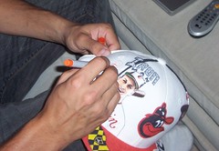
A few months ago I included a Ticker link to Chris Giorgio’s custom-painted caps, which are one-of-a-kind designs that he makes to order. Now, at my request, he’s provided a look into his creative process:
First I take down the details of the order — the hat size, team, specific players, color scheme, and any other requests. For my latest project, my client wanted a 1980s Baltimore Orioles cap featuring Eddie Murray.
I start by getting a blank white hat from Lids and my box of Sharpies, which I use to customize the hats. I start with the cap logo on the front, because that never changes position on all the hats that I do (same goes for the alternate smaller logo on the back of the hat). I go to Chris Creamer’s SportsLogos.net for all my logos.
Next, I usually go to MyFonts or Dafont and look for a font that I find fun, detailed, and interesting to go along the brim of the hat. This space is best for typography, rather than, say, portraits. In this case I went with a paint-splatter style. I just preview the font (without buying it) and then copy it from the screen by hand.
I usually then do some research on the team, city, state, etc., and try to come up with things to put on the hat. You once linked to a page of city flag designs, for example, so for this cap I but the Baltimore city flag on the brim.
Other common design elements on my hats are championship logos and/or rings, retired numbers, city skylines, famous city buildings, and obviously players and their names or nicknames. I save all my images in a folder categorized by team, so I’ll know what works well if I have to do another hat for that team. When I’m trying to find a good player photo, I usually like at least one of a player celebrating (fist pump, arms raised, etc.). Then I sign the finished design.
At the end, I spray the hat with water and a stain repellant. The whole process takes 12 to 18 hours, depending on the amount of detail.
Interested in having Chris create a cap for you? Contact him here.
Raffle Reminder: In case you missed it on Friday, I’m currently raffling off an authentic Man City soccer jersey. Details here.
Consumer Advice, Please: For reasons not worth explaining, I’m in the market for an inexpensive ($175-ish) camcorder. Based on my very preliminary research, the two most obvious choices appear to be the Flip and the Aiptek. If anyone is familiar with this particular product category and would like to offer some advice, please give me a shout. Thanks.
Uni Watch News Ticker: Nice, right? That’s part of a collection of Indiana-themed memorabilia that a collector is scanning and donating to a local library (with thanks to Todd Usher). ”¦ HHH has added a bunch of additional designs to his collection of city flag jersey concepts. ”¦ The NFL has put together a sensational AFL photo slideshow, including lots of great shots I’d never seen before. Don’t miss. ”¦ Sue Bird is wearing Livestrong sneakers (thanks, Vince). ”¦ Several readers have noted that the Mets’ left-sleeve team logo patch has been missing from Nick Evans’s jersey lately. ”¦ Heartening news from the world of rugby, where a New Zealand team has inked a new deal with a sponsor who’s chosen not to appear on the jersey (with thanks to Caleb Borchers). ”¦ Jorge Posada made a bare-handed catch on Friday night. ”¦ Here’s how a Blue Jays road jersey is supposed to look. Now compare the last “O” to the one on Brett Cecil’s jersey Friday night. Cecil’s “O” is upside-down (great catch by Mike Priest). ”¦ The Astros honored the Houston Fire Dept. on Friday night by wearing special caps (with thanks to Patrick Mahoney). ”¦ Here’s something I hadn’t been aware of: Ken Harrelson wore a uniform when he was GM of the White Sox (good find by Don Montgomery). ”¦ Throwback game in Tampa on Saturday night. Lots of additional photos here. ”¦ Meanwhile, over in Detroit, the Tigers and Indians were doing the Negro Leagues thing. ”¦ Reprinted from Saturday’s comments: Bit of a kerfuffle over the new Detla Airlines flight attendant uniforms. ”¦ Ryan Church is wearing No. 25 with the Braves but was still wearing his “RC 19” batting gloves on Saturday (good spot by Brandon Schwartz). ”¦ More moustaches for the Cardinals (with thanks to Mark Nothum). ”¦ Two interesting bits of trademark infringement: First, a hardware store in Yonkers is using the Twins’ logo on its awning, and then there’s a Connecticut realtor named Cal Massaro who uses the Cal logo (with thanks to Marcus Solis and Ryan Harrington, respectively). ”¦ John Weghorst has made a “video” (really more of a photo slideshow) of 1960s Houston Oilers imagery. ”¦ If you have an 8mm projector, you might wanna bid on this (with thanks to HHH). ”¦ Hmmm, why is Madden using the Jets’ 1980s helmet? (As spotted by Michael G. Paez.) ”¦ Dusty McGowan reports that Jimmy Rollins was wearing the wrong cap in the dugout yesterday. Anyone know if he actually did so in the game? ”¦ Michael Princip‘s awesome Illustrated NFL site now has an interview with watercolorist Bart Forbes and some newly added illos by several other artists. ”¦ Speaking of football illos, check out this excellent Lance Alworth caricature by Aaron Bell. ”¦ Chad Dotson was watching yesterday’s Mets/Reds game on FSN Ohio and captured this moment for posterity. According to Chad, Reds broadcaster George Grande said, “There’s kind of an old-school guy there.” ”¦ If you watch the first 10 seconds of this video clip, you’ll see the Hawaiian shirts that the Phillies ballgirls have been wearing in support of Shane Victorino’s All-Star candidacy (with thanks to Kurt Esposito). ”¦ Remember the Little League coach who was sending signals to his base coaches via text message? Now football coaches can do something similar with encrypted messages (with thanks to HHH). ”¦ Also from HHH: Here’s a bunch of illustrations, most of them sports-related, from the iconic 1920s artist John Held Jr. ”¦ “The St. Louis Blues held their pro orientation camp this weekend for their new draft class, young players who didn’t play in their organization last year, plus NHL vets TJ Oshie and Erik Johnson,” writes Ricky Foley. “At least several, if not all of the players, had the old NHL logo on their jerseys. Also, Lars Eller was wearing a red no-contact jersey as he recovered from an injury, and he had matching red socks. And the team also had a rather low-budget type of jersey nameplate — all of them were white, regardless of the jersey color, and they looked like they were beginning to fall off of several players’ jerseys, such as Brett Sonne’s.” ”¦ Loves this old Puma ad that Ken Davidoff linked to on his blog yesterday. ”¦ Not sure we covered this at the time, but check out all the great throwbacks that were worn for this 2008 hockey tourney. ”¦ Remember the little white inscriptions on Ramon Ramirez’s cap? A full explanation is provided in the first boldface section of this page (with thanks to Tim Ryan). ”¦ Good to see that the Mets’ representatives in the Futures Game wore blue caps. … Excellent article about scripted golf attire. … RIP, Thunder.
All that work and research that went into the Eddie Murray hat and he couldn’t spell Ripken correctly?
Paul, the ticker repeats itself.
Mr. Giorgio may want to consider paying for the fonts he’s copying by hand (unless he’s only selecting free fonts, in which case, good for him!).
Just thought I would post a pic of my beautiful wife and myself with our wedding gifts to each other last week. The special thing about this, is that my gift to her was a Rob Ullman pin up!
The gift that I received were some awesome Super Bowl I Championship cuff links! (In case you forgot, we had our wedding reception at Lambeau Field)
And just because I want to, I am also going to plug Mr. Ullman’s great work. He is very professional to work with, and his talent speaks for himself. He is an amazing artist. I highly recommend getting a project done by him.
link
[quote comment=”339376″]All that work and research that went into the Eddie Murray hat and he couldn’t spell Ripken correctly?[/quote]
Ripken and McGwire might as well change their names to Ripkin and McGuire, for how often their names get butchered.
All that work and research that went into the Eddie Murray hat and he couldn’t spell Ripken correctly?
Great googly-moogly…
In the new Madden you can mix and match all the uniform options (retro helmet, modern jersey, alt pants, etc.) That would explain the 90’s Jets helmet on the modern (or throwback) uni set.
In the Madden article the player states he chose the 80’s “uniform”….
You people get all bent out of shape when a strange fold makes a jersey look like it’s sewn wrong or falling apart. I believe folds in the fabric can explain the Toronto Blue Jays item and the “falling off” nameplate on the St. Louis Blues item.
But hey…that’s just me, a guy with common sense that doesn’t jump at the chance to point out “mistakes” when only seeing a simple picture online.
Why can’t MLB schedule the futures game for Sunday Night, and not against MLB games? It made no sense that they start all star festivities in St. Louis, at the same time that the Cardinals are in Chicago to play their biggest division rival?
Thanks for including the updated information in the Ticker Paul. Just wanted to add that it’s actually Bart not Brett; link
Also, we’ve finished another link tribute illo,link
[quote comment=”339382″]In the new Madden you can mix and match all the uniform options (retro helmet, modern jersey, alt pants, etc.) That would explain the 90’s Jets helmet on the modern (or throwback) uni set.[/quote]
You know, I actually miss those Jets helmets now that they are gone.
[quote comment=”339376″]All that work and research that went into the Eddie Murray hat and he couldn’t spell Ripken correctly?[/quote]
That’s the first thing I noticed…breaks my heart
The new Man City white jerseys where in action against TSV 1860 Munich in the German Alps this weekend (1-1 draw).
link
1860 Munich are the Lions and hence the great lion on their jersey. I really liked last years but (particularly if you like the sky blue) this year’s is even better.
link
The A’s “throwback” attire is the most half-assed attempt I’ve ever seen.
[quote comment=”339381″]All that work and research that went into the Eddie Murray hat and he couldn’t spell Ripken correctly?
Great googly-moogly…[/quote]
That is so unfortunate.
I’d be more impressed with the NFL’s tribute to the AFL photo display if they hadn’t cheated and included a couple of pics from the 1970s, which of course was after the AFL had been merged out of existence.
[quote comment=”339386″]Thanks for including the updated information in the Ticker Paul. Just wanted to add that it’s actually Bart not Brett; link
Also, we’ve finished another link tribute illo,link[/quote]
Plus I misspelled your first name, Michael. Both of those errors, and all the other glitches in today’s Ticker, are now fixed.
I’d be more impressed with the NFL’s tribute to the AFL photo display if they hadn’t cheated and included a couple of pics from the 1970s, which of course was after the merger.
[quote comment=”339384″]You people get all bent out of shape when a strange fold makes a jersey look like it’s sewn wrong or falling apart. I believe folds in the fabric can explain the Toronto Blue Jays item and the “falling off” nameplate on the St. Louis Blues item.
But hey…that’s just me, a guy with common sense that doesn’t jump at the chance to point out “mistakes” when only seeing a simple picture online.[/quote]
I saw a full inning of the Jays game, not just an isolated photo. Trust me, his “O” was upside-down.
“Dusty McGowan reports that Jimmy Rollins was wearing the wrong cap in the dugout yesterday. Anyone know if he actually did so in the game?”
I saw the Phils game yesterday and I can report that Rollins wore the correct cap in the field.
[quote comment=”339395″][quote comment=”339384″]You people get all bent out of shape when a strange fold makes a jersey look like it’s sewn wrong or falling apart. I believe folds in the fabric can explain the Toronto Blue Jays item and the “falling off” nameplate on the St. Louis Blues item.
But hey…that’s just me, a guy with common sense that doesn’t jump at the chance to point out “mistakes” when only seeing a simple picture online.[/quote]
I saw a full inning of the Jays game, not just an isolated photo. Trust me, his “O” was upside-down.[/quote]
Paul, although the last “O” in his jersey may have been upside down, the last O in that picture does not appear to be upside down. Drop shadow goes to the lower right in both cases. From what I can see at least.
With all the Tecmo Bowl talk last week.. I decided I would break out the NES and play a few games. I noticed a couple uni related things with the referees. The graphics are not the greatest of course…so when they show a shot of the refs,the stipes on their shirts look distorted. They actually look alot like the current stripes that they wear.. it made me think that Tecmo may have been the inspiration for them. The other cool uni thing was the nice shot of the ref’s stirups when they would show the cut away for a 1st down measurement.
Not exactly ‘uni’, but the PGA tour should provide some clothing guidelines. At least judging from this:
link,
link, or link
Phil!!! You can finally get your Timmy’s… depending on how close you are to the newly-opened link!
Pretty Good Read:
link
The Blues practice jersey nameplates are velcro which is why they look like they are falling off. They have been doing this for years for training camp jerseys.
Something to ponder. Can letters not be letters, but a graphic design?
Was looking at the Twins decal on my daughter’s car window and started thinking about something I’d not thought of in years. Is the “TC” on the Twins home hats a pair of initials or a graphic representation/geographic locator?
When they first unveiled their hats after the move to Minnesota, I took it to be a graphic, a way of explaining what the “Twins” nickname meant (“Ah, they’re in Minnesota, but named after the Twin Cities”). They weren’t, after all, called the Twin Cities Twins, so the “TC” had no specific relevance to geography.
Granted it IS initials, but it’s intent always has seemed, to me, to serve more as as a graphic in reference to the team name.
(Soft of like the Triplets of minor league days, to me their “TC” meant “Tri-Cities”…which begs another question: Were they called the Binghampton Triplets, the Tri-Cities Triplets or both…at different times in their history?).
Your thoughts?
—Ricko
[quote comment=”339400″]Phil!!! You can finally get your Timmy’s… depending on how close you are to the newly-opened link![/quote]
perhaps mr. lukas can enjoy, from the article:
[quote]Two of the new stores will be located in Brooklyn[/quote]
im close to the city, teebz, but not close enough to make the trip in just for a cup of joe…however, next time im there, im there
[quote comment=”339401″]Pretty Good Read:
link
Certainly #10-20 would include Harmon Killebrew with the Kansas City Royals. That was just…weird.
Emmitt Smith with the Arizona Cardinals, too.
—Ricko
Just some info for that Madden picture –
This year they’re letting you mix and match uniform parts – helmet, pants, jersey, socks and white or black shoes. So, someone intentionally grabbed the 80’s helmet with the current uniform. The normal white helmet is in the game, as is the rest of the 80’s uniform. It’s not a uniform error, it’s just a user with poor taste.
Picture 45 in the AFL gallery is the best!
I’m sure you’ve all heard this already, and this is old news by now, but in yesterday’s Red Sox game, Jason Bay was walked three times and hit by pitches twice, giving him zero official at bats.
[quote comment=”339405″][quote comment=”339400″]Phil!!! You can finally get your Timmy’s… depending on how close you are to the newly-opened link![/quote]
perhaps mr. lukas can enjoy, from the article:
[quote]Two of the new stores will be located in Brooklyn[/quote]
im close to the city, teebz, but not close enough to make the trip in just for a cup of joe…however, next time im there, im there[/quote]
FYI – here are the locations link
Seeing as how I only seem to visit NYC in the summer – guess the only thing I would be buying there would be the Iced Capp
[quote comment=”339410″][quote comment=”339405″][quote comment=”339400″]Phil!!! You can finally get your Timmy’s… depending on how close you are to the newly-opened link![/quote]
perhaps mr. lukas can enjoy, from the article:
[quote]Two of the new stores will be located in Brooklyn[/quote]
im close to the city, teebz, but not close enough to make the trip in just for a cup of joe…however, next time im there, im there[/quote]
FYI – here are the locations link
Seeing as how I only seem to visit NYC in the summer – guess the only thing I would be buying there would be the Iced Capp[/quote]
Spring for a coffee as well. It might be the most addictive thing you can buy for under $2. LOL
Big surprise. The Natinals have fired their mangler.
—Ricko
[/quote] … Here’s how a Blue Jays road jersey is supposed to look. [/quote]
I think this is how a Blue Jays road jersey is supposed to look:
link
I agree the Brett Cecil “O” isn’t upside down – the bevel in the letter appears to be on the right side.
It looks to me as if its just on crooked – tilted slightly to the left. The verticals in the “O” aren’t parallel to the “T” beside it, and the line of the arch on both the top and bottom isn’t right.
link
Does the number #3 have any significance? Darren Rovell is saying that Tracy McGrady is switching his number from #1 to promote a Darfur initiative. Not as dumb as Ron Artest’s choice of #37 because that was how many weeks Thriller was #1 but still…
[quote comment=”339413″][/quote] … Here’s how a Blue Jays road jersey is supposed to look. [/quote]
I think this is how a Blue Jays road jersey is supposed to look:
link
isn’t that their HOME alt? [insert eyeroll]
[quote comment=”339415″]Does the number #3 have any significance? Darren Rovell is saying that Tracy McGrady is switching his number from #1 to promote a Darfur initiative. Not as dumb as Ron Artest’s choice of #37 because that was how many weeks Thriller was #1 but still…[/quote]
Located in a third-world country?
whoa…how many things are wrong with the raider uni in the pic?
I just read that the Iowa Chops are suspended…
link
Besides the worst Jersey’s in the AHL, worst name and all…
it seems like it was just yesterday we were bashing them…they fold up so fast!
[quote comment=”339419″]I just read that the Iowa Chops are suspended…
link
Besides the worst Jersey’s in the AHL, worst name and all…
it seems like it was just yesterday we were bashing them…they fold up so fast![/quote]
Nothing makes me think of hockey more than a feral hog.
[quote comment=”339416″][quote comment=”339413″][/quote] … Here’s how a Blue Jays road jersey is supposed to look. [/quote]
I think this is how a Blue Jays road jersey is supposed to look:
link
isn’t that their HOME alt? [insert eyeroll][/quote]
This is more like it: link
[quote comment=”339401″]Pretty Good Read:
link
And AGAIN they go with that really cheap Photoshop job.
There are so many great Photoshops of Favre in purple, but that one gets all the play.
[quote comment=”339421″][quote comment=”339416″][quote comment=”339413″][/quote] … Here’s how a Blue Jays road jersey is supposed to look. [/quote]
I think this is how a Blue Jays road jersey is supposed to look:
link
isn’t that their HOME alt? [insert eyeroll][/quote]
This is more like it: link
What the heck is that? No split lettering?
[quote comment=”339385″]Why can’t MLB schedule the futures game for Sunday Night, and not against MLB games? It made no sense that they start all star festivities in St. Louis, at the same time that the Cardinals are in Chicago to play their biggest division rival?[/quote]
As it happened, there was a four-hour rain delay during the Futures Game… so the scoreboard showed the telecast of Cards/Cubs from Wrigley during the delay.
[quote comment=”339415″]Does the number #3 have any significance? Darren Rovell is saying that Tracy McGrady is switching his number from #1 to promote a Darfur initiative. Not as dumb as Ron Artest’s choice of #37 because that was how many weeks Thriller was #1 but still…[/quote]
This is what I found:
Rockets guard Tracy McGrady will change his uniform number to No. 3 to promote his “3 points Darfur” initiative, with an announcement expected this week.
McGrady put in the paperwork for the uniform change midway through last season and had received league approval. He was making the switch to his high school number to bring attention to his Darfur Dream Team campaign and 3 Points documentary.
The Darfur Dream Team enlists athletes to help raise funds for schools in Chad for Darfur refugees in a sister school program with schools in the United States. The documentary 3 Points follows McGrady on his trip to Sudan and Chad in the summer of 2007.
[quote comment=”339410″][quote comment=”339405″][quote comment=”339400″]Phil!!! You can finally get your Timmy’s… depending on how close you are to the newly-opened link![/quote]
It looks like Tim Horton’s has taken over many of the spots where Krispy Kreme was. Not a great strategy, IMO.
perhaps mr. lukas can enjoy, from the article:
[quote]Two of the new stores will be located in Brooklyn[/quote]
im close to the city, teebz, but not close enough to make the trip in just for a cup of joe…however, next time im there, im there[/quote]
FYI – here are the locations link
Seeing as how I only seem to visit NYC in the summer – guess the only thing I would be buying there would be the Iced Capp[/quote]
[quote comment=”339426″][quote comment=”339410″][quote comment=”339405″][quote comment=”339400″]Phil!!! You can finally get your Timmy’s… depending on how close you are to the newly-opened link![/quote]
perhaps mr. lukas can enjoy, from the article:
[quote]Two of the new stores will be located in Brooklyn[/quote]
im close to the city, teebz, but not close enough to make the trip in just for a cup of joe…however, next time im there, im there[/quote]
FYI – here are the locations link
Seeing as how I only seem to visit NYC in the summer – guess the only thing I would be buying there would be the Iced Capp[/quote][/quote]
It looks like Tim Horton’s has taken over many of the spots where Krispy Kreme was. Not a great strategy, IMO.
[quote comment=”339425″][quote comment=”339415″]Does the number #3 have any significance? Darren Rovell is saying that Tracy McGrady is switching his number from #1 to promote a Darfur initiative. Not as dumb as Ron Artest’s choice of #37 because that was how many weeks Thriller was #1 but still…[/quote]
This is what I found:
Rockets guard Tracy McGrady will change his uniform number to No. 3 to promote his “3 points Darfur” initiative, with an announcement expected this week.
McGrady put in the paperwork for the uniform change midway through last season and had received league approval. He was making the switch to his high school number to bring attention to his Darfur Dream Team campaign and 3 Points documentary.
The Darfur Dream Team enlists athletes to help raise funds for schools in Chad for Darfur refugees in a sister school program with schools in the United States. The documentary 3 Points follows McGrady on his trip to Sudan and Chad in the summer of 2007.[/quote]
Cool, thanks for the info.
Rovell also adds in that TMac’s jersey sales were NOT in the top 15 last year.
I was just gonna comment about how drawing with Sharpies leaves zero room for error, and sure enough, one was found. Oops! The artwork is impressive though.
[quote comment=”339406″][quote comment=”339401″]Pretty Good Read:
link
Certainly #10-20 would include Harmon Killebrew with the Kansas City Royals. That was just…weird.
Emmitt Smith with the Arizona Cardinals, too.
—Ricko[/quote]
Add link of the link to the list…
[quote comment=”339405″][quote comment=”339400″]Phil!!! You can finally get your Timmy’s… depending on how close you are to the newly-opened link![/quote]
perhaps mr. lukas can enjoy, from the article:
[quote]Two of the new stores will be located in Brooklyn[/quote]
im close to the city, teebz, but not close enough to make the trip in just for a cup of joe…however, next time im there, im there[/quote]
It’s not just a cup of joe, the donuts are awesome – 2nd best I’ve had, next to Jubilee Donuts (3 locations in the Akron area to serve you). Anytime I head to PA, I try to stop at the Timmy’s near the border by East Liverpool, OH. I like the Boston Creme Pie donuts.
Oh, and Phil, regarding your late-night switcherooing of the Pats/Alouettes and the Steelers/Ti-Cats, now you’re getting the idea! Check yesterday’s late comments, everyone.
[quote comment=”339403″]Something to ponder. Can letters not be letters, but a graphic design?
…
Granted it IS initials, but it’s intent always has seemed, to me, to serve more as as a graphic in reference to the team name.
—Ricko[/quote]
Okay Ricko, without getting too deep: when are intials “just” initials and when are they a graphic? You’re familiar with the ND for Notre Dame, the NY for the NFL Giants, the LA for the Dodgers; Is there a basic difference between all of these? I’m just trying to get to the root of your question.
Non-related comments: the Cleveland Negro Leagues tribute isn’t too far off from my preferred White Sox away uni.
According to the Chicago Tribune, the Cubs are considering filing bankruptcy. C’mon, that team is simply printing money up there: if they get to file bankruptcy, how can anyone say the Marlins, Royals, etc. shouldn’t be filing bankruptcy?
Pic #10 of the AFL slide show – why does Charlie Tolar #44 have a different # (12?) on his sock or any # for that reason?
link
[quote comment=”339428″][quote comment=”339425″][quote comment=”339415″]Does the number #3 have any significance? Darren Rovell is saying that Tracy McGrady is switching his number from #1 to promote a Darfur initiative. Not as dumb as Ron Artest’s choice of #37 because that was how many weeks Thriller was #1 but still…[/quote]
This is what I found:
Rockets guard Tracy McGrady will change his uniform number to No. 3 to promote his “3 points Darfur” initiative, with an announcement expected this week.
McGrady put in the paperwork for the uniform change midway through last season and had received league approval. He was making the switch to his high school number to bring attention to his Darfur Dream Team campaign and 3 Points documentary.
The Darfur Dream Team enlists athletes to help raise funds for schools in Chad for Darfur refugees in a sister school program with schools in the United States. The documentary 3 Points follows McGrady on his trip to Sudan and Chad in the summer of 2007.[/quote]
Cool, thanks for the info.
Rovell also adds in that TMac’s jersey sales were NOT in the top 15 last year.[/quote]
Tracy McGrady is still playing? I mean is he going to put a 3 on his suit jacket or…?
Johnny O, nice pic of the wedding gifts. Was that from the reception? Did you really go Green/Gold under the tux? :-)
I’m not sure if it was mentioned in the past month, but those faded jerseys, and the rest of the Braves’ giant Coke bottle of equipment, are link with a new Coke design.
link
[quote comment=”339432″][quote comment=”339403″]Something to ponder. Can letters not be letters, but a graphic design?
…
Granted it IS initials, but it’s intent always has seemed, to me, to serve more as as a graphic in reference to the team name.
—Ricko[/quote]
Okay Ricko, without getting too deep: when are intials “just” initials and when are they a graphic? You’re familiar with the ND for Notre Dame, the NY for the NFL Giants, the LA for the Dodgers; Is there a basic difference between all of these? I’m just trying to get to the root of your question.
Non-related comments: the Cleveland Negro Leagues tribute isn’t too far off from my preferred White Sox away uni.
According to the Chicago Tribune, the Cubs are considering filing bankruptcy. C’mon, that team is simply printing money up there: if they get to file bankruptcy, how can anyone say the Marlins, Royals, etc. shouldn’t be filing bankruptcy?[/quote]
I guess my point was that the “TC” stands for nothing in the team’s full name (Minnesota Twins), geographically speaking. It’s a representation of “Twin Cities,” which explains the nickname. It was the easiest way to do that…for a hat logo, anyway. The two guys shaking hands across the bridge sure wouldn’t have worked.
I don’t meant to start a debate, just saying that interestingly enough in this instance the TC probably is more a graphic for the nickname than initials for the team’s geographic location (which, of course it actually is, but not a place mentioned in the team name).
In other words can keep going circles on it forever. LOL
—Ricko
[quote comment=”339431″][quote comment=”339405″][quote comment=”339400″]Phil!!! You can finally get your Timmy’s… depending on how close you are to the newly-opened link![/quote]
perhaps mr. lukas can enjoy, from the article:
[quote]Two of the new stores will be located in Brooklyn[/quote]
im close to the city, teebz, but not close enough to make the trip in just for a cup of joe…however, next time im there, im there[/quote]
It’s not just a cup of joe, the donuts are awesome – 2nd best I’ve had, next to Jubilee Donuts (3 locations in the Akron area to serve you). Anytime I head to PA, I try to stop at the Timmy’s near the border by East Liverpool, OH. I like the Boston Creme Pie donuts.
Oh, and Phil, regarding your late-night switcherooing of the Pats/Alouettes and the Steelers/Ti-Cats, now you’re getting the idea! Check yesterday’s late comments, everyone.[/quote]
I’d have to say that Tim Hortons donuts are the best I’ve ever had. I’m a big fan of the link.
Since I’ve never tried (or heard of) Jubilee Donuts, I’ll have to check them out if and when I’m in the Akron area.
Paul (and while you’re at it, please let everyone at ESPN know, too), the Tampa Bay Rays do not play in Tampa as everyone says. Tropicana field is in St Petersburg, miles away from Tampa in another county. Everyone always says “Down in Tampa…” when, in fact, nothing happened in Tampa. That would be like saying that the Mets play in Brooklyn or the Yankees play in Manhattan.
there’s another new shirt… “I’m calling it a graphic”
[quote comment=”339437″]I don’t meant to start a debate, just saying that interestingly enough in this instance the TC probably is more a graphic for the nickname than initials for the team’s geographic location (which, of course it actually is, but not a place mentioned in the team name).
In other words can keep going circles on it forever. LOL
[/quote]
I see, the “cities” part isn’t mentioned anywhere, and for that matter the word is “twin” rather than “twins”.
My first reaction is those types of things are initials (in all cases) but there does have to be some allowance to say that the particular design is a trademark. But I see why the TC might be different than some of the first things that went thru my mind.
[quote comment=”339439″]Paul (and while you’re at it, please let everyone at ESPN know, too), the Tampa Bay Rays do not play in Tampa as everyone says. Tropicana field is in St Petersburg, miles away from Tampa in another county. Everyone always says “Down in Tampa…” when, in fact, nothing happened in Tampa. That would be like saying that the Mets play in Brooklyn or the Yankees play in Manhattan.[/quote]
That’s unheard of!
Next you’ll be telling us that the NY Giants Don’t even play in the state of New York! Wait, what? They don’t? The Jets either? This just in! The Dallas Cowboys don’t play in Dallas? Wow…
[quote comment=”339439″]Paul (and while you’re at it, please let everyone at ESPN know, too), the Tampa Bay Rays do not play in Tampa as everyone says. Tropicana field is in St Petersburg, miles away from Tampa in another county. Everyone always says “Down in Tampa…” when, in fact, nothing happened in Tampa. That would be like saying that the Mets play in Brooklyn or the Yankees play in Manhattan.[/quote]
And strangely enough, the Lightning play in the St. Pete Times Forum, which is in Tampa.
“It looks like Tim Horton’s has taken over many of the spots where Krispy Kreme was. Not a great strategy, IMO. ”
Actually, they are all replacing Dunkin Donuts locations. It is the result of a feud between the franchisee (Reese restaurants) and Dunkin Donuts.
[quote comment=”339443″][quote comment=”339439″]Paul (and while you’re at it, please let everyone at ESPN know, too), the Tampa Bay Rays do not play in Tampa as everyone says. Tropicana field is in St Petersburg, miles away from Tampa in another county. Everyone always says “Down in Tampa…” when, in fact, nothing happened in Tampa. That would be like saying that the Mets play in Brooklyn or the Yankees play in Manhattan.[/quote]
And strangely enough, the Lightning play in the St. Pete Times Forum, which is in Tampa.[/quote]
Yeah, we try to confuse everyone around here. Not quite as much as Los Angele… Anahe… Califo… the Angels.
[quote comment=”339435″]Johnny O, nice pic of the wedding gifts. Was that from the reception? Did you really go Green/Gold under the tux? :-)[/quote]
Thanks anotherguy!
That picture is actually from the rehearsal dinner. The bridesmaids dresses wore green, and my groomsmen wore green vests as well. The ushers wore yellow vests. How can I not go green and gold when your reception is at Lambeau? I didn’t wear green and gold (gold tie with ivory vest) But I did have those cuff links…which gave it a real nice tough (especially to my family from Chicago)
[quote comment=”339439″]Paul (and while you’re at it, please let everyone at ESPN know, too), the Tampa Bay Rays do not play in Tampa as everyone says. Tropicana field is in St Petersburg, miles away from Tampa in another county. Everyone always says “Down in Tampa…” when, in fact, nothing happened in Tampa. That would be like saying that the Mets play in Brooklyn or the Yankees play in Manhattan.[/quote]
Agreed. Was in St Pete over the weekend, and was reading an article in Tampa Tribune about the possible new stadium for the Rays. The writer thought the new stadium should be on the tampa side of the bay, not the st pete side. Got me to thinking, thats why they call their teams “Tampa Bay” in lieu of just “Tampa” or “St Pete”, so they do not alienate the other side of the bay. One friend once mentioned that no, they don’t actually play in the bay. Seems like crossing the 7 mile bridge on 275 is too much for some folks.
[quote comment=”339442″][quote comment=”339439″]Paul (and while you’re at it, please let everyone at ESPN know, too), the Tampa Bay Rays do not play in Tampa as everyone says. Tropicana field is in St Petersburg, miles away from Tampa in another county. Everyone always says “Down in Tampa…” when, in fact, nothing happened in Tampa. That would be like saying that the Mets play in Brooklyn or the Yankees play in Manhattan.[/quote]
That’s unheard of!
Next you’ll be telling us that the NY Giants Don’t even play in the state of New York! Wait, what? They don’t? The Jets either? This just in! The Dallas Cowboys don’t play in Dallas? Wow…[/quote]
Yeah, but when you talk about the Jets playing, you never say “last night in New York…”
[quote comment=”339443″][quote comment=”339439″]Paul (and while you’re at it, please let everyone at ESPN know, too), the Tampa Bay Rays do not play in Tampa as everyone says. Tropicana field is in St Petersburg, miles away from Tampa in another county. Everyone always says “Down in Tampa…” when, in fact, nothing happened in Tampa. That would be like saying that the Mets play in Brooklyn or the Yankees play in Manhattan.[/quote]
And strangely enough, the Lightning play in the St. Pete Times Forum, which is in Tampa.[/quote]
St. Pete Times is the paper obviously and sponser of the Ex-Ice Palace, but for the Lighting you CAN say Tampa, as well as for the Bucs. Technically though, can’t say Tampa for the Rays.
[quote comment=”339420″][quote comment=”339419″]I just read that the Iowa Chops are suspended…
link
Besides the worst Jersey’s in the AHL, worst name and all…
it seems like it was just yesterday we were bashing them…they fold up so fast![/quote]
Nothing makes me think of hockey more than a feral hog.[/quote]
It’s not what you think regarding their horri-awful logo and uniforms. There are link why the Chops folded. I’m blaming Schlegel Sports, the ownership group. They’re extremely sketchy.
[quote comment=”339450″][quote comment=”339420″][quote comment=”339419″]I just read that the Iowa Chops are suspended…
link
Besides the worst Jersey’s in the AHL, worst name and all…
it seems like it was just yesterday we were bashing them…they fold up so fast![/quote]
Nothing makes me think of hockey more than a feral hog.[/quote]
It’s not what you think regarding their horri-awful logo and uniforms. There are link why the Chops folded. I’m blaming Schlegel Sports, the ownership group. They’re extremely sketchy.[/quote]
Oh, I was just taking another shot at a dopey team name.
Besides, technically in order to become a “chop” the pig has to be dead, right?
—Ricko
[quote comment=”339451″][quote comment=”339450″][quote comment=”339420″][quote comment=”339419″]I just read that the Iowa Chops are suspended…
link
Besides the worst Jersey’s in the AHL, worst name and all…
it seems like it was just yesterday we were bashing them…they fold up so fast![/quote]
Nothing makes me think of hockey more than a feral hog.[/quote]
It’s not what you think regarding their horri-awful logo and uniforms. There are link why the Chops folded. I’m blaming Schlegel Sports, the ownership group. They’re extremely sketchy.[/quote]
Oh, I was just taking another shot at a dopey team name.
Besides, technically in order to become a “chop” the pig has to be dead, right?
—Ricko[/quote]
They actually had an agreement with the pork producers in Iowa. It was stupid to begin with because they essentially told corn and wheat farmers that they didn’t quite measure up (or pony up the dollars).
From the very start, this franchise was short on dollars and long on stupidity.
Plus, to paraphrase Lloyd Bridges in AIRPLANE…
“Swing Flu!?! I picked a lousy year to name a hockey team after pigs.”
[quote comment=”339430″][quote comment=”339406″][quote comment=”339401″]Pretty Good Read:
link
Certainly #10-20 would include Harmon Killebrew with the Kansas City Royals. That was just…weird.
Emmitt Smith with the Arizona Cardinals, too.
—Ricko[/quote]
Add link of the link to the list…[/quote]
Not necessarily. Jim Edmonds did some great things in his 8 years in St. Louis, but he also spent 7 years for the California/Anaheim Angels. link
Got me to thinking, thats why they call their teams “Tampa Bay” in lieu of just “Tampa” or “St Pete”, so they do not alienate the other side of the bay. One friend once mentioned that no, they don’t actually play in the bay. Seems like crossing the 7 mile bridge on 275 is too much for some folks.
Why not use T/C for their logo, if it’s not already taken. Wait, it is? Oh, I thought it was M/SP. I suppose next you’ll tell me there was a team called the “Capital Bullets”!
Submitted for your approval:
PIUTJLW (player in uniform that just looks wrong)
link
According to the Chicago Tribune, the Cubs are considering filing bankruptcy. C’mon, that team is simply printing money up there: if they get to file bankruptcy, how can anyone say the Marlins, Royals, etc. shouldn’t be filing bankruptcy?
It would be to make the sale of the team easier, to disengage it from any debts that the current owner, Tribune Co., has:
link
Great stuff, Chris!
And on that hat related note, check this out:
AL:
link
NL:
link
Cooperstown Collection:
link
Miscellaneous:
link
And in honor of Phil, Brinke and Wimbledon:
link
[quote comment=”339455″]Got me to thinking, thats why they call their teams “Tampa Bay” in lieu of just “Tampa” or “St Pete”, so they do not alienate the other side of the bay. One friend once mentioned that no, they don’t actually play in the bay. Seems like crossing the 7 mile bridge on 275 is too much for some folks.
Why not use T/C for their logo, if it’s not already taken. Wait, it is? Oh, I thought it was M/SP. I suppose next you’ll tell me there was a team called the “Capital Bullets”![/quote]
A-ha! Slightly supporting one point of the discussion. “Twin Cities” isn’t even the actual name of the cities. It’s a phrase/moniker in the local vernacular. Hence, TC is a graphic representation of the nickname…which isn’t the TEAM nickname, but it does explain the ORIGIN of it.
(I love it when it gets convoluted).
—Ricko
[quote comment=”339460″]Great stuff, Chris!
And on that hat related note, check this out:
AL:
link
NL:
link
Cooperstown Collection:
link
Miscellaneous:
link
And in honor of Phil, Brinke and Wimbledon:
link
Is this Show and Tell? LOL ;o)
[quote comment=”339462″][quote comment=”339460″]Great stuff, Chris!
And on that hat related note, check this out:
AL:
link
NL:
link
Cooperstown Collection:
link
Miscellaneous:
link
And in honor of Phil, Brinke and Wimbledon:
link
Is this Show and Tell? LOL ;o)[/quote]
When did he A’s wear ever that yellow-gold thing with the kelly visor? Couldn’t have been for more than a game or two, if at all. Coaches caps were white. (Cooperstown)
Anybody?
—Ricko
All this talking about the Twins’ TC logo has made me wonder just how many teams out there go by a nickname with either their official logos or whatnot. I mean, off the top of my head, I can think of the following:
Baseball:
Twins (‘TC’ logo)
Hockey:
Ottawa (Sens wordmark on jersey)
Tampa (Bolts wordmark on jersey)
College:
Virginia Tech (official name is Virginia Polytechnic Institute and State University)
Georgia Tech (official name is Georgia Institute of Technology)
any others?
[quote comment=”339460″]Great stuff, Chris!
And on that hat related note, check this out:
AL:
link
NL:
link
Cooperstown Collection:
link
Miscellaneous:
link
And in honor of Phil, Brinke and Wimbledon:
link
matt,
you brought your entire cap collection to cape cod? did you have enough room in your suitcase for your sneaks?
[quote comment=”339464″]All this talking about the Twins’ TC logo has made me wonder just how many teams out there go by a nickname with either their official logos or whatnot. I mean, off the top of my head, I can think of the following:
Baseball:
Twins (‘TC’ logo)
Hockey:
Ottawa (Sens wordmark on jersey)
Tampa (Bolts wordmark on jersey)
College:
Virginia Tech (official name is Virginia Polytechnic Institute and State University)
Georgia Tech (official name is Georgia Institute of Technology)
any others?[/quote]
Army and Navy, maybe?
A-ha! Slightly supporting one point of the discussion. “Twin Cities” isn’t even the actual name of the cities. It’s a phrase/moniker in the local vernacular. Hence, TC is a graphic representation of the nickname…which isn’t the TEAM nickname, but it does explain the ORIGIN of it.
(I love it when it gets convoluted).
–Ricko
I have no dog in this fight (if there even is one) but perhaps the reasoning for the reference to “twin cities” is because calling them the “minneapolis-st.paul twins” contained too many syllables so they settled on the “minnesota twins”. If memory serves, this also made them the first major league team to incorporate a state in their name rather than just a city. so the hat logo, rather than just being an “M” which might have made people think of only minneapolis, was in fact “t/c”. there’s probably more to it than that but i have a short attention span.
[quote comment=”339466″][quote comment=”339464″]All this talking about the Twins’ TC logo has made me wonder just how many teams out there go by a nickname with either their official logos or whatnot. I mean, off the top of my head, I can think of the following:
Baseball:
Twins (‘TC’ logo)
Hockey:
Ottawa (Sens wordmark on jersey)
Tampa (Bolts wordmark on jersey)
College:
Virginia Tech (official name is Virginia Polytechnic Institute and State University)
Georgia Tech (official name is Georgia Institute of Technology)
any others?[/quote]
Army and Navy, maybe?[/quote]
Sansabelt-era Angels (Carew, Reggie) were “California” but had the halo A (couple different versions, in fact).
Teebz and Kek (and other interested parties),
Just got back from the PA state library in the 4th and final chapter on solving the legends and myths on the early-mid 80’s use of the Penguins yellow sweater.
The season in question is Mario Lemieux’s rookie season, the 1984-85 season. This time I was able to get a shot from 39 of the 40 home games (12/28 vs. Whalers the missing game) and in each game they wore white jerseys at home. Which means they did NOT wear yellow at home that season. Which also means, that contrary to popular belief, Mario never wore the yellow sweater in a game that counted. He only wore the yellows in the 1984 exhibition season.
To recap and sum up then, my findings on the Pens yellow jersey era:
1981-82:
(2 games missing), White: 28 times, Yellow: 14 times. White also worn twice in playoffs.
1982-83:
(6 games missing), White: 27 times, Yellow: 7 times.
1983-84:
(7 games missing), Yellow: 33 times, no sightings of the whites.
1984-85:
(1 game missing), White: 39 times, no sightings of the yellows.
Also, I want to say that the yellow worn as a Sunday home sweater is a total myth. The Pens seldom played Sunday home games in this era, and the yellows were worn without regard to day of the week or time.
Teebz, give me a holler anytime.
Kek, Hope to get on the Buccos mix and match history for 1977 and 1978 some time soon.
[quote comment=”339457″]Submitted for your approval:
PIUTJLW (player in uniform that just looks wrong)
link
Wait.. why is he wearing a Natinals hat?
[quote comment=”339470″][quote comment=”339457″]Submitted for your approval:
PIUTJLW (player in uniform that just looks wrong)
link
Wait.. why is he wearing a Natinals hat?[/quote]
Might still be….
[quote comment=”339469″]Teebz and Kek (and other interested parties),
Just got back from the PA state library in the 4th and final chapter on solving the legends and myths on the early-mid 80’s use of the Penguins yellow sweater.
The season in question is Mario Lemieux’s rookie season, the 1984-85 season. This time I was able to get a shot from 39 of the 40 home games (12/28 vs. Whalers the missing game) and in each game they wore white jerseys at home. Which means they did NOT wear yellow at home that season. Which also means, that contrary to popular belief, Mario never wore the yellow sweater in a game that counted. He only wore the yellows in the 1984 exhibition season.
To recap and sum up then, my findings on the Pens yellow jersey era:
1981-82:
(2 games missing), White: 24 times, Yellow: 14 times. White also worn twice in playoffs.
1982-83:
(6 games missing), White: 27 times, Yellow: 7 times.
1983-84:
(7 games missing), Yellow: 33 times, no sightings of the whites.
1984-85:
(1 game missing), White: 39 times, no sightings of the yellows.
Also, I want to say that the yellow worn as a Sunday home sweater is a total myth. The Pens seldom played Sunday home games in this era, and the yellows were worn without regard to day of the week or time.
Teebz, give me a holler anytime.
Kek, Hope to get on the Buccos mix and match history for 1977 and 1978 some time soon.[/quote]
Revised the 81-82 whites. Sorry!!
[quote comment=”339467″]A-ha! Slightly supporting one point of the discussion. “Twin Cities” isn’t even the actual name of the cities. It’s a phrase/moniker in the local vernacular. Hence, TC is a graphic representation of the nickname…which isn’t the TEAM nickname, but it does explain the ORIGIN of it.
(I love it when it gets convoluted).
–Ricko
I have no dog in this fight (if there even is one) but perhaps the reasoning for the reference to “twin cities” is because calling them the “minneapolis-st.paul twins” contained too many syllables so they settled on the “minnesota twins”. If memory serves, this also made them the first major league team to incorporate a state in their name rather than just a city. so the hat logo, rather than just being an “M” which might have made people think of only minneapolis, was in fact “t/c”. there’s probably more to it than that but i have a short attention span.[/quote]
LOL. Know what I think MIGHT HAVE happened? I think someone in the organization may have ordered a whole mess of caps for spring training before the decision was made to go with “Minnesota”. Calvin Griffith, not wanting to spend money on perfectly good hats for nothing, just used them.
And the whole “graphic or initials” thing may be nothing but an accident based on, um…thriftiness.
—Ricko
[quote comment=”339468″][quote comment=”339466″][quote comment=”339464″]All this talking about the Twins’ TC logo has made me wonder just how many teams out there go by a nickname with either their official logos or whatnot. I mean, off the top of my head, I can think of the following:
Baseball:
Twins (‘TC’ logo)
Hockey:
Ottawa (Sens wordmark on jersey)
Tampa (Bolts wordmark on jersey)
College:
Virginia Tech (official name is Virginia Polytechnic Institute and State University)
Georgia Tech (official name is Georgia Institute of Technology)
any others?[/quote]
Army and Navy, maybe?[/quote]
Sansabelt-era Angels (Carew, Reggie) were “California” but had the halo A (couple different versions, in fact).[/quote]
another college, maybe: Stanford University (Leland Stanford Junior University)?
[quote comment=”339464″]All this talking about the Twins’ TC logo has made me wonder just how many teams out there go by a nickname with either their official logos or whatnot. I mean, off the top of my head, I can think of the following:
Baseball:
Twins (‘TC’ logo)
Hockey:
Ottawa (Sens wordmark on jersey)
Tampa (Bolts wordmark on jersey)
College:
Virginia Tech (official name is Virginia Polytechnic Institute and State University)
Georgia Tech (official name is Georgia Institute of Technology)
any others?[/quote]
How about:
link
[quote comment=”339475″][quote comment=”339464″]All this talking about the Twins’ TC logo has made me wonder just how many teams out there go by a nickname with either their official logos or whatnot. I mean, off the top of my head, I can think of the following:
Baseball:
Twins (‘TC’ logo)
Hockey:
Ottawa (Sens wordmark on jersey)
Tampa (Bolts wordmark on jersey)
College:
Virginia Tech (official name is Virginia Polytechnic Institute and State University)
Georgia Tech (official name is Georgia Institute of Technology)
any others?[/quote]
How about:
link
Orioles hat has bird. Blue Jays used to (well, JUST a bird, I mean).
I we’re talking about hat logos, inside the greater discussion…
Chief Wahoo.
More MLB nickname references on hat, as opposed to locators….
White Sox
A’s
[quote comment=”339478″]More MLB nickname references on hat, as opposed to locators….
White Sox
A’s[/quote]
What about an A with a diamond pattern and fangs?
[quote comment=”339460″]Great stuff, Chris!
And on that hat related note, check this out:
AL:
link
NL:
link
Cooperstown Collection:
link
Miscellaneous:
link
And in honor of Phil, Brinke and Wimbledon:
link
aaagggh! bright light! bright light!
[quote comment=”339412″]Big surprise. The Natinals have fired their mangler.
—Ricko[/quote]
So Jimm Rigleman gets to be the guy, eh? “Good luck, Jim”..or “Sorry to hear that, Jim.”
[quote comment=”339475″][quote comment=”339464″]All this talking about the Twins’ TC logo has made me wonder just how many teams out there go by a nickname with either their official logos or whatnot. I mean, off the top of my head, I can think of the following:
Baseball:
Twins (‘TC’ logo)
Hockey:
Ottawa (Sens wordmark on jersey)
Tampa (Bolts wordmark on jersey)
College:
Virginia Tech (official name is Virginia Polytechnic Institute and State University)
Georgia Tech (official name is Georgia Institute of Technology)
any others?[/quote]
How about:
link
A few more MLB:
link, link, link and link
[quote comment=”339479″][quote comment=”339478″]More MLB nickname references on hat, as opposed to locators….
White Sox
A’s[/quote]
What about an A with a diamond pattern and fangs?[/quote]
Or a star that has to do with…space or something?
In Japan, the Hanshin Tigers are named for a railway company that links Osaka and Kobe. A part of the pictographs from each city’s kanji, saka and ko to make the company name. Plus the Tigers don’t have a home in either city, actually Nishinomiya, which is in between the two.
Which leads to many things, thank you wikipedia.
link
Plus, the Chunichi Dragons are a media company that is an abbreviation reading for Chubu (Chu) Nippon (nichi) or Central Japan. This area can be like eight to nine states (prefectures in Japanese) in one, similar to the New England area of the USA. But the company is based in Nagoya, which for all intensive purposes is the home of this region.
link
[quote comment=”339448″][quote comment=”339442″][quote comment=”339439″]Paul (and while you’re at it, please let everyone at ESPN know, too), the Tampa Bay Rays do not play in Tampa as everyone says. Tropicana field is in St Petersburg, miles away from Tampa in another county. Everyone always says “Down in Tampa…” when, in fact, nothing happened in Tampa. That would be like saying that the Mets play in Brooklyn or the Yankees play in Manhattan.[/quote]
That’s unheard of!
Next you’ll be telling us that the NY Giants Don’t even play in the state of New York! Wait, what? They don’t? The Jets either? This just in! The Dallas Cowboys don’t play in Dallas? Wow…[/quote]
Yeah, but when you talk about the Jets playing, you never say “last night in New York…”[/quote]
Sure you do. Perhaps not in that way directly, but when referring to the Jets it’s quite common to hear “New York this” and “New York that” even though the New York suburb in which they play is across the state line.
[quote comment=”339465″][quote comment=”339460″]Great stuff, Chris!
And on that hat related note, check this out:
AL:
link
NL:
link
Cooperstown Collection:
link
Miscellaneous:
link
And in honor of Phil, Brinke and Wimbledon:
link
matt,
you brought your entire cap collection to cape cod? did you have enough room in your suitcase for your sneaks?[/quote]
Nope…The girls went to the beach today.
The Honey-Do list is done so all I have to do is go for a nice long run and umpire at 6.
I’ve been meaning to take an actual inventory so there you have it. WIth the great expo on Chris today, I thought it appropriate.
[quote comment=”339467″]A-ha! Slightly supporting one point of the discussion. “Twin Cities” isn’t even the actual name of the cities. It’s a phrase/moniker in the local vernacular. Hence, TC is a graphic representation of the nickname…which isn’t the TEAM nickname, but it does explain the ORIGIN of it.
(I love it when it gets convoluted).
–Ricko
I have no dog in this fight (if there even is one) but perhaps the reasoning for the reference to “twin cities” is because calling them the “minneapolis-st.paul twins” contained too many syllables so they settled on the “minnesota twins”. If memory serves, this also made them the first major league team to incorporate a state in their name rather than just a city. so the hat logo, rather than just being an “M” which might have made people think of only minneapolis, was in fact “t/c”. there’s probably more to it than that but i have a short attention span.[/quote]
You’re close – It was actually that scumbag Griffith not wanting to scare away St. Paul. If the Twins wore a “M” on their caps, it might be confused as “M for Minneapolis”. So “TC” was born.
[quote comment=”339485″][quote comment=”339448″][quote comment=”339442″][quote comment=”339439″]Paul (and while you’re at it, please let everyone at ESPN know, too), the Tampa Bay Rays do not play in Tampa as everyone says. Tropicana field is in St Petersburg, miles away from Tampa in another county. Everyone always says “Down in Tampa…” when, in fact, nothing happened in Tampa. That would be like saying that the Mets play in Brooklyn or the Yankees play in Manhattan.[/quote]
That’s unheard of!
Next you’ll be telling us that the NY Giants Don’t even play in the state of New York! Wait, what? They don’t? The Jets either? This just in! The Dallas Cowboys don’t play in Dallas? Wow…[/quote]
Yeah, but when you talk about the Jets playing, you never say “last night in New York…”[/quote]
Sure you do. Perhaps not in that way directly, but when referring to the Jets it’s quite common to hear “New York this” and “New York that” even though the New York suburb in which they play is across the state line.[/quote]
Right you are, but they never say “Last night IN new york”, etc.
I hope the owner of that Baltimore cap sent it back to Mr. Giorgio for a refund. Reminds me of the bad/misspelled tattoos!
[quote comment=”339465″][quote comment=”339460″]Great stuff, Chris!
And on that hat related note, check this out:
AL:
link
NL:
link
Cooperstown Collection:
link
Miscellaneous:
link
And in honor of Phil, Brinke and Wimbledon:
link
matt,
you brought your entire cap collection to cape cod? did you have enough room in your suitcase for your sneaks?[/quote]
And by the way, my wife gives me a limit on how many I’m allowed to bring.
1 for running and hoops
1 for golf
1 pair of sandals
1 nice pair to wear “out”
Ricko,
According to the cap’s manufaturer, American Needle, the cap was worn in 1969.
link
Although I googled Catfish Hunter 1970, (Thinking that the picture would have been taken from the previous year), and this is what I got:
link
If by some chance, this ticker item was purchased by a Uniwatch reader, and if that reader plans on copying it to DVD, I for one would be eager to shell out a few shekels for a copy. (assuming that the copyright gods won’t rend asunder the fabric of the universe.
Heretofore, i’ve only had the pleasure of watching my beloved eagles lose 250 or so games, and am always eager to add one more to the pyre.
if not, I thank you for your time.
adam
link
Paul
i’m unclear of the etiquette, and if this post in any way strays into unseemly territory, just delete it, no harm no foul.
[quote comment=”339418″]whoa…link in the pic?[/quote]
Those big guys were one of the coolest parts of any Super Bowl.
[quote comment=”339482″][quote comment=”339475″][quote comment=”339464″]All this talking about the Twins’ TC logo has made me wonder just how many teams out there go by a nickname with either their official logos or whatnot. I mean, off the top of my head, I can think of the following:
Baseball:
Twins (‘TC’ logo)
Hockey:
Ottawa (Sens wordmark on jersey)
Tampa (Bolts wordmark on jersey)
College:
Virginia Tech (official name is Virginia Polytechnic Institute and State University)
Georgia Tech (official name is Georgia Institute of Technology)
any others?[/quote]
How about:
link
A few more MLB:
link, link, link and link[/quote]
Cardinals bird and bat:
link
Red SOx Alt:
link
A few teams could be considered combos:
Braves Alt:
link
Brewers:
link
Tigers:
link
Mariners:
link
Marlins:
link
Angels:
link
Re: Tampa Bay
When I moved here 20 years ago, I couldn’t believe the animosity between Tampa and St. Pete. I mean I’d grown up in Dallas where rivalries flourished with Ft. Worth and Houston. But nothing like this…
Somehow, in some way, that 7-mile bridge helps separate the two communities.
[quote comment=”339490″]Although I googled Catfish Hunter 1970, (Thinking that the picture would have been taken from the previous year), and this is what I got:
link
intersting … you got the 68 uni
“According to the cap’s manufaturer, American Needle, the cap was worn in 1969.”
link…
Well, if they did wear it, it was for a short stint. I have never seen any visual evidence of it. Frankly, I defy anyone to find any game action photos of it dated, especially dated more than a week or so apart.
Kinda like that one site that sells a hat supposedly worn by the A’s in the ’50s. It’s navy with fancy block white K and red C entwined. Never happened. That hat was the fabrication of a Topps artist for the 1955 cards after the A’s left Philadelphia following the ’54 season.
link|66%3A2|39%3A1|72%3A1240|293%3A1|294%3A50#ebayphotohosting
—Ricko
Wouldn’t the “Live Strong” sneakers be more effective if the left one was yellow?
Or, perhaps just a yellow ring around the left shoe, a la the yellow bracelet that goes around the left wrist. That’s the way their Tees look (yellow ring around just the left sleeve).
Missed opportunity.
My bad. Red K and white C…not other way ’round.
“RIP Thunder”
OK, I’ll bite. What am I missing?
[quote comment=”339499″]”RIP Thunder”
OK, I’ll bite. What am I missing?[/quote]
link
Topps invented this hat for the Giants for ’58, too…based on the San Francisco Seals.
link|66%3A2|39%3A1|72%3A1240|293%3A1|294%3A50#ebayphotohosting
[quote comment=”339499″]”RIP Thunder”
OK, I’ll bite. What am I missing?[/quote]
Arturo Gatti’s nickname
[quote comment=”339499″]”RIP Thunder”
OK, I’ll bite. What am I missing?[/quote]
here
completely o/t… but MPowers, if I send you a picture of a pair of high-top silver Nikes that I have from the 80’s later on tonight, do you think you could tell me anything about them?
[quote comment=”339493″][quote comment=”339482″][quote comment=”339475″][quote comment=”339464″]All this talking about the Twins’ TC logo has made me wonder just how many teams out there go by a nickname with either their official logos or whatnot. I mean, off the top of my head, I can think of the following:
Baseball:
Twins (‘TC’ logo)
Hockey:
Ottawa (Sens wordmark on jersey)
Tampa (Bolts wordmark on jersey)
College:
Virginia Tech (official name is Virginia Polytechnic Institute and State University)
Georgia Tech (official name is Georgia Institute of Technology)
any others?[/quote]
How about:
link
A few more MLB:
link, link, link and link[/quote]
Cardinals bird and bat:
link
Red SOx Alt:
link
A few teams could be considered combos:
Braves Alt:
link
Brewers:
link
Tigers:
link
Mariners:
link
Marlins:
link
Angels:
link
Yeah, I really don’t think that was what Beardface meant (BF, correct me if I’m wrong). If, for example, the Cardinals cap had “Cards” or “Redbirds” on it or the Brewers cap said “Brew Crew” or “CC” for Cream City then I think you’d be on the right track.
Anyway, I came up with some more NCAA examples.
link, link, link and link.
CFL’s Calgary Stampeders unveil retro unis
link
[quote comment=”339488″][quote comment=”339485″][quote comment=”339448″][quote comment=”339442″][quote comment=”339439″]Paul (and while you’re at it, please let everyone at ESPN know, too), the Tampa Bay Rays do not play in Tampa as everyone says. Tropicana field is in St Petersburg, miles away from Tampa in another county. Everyone always says “Down in Tampa…” when, in fact, nothing happened in Tampa. That would be like saying that the Mets play in Brooklyn or the Yankees play in Manhattan.[/quote]
That’s unheard of!
Next you’ll be telling us that the NY Giants Don’t even play in the state of New York! Wait, what? They don’t? The Jets either? This just in! The Dallas Cowboys don’t play in Dallas? Wow…[/quote]
Yeah, but when you talk about the Jets playing, you never say “last night in New York…”[/quote]
Sure you do. Perhaps not in that way directly, but when referring to the Jets it’s quite common to hear “New York this” and “New York that” even though the New York suburb in which they play is across the state line.[/quote]
Right you are, but they never say “Last night IN new york”, etc.[/quote]
Really? I hear it all the time.
In 2006, the Bears played back-to-back road games against the Giants and Jets. Because it was an unusual scheduling quirk, there was plenty of talk about it. I don’t think I once heard anyone say the Bears were playing two straight in New Jersey or in East Rutherford.
[quote comment=”339504″]completely o/t… but MPowers, if I send you a picture of a pair of high-top silver Nikes that I have from the 80’s later on tonight, do you think you could tell me anything about them?[/quote]
Phil,
Could you send Mr. Davis my e-mail address please?
Love this David Boss illo: link
If there were still sleeves on today’s jerseys, I’d like to see this look.
[quote comment=”339399″]Not exactly ‘uni’, but the PGA tour should provide some clothing guidelines. At least judging from this:
link,
link, or link[/quote]
I’m sure I read it here, (where else would I read about Golf Pants?) but John endorses the company.
link
[quote comment=”339472″][quote comment=”339469″]Teebz and Kek (and other interested parties),
Just got back from the PA state library in the 4th and final chapter on solving the legends and myths on the early-mid 80’s use of the Penguins yellow sweater.
The season in question is Mario Lemieux’s rookie season, the 1984-85 season. This time I was able to get a shot from 39 of the 40 home games (12/28 vs. Whalers the missing game) and in each game they wore white jerseys at home. Which means they did NOT wear yellow at home that season. Which also means, that contrary to popular belief, Mario never wore the yellow sweater in a game that counted. He only wore the yellows in the 1984 exhibition season.
To recap and sum up then, my findings on the Pens yellow jersey era:
1981-82:
(2 games missing), White: 24 times, Yellow: 14 times. White also worn twice in playoffs.
1982-83:
(6 games missing), White: 27 times, Yellow: 7 times.
1983-84:
(7 games missing), Yellow: 33 times, no sightings of the whites.
1984-85:
(1 game missing), White: 39 times, no sightings of the yellows.
Also, I want to say that the yellow worn as a Sunday home sweater is a total myth. The Pens seldom played Sunday home games in this era, and the yellows were worn without regard to day of the week or time.
Teebz, give me a holler anytime.
Kek, Hope to get on the Buccos mix and match history for 1977 and 1978 some time soon.[/quote]
Revised the 81-82 whites. Sorry!![/quote]
timmy b, great stuff indeed, it’s amazing how that yellow jersey as a sunday myth as well as the myth of Mario wearing it in regular season has persisted all this time. Personally, I think it makes owning that jersey that more unique.
Can you email me and let me know if you’re available for that August 1 Altoona Curve game? If not, we should plan to meet some other time on that Pirates’ research.
[quote comment=”339510″][quote comment=”339399″]Not exactly ‘uni’, but the PGA tour should provide some clothing guidelines. At least judging from this:
link,
link, or link[/quote]
I’m sure I read it here, (where else would I read about Golf Pants?) but John endorses the company.
link[/quote]
you read about it here
/great job by johnny o
//and johnny, where’s the honeymoon pics ;)
[quote comment=”339487″][quote comment=”339467″]A-ha! Slightly supporting one point of the discussion. “Twin Cities” isn’t even the actual name of the cities. It’s a phrase/moniker in the local vernacular. Hence, TC is a graphic representation of the nickname…which isn’t the TEAM nickname, but it does explain the ORIGIN of it.
(I love it when it gets convoluted).
–Ricko
I have no dog in this fight (if there even is one) but perhaps the reasoning for the reference to “twin cities” is because calling them the “minneapolis-st.paul twins” contained too many syllables so they settled on the “minnesota twins”. If memory serves, this also made them the first major league team to incorporate a state in their name rather than just a city. so the hat logo, rather than just being an “M” which might have made people think of only minneapolis, was in fact “t/c”. there’s probably more to it than that but i have a short attention span.[/quote]
You’re close – It was actually that scumbag Griffith not wanting to scare away St. Paul. If the Twins wore a “M” on their caps, it might be confused as “M for Minneapolis”. So “TC” was born.[/quote]
What you bet the truth is some hybrid of both our notions, Chance?
Someone ordered the hats thinking would be “Twin Cities Twins”.
Then later…
“Sounds really repetitive, let’s go with Minnesota Twins.”
“Okay, but can’t but ‘M’ on hats or St. Paul will be pissed,”
“Well, what the hell, perfect. We already ordered ‘TC’ hats anyway. Have another drink.”
—Ricko
[quote comment=”339406″][quote comment=”339401″]Pretty Good Read:
link
Certainly #10-20 would include Harmon Killebrew with the Kansas City Royals. That was just…weird.
Emmitt Smith with the Arizona Cardinals, too.
—Ricko[/quote]
Franco Harris with the Seahawks, Dieter Brock with the Tiger-Cats, Larry Csonka with the Memphis Southmen…
[quote comment=”339386″]Thanks for including the updated information in the Ticker Paul. Just wanted to add that it’s actually Bart not Brett; link
Also, we’ve finished another link tribute illo,link[/quote]
The Bengals illustration is beautiful, I have always admired work of that sort.
Guess Ken Harrelson never heard of Connie Mack.
[quote comment=”339513″][quote comment=”339487″][quote comment=”339467″]A-ha! Slightly supporting one point of the discussion. “Twin Cities” isn’t even the actual name of the cities. It’s a phrase/moniker in the local vernacular. Hence, TC is a graphic representation of the nickname…which isn’t the TEAM nickname, but it does explain the ORIGIN of it.
(I love it when it gets convoluted).
–Ricko
I have no dog in this fight (if there even is one) but perhaps the reasoning for the reference to “twin cities” is because calling them the “minneapolis-st.paul twins” contained too many syllables so they settled on the “minnesota twins”. If memory serves, this also made them the first major league team to incorporate a state in their name rather than just a city. so the hat logo, rather than just being an “M” which might have made people think of only minneapolis, was in fact “t/c”. there’s probably more to it than that but i have a short attention span.[/quote]
You’re close – It was actually that scumbag Griffith not wanting to scare away St. Paul. If the Twins wore a “M” on their caps, it might be confused as “M for Minneapolis”. So “TC” was born.[/quote]
What you bet the truth is some hybrid of both our notions, Chance?
Someone ordered the hats thinking would be “Twin Cities Twins”.
Then later…
“Sounds really repetitive, let’s go with Minnesota Twins.”
“Okay, but can’t but ‘M’ on hats or St. Paul will be pissed,”
“Well, what the hell, perfect. We already ordered ‘TC’ hats anyway. Have another drink.”
—Ricko[/quote]
Not likely. But let’s you and I have another drink anyway.
[quote comment=”339443″][quote comment=”339439″]Paul (and while you’re at it, please let everyone at ESPN know, too), the Tampa Bay Rays do not play in Tampa as everyone says. Tropicana field is in St Petersburg, miles away from Tampa in another county. Everyone always says “Down in Tampa…” when, in fact, nothing happened in Tampa. That would be like saying that the Mets play in Brooklyn or the Yankees play in Manhattan.[/quote]
And strangely enough, the Lightning play in the St. Pete Times Forum, which is in Tampa.[/quote]
On another note, I’m in a minority here, but I liked the original Ray uniforms. link
[quote comment=”339376″]All that work and research that went into the Eddie Murray hat and he couldn’t spell Ripken correctly?[/quote]
oops nobody’s perfect i guess. my first mistake. oh well…
[quote comment=”339515″][quote comment=”339386″]Thanks for including the updated information in the Ticker Paul. Just wanted to add that it’s actually Bart not Brett; link
Also, we’ve finished another link tribute illo,link[/quote]
The Bengals illustration is beautiful, I have always admired work of that sort.[/quote]
I’ve seen that Bengals figure before.
Hmmm….
Workin’ on it…
Greg Pruitt, maybe?
Calvin Hill?
Terry Metcalf?
Sweetness?
I’ll be cogitating. LOL
Ricko
[quote]Larry Csonka with the
Memphis Southmenjersey giants…[/quote](fixed)
but nice bonus points jim for the WFL reference!
[quote comment=”339473″][quote comment=”339467″]LOL. Know what I think MIGHT HAVE happened? I think someone in the organization may have ordered a whole mess of caps for spring training before the decision was made to go with “Minnesota”. Calvin Griffith, not wanting to spend money on perfectly good hats for nothing, just used them.
And the whole “graphic or initials” thing may be nothing but an accident based on, um…thriftiness.
—Ricko[/quote]
Calvin Griifith? Thrifty? Tell me about it.
My dad played in the minors for Griffith’s Senators. In spring training the players got steak…once…on Fridays. Dad and a lot of other players were Catholic (and that was when Fridays were meatless all year round). The guy sure knew how to pinch a penny.
Minor point but I think you will have a hard time buying nails from that Twins store. The signs are for anything but hardware.
[quote comment=”339521″][quote]Larry Csonka with the
Memphis Southmenjersey giants…[/quote](fixed)
but nice bonus points jim for the WFL reference![/quote]
George Sauer with New York Stars (another decent WFL reference that suits the discussion).
And, in reverse order, Steve Young with LA Express and/or Tampa Bay Bucs. Rarely gets remembered as being anything but a 49er.
—Ricko
Oh, no, say it ain’t so.
link|wbml-aol|dl2|link4|http%3A%2F%2Fwww.popeater.com%2Fmusic%2Farticle%2Fjessica-simpson-tony-romo-split%2F569096
[quote comment=”339494″]Re: Tampa Bay
When I moved here 20 years ago, I couldn’t believe the animosity between Tampa and St. Pete. I mean I’d grown up in Dallas where rivalries flourished with Ft. Worth and Houston. But nothing like this…
Somehow, in some way, that 7-mile bridge helps separate the two communities.[/quote]
I don’t know about everyone. I personally don’t hate Tampa (just driving through it). To put it into perspective, I’ve been to well over 150 (Devil) Rays games since 1998. In that time period, I’ve been to three Lightning games and two Buccaneers games. Driving to Hillsborough County for anything — sporting event, airport, school (currently a USF student, myself), visiting friends — is a task, and isn’t worth driving through the traffic and navigating the ever-changing roads. I feel sorry for anyone that came to the Super Bowl in February.
St. Petersburg, however, has traffic, but it is never as bad as it is in Tampa. Accessibility to Tropicana Field couldn’t be much better. You get off 275 and you’re literally there. To get to either Raymond James Stadium or the St. Pete Times Forum, you have to drive a good mile or so at least before you get to the venue.
When the Rays get their new stadium, I hope to God it’s on our side of the bay. Let Tampa keep the Bucs and the Bolts. Let St. Petersburg have the Rays.
[quote comment=”339525″]Oh, no, say it ain’t so.
link|wbml-aol|dl2|link4|http%3A%2F%2Fwww.popeater.com%2Fmusic%2Farticle%2Fjessica-simpson-tony-romo-split%2F569096[/quote]
PLEASE GOD LET IT BE TRUE!!!
[quote comment=”339524″][quote comment=”339521″][quote]Larry Csonka with the
Memphis Southmenjersey giants…[/quote](fixed)
but nice bonus points jim for the WFL reference![/quote]
George Sauer with New York Stars (another decent WFL reference that suits the discussion).
And, in reverse order, Steve Young with LA Express and/or Tampa Bay Bucs. Rarely gets remembered as being anything but a 49er.
—Ricko[/quote]
He’ll always be an Expresser (how do you refer to a single member of the Express, anyway?) to me. You’re right about the Bucs, though, Ricko.
[quote comment=”339509″]Love this David Boss illo: link
If there were still sleeves on today’s jerseys, I’d like to see this look.[/quote]
Yep, I totally dig the sleeves on this, probably my favorite, Boss illustration.
[quote comment=”339528″][quote comment=”339524″][quote comment=”339521″][quote]Larry Csonka with the
Memphis Southmenjersey giants…[/quote](fixed)
but nice bonus points jim for the WFL reference![/quote]
George Sauer with New York Stars (another decent WFL reference that suits the discussion).
And, in reverse order, Steve Young with LA Express and/or Tampa Bay Bucs. Rarely gets remembered as being anything but a 49er.
—Ricko[/quote]
He’ll always be an Expresser (how do you refer to a single member of the Express, anyway?) to me. You’re right about the Bucs, though, Ricko.[/quote]
See and my first thought of steve young is always in the creamsicle orange jersey..
Different strokes I suppose
[quote comment=”339484″]In Japan, the Hanshin Tigers are named for a railway company that links Osaka and Kobe. A part of the pictographs from each city’s kanji, saka and ko to make the company name. Plus the Tigers don’t have a home in either city, actually Nishinomiya, which is in between the two.
Which leads to many things, thank you wikipedia.
link
Plus, the Chunichi Dragons are a media company that is an abbreviation reading for Chubu (Chu) Nippon (nichi) or Central Japan. This area can be like eight to nine states (prefectures in Japanese) in one, similar to the New England area of the USA. But the company is based in Nagoya, which for all intensive purposes is the home of this region.
link
Jeremy,
I am amazed at your knowledge of NPB baseball. Thank you.
I bow before you.
[quote comment=”339459″]It would be to make the sale of the team easier, to disengage it from any debts that the current owner, Tribune Co., has:
[/quote]I’d like to know what debt the Trib incurred that the people would be looking to the Cubs for repayment.
Technically, the Trib should be using the proceeds from the sale of the Cubs to pay down debt, etc. What having one of your DIVISIONS go Chapt. 11 would do to help the PARENT is not something I’m seeing right now.
[quote comment=”339529″][quote comment=”339509″]Love this David Boss illo: link
If there were still sleeves on today’s jerseys, I’d like to see this look.[/quote]
Yep, I totally dig the sleeves on this, probably my favorite, Boss illustration.[/quote]
Oh and just to add, I believe since David Boss designed the NFL shield, the shield at the bottom should be the first version of it? Kind of did a 360 since it’s now back to the bold boxey lettering.
[quote comment=”339530″][quote comment=”339528″][quote comment=”339524″][quote comment=”339521″][quote]Larry Csonka with the
Memphis Southmenjersey giants…[/quote](fixed)
but nice bonus points jim for the WFL reference![/quote]
George Sauer with New York Stars (another decent WFL reference that suits the discussion).
And, in reverse order, Steve Young with LA Express and/or Tampa Bay Bucs. Rarely gets remembered as being anything but a 49er.
—Ricko[/quote]
He’ll always be an Expresser (how do you refer to a single member of the Express, anyway?) to me. You’re right about the Bucs, though, Ricko.[/quote]
See and my first thought of steve young is always in the creamsicle orange jersey..
Different strokes I suppose[/quote]
Wish I had a scanner. I have an NFL magazine with a full-page b&w photo of Steve Young as a Buc. He’s scrambling and his body is all contorted. So he looks awkward in more way than one (in my opinion – you’re right, different strokes).
[quote comment=”339503″][quote comment=”339499″]”RIP Thunder”
OK, I’ll bite. What am I missing?[/quote]
link[/quote]
Duh! Thanks everyone!
I’ve seen that Bengals figure before.
Hmmm….
Workin’ on it…
Greg Pruitt, maybe?
Calvin Hill?
Terry Metcalf?
Sweetness?
Manny
[quote comment=”339497″]Wouldn’t the “Live Strong” sneakers be more effective if the left one was yellow?
Or, perhaps just a yellow ring around the left shoe, a la the yellow bracelet that goes around the left wrist. That’s the way their Tees look (yellow ring around just the left sleeve).
Missed opportunity.[/quote]
I’ve been running in the Livestrong version of Nike Lunar Free trainers for a while – very nice design, yellow is a little more like what you describe.
link
link
Not likely. But let’s you and I have another drink anyway
make ’em doubles! (get it?)
[quote comment=”339512″][quote comment=”339510″][quote comment=”339399″]Not exactly ‘uni’, but the PGA tour should provide some clothing guidelines. At least judging from this:
link,
link, or link[/quote]
I’m sure I read it here, (where else would I read about Golf Pants?) but John endorses the company.
link[/quote]
link
/great job by johnny o
//and johnny, where’s the honeymoon pics ;)[/quote]
Thanks for the link to my/UW’s article Phil.
The honeymoon for me and the Mrs. will not be until late October. (I’m a golf pro… I got off five days for my wedding, and that is unheard of in the golf business). We are going to Punta Cana, Domincan Republic, so that should be gorgeous.
As far as my wedding pics go, they should be in sometime this week, and then I will make a sideshow on photobucket for ya’ll to drool over the Lambeau Field goodness that was my wedding day.
“Something to ponder. Can letters not be letters, but a graphic design?”
Sure! I’d say almost any logo that has letters is a graphic design. After all I doubt you could copyright or TM a letter. Anyone could make a hat that says LA, but don’t use that Dodgers “LA” design lest MLB come down on you. Great question by the way. Its spurred a lot of good discussion.
I was wondering what the A’s would do for 1990s throwbacks since their unis really haven’t changed since the late 80s. The dark green A’s pullover is more of an early to mid 80s right after Walter Haas bought the team thing. By 89 they looked pretty much as they do now.
[quote comment=”339537″][quote comment=”339497″]Wouldn’t the “Live Strong” sneakers be more effective if the left one was yellow?
Or, perhaps just a yellow ring around the left shoe, a la the yellow bracelet that goes around the left wrist. That’s the way their Tees look (yellow ring around just the left sleeve).
Missed opportunity.[/quote]
I’ve been running in the Livestrong version of Nike Lunar Free trainers for a while – very nice design, yellow is a little more like what you describe.
link
link
Very nice,
I’ve had my eye on these for sometime now:
link
[quote comment=”339520″][quote comment=”339515″][quote comment=”339386″]Thanks for including the updated information in the Ticker Paul. Just wanted to add that it’s actually Bart not Brett; link
Also, we’ve finished another link tribute illo,link[/quote]
The Bengals illustration is beautiful, I have always admired work of that sort.[/quote]
I’ve seen that Bengals figure before.
Hmmm….
Workin’ on it…
Greg Pruitt, maybe?
Calvin Hill?
Terry Metcalf?
Sweetness?
I’ll be cogitating. LOL
Ricko[/quote]
Yes you have. link
[quote comment=”339535″][quote comment=”339503″][quote comment=”339499″]”RIP Thunder”
OK, I’ll bite. What am I missing?[/quote]
link[/quote]
Duh! Thanks everyone![/quote]
Don’t worry, the first thing I thought of was this:
link
Now I feel like a heel.
[quote comment=”339541″][quote comment=”339537″][quote comment=”339497″]Wouldn’t the “Live Strong” sneakers be more effective if the left one was yellow?
Or, perhaps just a yellow ring around the left shoe, a la the yellow bracelet that goes around the left wrist. That’s the way their Tees look (yellow ring around just the left sleeve).
Missed opportunity.[/quote]
I’ve been running in the Livestrong version of Nike Lunar Free trainers for a while – very nice design, yellow is a little more like what you describe.
link
link
Very nice,
I’ve had my eye on these for sometime now:
link
Those are SWEET!
[quote comment=”339543″][quote comment=”339535″][quote comment=”339503″][quote comment=”339499″]
Don’t worry, the first thing I thought of was this:
link
Now I feel like a heel.[/quote]
Poor Thunder… maybe he’ll get a job in OKC.
[quote comment=”339539″][quote comment=”339512″][quote comment=”339510″][quote comment=”339399″]Not exactly ‘uni’, but the PGA tour should provide some clothing guidelines. At least judging from this:
link,
link, or link[/quote]
I’m sure I read it here, (where else would I read about Golf Pants?) but John endorses the company.
link[/quote]
link
/great job by johnny o
//and johnny, where’s the honeymoon pics ;)[/quote]
Thanks for the link to my/UW’s article Phil.
The honeymoon for me and the Mrs. will not be until late October. (I’m a golf pro… I got off five days for my wedding, and that is unheard of in the golf business). We are going to Punta Cana, Domincan Republic, so that should be gorgeous.
As far as my wedding pics go, they should be in sometime this week, and then I will make a sideshow on photobucket for ya’ll to drool over the Lambeau Field goodness that was my wedding day.[/quote]
Where at in Punta Cana? We went a few years ago. The resort was called Sunscape then,but is now called Dreams. We had a great time!
KFC Tshirt Semifinalist
Hey guys, I’m a long time lurker here I guess, but I wanted to let you know that I’ve been named a semifinalist for a KFC shirt contest that could end up being a pretty big deal for my fledgling graphic design biz.
If you get a chance, head on over to link and check them out – mine is entry #6 – Stand with the Colonel (I titled it Charity is Action, but what are you going to do??
Johnny O,
If you are a golf pro in the Green Bay area, I expect coverage of the latest NEWGA champs fashion choices. How does he lay out his outfits?
I saw these jerseys in action this Saturday. The team is well known and respected in this area and several of my fellow refs once played for the club but I have to say I think these are terrible.
link
link
link
“Reprinted from Saturday’s comments: Bit of a kerfuffle over the new Detla Airlines flight attendant uniforms.”
I love the word “kerfuffle.” Always thought it would be a good name for a band.
[quote comment=”339544″][quote comment=”339541″][quote comment=”339537″][quote comment=”339497″]Wouldn’t the “Live Strong” sneakers be more effective if the left one was yellow?
Or, perhaps just a yellow ring around the left shoe, a la the yellow bracelet that goes around the left wrist. That’s the way their Tees look (yellow ring around just the left sleeve).
Missed opportunity.[/quote]
I’ve been running in the Livestrong version of Nike Lunar Free trainers for a while – very nice design, yellow is a little more like what you describe.
link
link
Very nice,
I’ve had my eye on these for sometime now:
link
Those are SWEET![/quote]
Nice design, though sadly they don’t seem to have them in any reasonable sizes.
[quote comment=”339549″]I saw these jerseys in action this Saturday. The team is well known and respected in this area and several of my fellow refs once played for the club but I have to say I think these are terrible.
link
link
link
I was distracted by the guy in the white socks. Guess he didn’t get the memo it was black socks day.
Lose one or two colors and the jersey’s not that bad. Not my first choice of design, but I’ve seen worse.
Speaking of rugby, kudos to IMS Payroll for keeping your name off that New Zeland team’s rugby jerseys.
[quote comment=”339552″][quote comment=”339549″]I saw these jerseys in action this Saturday. The team is well known and respected in this area and several of my fellow refs once played for the club but I have to say I think these are terrible.
link
link
link
I was distracted by the guy in the white socks. Guess he didn’t get the memo it was black socks day.
Lose one or two colors and the jersey’s not that bad. Not my first choice of design, but I’ve seen worse.
Speaking of rugby, kudos to IMS Payroll for keeping your name off that New Zeland team’s rugby jerseys.[/quote]
2 color harlequin jerseys can look good. 4 or 5 colors is too much.
[quote comment=”339539″]I’m a golf pro… I got off five days for my wedding, and that is unheard of in the golf business. [/quote]Oh, not unheard of. I’m sure a golf pro in the upper Midwest could get almost any five days in January off.
:-)
[quote comment=”339539″] We are going to Punta Cana, Domincan Republic, so that should be gorgeous.[/quote]
In a shocking turn of events, I hear there may actually be a golf course or two down there….I’m sure JohnnyO’s decision was quite independent of that fact though.
I thought I saw that you and your ushers had gone pretty traditional in your choice of tuxedo, that’s why I was a bit confused to see you in the green shirt/gold tie. In either case, quite a lady to say “go for it” either at the rehersal or the ceremony itself.
[quote comment=”339550″]”Reprinted from Saturday’s comments: Bit of a kerfuffle over the new Detla Airlines flight attendant uniforms.”
I love the word “kerfuffle.” Always thought it would be a good name for a band.[/quote]
funny you should say that
bit of a saw doctors sound, eh?
for your edification:
link
eesh.
link
sorry, please clean the mess I left.
[quote comment=”339489″]I hope the owner of that Baltimore cap sent it back to Mr. Giorgio for a refund. Reminds me of the bad/misspelled tattoos![/quote]
i put off reading the comments for 5 hours because i knew what i would find. sure emough, comment number one, you misspelled ripken, without nary a word about how impressive the art work is. even if you don’t dig the style, you have to admit the kids got mad skills. how about giving him some props before you poke fun.
and on that subject, do any of you clowns who like to rip people like this have any idea how easy it is to make an uncorrectable mistake which ruins days of work? if you had a job where everything you did was irreversible, perhaps you would have a little compassion.
which leads me to comment 111 quoted above. you take pleasure in this man’s honest mistake? obviously the artist, who is probably undercharging for his time as it is, is going to have to make things right, which means he lost out on all that work. when i noticed the mistake my stomach dropped, i felt bad for the guy, where you have some snide comment about how you hoped the guy got a refund. if there is justice in this world, wile e. coyote will drop an anvil on your head, because clearly you don’t use it, and therefore don’t need it.
i won’t be coming back to the comments today, i have been made sick by this shameful display. so call me whatever you want, i won’t be responding.
[quote comment=”339391″][quote comment=”339381″]All that work and research that went into the Eddie Murray hat and he couldn’t spell Ripken correctly?
Great googly-moogly…[/quote]
That is so unfortunate.[/quote]
now this is a proper response to the mistake.
[quote comment=”339562″][quote comment=”339391″][quote comment=”339381″]All that work and research that went into the Eddie Murray hat and he couldn’t spell Ripken correctly?
Great googly-moogly…[/quote]
That is so unfortunate.[/quote]
now this is a proper response to the mistake.[/quote]
On the glass half-full side…if it wasn’t already a one-of-a kind, then now, it definitely is!
I am absolutely amazed at how these caps are made.
[quote comment=”339561″][quote comment=”339489″]I hope the owner of that Baltimore cap sent it back to Mr. Giorgio for a refund. Reminds me of the bad/misspelled tattoos![/quote]
i put off reading the comments for 5 hours because i knew what i would find. sure emough, comment number one, you misspelled ripken, without nary a word about how impressive the art work is. even if you don’t dig the style, you have to admit the kids got mad skills. how about giving him some props before you poke fun.
and on that subject, do any of you clowns who like to rip people like this have any idea how easy it is to make an uncorrectable mistake which ruins days of work? if you had a job where everything you did was irreversible, perhaps you would have a little compassion.
which leads me to comment 111 quoted above. you take pleasure in this man’s honest mistake? obviously the artist, who is probably undercharging for his time as it is, is going to have to make things right, which means he lost out on all that work. when i noticed the mistake my stomach dropped, i felt bad for the guy, where you have some snide comment about how you hoped the guy got a refund. if there is justice in this world, wile e. coyote will drop an anvil on your head, because clearly you don’t use it, and therefore don’t need it.
i won’t be coming back to the comments today, i have been made sick by this shameful display. so call me whatever you want, i won’t be responding.[/quote]
I can see why you’dbe upset with people just pointing out the mistakes. I can also see that if you are going to charge people for something there’s an expectation that it will be done right and if it is not done right that it will be corrected. If I ordered an item from anyone and it came out wrong I would expect it to be fixed. Any professional or semi-professional (I don’t know how Mr. Giorgio categorizes hifself) would apologize and correct it.
That said I agree that he deserves more kudos for his work. It really is very good. I’m already dreaming up a design.
Rock on y’all.
Not really a Cal logo.
See
link
“Not sure we covered this at the time, but check out all the great throwbacks that were worn for this 2008 hockey tourney.”
We did – I was there: link
The article about the jerseys is incorrect in several spots, though. Even though they specifically mention that “CCCP” will be replaced with “Rossiya” on the throwbacks, it wasn’t.
link
The tags for the year that are shown on the chest in the illustrations were actually on the rear hem. Shockingly, not mentioned is the company responsible – Nike.
[quote comment=”339555″][quote comment=”339550″]”Reprinted from Saturday’s comments: Bit of a kerfuffle over the new Detla Airlines flight attendant uniforms.”
I love the word “kerfuffle.” Always thought it would be a good name for a band.[/quote]
funny you should link
link saw doctors sound, eh?[/quote]
They sound pretty good! Guess they are worthy of taking my idea.
Well, how about another one from today’s comments: “Great Googly-Moogly”?
Dang it, that’s taken too: link
Gotta dig deep for a good one – talk amongst yourselves, this could take a while…
[quote comment=”339567″][quote comment=”339555″][quote comment=”339550″]”Reprinted from Saturday’s comments: Bit of a kerfuffle over the new Detla Airlines flight attendant uniforms.”
I love the word “kerfuffle.” Always thought it would be a good name for a band.[/quote]
funny you should link
link saw doctors sound, eh?[/quote]
They sound pretty good! Guess they are worthy of taking my idea.
Well, how about another one from today’s comments: “Great Googly-Moogly”?
Dang it, that’s taken too: link
Gotta dig deep for a good one – talk amongst yourselves, this could take a while…[/quote]
As far as I know, there’s no band called Oskee Wee Wee: link
Here is a gallery of the 1984 All-Star game
link
[quote comment=”339569″]Here is a gallery of the 1984 All-Star game
link
Carl Hubbel photo flipped….?
[quote comment=”339564″][quote comment=”339561″][quote comment=”339489″]I hope the owner of that Baltimore cap sent it back to Mr. Giorgio for a refund. Reminds me of the bad/misspelled tattoos![/quote]
i put off reading the comments for 5 hours because i knew what i would find. sure emough, comment number one, you misspelled ripken…
…i won’t be coming back to the comments today, i have been made sick by this shameful display. so call me whatever you want, i won’t be responding.[/quote]
I can see why you’dbe upset with people just pointing out the mistakes. I can also see that if you are going to charge people for something there’s an expectation that it will be done right and if it is not done right that it will be corrected. If I ordered an item from anyone and it came out wrong I would expect it to be fixed. Any professional or semi-professional (I don’t know how Mr. Giorgio categorizes hifself) would apologize and correct it.
That said I agree that he deserves more kudos for his work. It really is very good. I’m already dreaming up a design.
Rock on y’all.[/quote]
On the bright side, correcting the “i” and changing it to an “e” is probably not that difficult.
That’s two valid points, though: It’s a shame that criticism of the misspelling was the first comment made, but on the other hand, the fact that by his own admission quite a bit of research goes into making a cap the fact that you would misspell Cal Ripken’s name is kind of inexcusable. Baseball fan or not.
The hats ARE impressive, though.
MPowers– These are the Nike shoes I mentioned before. Thanks for looking at them.
link
link
link
link
[quote comment=”339570″][quote comment=”339569″]Here is a gallery of the 1984 All-Star game
link
Carl Hubbel photo flipped….?[/quote]
Looks that way.
[quote comment=”339573″][quote comment=”339570″][quote comment=”339569″]Here is a gallery of the 1984 All-Star game
link
Carl Hubbel photo flipped….?[/quote]
Looks that way.[/quote]
Certainly does… he was a lefty.
is that just dirt on reggie’s pony or did he sign it?
[quote comment=”339444″]”It looks like Tim Horton’s has taken over many of the spots where Krispy Kreme was. Not a great strategy, IMO. ”
Actually, they are all replacing Dunkin Donuts locations. It is the result of a feud between the franchisee (Reese restaurants) and Dunkin Donuts.[/quote]
It’s actually Riese Restaurants, and most of their locations are near Madison Square Garden. Their logo seems to resemble a silhouette of MSG, and have been an in-gam sponsor for the Knicks and Rangers in the past (present?). I don’t think its owned by Cablevision, but were they ever owned by a previous owner of the Garden?
Don’t know if this has been mentioned, but I think the National League All Star hat looks a lot like the Milwaukee Brewer’s “M” logo.
link
link
[quote comment=”339577″]Don’t know if this has been mentioned, but I think the National League All Star hat looks a lot like the Milwaukee Brewer’s “M” logo.
link
link
The stars on the side remind me of the Phils alt/BP caps from the 90s…
[quote comment=”339575″]is that just dirt link or did he sign it?[/quote]
I… must kill… the Queen…
Regarding the Jets/Madden comment. If you read the article, it states that they purposefully picked the uni to look like that based upon player preference.
[quote comment=”339546″][quote comment=”339539″][quote comment=”339512″][quote comment=”339510″][quote comment=”339399″]Not exactly ‘uni’, but the PGA tour should provide some clothing guidelines. At least judging from this:
link,
link, or link[/quote]
I’m sure I read it here, (where else would I read about Golf Pants?) but John endorses the company.
link[/quote]
link
/great job by johnny o
//and johnny, where’s the honeymoon pics ;)[/quote]
Thanks for the link to my/UW’s article Phil.
The honeymoon for me and the Mrs. will not be until late October. (I’m a golf pro… I got off five days for my wedding, and that is unheard of in the golf business). We are going to Punta Cana, Domincan Republic, so that should be gorgeous.
As far as my wedding pics go, they should be in sometime this week, and then I will make a sideshow on photobucket for ya’ll to drool over the Lambeau Field goodness that was my wedding day.[/quote]
Where at in Punta Cana?
We went a few years ago. The resort was called Sunscape then,but is now called Dreams. We had a great time![/quote]
We will be going to the Moon Palace resort. It was just opened in January, but it has a spa, two golf courses, and a Casino!
And I am a golf pro in Janesville, WI (South Central Wisconsin. Almost on the boarder of Illinois) But I did go to college in Green Bay (St. Norbert, De Pere, WI) And although I do know of the NEWGA tournaments, I don’t know who the current champion is. Do you have a name? Maybe I know them?
[quote comment=”339579″][quote comment=”339575″]is that just dirt link or did he sign it?[/quote]
I… must kill… the Queen…[/quote]
Love that movie!
Ummmm…
why is ESPN using glowpuck technology during the HRD?
[quote comment=”339583″]Ummmm…
why is ESPN using glowpuck technology during the HRD?[/quote]
because they can?
[quote comment=”339584″][quote comment=”339583″]Ummmm…
why is ESPN using glowpuck technology during the HRD?[/quote]
because they can?[/quote]
GlowPuck… so bad even FOX realized it was a bad idea
But hey, when you’re smart enough to have the HRD in the daytime so its impossible to track the ball in flight, even in HD, I guess you have to improvise somehow
So when is ESPN going to dust off the fighting robots?
[quote]when you’re smart enough to have the HRD in the daytime so its impossible to track the ball in flight, even in HD, I guess you have to improvise somehow[/quote]
funny, i had no trouble following the balls hit by brandon inge
[quote comment=”339586″][quote]when you’re smart enough to have the HRD in the daytime so its impossible to track the ball in flight, even in HD, I guess you have to improvise somehow[/quote]
funny, i had no trouble following the balls hit by brandon inge[/quote]
Yeah… should have clarified on that one…
haha
I am loving the 1949-59 alt Cardinals logo they keep using before and after the throwback segments: link
Watching the Home Run Derby, both Carlos Pena and his pitcher have the Rays’ alternate manta ray patch on their right sleeve… upside down.
[quote comment=”339589″]Watching the Home Run Derby, both Carlos Pena and his pitcher have the Rays’ alternate manta ray patch on their right sleeve… upside down.[/quote]
I just noticed that too, and hopped on UniWatch to see if anyone else saw it.
[quote comment=”339589″]Watching the Home Run Derby, both Carlos Pena and his pitcher have the Rays’ alternate manta ray patch on their right sleeve… upside down.[/quote]
They just showed another Ray (I think Longoria) quickly, his was right-side up
[quote comment=”339591″][quote comment=”339589″]Watching the Home Run Derby, both Carlos Pena and his pitcher have the Rays’ alternate manta ray patch on their right sleeve… upside down.[/quote]
They just showed another Ray (I think Longoria) quickly, his was right-side up[/quote]
Haven’t seen Longoria, but I did see Ben Zobrist and Jason Bartlett, so that might have been who it was. Then again, I wasn’t paying real close attention.
[quote comment=”339587″][quote comment=”339586″][quote]when you’re smart enough to have the HRD in the daytime so its impossible to track the ball in flight, even in HD, I guess you have to improvise somehow[/quote]
funny, i had no trouble following the balls hit by brandon inge[/quote]
Yeah… should have clarified on that one…
haha[/quote]
Funny thing is Inge said that if he got voted in he wanted to be in the derby because he would just swing from his ass. He also said it was a no lose because if he doesn’t hit any he wasn’t suppose to and if he hit a bunch he would be a big surprise.
Is it me or do the American league hats look like the Angels logo from the 1990’s?
[quote comment=”339594″]Is it me or do the American league hats look like the Angels logo from the 1990’s?[/quote]
Agreed… and like I said before, the National League “N” kind of looks like the Brewer’s “M”.
[quote comment=”339595″][quote comment=”339594″]Is it me or do the American league hats look like the Angels logo from the 1990’s?[/quote]
Agreed… and like I said before, the National League “N” kind of looks like the Brewer’s “M”.[/quote]
I agree with the National League as well
nice calls johnny and aflfan
agreed on both counts
[quote comment=”339590″][quote comment=”339589″]Watching the Home Run Derby, both Carlos Pena and his pitcher have the Rays’ alternate manta ray patch on their right sleeve… upside down.[/quote]
I just noticed that too, and hopped on UniWatch to see if anyone else saw it.[/quote]
Ditto
Holy shit is this boring. They really need to change the format of this “derby” business. Ten outs each? *yaaaaaaaaaaawwwwwwwn*
Oh, goody. We’re going into overtime.
~~~~~~~~~~~~~~~~~~~~~~~~~~
Yes, I can change the channel or turn off the TV if I want, but I’d rather bitch.
[quote comment=”339592″][quote comment=”339591″][quote comment=”339589″]Watching the Home Run Derby, both Carlos Pena and his pitcher have the Rays’ alternate manta ray patch on their right sleeve… upside down.[/quote]
They just showed another Ray (I think Longoria) quickly, his was right-side up[/quote]
Haven’t seen Longoria, but I did see Ben Zobrist and Jason Bartlett, so that might have been who it was. Then again, I wasn’t paying real close attention.[/quote]
The BP pitcher for Peña also has an upside-down Ray.
Don’t forget, Peña wasn’t named to the team until yesterday, so his jersey was probably put together quickly rather than a week or so ago.
[quote comment=”339599″]Holy shit is this boring. They really need to change the format of this “derby” business. Ten outs each? *yaaaaaaaaaaawwwwwwwn*
Oh, goody. We’re going into overtime.
~~~~~~~~~~~~~~~~~~~~~~~~~~
Yes, I can change the channel or turn off the TV if I want, but I’d rather bitch.[/quote]
more boring that watching paint dry=HRD
more grating than nails on a chalkboard=boomer, morgan & phillips
[quote comment=”339601″][quote comment=”339599″]Holy shit is this boring. They really need to change the format of this “derby” business. Ten outs each? *yaaaaaaaaaaawwwwwwwn*
Oh, goody. We’re going into overtime.
~~~~~~~~~~~~~~~~~~~~~~~~~~
Yes, I can change the channel or turn off the TV if I want, but I’d rather bitch.[/quote]
more boring that watching paint dry=HRD
more grating than nails on a chalkboard=boomer, morgan & phillips[/quote]
When Joe Buck came to the booth… my ears started bleeding.
[quote comment=”339601″][quote comment=”339599″]Holy shit is this boring. They really need to change the format of this “derby” business. Ten outs each? *yaaaaaaaaaaawwwwwwwn*
Oh, goody. We’re going into overtime.
~~~~~~~~~~~~~~~~~~~~~~~~~~
Yes, I can change the channel or turn off the TV if I want, but I’d rather bitch.[/quote]
more boring that watching paint dry=HRD
more grating than nails on a chalkboard=boomer, morgan & phillips[/quote]
“Beck, beck, beck…!”
[quote comment=”339597″]nice calls johnny and aflfan
link[/quote]
This isn’t saying much, but these are the best AL and NL hats in the three years New Era and MLB decided they needed to be made. (I don’t like the concept: I’d rather see the regular hats with the AL/NL BP tops.)
So what’s so good about these hats? They DIDN’T try to squeeze “AMERICAN” and “NATIONAL” on the hats like the past two years. Look how good a “simple” A or N can look!
I like Albert’s ring man with the mohawk and the “5” in Sharpie on his bare dome.
[quote comment=”339602″][quote comment=”339601″][quote comment=”339599″]Holy shit is this boring. They really need to change the format of this “derby” business. Ten outs each? *yaaaaaaaaaaawwwwwwwn*
Oh, goody. We’re going into overtime.
~~~~~~~~~~~~~~~~~~~~~~~~~~
Yes, I can change the channel or turn off the TV if I want, but I’d rather bitch.[/quote]
more boring that watching paint dry=HRD
more grating than nails on a chalkboard=boomer, morgan & phillips[/quote]
When Joe Buck came to the booth… my ears started bleeding.[/quote]
Pissed me off because the never even said a thing about Inge until the end. This guy is a class act and deserved a little national play.
Earlier this year he went to visit a kid who needed a heart transplant. Just as he got there the kid got his heart and was in surgery. He went back another day to visit the kid and sign autographs and stuff for him. Before he left he had the kid sign his arm so he could see it on TV that night. He also hit a HR in that game. That would have been a nice story to share while he was going 0 for.
In #56 by anotherguy worte:
[quote/] Non-related comments: the Cleveland Negro Leagues tribute isn’t too far off from my preferred White Sox away uni.[/quote]
Since I work at home, I screw around alot. link
Now’s the time to make changes for 2010. Eh? Ehhh…?
[quote comment=”339607″]In #56 by anotherguy worte:
[quote/] Non-related comments: the Cleveland Negro Leagues tribute isn’t too far off from my preferred White Sox away uni.[/quote]
Since I work at home, I screw around alot. link
Now’s the time to make changes for 2010. Eh? Ehhh…?[/quote]
I am a Tiger fan but I always liked these.
link
[quote comment=”339601″][quote comment=”339599″]Holy shit is this boring. They really need to change the format of this “derby” business. Ten outs each? *yaaaaaaaaaaawwwwwwwn*
Oh, goody. We’re going into overtime.
~~~~~~~~~~~~~~~~~~~~~~~~~~
Yes, I can change the channel or turn off the TV if I want, but I’d rather bitch.[/quote]
more boring that watching paint dry=HRD
more grating than nails on a chalkboard=boomer, morgan & phillips[/quote]
And those of us who don’t have ESPN are watching the Friends episode where they throw the ball around all show long, while reading your complaints. Molson Canadian must be good stuff, ’cause I’m mildly entertained…
In response to what aflfan “worte”:
Yes, those are cool. The overall red color scheme might be too traumatic a change. As a Sunday or special alt, I think fans would accept it. The “Chicago” wordmark on the road has a fair amount of history, being used in three overall color changes, so it’d be nice to see it return.
[quote comment=”339608″][quote comment=”339607″]In #56 by anotherguy worte:
[quote/] Non-related comments: the Cleveland Negro Leagues tribute isn’t too far off from my preferred White Sox away uni.[/quote]
Since I work at home, I screw around alot. link
Now’s the time to make changes for 2010. Eh? Ehhh…?[/quote]
I am a Tiger fan but I always liked these.
link
How ’bout something in between – say, red pinstripes with black hat, name and numbers?
[quote comment=”339610″]In response to what aflfan “worte”:
Yes, those are cool. The overall red color scheme might be too traumatic a change. As a Sunday or special alt, I think fans would accept it. The “Chicago” wordmark on the road has a fair amount of history, being used in three overall color changes, so it’d be nice to see it return.[/quote]
The roads were always my favorites of those. In MLB The Show 09 when I play the soxs I put them in those.
PRINCE FIELDER! Un-tuck that jersey!
[quote comment=”339611″][quote comment=”339608″][quote comment=”339607″]In #56 by anotherguy worte:
[quote/] Non-related comments: the Cleveland Negro Leagues tribute isn’t too far off from my preferred White Sox away uni.[/quote]
Since I work at home, I screw around alot. link
Now’s the time to make changes for 2010. Eh? Ehhh…?[/quote]
I am a Tiger fan but I always liked these.
link
How ’bout something in between – say, red pinstripes with black hat, name and numbers?[/quote]
Honestly, that sounds like a real clusterfuck. I think black pins with a red cap would be better but would still look pretty crappy.
What would I do? Well, I’m glad you asked. I’d basically keep the uni as-is, but I’d replace the silver trim on the home jersey with red. I’d put a Chicago flag sleeve patch on there.
On the road jersey, I’d keep the simple script Chicago wordmark (No tail — I don’t like the way it cuts across the bottom of the G). I’d change all the white trim to red (except for the sock and the bases on the sleeve patch). I would add black placket piping.
I wouldn’t change the cap at all.
*shakes his head*
Prince looks like he is wearing a dress.
*sigh*
[quote comment=”339616″]*shakes his head*
Prince looks like he is wearing a dress.
*sigh*[/quote]
I was thinking rain poncho. Jeezum crow! How long is that jersey?
Every once in a while “The Batting Stance Guy” makes an appearance on FS Wisconsin. The other day, he copied Fielder’s swing and when he rounded first base, he un-tucked his jersey and he spoofed Fielder and the jersey went down to his feet.
Next time, I will DVR it and post it on here.
I didn’t watch, but I’d assume this is the one:
link
The allstar softball game is always an interesting collection of uniforms, and talent, and I enjoy watching.
Desperate Housewive male James Denton has tiny stirrup strips, somebody still has their New Era stickers still on (I both hate that and don’t get it), and everyone has a small, totally unnecessary Taco Bell logo on their cap above the left ear.
[quote comment=”339615″][quote comment=”339611″][quote comment=”339608″][quote comment=”339607″]In #56 by anotherguy worte:
[quote/] Non-related comments: the Cleveland Negro Leagues tribute isn’t too far off from my preferred White Sox away uni.[/quote]
Since I work at home, I screw around alot. link
Now’s the time to make changes for 2010. Eh? Ehhh…?[/quote]
I am a Tiger fan but I always liked these.
link
How ’bout something in between – say, red pinstripes with black hat, name and numbers?[/quote]
Honestly, that sounds like a real clusterfuck. I think black pins with a red cap would be better but would still look pretty crappy.
What would I do? Well, I’m glad you asked. I’d basically keep the uni as-is, but I’d replace the silver trim on the home jersey with red. I’d put a Chicago flag sleeve patch on there.
On the road jersey, I’d keep the simple script Chicago wordmark (No tail — I don’t like the way it cuts across the bottom of the G). I’d change all the white trim to red (except for the sock and the bases on the sleeve patch). I would add black placket piping.
I wouldn’t change the cap at all.[/quote]
funny you should mention that james
i was wondering what you think of this
[quote comment=”339506″]CFL’s Calgary Stampeders unveil retro unis
link
… and the Bombers too:
link
[quote comment=”339621″][quote comment=”339615″][quote comment=”339611″][quote comment=”339608″][quote comment=”339607″]
How ’bout something in between – say, red pinstripes with black hat, name and numbers?[/quote]
Honestly, that sounds like a real clusterfuck. I think black pins with a red cap would be better but would still look pretty crappy.
What would I do? Well, I’m glad you asked. I’d basically keep the uni as-is, but I’d replace the silver trim on the home jersey with red. I’d put a Chicago flag sleeve patch on there.
On the road jersey, I’d keep the simple script Chicago wordmark (No tail — I don’t like the way it cuts across the bottom of the G). I’d change all the white trim to red (except for the sock and the bases on the sleeve patch). I would add black placket piping.
I wouldn’t change the cap at all.[/quote]
funny you should mention that james
i was wondering link[/quote]
Beautiful, Phil! I could go for reversed stirrups with red sanitaries though.
[quote comment=”339621″][quote comment=”339615″][quote comment=”339611″][quote comment=”339608″][quote comment=”339607″]In #56 by anotherguy worte:
[quote/] Non-related comments: the Cleveland Negro Leagues tribute isn’t too far off from my preferred White Sox away uni.[/quote]
Since I work at home, I screw around alot. link
Now’s the time to make changes for 2010. Eh? Ehhh…?[/quote]
I am a Tiger fan but I always liked these.
link
How ’bout something in between – say, red pinstripes with black hat, name and numbers?[/quote]
Honestly, that sounds like a real clusterfuck. I think black pins with a red cap would be better but would still look pretty crappy.
What would I do? Well, I’m glad you asked. I’d basically keep the uni as-is, but I’d replace the silver trim on the home jersey with red. I’d put a Chicago flag sleeve patch on there.
On the road jersey, I’d keep the simple script Chicago wordmark (No tail — I don’t like the way it cuts across the bottom of the G). I’d change all the white trim to red (except for the sock and the bases on the sleeve patch). I would add black placket piping.
I wouldn’t change the cap at all.[/quote]
funny you should mention that james
i was wondering link[/quote]
Not bad. I’d say change the white trim to black. Do the same for the stirrups — change the white stripes to black and then everything south of the the bottom stripe should be white.
[quote comment=”339623″][quote comment=”339621″]i was wondering link[/quote]
Beautiful, Phil! I could go for reversed stirrups with red sanitaries though.[/quote]
ok…here ya go
and just for shits and giggles, how about that uni in “powder” red?
[quote comment=”339625″][quote comment=”339623″][quote comment=”339621″]i was wondering link[/quote]
Beautiful, Phil! I could go for reversed stirrups with red sanitaries though.[/quote]
ok…link
and just for shits and giggles, how about that uni link?[/quote]
Good stuff, and good night!
[[quote comment=”339625″][quote comment=”339623″][quote comment=”339621″]i was wondering link[/quote]
Beautiful, Phil! I could go for reversed stirrups with red sanitaries though.[/quote]
ok…link
and just for shits and giggles, how about that uni link?[/quote]
Those are great. I did a couple like that a while back – link
(Now, that I’ve got the drawing/animation app. open, maybe I should get some work done…) I’ll check back with you night owls in a bit.
[quote comment=”339627″][[quote comment=”339625″][quote comment=”339623″][quote comment=”339621″]i was wondering link[/quote]
Beautiful, Phil! I could go for reversed stirrups with red sanitaries though.[/quote]
ok…link
and just for shits and giggles, how about that uni link?[/quote]
Those are great. I did a couple like that a while back – link
(Now, that I’ve got the drawing/animation app. open, maybe I should get some work done…) I’ll check back with you night owls in a bit.[/quote]
Man, just about to go to bed when I saw this…
Good stuff, one and all. Michael, yours got me thinking (uh oh), how about combining your first two? That’s right – the light blue, with green trim. I’m not saying the Sox should go with that look, but I sure wanna see it.
[quote comment=”339624″]I’d say change the white trim to black. Do the same for the stirrups — change the white stripes to black and then everything south of the the bottom stripe should be white.[/quote]
last one for the night
like this?
[quote comment=”339627″]Those are great. I did a couple like that a while back – link
(Now, that I’ve got the drawing/animation app. open, maybe I should get some work done…) I’ll check back with you night owls in a bit.[/quote]
thanks mike…as are yours…i think we may need to collaborate on something (huge, i think) i’ve got in the works
drop me a line tonight or tomorrow and i’ll explain
cheers,
PH
[quote comment=”339629″][quote comment=”339624″]I’d say change the white trim to black. Do the same for the stirrups — change the white stripes to black and then everything south of the the bottom stripe should be white.[/quote]
last one for the night
link?[/quote]
Close, but not quite. link is what I had in mind. But on second thought, maybe the cap should stay black.
[quote comment=”339631″][quote comment=”339629″][quote comment=”339624″]I’d say change the white trim to black. Do the same for the stirrups — change the white stripes to black and then everything south of the the bottom stripe should be white.[/quote]
last one for the night
link?[/quote]
Close, but not quite. link is what I had in mind. But on second thought, maybe the cap should stay black.[/quote]
A “White Sox should have white socks” man…I like it! Either hat would look good, I think.
[quote comment=”339631″][quote comment=”339629″][quote comment=”339624″]I’d say change the white trim to black. Do the same for the stirrups — change the white stripes to black and then everything south of the the bottom stripe should be white.[/quote]
last one for the night
link?[/quote]
Close, but not quite. link is what I had in mind. But on second thought, maybe the cap should stay black.[/quote]
ok…i see what you did there…
this or this
personally, i hate (and i think you do to) two-color caps…but i think the red bill actually works with that one
[quote comment=”339633″][quote comment=”339631″][quote comment=”339629″][quote comment=”339624″]I’d say change the white trim to black. Do the same for the stirrups — change the white stripes to black and then everything south of the the bottom stripe should be white.[/quote]
last one for the night
link?[/quote]
Close, but not quite. link is what I had in mind. But on second thought, maybe the cap should stay black.[/quote]
ok…i see what you did there…
link or link
personally, i hate (and i think you do to) two-color caps…but i think the red bill actually works with that one[/quote]
Nice.
I generally prefer solid-color, but I think two-tone has its place: I think it works for the A’s, Indians, and Braves to name a few. I don’t think it worked at all for the Cubs, though. And the less said about the Mets’ two-tones, the better.
Red bill might work OK here. Maybe.
[quote comment=”339632″][quote comment=”339631″][quote comment=”339629″][quote comment=”339624″]I’d say change the white trim to black. Do the same for the stirrups — change the white stripes to black and then everything south of the the bottom stripe should be white.[/quote]
last one for the night
link?[/quote]
Close, but not quite. link is what I had in mind. But on second thought, maybe the cap should stay black.[/quote]
A “White Sox should have white socks” man…I like it! Either hat would look good, I think.[/quote]
Yeah, probably. link with black hat and belt.
[quote comment=”339635″][quote comment=”339632″][quote comment=”339631″][quote comment=”339629″][quote comment=”339624″]I’d say change the white trim to black. Do the same for the stirrups — change the white stripes to black and then everything south of the the bottom stripe should be white.[/quote]
last one for the night
link?[/quote]
Close, but not quite. link is what I had in mind. But on second thought, maybe the cap should stay black.[/quote]
A “White Sox should have white socks” man…I like it! Either hat would look good, I think.[/quote]
Yeah, probably. link with black hat and belt.[/quote]
Very nice. It would give the town some continuity with the Sox, Bulls and Blackhawks in those colors.
OK, I’m going to bed. link. I changed the sock stripes a little.
MPowers— These are the Nike shoes I mentioned before. Thanks for looking at them.
link….
link….
link….
link….
Scott, those are Nike Terminators.
They are so named because Michael Biehn’s charcater in the original film, Kyle Reese, wore them.
link
There was also a sit-com during the early 80’s named “The Facts of Life”. Nancy McKeon who played the butchy Jo wore them as well:
link
Rollins was wearing the correct cap in the game. You can see so in this image: link