How great is Ricko? This great. Maybe you were doodling uniform drawings in your notebook or devising new logos for your favorite team, but Ricko basically doing proto-Okkonen-esque work back around 1960, three decades before Okkonen’s book was published. “These look quite juvenile,” he says, “but keep in mind I was just a kid.” Sorry, dude, false modesty doesn’t suit you. I mean, look at this stuff — totally obsessive, totally brilliant. Dude even documented the AFL All-Star Game uniforms!
“These ones show how tough it was, almost 50 years ago, to get things right,” say Ricko. “Nothing was in color — not TV, not newspapers. Maybe an SI cover or article, or Sport magazine (if you wanted to wait for it) or gum cards (ditto). If the play-by-play guys didn’t say the colors of the unis in the new AFL, you didn’t have a clue. Hence the incorrect black-gold Art Powell for ’63. Saw the new unis on a B&W TV and figured Al Davis (who had coached at Army) had decided that the Raiders ought to LOOK like Army. On a later telecast, after I’d already made that card, an announcer said the Raiders were in ‘silver pants and helmets’ — that’s how I learned they’d changed their colors. Davis had, in fact, styled the Raiders unis after the Black Knights, but had changed from the earlier Raider black and gold.”
As for the outline template, Ricko says it’s “based on one of the drawings of Jim Brown in the cover story from this issue of SI, which I’m pretty sure I no longer have, so, I can’t show you the original. Anyway, by 1963 I realized it made more sense to just start a clippings file.” Speaking of which, here’s the latest batch of treasures from that stash:
• Nice little item here about the Astros’ 1971 jerseys. Love how the jersey is referred to as a “blouse.”
• This one’s a little hard to believe: According to the photo caption in this 1967 article, Rusty Staub would change his shoes after reaching base. Would the umps really tolerate the delay that must have caused? (And if you ever saw Rusty “run,” you know that it would take a lot more than a footwear switcheroo to help him move around the bases.)
• Speaking of soccer cleats, check out Joe Namath in the Orange Bowl (his last college game).
• We’re all familiar with football players spatting their shoes with tape. But several MLB players were doing it in the ’70s, including Dave Parker, Pops, Ed Herrman, Jay Johnstone, and Ed Ott (who apparently used gold tape in Pittsburgh).
• You probably think of Fred Biletnikoff wearing No. 25 (and lots of stickum). But he wore 14 in his rookie season. Here’s a much later shot of him and Cliff Branch dipping into the glue pot.
• Always good to have color images of the White Sox’s white stirrups from the 1959 World Series. And speaking Chisox stirrups, you’ll never find a better shot of the early-’70s design than this one.
• Some great Washington Senators images here: Gil Hodges exhibiting some serious stripeage and Hondo Howard wearing the white spikes the Sens wore in 1971 (not shown in Dressed to the Nines, but they wore ’em, as confirmed in this Denny McLain shot). As for this card, Ricko explains: “Wasn’t it nice of Calvin Griffith to leave his last D.C. uniforms behind for the new Senators to use during spring training? With the hats and socks they’d take into the regular season.”
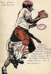
• And just because I like Ricko’s artwork so much, here are a few more of his illustrations. “I kinda liked Lionel Taylor when I was 14,” he says. He apparently liked Broadway Joe, too.
That’s enough for this time around. Lots more soon.
Two Reminders: Remember, I’ll participating tonight as part of a “Sports and Design” reading series at KGB. It’s free, and it starts at 7pm.
Also, don’t forget my latest research project: Next time you see a home plate ump “cleaning” the plate by kicking the dirt off of it, instead of bending over and using his whisk brush, please make a note of the date, inning, and batter, and then let me know. Thanks.
Uni Watch News Ticker: Remember the NFL’s 1994 throwback program? Ronnie Poore somehow got his hands on all of the official style-guide sheets and sent them my way. Some of them don’t match up with what the teams eventually wore (the Niners sheet, e.g., shows a blank helmet, which isn’t what the team wore), but that just makes it all more interesting. You can see a slideshow of all 28 style sheets here. ”¦ Ever wonder about the history of the foam finger? Me neither, but here it is anyway. ”¦ The Blackhawks held a convention last weekend, and Ryan Connelly notes that the jerseys worn by past and present players had a little convention patch — a nice touch (plus it appears that Stan Mikita has rather Lindsey Nelson-eque taste in sportscoats). ”¦ Jeremy Brahm, who’s previously noted the problem of Portland Timbers jerseys ripping during play, says the phenomenon hasn’t been fixed. ”¦ No idea how legit this is, but someone is claiming that the new Hornets jerseys will look like this (blame Chris Mycoskie if it turns out to be hooey). ”¦ Check out this shot of the 1925 Pirates — even the scouts are in uniform (with thanks to Jerry Wolper). ”¦ Here’s another Pirates team shot, this one from 1903. Man, dig those double-breasted jackets (big thanks to Phil Johnson, who also says he was just in Pittsburgh and was puzzled to see that the “Heinz” in Heinz Field is AWOL). … Interesting article here about the tailor to the U.S. Olympic team (with thanks to Dwayne White). ”¦ Most of you have never heard of Anne Occi, but she’s a household name to those of us who work with baseball logos and such, because she’s essentially the overseer of, and gatekeeper for, all of MLB’s new designs. Never seen an article about her until now (with thanks to Bill Erdek). ”¦ Peter Colvin and I both wanna know how the hell you can have your uni number retired from the NBA Summer League? ”¦ Check out what the Austin Blue Sox — an amateur team in Austin, Minnesota — are wearing on their shins (with thanks to Brian Schulz). ”¦ Interesting article, plus an embedded video, here about the guy who makes championship boxing and wrestling belts (nice find by Xavier Otero). ”¦ You know those clear plastic throat guards that hockey goalies wear? Eric Borer reports that umpire Kerwin Danley, who missed six weeks of action after taking a fastball off his jaw, is now wearing something similar on his hockey-style ump’s mask. ”¦ Good UGA equipment slideshow here (with thanks to Brent Hardman). ”¦ Russell, Under Armour, and Nike, all at once — ooof (with “thanks” to Jonathon Binet). ”¦ Following up on an item from yesterday: Sure enough, Bobby Layne did wear No. 22 for the Longhorns — look here (big thanks to Jim Parker). ”¦ Lots of photo links to Va. Tech’s new football uniforms here. ”¦ Scroll down to the bottom of this page for loads more vintage base ball photos (with thanks to Ian Hoadley). ”¦ Naomi Campbell apparently has a good throwing arm (at least when throwing cell phones at subordinates), so it’s no surprise to see her taking a turn at bat. Additional crimes against nature here and here. ”¦ The pine tar phenomenon has trickled down to high school baseball in Iowa (with thanks to Jesse Gavin, who also notes that this team — Davenport Assumption — is a pretty good approximation of what the Braves would look like if they wore vests).
Those photos of Naomi Campbell were from one episode of the ABC show “Ugly Betty”. It featured a softball game between two fashion magazines, hence the somewhat bizarre uniforms for some of the players. Actually, screencaps for the episode might make for an interesting blog post, Paul.
Dear Phil Johnson:
Thank you for buying a “Pirates Insider.” I’m glad my digging for awesome old uni pictures did not go unnoticed.
– PI’s Designer
…and link is that dude’s uni made from?
…please tell me that’s faux-leather or something besides the real deal…
/leather on the ladies=teh hawt
//leather on teh dude=village person
and of course, a big tip o’ the cap goes out to UW octogenarian ricko for all those mint drawings
dude!
those are the shit!
as someone who attempted (and failed hugely) to draw all my favorite players as a youngun, i can totally appreciate the skill, time and effort that went into all of them…even if you did “trace” the outlines (remember tracing paper?)…that’s still some mad skills
cheers!
Those pictures of the baseball players with tape on their shoes (referred to here as spats) were mostly likely used to keep the tongue from flapping around. I thought that football players used spats as ankle/foot support. That doesn’t look like the case with these baseball players.
Maybe I have the purpose or definition of “Spat” incorrect?
1994 throwback yahoo links are broken
[quote comment=”281214″]1994 throwback yahoo links are broken[/quote]
That’s the problem with Geocities sites — they crash once they get even a tiny bit of traffic. Too bad. I’ll take out the links now.
[quote comment=”281212″]and of course, a big tip o’ the cap goes out to UW octogenarian ricko for all those mint drawings
dude!
those are the shit!
as someone who attempted (and failed hugely) to draw all my favorite players as a youngun, i can totally appreciate the skill, time and effort that went into all of them…even if you did “trace” the outlines (remember tracing paper?)…that’s still some mad skills
cheers![/quote]
Seriously! I had enough trouble coloring in between the lines at that age!!! That’s some primo shit ricko. I think it would be a neat art exhibit to display all those pieces at once.
[quote comment=”281213″]Those pictures of the baseball players with tape on their shoes (referred to here as spats) were mostly likely used to keep the tongue from flapping around. I thought that football players used spats as ankle/foot support. That doesn’t look like the case with these baseball players.
Maybe I have the purpose or definition of “Spat” incorrect?[/quote]
Anthony, I think your definition of spat is correct. Over time, I think that the term has morphed into a description of ANY tape on a shoe but as I understand, spatting was done with ankle/foot support in mind. I had a pair of Nike cross trainers with the real thick velcro strap across the top that was supposed to replicate spatting but came up WAY short. Maybe some of you sneakerheads can help me with the name of the shoe, it was Bruce Smith’s shoe I believe, but many others wore it.
Why would it be so important to keep the tongue of the baseball cleats taped down? Every pair of baseball cleats I ever owned had a tongue like that and I can never remember it being a problem.
So, according to the Ricko Files, the New York Titans officially became the Titans of New York?
You learn something new everyday here.
Paul, I believe it is Stan MIKITA, not Makita.
An error is discovered on the Pittsburgh Steelers’ Super Bowl IX rings:
link
[quote comment=”281217″][quote comment=”281213″]Those pictures of the baseball players with tape on their shoes (referred to here as spats) were mostly likely used to keep the tongue from flapping around. I thought that football players used spats as ankle/foot support. That doesn’t look like the case with these baseball players.
Maybe I have the purpose or definition of “Spat” incorrect?[/quote]
Anthony, I think your definition of spat is correct. Over time, I think that the term has morphed into a description of ANY tape on a shoe but as I understand, spatting was done with ankle/foot support in mind. I had a pair of Nike cross trainers with the real thick velcro strap across the top that was supposed to replicate spatting but came up WAY short. Maybe some of you sneakerheads can help me with the name of the shoe, it was Bruce Smith’s shoe I believe, but many others wore it.
Why would it be so important to keep the tongue of the baseball cleats taped down? Every pair of baseball cleats I ever owned had a tongue like that and I can never remember it being a problem.[/quote]
Some of the older baseball cleats had long flaps that would, um, “flap” while you ran so that it was like a slo-mo version of baseball cards in bicycle spokes. Players started poking holes in those tongues so they could thread the laces through them and secure the tongues in place. Manufacturers eventually began doing that for them. Actually, addidas was the first, I think, in ’72 or ’73. Had grommets in the tongues even.
Parker kinda started the heavy duty taping thing during his facemask period (Johnstone had been doing it for a while). Think he got into a football player mentality. Among those who did it occasionally (don’t have photos, sorry), included Joe Rudi while with the Angels, Ken Landreaux, Hosken Powell, John Milner, Bob Dernier and …
link
They forgot one version of the foam finger
link
[quote comment=”281221″][quote comment=”281217″][quote comment=”281213″]Those pictures of the baseball players with tape on their shoes (referred to here as spats) were mostly likely used to keep the tongue from flapping around. I thought that football players used spats as ankle/foot support. That doesn’t look like the case with these baseball players.
Maybe I have the purpose or definition of “Spat” incorrect?[/quote]
Anthony, I think your definition of spat is correct. Over time, I think that the term has morphed into a description of ANY tape on a shoe but as I understand, spatting was done with ankle/foot support in mind. I had a pair of Nike cross trainers with the real thick velcro strap across the top that was supposed to replicate spatting but came up WAY short. Maybe some of you sneakerheads can help me with the name of the shoe, it was Bruce Smith’s shoe I believe, but many others wore it.
Why would it be so important to keep the tongue of the baseball cleats taped down? Every pair of baseball cleats I ever owned had a tongue like that and I can never remember it being a problem.[/quote]
Some of the older baseball cleats had long flaps that would, um, “flap” while you ran so that it was like a slo-mo version of baseball cards in bicycle spokes. Players started poking holes in those tongues so they could thread the laces through them and secure the tongues in place. Manufacturers eventually began doing that for them. Actually, addidas was the first, I think, in ’72 or ’73. Had grommets in the tongues even.
Parker kinda started the heavy duty taping thing during his facemask period (Johnstone had been doing it for a while). Think he got into a football player mentality. Among those who did it occasionally (don’t have photos, sorry), included Joe Rudi while with the Angels, Ken Landreaux, Hosken Powell, John Milner, Bob Dernier and …
link
OK, that makes sense. I guess I was taking for granted that the holes were always in the flap and the laces were always threaded through them on the pairs of cleats I owned. The tying of the laces does pretty much the same job that the tape did right?
Correction. EDDIE Milner.
John Milner is the guy in the “piss-yellow deuce coupe” who outdrags Bob Falfa (Harrison Ford) in AMERICAN GRAFFITTI.
link
Here is an interesting peice of trivia about the Steelers first Super Bowl Ring.
Re: Davenport Assumption
Their old uniforms — pre-vest — were gray and looked exactly like the Atlanta Braves. They just said Assumption instead of Atlanta.
about the throwbacks…awesome
Do you by any chance have a way to get the dates for when they were all worn? I have been trying to compile a notebook for when throwbacks/alternates have been worn and having this complete list would nearly complete that list that I have right now…
RE: Lexan Dangler
Gary Cedarstrom is also wearing one as well.
Danley was wearing the traditional mask when he was hit in the face. When he first came back he was wearing the HSM with a normal throat extension on it but has changed recently.
Both are wearing the Wilson Shock HSM. The mask features little shock absorbers on each side of the cage but the chin area is very short.
link
That pic of Gil Hodges in a Senators uni should be included on the list of athletes who look strange in the wrong uniform. Gil in anything but a Dodgers uni (and to a lesser extent, a Mets uni), is odd. I know I’ll catch some grief from DC fans, but I think I’m right.
This is getting out of control. The ‘Skins introduced Jason Taylor at a presser and gave him a jersey with his name and #1 on it. Now, he is neither their 1st round pick nor will he be wearing #1. Why couldn’t they put together a jersey with what his actual jersey # will be?
Lets hope Stan Mikita gets his sport jackets cleaned on occasion, something Lindsey Nelson never did.
Ricko, did you ever in the wildest dreams of youth imagine a day when you would be commiserating daily with like-minded obsessives about stripes and colors and logos?
I wasn’t quite at your level of documentation…and nothing was kept, dang it…but your renderings sure ring familiar.
Awesome drawings there, Ricko. My favorite is obviously the one of Joe Namath is his Alabama gear. Looking at those makes me wish I had saved my uniform sketches from years gone by.
I noticed a few things on those NFL throwback pages.
1. I believe the Jets had white stripes on their helmets.
2. The Vikings had purple pants (not shown) to where with their white jersey. Denny Green wouldn’t let them. Much like Mike Martz did with those blue pants the Rams where at times. Best thing he ever did.
3. I’m pretty sure the Bills wore the red helmet with a white version of the standing buffalo.
Nice drawings Rick-o but they don’t quite have the artistic merit of the football drawings I produced in my youth.
link
[quote comment=”281224″]Correction. EDDIE Milner.
John Milner is the guy in the “piss-yellow deuce coupe” who outdrags Bob Falfa (Harrison Ford) in AMERICAN GRAFFITTI.[/quote]
heh
while link…
link played for the mets in the 70’s and the bucs from ’78-81 or 82…
Note to Matt & Paul:
Don’t let ’em get to you. Softball is suppposed to be fun. People you play with and against will judge you in the end by your attitude, not how you’re dressed. I know in my case a lot of guys thought I was a goofball at first, but now they have almost as much fun with my gear as I do when I do a throwback.
It’s the guys who play like they think ESPN is waiting for the final score who are the schumcks…not the ones who chose to wear baseball pants.
I’ve played a lot of competitive ball, and a lot of casual ball. My 54th consecutive season playing on some kind of team (starting at age 7). Our current travelling team has been ranked as high as 2nd in the Midwest in our classification…and at least in Senior Softball its about whether you’ve having fun being out there, not about your choice of shorts, sweats or pants. Apparel, believe me, is all over the map.
That’s cuz we realized a long time ago what the real issue is: Loving to play the game.
[quote comment=”281232″]Ricko, did you ever in the wildest dreams of youth imagine a day when you would be commiserating daily with like-minded obsessives about stripes and colors and logos?
I wasn’t quite at your level of documentation…and nothing was kept, dang it…but your renderings sure ring familiar.[/quote]
Nope, sure never thought that. Good to find others who care, though. Glad I kept all that stuff, cuz maybe can help solve a mystery or two, maybe add to the knowledge base. I know I’ve learned a TON from this site. And that’s always a fun.
Did anyone notice in the Rusty Staub article that home plate was called the “dishrag”???
I have always heard home plate called the “dish” but assumed it was a nickname for the “plate” – is it possible that there is another origin of the name?
Or is his calling it a dishrag just an extended derivation of dish – kinda like “Copy Guy” from SNL skits..
Anyone have an idea?
I also got a set of those 1994 throwback sheets. Only I got 30 of them. There were two for the 49ers — one with white pants, one with silver pants. There were also two for the Cardinals — one with white pants, one with the canvas-colored pants. I noticed that there were minute variations on the helmets, striping, etc.
Oh, and I saw a Starter 1994 Steelers Barry Foster throwback in the thrift store the other day. The front number was sewn on, but everything else was screened on like the Logo Athletic tops you could have purchased in Foot Locker stores.
[quote comment=”281234″]I’m pretty sure the Bills wore the red helmet with a white version of the standing buffalo.[/quote]
As I Bills fan, I can verify that was the case…I believe they only wore the white standing buffalo on the red helmet once on the road at Houston and against Denver at home on a Monday night.
The team caught some heat from the fans for this outlandish act and thankfully, the Bills have since come to their senses and now employ the white helmet when they wear the throwbacks.
You can see the Jim Brown article with the drawing that became Ricko’s template here:
link
p.65 (p.57 in the actual magazine)
[quote comment=”281238″]Note to Matt & Paul:
Don’t let ’em get to you. Softball is suppposed to be fun. People you play with and against will judge you in the end by your attitude, not how you’re dressed. [/quote]
unless, of course, you wear zubaz
Lots of photo links to Va. Tech’s new football uniforms here.
wow…still looks like crap…
[quote comment=”281243″]You can see the Jim Brown article with the drawing that became Ricko’s template here:
link
p.65 (p.57 in the actual magazine)[/quote]
u2…that’s great…thanks for posting it…
btw…check out p 58-59 in that magazine for the ad on ‘official nfl merchandise’…to see how times have changed since 1960…
the ad features folks knocking back martinis [or something equally as potent], smoking [w/an official nfl lighter ;)], and young boys playing football in their underwear with older men watching…
classic
*or pp 58-59 in the SI reader…not sure what page, but it’s about 3 pages before the jim brown article
[quote comment=”281243″]You can see the Jim Brown article with the drawing that became Ricko’s template here:
link
p.65 (p.57 in the actual magazine)[/quote]
Here’s the relevant spread:
link
And a close-up:
link
Interesting to see that David Ortiz went back to a link last night during his first rehab game with the AA Portland Sea Dog.
[quote comment=”281249″]Interesting to see that David Ortiz went back to a link last night during his first rehab game with the AA Portland Sea Dog.[/quote]
Thought he was playing with Pawtactet, or however you spell it,for rehab. surprised to see him in AA.
Here is a challenge. I have a 1932 Chicago Cubs home alternate jersey, the one with the “Cubs” fancy script logo.
This is the first year that the Cubs wore numbers on their jerseys and I have been unable to locate any photos of this jersey, or any other jersey style from this season showing the number font used on the back of this jersey. The closest I have found is a photo of a reproduction Mitchell and Ness jersey, but no player photos to verify they’ve got it right.
I’ve searched the internet for photos with no results. Nothing on Youtube either. Since they went to the World Series that season, perhaps there are some out there or maybe there’s a photo in a book that might help.
Thanks for any help.
We got our first glimpse yesterday of the Houston Cougars new Nike jerseys. As feared, they’re pretty much standard issue, off the rack, generic crap.
link
Say what you want about the Adidas uni’s and the funky font:
link
At least those uni’s had the advantage of being unique. Now we’re just another nameless, faceless Nike school.
Just my experience, those were one in the same!!!
I’m not knocking them as bad as SB did in the final post yesterday, it’s just not my cup of tea.
As far as looking good, I’ll just say that’s all in the eye of the beholder. It’s like you guys knocking Paul for his attire but he’s in a unique position as owner of this blog that it makes for intersting content.
And personally, I’ll put my black high tops and black socks, black mesh shorts, team shirt and St. Louis Cardinals Sunday cap (don’t ask why, just my lucky softball hat) look just as good as anyone in the baseball pants crowd!!!!
Paul, I think for those hot days, you should try to score a pair of those coveted White Sox shorts with the corresponding socks. Pair those up with your Obama SOX inspired shirt would be the shit! I know those are two different CHISOX era unis but I think it would work.
Of course, technically, those weren’t stirrups, but I think I could give you a pass!
[quote comment=”281217″][quote comment=”281213″]Those pictures of the baseball players with tape on their shoes (referred to here as spats) were mostly likely used to keep the tongue from flapping around. I thought that football players used spats as ankle/foot support. That doesn’t look like the case with these baseball players.
Maybe I have the purpose or definition of “Spat” incorrect?[/quote]
Anthony, I think your definition of spat is correct. Over time, I think that the term has morphed into a description of ANY tape on a shoe but as I understand, spatting was done with ankle/foot support in mind. I had a pair of Nike cross trainers with the real thick velcro strap across the top that was supposed to replicate spatting but came up WAY short. Maybe some of you sneakerheads can help me with the name of the shoe, it was Bruce Smith’s shoe I believe, but many others wore it.
Why would it be so important to keep the tongue of the baseball cleats taped down? Every pair of baseball cleats I ever owned had a tongue like that and I can never remember it being a problem.[/quote]
Nike Air Veer?
link
[quote comment=”281245″]Lots of photo links to Va. Tech’s new football uniforms here.
wow…still looks like crap…[/quote]
[quote comment=”281238″]Note to Matt & Paul:
Don’t let ’em get to you. Softball is suppposed to be fun. People you play with and against will judge you in the end by your attitude, not how you’re dressed. I know in my case a lot of guys thought I was a goofball at first, but now they have almost as much fun with my gear as I do when I do a throwback.
It’s the guys who play like they think ESPN is waiting for the final score who are the schumcks…not the ones who chose to wear baseball pants.
I’ve played a lot of competitive ball, and a lot of casual ball. My 54th consecutive season playing on some kind of team (starting at age 7). Our current travelling team has been ranked as high as 2nd in the Midwest in our classification…and at least in Senior Softball its about whether you’ve having fun being out there, not about your choice of shorts, sweats or pants. Apparel, believe me, is all over the map.
That’s cuz we realized a long time ago what the real issue is: Loving to play the game.[/quote]
Softball Guy… this says it all. Thank you, Jim Rome.
Looking good I meant, of course, is how the individual feels about how they look. Sometimes is just a matter of what they’re used to wearing. A guy in baseball pants who shows up and plays is one thing. So is a guy in shorts. It’s the ones who strut, or whose eyes are practically vibrating in their sockets, that are tough to stomach no matter what they’re wearing.
I always want to remind them to relax, there are no MLB scouts in the stands. No one likes someone who thinks they’re hot shit.
When I first started wearing wristbands I got all kinds of crap. Now whoever wants can wear them and no one says a word.
I guess most of my softball is in leagues where it just matters what kind of player (or guy) you are.
Of course, I don’t play Classic ball anymore. Got out of it years ago. Too many “eye vibrators.” Too much posturing. Took all the fun out of it.
I just try to play well enough that if we win I had something to do with it, and if we lose it wasn’t my fault. LOL
[quote comment=”281256″][quote comment=”281238″]Note to Matt & Paul:
Don’t let ’em get to you. Softball is suppposed to be fun. People you play with and against will judge you in the end by your attitude, not how you’re dressed. I know in my case a lot of guys thought I was a goofball at first, but now they have almost as much fun with my gear as I do when I do a throwback.
It’s the guys who play like they think ESPN is waiting for the final score who are the schumcks…not the ones who chose to wear baseball pants.
I’ve played a lot of competitive ball, and a lot of casual ball. My 54th consecutive season playing on some kind of team (starting at age 7). Our current travelling team has been ranked as high as 2nd in the Midwest in our classification…and at least in Senior Softball its about whether you’ve having fun being out there, not about your choice of shorts, sweats or pants. Apparel, believe me, is all over the map.
That’s cuz we realized a long time ago what the real issue is: Loving to play the game.[/quote]
Softball Guy… this says it all. Thank you, Jim Rome.[/quote]
Crap! The link disappeared!
link
When I first discovered this site, I thought of an old article in SI that I read as a kid that gave a great synopsis of the baseball uniform. I remembered it was the year the O’s changed their cap to the anatomical bird, 1989. After a little research, I found the article. (click on view this issuse, go to page 112 “Fabric of the Game”). I don’t know if it’s been posted here before, but I’m sure UniWatch readers would enjoy this as the pennant races heat up.
Couple thing to point out…
First, on the previous year’s Houston football jerseys, the adidas plant was actually an old Champion manufacturing location. They just picked up that funny looking (yet Champion’s own distinctive) number font from there.
And second, the Green bay Packers’ numbering on the white jersey was in navy blue, not “athletic gold” (read: yellow) as the spec sheet pointed out. I should remember because it was in that Monday Night Football game on Halloween against the Bears in the mud at Soldier Field (pre-2004 renovation) that those numbers were easier to see for TV purposes.
link
I guess I don’t know how to put a link into my comments.
[quote comment=”281245″]Lots of photo links to Va. Tech’s new football uniforms here.
wow…still looks like crap…[/quote]
After seeing those pics of Glennon, Taylor and Chancellor, I REALLY like the unis!
As for those Naomi Campbell shots…sheesh!
Davenport Assumption LOOKS GOOD!
I knew I’d catch some heat for the softball pics, hence I posted them…all in fun
[quote comment=”281254″][quote comment=”281217″][quote comment=”281213″]Those pictures of the baseball players with tape on their shoes (referred to here as spats) were mostly likely used to keep the tongue from flapping around. I thought that football players used spats as ankle/foot support. That doesn’t look like the case with these baseball players.
Maybe I have the purpose or definition of “Spat” incorrect?[/quote]
Anthony, I think your definition of spat is correct. Over time, I think that the term has morphed into a description of ANY tape on a shoe but as I understand, spatting was done with ankle/foot support in mind. I had a pair of Nike cross trainers with the real thick velcro strap across the top that was supposed to replicate spatting but came up WAY short. Maybe some of you sneakerheads can help me with the name of the shoe, it was Bruce Smith’s shoe I believe, but many others wore it.
Why would it be so important to keep the tongue of the baseball cleats taped down? Every pair of baseball cleats I ever owned had a tongue like that and I can never remember it being a problem.[/quote]
Nike Air Veer?
link
THAT’S IT! And those are the ones I had. Those, along with both pairs of Air Jordans I owned (V and XIII, still have the XIIIs, wish I still had the Vs) were my most comfortable sneakers I’ve had.
[quote comment=”281259″]When I first discovered this site, I thought of an old article in SI that I read as a kid that gave a great synopsis of the baseball uniform. I remembered it was the year the O’s changed their cap to the anatomical bird, 1989. After a little research, I found the article.
(click on view this issuse, go to page 112 “Fabric of the Game”). I don’t know if it’s been posted here before, but I’m sure UniWatch readers would enjoy this as the pennant races heat up.[/quote]
link
[quote comment=”281262″]I knew I’d catch some heat for the softball pics, hence I posted them…all in fun[/quote]
matt powers…”angry young (softball) guy”
this shall be your new nickname from now on! ;)
[quote comment=”281265″][quote comment=”281262″]I knew I’d catch some heat for the softball pics, hence I posted them…all in fun[/quote]
matt powers…”angry young (softball) guy”
this shall be your new nickname from now on! ;)[/quote]
OH…and teebz…
you owe me a new keyboard ;)
/thanks for the JR softball guy link…
[quote comment=”281246″][quote comment=”281243″]You can see the Jim Brown article with the drawing that became Ricko’s template here:
link
p.65 (p.57 in the actual magazine)[/quote]
u2…that’s great…thanks for posting it…
btw…check out p 58-59 in that magazine for the ad on ‘official nfl merchandise’…to see how times have changed since 1960…
the ad features folks knocking back martinis [or something equally as potent], smoking [w/an official nfl lighter ;)], and young boys playing football in their underwear with older men watching…
classic[/quote]
I hope those are Frat paddles on the wall!
And Kek,
If you loved the XIII’s so much, you can still get them reasonably:
link
Ha!
BTW, the V’s just came back out as well:
link
I hope that dude who made Native American art out of Jordans doesn’t get his materials there!
[quote comment=”281267″][quote comment=”281246″][quote comment=”281243″]You can see the Jim Brown article with the drawing that became Ricko’s template here:
link
p.65 (p.57 in the actual magazine)[/quote]
u2…that’s great…thanks for posting it…
btw…check out p 58-59 in that magazine for the ad on ‘official nfl merchandise’…to see how times have changed since 1960…
the ad features folks knocking back martinis [or something equally as potent], smoking [w/an official nfl lighter ;)], and young boys playing football in their underwear with older men watching…
classic[/quote]
I hope those are Frat paddles on the wall!
And Kek,
If you loved the XIII’s so much, you can still get them reasonably:
link
Ha!
BTW, the V’s just came back out as well:
link
I hope that dude who made Native American art out of Jordans doesn’t get his materials there![/quote]
The Nike Air Veer spurned some of the funniest commercials Nike ever made starring none other than Dennis Hopper:
link
“Bad Things, Man”!
Angry Young Man/Guy ???????????????????????
I read somewhere that the 49ers are going back to the 1980s uniforms in 2009. I don’t know why they got away from them in the first place. That Super Bowl in 1995 (?) was a pretty bad uni Super Bowl: the weird mid-’90s Niners jerseys vs. the drab Chargers. –link
[quote comment=”281260″]Couple thing to point out…
First, on the previous year’s Houston football jerseys, the adidas plant was actually an old Champion manufacturing location. They just picked up that funny looking (yet Champion’s own distinctive) number font from there.
And second, the Green bay Packers’ numbering on the white jersey was in navy blue, not “athletic gold” (read: yellow) as the spec sheet pointed out. I should remember because it was in that Monday Night Football game on Halloween against the Bears in the mud at Soldier Field (pre-2004 renovation) that those numbers were easier to see for TV purposes.[/quote]
Some of those 1994 throwback jerseys like the Packers were invented out of necessity. Packers, I don’t think, HAD any white jerseys back then. The yellow shoulder yoke was deemed enough of a difference form other teams…when only issue was the in-person audience (can’t think of very many teams that DID have white jerseys, even into the late 40’s. And the Rams had nothing but gold jerseys–home AND road–until the NFL required them to get something else in the mid 50’s).
I say that cuz I have yet to see a game photo of Hutson or Herber or Isbell or any Packers from their era in a white jersey. Lostsa game action, and is from places like Detroit or Chicago and both teams are in dark. The Bears were one of the few teams that had white jerseys (as with navy pants when they hammered the Redskins in that NFL title game). In fact, has anyone ever checked: Were those jerseys and pants special just for that championship? Cuz only photos of Bears white jerseys from that era I’ve ever seen are from that particular game.
Wow, man.
This is just a thing of beauty. I’d like to adapt something like it as a template for my database.
[quote comment=”281250″][quote comment=”281249″]Interesting to see that David Ortiz went back to a link last night during his first rehab game with the AA Portland Sea Dog.[/quote]
Thought he was playing with Pawtactet, or however you spell it,for rehab. surprised to see him in AA.[/quote]
The plan was for Ortiz to do 3 games in AAA Pawtucket, a day off, then 3 days in AA Portland, and then rejoin the Sox in Boston on Friday. I think it was all done to avoid having him fly across the country. Pawtucket is 1 hour from Boston, and Portland is only 2 hrs. So it’s all close.
Sorry, link.
[quote comment=”281266″][quote comment=”281265″][quote comment=”281262″]I knew I’d catch some heat for the softball pics, hence I posted them…all in fun[/quote]
matt powers…”angry young (softball) guy”
this shall be your new nickname from now on! ;)[/quote]
OH…and teebz…
you owe me a new keyboard ;)
/thanks for the JR softball guy link…[/quote]
Anytime, Phil. I actually play in a pretty solid men’s softball league, and there are guys who come decked out in full garb. I wear a t-shirt jersey, and two options for pants depending on where we play.
Option A: long, pyjama-style, gray pants when we play at the fields outside the city (no mosquito spraying outside the city limits = need for added protection).
Option B: high socks with gray, short-legged pants. Perfect for rolling the elastic hem under the socks for a real old-time feel.
I haven’t found stirrups I prefer for the look of our team, so I haven’t gone to them yet. However, I’m not “mashing” whatsoever when we play. Hit for average and run the bases. If you want to trot, you’re in it for the wrong reasons.
Mr. Powers, this has nothing to do with you, though. Just as a side question, what kind of cleats are those? I’m a Mizuno guy, but I liked the looks of those cleats you were wearing. :o)
Nice detail on the style-guide sheets from 1994… the sheets for most of the relocated franchises are identified by team name without a city: “Cardinals”, “Colts”, and “Raiders”. No love for the Cleveland Rams, though–it’s “Los Angeles” on the style guide.
[quote comment=”281244″][quote comment=”281238″]Note to Matt & Paul:
Don’t let ’em get to you. Softball is suppposed to be fun. People you play with and against will judge you in the end by your attitude, not how you’re dressed. [/quote]
unless, of course, you wear zubaz[/quote]
Well, yes, some things are over the line no matter what.
Although it would be fun to see someone bloue those things and wear them with classic striped stirrups.
(shudder. wince.)
[quote comment=”281267″][quote comment=”281246″][quote comment=”281243″]You can see the Jim Brown article with the drawing that became Ricko’s template here:
link
p.65 (p.57 in the actual magazine)[/quote]
u2…that’s great…thanks for posting it…
btw…check out p 58-59 in that magazine for the ad on ‘official nfl merchandise’…to see how times have changed since 1960…
the ad features folks knocking back martinis [or something equally as potent], smoking [w/an official nfl lighter ;)], and young boys playing football in their underwear with older men watching…
classic[/quote]
I hope those are Frat paddles on the wall!
And Kek,
If you loved the XIII’s so much, you can still get them reasonably:
link
Ha!
BTW, the V’s just came back out as well:
link
I hope that dude who made Native American art out of Jordans doesn’t get his materials there![/quote]
Still have the XIIIs and they’re in reasonably good shape. I actually wore them a lot as I played a lot of pickup hoops at that point in my life.
I’d love to have the Vs again, but isn’t that shot of the IVs? I had the purple (grape?) ones. They also had a white pair with a 23 stitched on the side.
[quote comment=”281267″][quote comment=”281246″][quote comment=”281243″]You can see the Jim Brown article with the drawing that became Ricko’s template here:
link
p.65 (p.57 in the actual magazine)[/quote]
u2…that’s great…thanks for posting it…
btw…check out p 58-59 in that magazine for the ad on ‘official nfl merchandise’…to see how times have changed since 1960…
the ad features folks knocking back martinis [or something equally as potent], smoking [w/an official nfl lighter ;)], and young boys playing football in their underwear with older men watching…
classic[/quote]
I hope those are Frat paddles on the wall!
And Kek,
If you loved the XIII’s so much, you can still get them reasonably:
link
Ha!
BTW, the V’s just came back out as well:
link
I hope that dude who made Native American art out of Jordans doesn’t get his materials there![/quote]
That would be the Air Jordan “IV” not the “V”…we don’t want to screw up non-Sneaker aficionados out there. Both make me drool the same anyways.
[quote comment=”281211″]…and link is that dude’s uni made from?
…please tell me that’s faux-leather or something besides the real deal…
/leather on the ladies=teh hawt
//leather on teh dude=village person[/quote]
Dude has a Gucci belt on! Ahahahahaha! I was looking for a Goyard or Louis V. fielders mitt too .
Naomi Campbell has some SUUURIOUS LEGS!…she’s a bitch though and her Sobe commercials suck.
[quote comment=”281264″][quote comment=”281259″]When I first discovered this site, I thought of an old article in SI that I read as a kid that gave a great synopsis of the baseball uniform. I remembered it was the year the O’s changed their cap to the anatomical bird, 1989. After a little research, I found the article.
(click on view this issuse, go to page 112 “Fabric of the Game”). I don’t know if it’s been posted here before, but I’m sure UniWatch readers would enjoy this as the pennant races heat up.[/quote]
link
MAN!!! I remember that issue of SI like it was yesterday. Benito was my boy! Plus, several good catching stories inside.
Page 32: Bob Boone with the skull cap and older style catcher’s mask (what was the name of that style?)
Page 62: Shot of Andy Van Slyke in the ROOS spikes.
The first shot, I could remember, of the Okkonnen sketches.
Regarding the cover: where those player wristbands part of a say no to drugs campaign? I remember Bonds wearing them too (among others)?
These are so dope! Such an improvement and so clean looking. They finally got it right.
link
link
I’m trying to search the archives of the site, and either I’m a moron or something isn’t working (or both).
Does anyone remember the link to a video of the guy from New York who tries and get all of the batting practice balls? It was recent — proabably in the last two months.
[quote comment=”281277″][quote comment=”281267″][quote comment=”281246″][quote comment=”281243″]You can see the Jim Brown article with the drawing that became Ricko’s template here:
link
p.65 (p.57 in the actual magazine)[/quote]
u2…that’s great…thanks for posting it…
btw…check out p 58-59 in that magazine for the ad on ‘official nfl merchandise’…to see how times have changed since 1960…
the ad features folks knocking back martinis [or something equally as potent], smoking [w/an official nfl lighter ;)], and young boys playing football in their underwear with older men watching…
classic[/quote]
I hope those are Frat paddles on the wall!
And Kek,
If you loved the XIII’s so much, you can still get them reasonably:
link
Ha!
BTW, the V’s just came back out as well:
link
I hope that dude who made Native American art out of Jordans doesn’t get his materials there![/quote]
Still have the XIIIs and they’re in reasonably good shape. I actually wore them a lot as I played a lot of pickup hoops at that point in my life.
I’d love to have the Vs again, but isn’t that shot of the IVs? I had the purple (grape?) ones. They also had a white pair with a 23 stitched on the side.[/quote]
I wish there was an Edit button…my mistake..you’re right!
Those ARE the IV’s.
The V’s came out two years ago and the Fusion Air Force 1/Air Jordan V’s came out this Spring!
AJ V:
link
AJ V/AF1:
link
Ricko man, I am just in awe at what you’ve brought to this site, this stuff is so freakin’ awesome!
-Jet
[quote comment=”281274″][quote comment=”281266″][quote comment=”281265″][quote comment=”281262″]I knew I’d catch some heat for the softball pics, hence I posted them…all in fun[/quote]
matt powers…”angry young (softball) guy”
this shall be your new nickname from now on! ;)[/quote]
OH…and teebz…
you owe me a new keyboard ;)
/thanks for the JR softball guy link…[/quote]
Anytime, Phil. I actually play in a pretty solid men’s softball league, and there are guys who come decked out in full garb. I wear a t-shirt jersey, and two options for pants depending on where we play.
Option A: long, pyjama-style, gray pants when we play at the fields outside the city (no mosquito spraying outside the city limits = need for added protection).
Option B: high socks with gray, short-legged pants. Perfect for rolling the elastic hem under the socks for a real old-time feel.
I haven’t found stirrups I prefer for the look of our team, so I haven’t gone to them yet. However, I’m not “mashing” whatsoever when we play. Hit for average and run the bases. If you want to trot, you’re in it for the wrong reasons.
Mr. Powers, this has nothing to do with you, though. Just as a side question, what kind of cleats are those? I’m a Mizuno guy, but I liked the looks of those cleats you were wearing. :o)[/quote]
Teebz,
They are the Nike Air Five Tool MCS. That color is sold exclusively at Sports Authority because it is an Albert Pujols signature shoe!
link
link
Eastbay has the solid colors!
Red:
link
Blue:
link
Black:
link
Conversion Black:
link
Baseball Express is usually a really good site as well!
Just passing along a rumor I saw… Don’t shoot the messenger… :-)
[quote comment=”281281″]These are so dope! Such an improvement and so clean looking. They finally got it right.
link
link
Dope? Not really. And why would they not have “Hornets” on the home whites instead of “New Orleans”. If that IS the actual design they’re going with, then I am highly disappointed. I’ve seen SEVERAL concepts on the Chris Creamer boards that are 1,000,000 times better.
[quote comment=”281282″]I’m trying to search the archives of the site, and either I’m a moron or something isn’t working (or both).[/quote]
Site-search function is down. Google problems. Working on it. Might be two more weeks (these problems usually take 30 days to resolve). Sorry.
Because of the Shockey Trade, my local paper ran some pics of him that I’d never seen before:
Check out his eye black strips:
link
And to further irritate Paul, these are from a while back, but I’ll repost my finds from the same place I found those stirrups last week:
If the polish doesn’t work on those Copas, we have a backup plan!
link
link
link
link
[quote comment=”281269″]I read somewhere that the 49ers are going back to the 1980s uniforms in 2009. I don’t know why they got away from them in the first place. That Super Bowl in 1995 (?) was a pretty bad uni Super Bowl: the weird mid-’90s Niners jerseys vs. the drab Chargers. –link[/quote]
Don’t know about the comeback of the 80’s unis, but that would be great. As to SuperBowl XXIX (94 season/January 95), those weren’t “new” unis, they were the throwbacks everyone wore that year. The Niners won a couple games in them early in the year and decided they were lucky, so made them the unis for the rest of the season and postseason. They went 14-2 and destroyed San Diego in the SB, so maybe they had the right idea.
[quote comment=”281289″]Because of the Shockey Trade, my local paper ran some pics of him that I’d never seen before:
Check out his eye black strips:
link
And to further irritate Paul, these are from a while back, but I’ll repost my finds from the same place I found those stirrups last week:
If the polish doesn’t work on those Copas, we have a backup plan!
link
link
link
link
If Paul isn’t frightened enough already, I have found his Hell on Earth:
link
link
link
link
link
I really hope those are not the new Hornets unis. Ugh.
I’m hoping they ditch the teal, for starters. They need their own identity, they still feel like the Charlotte team far too much.
I know the disdain for purple here, but I’m hoping they go with the traditional green, purple and gold for NOLA.
Who likes Robert Riger’s football art?
Check out the “Ray Berry on Pass Catching” article.
link
[quote comment=”281281″]These are so dope! Such an improvement and so clean looking. They finally got it right.
link
link
The only got if they get rid of that awful Hugo Hornet logo completely. and go fith the FDB as the primary and only logo.
[quote comment=”281287″][quote comment=”281281″]These are so dope! Such an improvement and so clean looking. They finally got it right.
link
link
Dope? Not really. And why would they not have “Hornets” on the home whites instead of “New Orleans”. [/quote]
Yeah – “New Orleans” on the whites? That’s link.
Love the new color scheme, love the gold letters and numbers on the roads, and love the new typeface. Not wild about the pinstripes, but those aren’t as bad as I feared.
Berry story starts here, p. 53.
link
[quote comment=”281262″]
Teebz,
They are the Nike Air Five Tool MCS. That color is sold exclusively at Sports Authority because it is an Albert Pujols signature shoe!
link
link
Eastbay has the solid colors!
Red:
link
Blue:
link
Black:
link
Conversion Black:
link
Baseball Express is usually a really good site as well![/quote]
Sweet. There are lots of cleats on sale. Thanks a million!
is the guy in the front row of the 1903 pic wearing a different jersey?
[quote comment=”281282″]I’m trying to search the archives of the site, and either I’m a moron or something isn’t working (or both).
Does anyone remember the link to a video of the guy from New York who tries and get all of the batting practice balls? It was recent — proabably in the last two months.[/quote]
I think this is the guy you’re thinking of: link
With the Pirates and Dodgers having back to back series here in Denver, I got a look at the names on the back of the LaRoche brothers jerseys. In full NOB tradition, both clubs take different approaches to the lettering of LaRoche.
Adam
link
Andy
link
Ronaldinho to wear #80 at Milan:
link
1980 is the year of his birth. #10 was taken. Club says they’ve never asked a player to give up his number.
[quote comment=\”281267\”][quote comment=\”281246\”][quote comment=\”281243\”]
BTW, the V\’s just came back out as well:
link
I hope that dude who made Native American art out of Jordans doesn\’t get his materials there![/quote]
IV\’s in that pack
V\’s are next month
As a Houston Cougar I’m disappointed with the new uni’s. I wish we’d do something link
and link.
Or even a return to link.
Never happen, but I can wish, can’t I?
Oh, so now we have a name and face to blame for those incredibly lousy and generic Tampa Bay Rays logos: Anne Occi. Funny, 18 years employed… there hasn’t been one classic logo made in the past 18 years in MLB. And shame for putting a gradient on the 1st Devil Rays logo & the Giants logo.
“The Rays wanted to “showcase the beauty of the Florida sunshine,” said Occi, while at the same time seeking out “a timeless, traditional look.” The yearlong process of developing a redesign can involve some back-and-forth and multiple revisions, but Occi said this redesign was painless.”
That’s funny, because the result is painful. Some of them All Star logos have been god-awful.
[quote comment=”281304″]Oh, so now we have a name and face to blame for those incredibly lousy and generic Tampa Bay Rays logos: Anne Occi. Funny, 18 years employed… there hasn’t been one classic logo made in the past 18 years in MLB. And shame for putting a gradient on the 1st Devil Rays logo & the Giants logo.
“The Rays wanted to “showcase the beauty of the Florida sunshine,” said Occi, while at the same time seeking out “a timeless, traditional look.” The yearlong process of developing a redesign can involve some back-and-forth and multiple revisions, but Occi said this redesign was painless.”
That’s funny, because the result is painful. Some of them All Star logos have been god-awful.[/quote]
I have always thought this:
link
was a huge step up from this:
link
link
Taylor jersey
[quote comment=”281307″]http://store.redskins.com/productinfo.asp?item=1680&deptcode1=626
Taylor jersey[/quote]
andre carter no give up 99?
[quote comment=”281304″]Oh, so now we have a name and face to blame for those incredibly lousy and generic Tampa Bay Rays logos: Anne Occi. Funny, 18 years employed… there hasn’t been one classic logo made in the past 18 years in MLB. And shame for putting a gradient on the 1st Devil Rays logo & the Giants logo.
“The Rays wanted to “showcase the beauty of the Florida sunshine,” said Occi, while at the same time seeking out “a timeless, traditional look.” The yearlong process of developing a redesign can involve some back-and-forth and multiple revisions, but Occi said this redesign was painless.”
That’s funny, because the result is painful. Some of them All Star logos have been god-awful.[/quote]
True enough, although the Yankee Stadium farewell patch is beautiful. If only next year’s is half as good.
[quote comment=”281281″]These are so dope! Such an improvement and so clean looking. They finally got it right.
link
link
I will punch someone in the jejunum if those are the actual jerseys
I have a question about colored sanitaries. Has anyone ever worn gray sanitaries, for example to match a road uniform? Wouldn’t link look 100 times better if the sanitary was gray?
[quote comment=”281311″]I have a question about colored sanitaries. Has anyone ever worn gray sanitaries, for example to match a road uniform? Wouldn’t link look 100 times better if the sanitary was gray?[/quote]
No. The only stirrups that might look better with grey sanitaries would be the old White Sox white stirrups.
Any way we can get the archives of the old Rocko stuff you posted? I wanna see the other stuff again but I can’t find it for some reason…
Regarding the foam finger invention…. my dad just knocked a huge hole in that story!
“Interesting. However, I have a foam Hook ’em Horns hand that predates his earliest model by 3 months. I bought it at the 1977 0U / Texas game. I can remember a guy tearing the little finger off after we won the game that converted his Hook ’em Horns hand to a number 1 hand.”
I loved looking at Ricko’s AFL and NFL uniform illustrations.
I’m also struck by how the NFL Throwbacks Weekend 1994 style sheet illustrations and information differed from what was actually worn on the field. For example, I had always thought that the color of the Washington Redskins throwback pants was a darker gold than the gold color given on the style sheet. I was also surprised by the rather pale Saints’ throwback metallic gold color given on the style sheet. (Does anyone know what Pantone textile colors may have been used for the throwbacks in 1994?)
Is it possible that some of the colors used on the 1994 NFL Throwback uniforms were the then-current uniform supplier colors that came closest to the estimated vintage colors?
Thank you.
[quote comment=”281315″]I loved looking at Ricko’s AFL and NFL uniform illustrations.
I’m also struck by how the NFL Throwbacks Weekend 1994 style sheet illustrations and information differed from what was actually worn on the field. For example, I had always thought that the color of the Washington Redskins throwback pants was a darker gold than the gold color given on the style sheet. I was also surprised by the rather pale Saints’ throwback metallic gold color given on the style sheet. (Does anyone know what Pantone textile colors may have been used for the throwbacks in 1994?)
Is it possible that some of the colors used on the 1994 NFL Throwback uniforms were the then-current uniform supplier colors that came closest to the estimated vintage colors?
Thank you.[/quote]
You’re right about Saints, that’s for sure. The Throwbacks were darker than shown on style sheets (I remember thinking, “Hey, they got the gold close to right” when I saw the actual game video.
Here’s what the first Saints unis DID look like. Don’t let the helmet fool you. That was the training camp version. The three-stripe helmet (which initially was white around black, as I recall) was on hand for games right from the beginning.
link
[quote comment=”281298″]is the guy in the front row of the 1903 pic wearing a different jersey?[/quote]
Yes. Brooklyn. It may be Lave Winham, who pitched for the Superbas in 1902 and the Pirates in 1903.
[quote comment=”281313″]Any way we can get the archives of the old Ricko stuff you posted? I wanna see the other stuff again but I can’t find it for some reason…[/quote]
Although the site-search function is currently on the fritz, you go to the top of the page, click on “Archives,” and then search for “Ricko.” C’mon, man, it’s easy!
But here:
link
link
[quote comment=”281311″]I have a question about colored sanitaries. Has anyone ever worn gray sanitaries, for example to match a road uniform? Wouldn’t link look 100 times better if the sanitary was gray?[/quote]
maybe…as they say, be careful what you wish for…i was actually hoping some team might consider the “all gray” look which the nationals featured at the ASG HRD…
and while i still think it’d be worth a shot, several other readers questioned whether or not it would work (and gave some examples of teams that had tried, in one form or another — i think the o’s and jays)
i’d love, however, to see what the sanis would look like gray, as i would also love to see what a team would look like if decked out in all gray…
so…if anyone has that p-shop ability…any way you could do a mockup of something like that?
purdy pleaze
or…maybe ricko could just do up a nice color illustration for me!
[quote comment=”281259″]When I first discovered this site, I thought of an old article in SI that I read as a kid that gave a great synopsis of the baseball uniform. I remembered it was the year the O’s changed their cap to the anatomical bird, 1989. After a little research, I found the article.
(click on view this issuse, go to page 112 “Fabric of the Game”). I don’t know if it’s been posted here before, but I’m sure UniWatch readers would enjoy this as the pennant races heat up.[/quote]
thinking bout when Dem O’s went to the ornithologically correct bird reminded me of this short lived alternate hat that was worn for two seasons
link
[quote comment=”281320″]or…maybe ricko could just do up a nice color illustration for me![/quote]
holy shit marcus
read the second paragraph from post 109
that cap is EXACTLY what i was talking about, but no one ever pointed me to it!
…im getting this odd sensation of deja vu all over again
and the above (#112) is in response to post 111, not 110…
…time to get a coffee
This link about the Ravens starting training camp mentions that players get a special “Arm & Hammer” patch for attending at least 85% of the teams off season workouts.
I’ve never heard of training camp patches. I tried finding a picture but today being the first day of camp I could only come up with link. It’s hard to see, but there’s an extra patch on the front left side of Troy Smith’s (10) jersey that isn’t on Joe Flacco’s (5).
(Boller was said to also have the patch but it looks like his arm is blocking it in that shot.) Hopefully later in camp there will be better views.
I also think the patch needs a new name. Arm & Hammer is synonymous with baking soda to me.
[quote comment=”281324″]This link about the Ravens starting training camp mentions that players get a special “Arm & Hammer” patch for attending at least 85% of the teams off season workouts.
I’ve never heard of training camp patches. I tried finding a picture but today being the first day of camp I could only come up with link. It’s hard to see, but there’s an extra patch on the front left side of Troy Smith’s (10) jersey that isn’t on Joe Flacco’s (5).
(Boller was said to also have the patch but it looks like his arm is blocking it in that shot.) Hopefully later in camp there will be better views.
I also think the patch needs a new name. Arm & Hammer is synonymous with baking soda to me.[/quote]
if i attend 85% of my teams offseason workouts i get a pink slip
[quote comment=\”281303\”]As a Houston Cougar I\’m disappointed with the new uni\’s. I wish we\’d do something simple
and clean.
Or even a return to STRIPES!!.
Never happen, but I can wish, can\’t I?[/quote]
link
I spy with my little eye…Nike Air Force 3\’s on QB David Klingler!
A certain former Wildcat of Arizona,Eugene Edgerson, was known for being ol\’ school wore them from 1996 to 2001! He now plys for the Globetrotters.
link
link
link
Ol school Air Dynamic Flight and Air Total Max 2:
link
Interesting…A young Edgerson playing against Carolina…The Tar Heel is wearing the Nike Adjust Force, which only came in base white and base black.
You could buy colored straps to go over the laces and heel to coordinate to your uniform!
link
link
[quote comment=”281325″][quote comment=”281324″]This link about the Ravens starting training camp mentions that players get a special “Arm & Hammer” patch for attending at least 85% of the teams off season workouts.
I’ve never heard of training camp patches. I tried finding a picture but today being the first day of camp I could only come up with link. It’s hard to see, but there’s an extra patch on the front left side of Troy Smith’s (10) jersey that isn’t on Joe Flacco’s (5).
(Boller was said to also have the patch but it looks like his arm is blocking it in that shot.) Hopefully later in camp there will be better views.
I also think the patch needs a new name. Arm & Hammer is synonymous with baking soda to me.[/quote]
if i attend 85% of my teams offseason workouts i get a pink slip[/quote]
“A patch? I get this really swell PATCH? Gosh, this is just the thing we need to help us beat our traditional rival, perennial powerhouse State U. this season…so that you can get a big raise and your daughter finally can have that operation! Gee, Coach, THANKS. You’re the BEST!”
[quote comment=”281322″][quote comment=”281320″]or…maybe ricko could just do up a nice color illustration for me![/quote]
holy shit marcus
read the second paragraph from post 109
that cap is EXACTLY what i was talking about, but no one ever pointed me to it!
…im getting this odd sensation of deja vu all over again[/quote]
i think it was an awesome look!! unfortunately, most didn’t like the look. I remember watching games and not hearing alot of positives regarding the hat. Rumors abound that the O’s are changing uniforms next year, with our main colors being black and orange, I think it would look so better if our road uniforms were very light tan
[quote comment=”281326″][quote comment=\”281303\”]As a Houston Cougar I\’m disappointed with the new uni\’s. I wish we\’d do something simple
and clean.
Or even a return to STRIPES!!.
Never happen, but I can wish, can\’t I?[/quote]
link
I spy with my little eye…Nike Air Force 3\’s on QB David Klingler!
A certain former Wildcat of Arizona,Eugene Edgerson, was known for being ol\’ school wore them from 1996 to 2001! He now plys for the Globetrotters.
link
link
link
Ol school Air Dynamic Flight and Air Total Max 2:
link
Interesting…A young Edgerson playing against Carolina…The Tar Heel is wearing the Nike Adjust Force, which only came in base white and base black.
You could buy colored straps to go over the laces and heel to coordinate to your uniform!
link
link
To add a footnote to the post on the Air Adjust Force, Quentin Griffin, while at Oklahoma, used to wear the colored straps over his football cleats.
Kek mentioned something about spats today, these could be related!
link
link
Eastbay has the equivalent of fake stirrups, but for spats:
link
BTW, as for the Nike Adjust Force being unique…No. Cheerleading shoes have been made this way for years. You can place colored tabs into a holster within the shoe to coordinate the colors.
Just this past year, Adidas started making their Superstar Basketball shoes in Adi-Color, meaning that you could slip in the correct color tabto match the uni.
This years Signature cleat for LaDainian Tomlinson, the Nike LDT, has the same idea!
link
[quote comment=”281328″][quote comment=”281322″][quote comment=”281320″]or…maybe ricko could just do up a nice color illustration for me![/quote]
holy shit marcus
read the second paragraph from post 109
that cap is EXACTLY what i was talking about, but no one ever pointed me to it!
…im getting this odd sensation of deja vu all over again[/quote]
i think it was an awesome look!! unfortunately, most didn’t like the look. I remember watching games and not hearing alot of positives regarding the hat. Rumors abound that the O’s are changing uniforms next year, with our main colors being black and orange, I think it would look so better if our road uniforms were very light tan[/quote]
like this color…..
link
Eastbay:
Fake spats:
link
Adi-Color:
link
Nike LDT:
link
Ricko –
Those drawings from your childhood are really, really cool. Thanks for preserving them.
[quote comment=”281329″][quote comment=”281326″][quote comment=\”281303\”]As a Houston Cougar I\’m disappointed with the new uni\’s. I wish we\’d do something simple
and clean.
Or even a return to STRIPES!!.
Never happen, but I can wish, can\’t I?[/quote]
link
I spy with my little eye…Nike Air Force 3\’s on QB David Klingler!
A certain former Wildcat of Arizona,Eugene Edgerson, was known for being ol\’ school wore them from 1996 to 2001! He now plys for the Globetrotters.
link
link
link
Ol school Air Dynamic Flight and Air Total Max 2:
link
Interesting…A young Edgerson playing against Carolina…The Tar Heel is wearing the Nike Adjust Force, which only came in base white and base black.
You could buy colored straps to go over the laces and heel to coordinate to your uniform!
link
link
To add a footnote to the post on the Air Adjust Force, Quentin Griffin, while at Oklahoma, used to wear the colored straps over his football cleats.
Kek mentioned something about spats today, these could be related!
link
link
Eastbay has the equivalent of fake stirrups, but for spats:
link
BTW, as for the Nike Adjust Force being unique…No. Cheerleading shoes have been made this way for years. You can place colored tabs into a holster within the shoe to coordinate the colors.
Just this past year, Adidas started making their Superstar Basketball shoes in Adi-Color, meaning that you could slip in the correct color tabto match the uni.
This years Signature cleat for LaDainian Tomlinson, the Nike LDT, has the same idea!
link
hey AYG…
none of the links that start with “http://cache” work…
can you put them in photobucket or flickr?
thanks
[quote comment=”281330″][quote comment=”281328″][quote comment=”281322″][quote comment=”281320″]or…maybe ricko could just do up a nice color illustration for me![/quote]
holy shit marcus
read the second paragraph from post 109
that cap is EXACTLY what i was talking about, but no one ever pointed me to it!
…im getting this odd sensation of deja vu all over again[/quote]
i think it was an awesome look!! unfortunately, most didn’t like the look. I remember watching games and not hearing alot of positives regarding the hat. Rumors abound that the O’s are changing uniforms next year, with our main colors being black and orange, I think it would look so better if our road uniforms were very light tan[/quote]
like this color…..
link
On purely a design level, the only time that I have heard of buff being used as an actual hue is here, in ladies lingerie:Definitely NSFW:
link
[quote comment=”281330″][quote comment=”281328″][quote comment=”281322″][quote comment=”281320″]or…maybe ricko could just do up a nice color illustration for me![/quote]
holy shit marcus
read the second paragraph from post 109
that cap is EXACTLY what i was talking about, but no one ever pointed me to it!
…im getting this odd sensation of deja vu all over again[/quote]
i think it was an awesome look!! unfortunately, most didn’t like the look. I remember watching games and not hearing alot of positives regarding the hat. Rumors abound that the O’s are changing uniforms next year, with our main colors being black and orange, I think it would look so better if our road uniforms were very light tan[/quote]
like this color…..
link
seeing as it worked out so well for the fathers…
but actually, and im in the minority here…i LIKE the pods sand
LI Phil,
Here are those “cache” photos of Mr. Griffin, late of the Denver Broncos, perhaps the last tailback to NOT rush for 1000 yards with their blocking schemes:
link
link
Regarding yesterday’s post on the Capital Bullets (correct spelling by the way).
I have often said that those NBA jerseys were the only ones that had absolutely no reference to the city, the team or the nickname. I know that the Warriors had “The City” for a while, but that is still a reference.
Part of my younger memory seems to believe that the Floridians of the ABA had a similar situation, although the throwbacks worn by the Heat a couple of years ago had MIAMI on the jersey.
Finally, was there ever another sports team name (other than Capital and Golden State) that does not mention a City or State in it? Can’t think of any myself.
I look forward to seeing what others think.
[quote comment=”281335″][quote comment=”281330″][quote comment=”281328″][quote comment=”281322″][quote comment=”281320″]or…maybe ricko could just do up a nice color illustration for me![/quote]
holy shit marcus
read the second paragraph from post 109
that cap is EXACTLY what i was talking about, but no one ever pointed me to it!
…im getting this odd sensation of deja vu all over again[/quote]
i think it was an awesome look!! unfortunately, most didn’t like the look. I remember watching games and not hearing alot of positives regarding the hat. Rumors abound that the O’s are changing uniforms next year, with our main colors being black and orange, I think it would look so better if our road uniforms were very light tan[/quote]
like this color…..
link
seeing as it worked out so well for the fathers…
but actually, and im in the minority here…i LIKE the pods sand[/quote]
maybe the orange would look better on the Padres sand color than the blue, but if not, then not quite as dark of a sand color as the fathers
First year of World Team Tennis (’74) Bay Area franchise was going to call themselves Golden Gate Otters (for “Organized Team Tennis”), but by the time play began they went by “Golden Gaters.”
Technically, the WFL franchise in Honolulu was the “The Hawaiians”. Not Honolulu Hawaiians. Not Hawaii Hawaiians. Just…The Hawaiians.
Rhine Fire of WLAF and NFL Europe played in Dusseldorf.
Same league(s): Scottish Claymores
[quote comment=”281339″]First year of World Team Tennis (’74) Bay Area franchise was going to call themselves Golden Gate Otters (for “Organized Team Tennis”), but by the time play began they went by “Golden Gaters.”[/quote]
maybe they feared a suit from UF
[quote comment=”281234″]I noticed a few things on those NFL throwback pages.
1. I believe the Jets had white stripes on their helmets.
2. The Vikings had purple pants (not shown) to where with their white jersey. Denny Green wouldn’t let them. Much like Mike Martz did with those blue pants the Rams where at times. Best thing he ever did.
3. I’m pretty sure the Bills wore the red helmet with a white version of the standing buffalo.[/quote]
1 you are correct about the white stripes. photo here:
link
2. i haven’t heard that before, but knowing the feeling toward purple around here, it’s just as well the Viking didn’t wear the dark pants
3. yep, right again about the Bills helmets. they looked like this:
link
[quote comment=”281340″]Technically, the WFL franchise in Honolulu was the “The Hawaiians”. Not Honolulu Hawaiians. Not Hawaii Hawaiians. Just…The Hawaiians.[/quote]
The New York Cosmos became simply as the Cosmos before the 1977 season.
Better shot of the Raven’s Arm & Hammer Patch
link
[quote comment=”281345″]Better shot of the Raven’s Arm & Hammer Patch
link
Even Better pic! Note the little “B” in the hammer
link
[quote comment=”281343″][quote comment=”281234″]I noticed a few things on those NFL throwback pages.
1. I believe the Jets had white stripes on their helmets.
2. The Vikings had purple pants (not shown) to where with their white jersey. Denny Green wouldn’t let them. Much like Mike Martz did with those blue pants the Rams where at times. Best thing he ever did.
3. I’m pretty sure the Bills wore the red helmet with a white version of the standing buffalo.[/quote]
1 you are correct about the white stripes. photo here:
link
2. i haven’t heard that before, but knowing the feeling toward purple around here, it’s just as well the Viking didn’t wear the dark pants
3. yep, right again about the Bills helmets. they looked like this:
link
No doubt about it, some NFL teams half-assed their throwbacks that year, mostly by not changing helmets: Jets, Bills, 49ers and Cowboys are the first I recall.
Remember thinking, “Cool, for their throwbacks the Jets are wearing Sackatchewan Roughriders uniforms.”
link
In the spirit of The Dark Knight, and something I just found out (maybe its been mentioned here before), in 1967 the Pittsburg Steelers wore Batman-inspired uniforms:
link
Okay.
Today, Phil has been referring to me as Angry Young Guy.
I had no idea why.
I do now and this is why:
link
I think Kek posted it last night…but I didn’t see it!
It is funnier than the Jim Everett bit.
I am not AYG but if I was ever going to become AYG, that has been OFFICIALLY nipped before the bud!
[quote comment=”281337″]
Finally, was there ever another sports team name (other than Capital and Golden State) that does not mention a City or State in it? Can’t think of any myself.
I look forward to seeing what others think.[/quote]
New England
angry young guy…
teebz posted it, today…link
douggie and sb just were having fun with yer softball uni, and the JR thing just fit perfectly
relax…no one’s gonna call you that if you don’t like it
[quote comment=”281337″]Regarding yesterday’s post on the Capital Bullets (correct spelling by the way).
I have often said that those NBA jerseys were the only ones that had absolutely no reference to the city, the team or the nickname. I know that the Warriors had “The City” for a while, but that is still a reference.
Part of my younger memory seems to believe that the Floridians of the ABA had a similar situation, although the throwbacks worn by the Heat a couple of years ago had MIAMI on the jersey.
Finally, was there ever another sports team name (other than Capital and Golden State) that does not mention a City or State in it? Can’t think of any myself.
I look forward to seeing what others think.[/quote]
In soccer their is Arsenal FC….amongst others.
Anyone ever order from Jersey-Joe.com and had any issues? I received my order from them today and the Jeter jersey I bought didn’t have any tags plus the MLB logo on the back is crooked and off-center. I emailed them and I’m hoping they are able to exchange it for another one since I’m not fully satisfied. Are they good when it comes to customer satisfaction?
Here’s the 1994 road uni in question:
link
It shows white with a navy number.
[quote comment=”281350″][quote comment=”281337″]
Finally, was there ever another sports team name (other than Capital and Golden State) that does not mention a City or State in it? Can’t think of any myself.
I look forward to seeing what others think.[/quote]
New England[/quote]
It seems like the Minor Leagues do this more often. Off the top of my head that new Lehigh Valley Iron Pigs team comes to mind, as does the Inland Empire 66ers and the High Desert Mavericks. The new team in Michigan is called the Great Lakes Loons.
[quote comment=”281318″][quote comment=”281313″]Any way we can get the archives of the old Ricko stuff you posted? I wanna see the other stuff again but I can’t find it for some reason…[/quote]
Although the site-search function is currently on the fritz, you go to the top of the page, click on “Archives,” and then search for “Ricko.” C’mon, man, it’s easy!
But here:
link
link
For some reason that didn’t work for me originally. My bad. Thanks.
As in, I’m retarded and didn’t really notice the archives thing up there until now. Wow.
David Ortiz played 3 games at AAA Pawtucket, then after Sunday off, moved on to AA Portland for 3 games as the Pawsox went on the road.
Didn’t see this listed after a cursory search, but Jon “Boog” Sciambi (broadcaster for the Atlanta Braves) was talking about Brian McCann’s gear tonight on the broadcast in the early innings. Apparently, Mizuno provided McCann with some new gear. It looks like it was to better match the blue uni set. Anyway, Boog said that one of the bench guys was giving him a hard time because he has “16” on everything. Boog went on to say that the only thing McCann didn’t have his number on was his helmet…because he forgot it, and it didn’t make the trip. He and Joe Simpson discussed the helmet (and Third Base Coach Brian Snitker’s helmet) for a few minutes.
I noticed the new gear last night, but didn’t see any mention here.
~E~
i know the pins are the official and traditional homer, but i LOVE LOVE LOVE the snow whites and blue caps/socks…
6 straight in them and counting…
thank you mr. samuels…blue=good…
purpleblack=death[quote comment=”281351″]angry young guy…
teebz posted it, today…link
douggie and sb just were having fun with yer softball uni, and the JR thing just fit perfectly
relax…no one’s gonna call you that if you don’t like it[/quote]
I hope you all know me better than that by now…it was funny as hell!
[quote comment=”281351″]angry young guy…
teebz posted it, today…link
douggie and sb just were having fun with yer softball uni, and the JR thing just fit perfectly
relax…no one’s gonna call you that if you don’t like it[/quote]
ANd I was talking about nipping my own de-evolution into AYG in the bud!
[quote comment=”281337″]Regarding yesterday’s post on the Capital Bullets (correct spelling by the way).
I have often said that those NBA jerseys were the only ones that had absolutely no reference to the city, the team or the nickname. I know that the Warriors had “The City” for a while, but that is still a reference.
Part of my younger memory seems to believe that the Floridians of the ABA had a similar situation, although the throwbacks worn by the Heat a couple of years ago had MIAMI on the jersey.
Finally, was there ever another sports team name (other than Capital and Golden State) that does not mention a City or State in it? Can’t think of any myself.
I look forward to seeing what others think.[/quote]
Well, it’s not on the jersey, but “bullets” is featured on the shorts. I think the Floridians had the same arrangement.
That uniform was so bold and colorful and unusual, yet streamlined as well. Just a brilliant relection of the contemporary pop art aesthetic. Maybe I’m being naieve, but I don’t think it had anything to do with potential sales. It was a statement, generated by someone’s vision, maybe a designer or an artist. And you took notice of that uniform. It popped like nothing else at the time.
And, yes, I love the Canucks old V jersey, too.
Meh. Jim Rome is a wanker. No time for him.
..and I’m not Angry Young Guy.
SB
now that tennis has returned to the hardcourts…
we see that link has continued it’s trend of link
this is good
unfortunately, link they put link
this is not good
i wonder where they got link…
In that photo from the Blackhawks’ fan convention, Bobby Hull looks an awful lot like Marge Schott.
Another great stirrup sight:
link
Angry Young Guy would go ALL OUT and order a s&*#load of gear while his family eats Ramen!
[quote comment=”281367″]Another great stirrup sight:
link
Angry Young Guy would go ALL OUT and order a s&*#load of gear while his family eats Ramen![/quote]
Site…homonym like to, two, and too…sorry grammar watch again
No Ricko, don’t get excited…I didnt say Gramma-Watch!
[quote comment=”281367″]Angry Young Guy would go ALL OUT and order a s&*#load of gear while his family eats Ramen![/quote]
hey AYG…
link
you gotta get that…ya know, keep your .700 average
Lou Pinella is still wearing his All-Star patch on his away jersey but none of the other Cubs are as far as I can tell.
[quote comment=”281360]“Six straight in them and counting…”[/quote]
…until Jerry Manuel (and the bullpen) came down with Wagner’s Disease in the ninth!
Well, the Brewers are at it again… but as long as they keep on winning, I could care more.
link
Thanks
[quote comment=”281324″]This link about the Ravens starting training camp mentions that players get a special “Arm & Hammer” patch for attending at least 85% of the teams off season workouts.
I’ve never heard of training camp patches. I tried finding a picture but today being the first day of camp I could only come up with link. It’s hard to see, but there’s an extra patch on the front left side of Troy Smith’s (10) jersey that isn’t on Joe Flacco’s (5).
(Boller was said to also have the patch but it looks like his arm is blocking it in that shot.) Hopefully later in camp there will be better views.
I also think the patch needs a new name. Arm & Hammer is synonymous with baking soda to me.[/quote]
Just found a link of the patch. Paul look out it’s a purple hammer!
[quote comment=”281270″][quote comment=”281260″]Couple thing to point out…
First, on the previous year’s Houston football jerseys, the adidas plant was actually an old Champion manufacturing location. They just picked up that funny looking (yet Champion’s own distinctive) number font from there.
And second, the Green bay Packers’ numbering on the white jersey was in navy blue, not “athletic gold” (read: yellow) as the spec sheet pointed out. I should remember because it was in that Monday Night Football game on Halloween against the Bears in the mud at Soldier Field (pre-2004 renovation) that those numbers were easier to see for TV purposes.[/quote]
Some of those 1994 throwback jerseys like the Packers were invented out of necessity. Packers, I don’t think, HAD any white jerseys back then. The yellow shoulder yoke was deemed enough of a difference form other teams…when only issue was the in-person audience (can’t think of very many teams that DID have white jerseys, even into the late 40’s. And the Rams had nothing but gold jerseys–home AND road–until the NFL required them to get something else in the mid 50’s).
I say that cuz I have yet to see a game photo of Hutson or Herber or Isbell or any Packers from their era in a white jersey. Lostsa game action, and is from places like Detroit or Chicago and both teams are in dark. The Bears were one of the few teams that had white jerseys (as with navy pants when they hammered the Redskins in that NFL title game). In fact, has anyone ever checked: Were those jerseys and pants special just for that championship? Cuz only photos of Bears white jerseys from that era I’ve ever seen are from that particular game.[/quote]
I can’t help you with the Bears, but I know a thing or two about the Packers’ uniform history.
The Packers did indeed wear a white version of their classic Curly Lambeau-era uniforms. It was introduced in 1946, and was just as the intended throwbacks – white, with gold yoke and numbers. It wasn’t the regular road jersey, but only meant to be worn when playing other navy-clad teams. Don’t know how often it was worn, but it couldn’t have been very frequent – I haven’t seen a picture of it, knowing it only from contemporary reports.
In 1994, the team intended to replicate it, but as noted it was deemed illegible and the numbers were changed to navy. Obviously after the style sheets were created.
Mitchell and Ness made link for a while, but it’s been retired.
As to white jerseys, the Packers had played around with the concept as early as 1938, when they wore white jerseys against the Cleveland Rams at City Stadium (interesting that the home team had to change).
In 1939 Lambeau’s men wore solid white jerseys with green numbers (immortalized in a link). Interesting to note, though, that they went back to the link for the title game against the Giants.
Thanks for the LSU shot with the mismatched pants. I wore a pair of those in the late sixties. Back in the mid-sixties Charlie McClendon changed the pants striping from purple/white/purple, which matched the helmet striping, to white/purple/white for a couple of seasons. I never figured out if Charlie Mac did this intentionally or if there was a screw up with the supplier. In any event, LSU had tons of uniforms. It was the tradition at LSU that we wore used game uniforms at practice. Jerseys were made of cotton so they only got used in games maybe a couple of times before they were relegated to the practice bin. When the jerseys got too ratty they would cut off the sleeves and issue them as work out shirts. Pants were a little more durable so they weren’t recycled quite as often. During the mid to late sixties LSU had stocks of pants with both stripe designs and until the white/purple/white striped pants were used up you often saw players in games and in practice with either striping pattern. At any rate, thanks for the trip down memory lane…