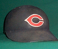
Two weeks ago, while writing about the amazing Vintage Card Traders site, I mentioned the old flocked helmets that the Pirates used to wear. That prompted a note from reader Josh Curran, who pointed me toward this photo of a flocked Reds helmet — the first one I’ve ever seen. In fact, the only other photos of flocked helmets that I have handy are these shots of Mickey Mantle and Manny Sanguillen (also note Duke Sims’s brimless catching helmet), although I know there were other fuzzy-helmeted players out there. This would be a good research project, so if anyone knows of other players who wore the flocked domes (preferably not from the Pirates), let me know.
That Reds photo, incidentally, comes from Dave Grob’s page on the Crosley Field site, both of which are friggin’ gold mines. Grob, a serious collector of game-used unis, has loads of great photos. Among the many highlights:
• Here’s one of Ted Kluszewski’s jerseys, with the sleeves tailored extra-extra short (not just torn off, as is often mistakenly reported).
• The Reds briefly experimented with putting player names below the uni number, instead of above. Here’s another shot.
• Lots of good sleeve patches on display here, including the WWII-era star-spangled shield and “Health” emblems, the National League’s 75th-anniversary patch (note the slight differences between that version and this one), and the baseball centennial patch.
• Lots of cool personalized tagging too, as seen here, here, and here.
• Most people don’t realize that the Giants’ colors were once red and blue.
• Check out this nifto uni-numbered jacket sleeve.
• Thing of beauty, no?
There’s more on Grob’s page — see for yourself. And the rest of the Crosley Field site has even more, including the evolution of Mr. Redlegs (1956, 1957, 1958, 1960, 1961, 1962, 1963, 1965, 1967), tons of old stadium photos (look here, here, here, and here), and this totally boss usher’s cap (dig the caned brow panel!), among other treats. Well worth exploring.
Quiz Results: I’ve put the results of the Distant Replays gift card raffle into a separate blog entry, which you can find by scrolling down to the post below this one.
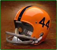
But wait, before you do that”¦: We’ve got another giveaway. The good folks at Helmet Hut are donating a free helmet from their Gridiron Memories online store. The lucky winner will be able to choose from any non-autographed college helmet on the site. They have killer stuff, as you can see from the models shown here, here, and here (the full inventory is here), and I can personally vouch for the incredibly authentic workmanship on these reproductions, right down to the stitching patterns on the fabric used in the interior web suspensions.
No time-consuming quiz this time, either. Just send an e-mail to helmetraffle at earthlink dot net (please note that this is not the usual Uni Watch address) and that’s it, you’re entered. I’ll choose the winner at random from all the entries received by next Monday at 9pm eastern time. I probably won’t even open these e-mails, so don’t bother writing anything clever — just think of it as putting your name in a hat. There’s no downside to entering, so everyone should do it.
Only one entry per person, but I’m going to stack the deck ever so slightly, like so: Everyone who’s donated to the cause by ordering Uni Watch temporary tattoos over the past couple of weeks will automatically have their names put into the hat a second time — a small gesture of thanks for supporting the site. And I’ll extend that same benefit to anyone who donates between now and next Monday. Same terms as before: $1 apiece for the first five tats, 50 cents apiece after that, with a five-tat minimum. PayPal those retirement funds to paul_lukas at earthlink dot net.
Uni Watch News Ticker: The Blues, desperate for offense, cloned Brett Hull last night. Okay, they actually just retired his number, which meant everyone had to endure that now-trite routine where all the players wore his jersey during pregame warm-ups. … Rob Bironas’s pants appear to be beltless (which is particularly odd considering the Titans have those little belt buckle sleeves). ”¦ Nice job by Bill Blewett, who writes: “Last night SDPBS had on a program about the history of South Dakota high school football, called 100 Years, 100 Yards, and I was able to snap some pics of some of the better get-ups. This one‘s from 1908. I wasn’t able to catch a year on this one, but that’s some pretty nice striping. The next one is from the 1954 six-man Claremont Honkers — unfortunately, this was the best pic I could get. It really doesn’t do these vertical stripes justice. Next is some numbering I thought was cool from the 1954 Sioux Falls Washington High team. The last ones are a few basketball pics they had thrown in throughout the program — nice socks on the defender, and some cool belt and chest striping.” ”¦ Chad Klenk usually only writes in to talk about Ohio State, but today he’s got the 1984 Orange Bowl on his mind: “They recently showed the game as one of those ‘Classic Replays’ that ESPN does. They had Turner Gill and Bernie Kosar making comments throughout the game, and one of the topics they specifically talked about was that two Nebraska DBs actually switched jersey numbers before the game. They showed an old newspaper article covering the switcheroo, but I was unable to find it — although I think I found a link to where that article can be purchased for $2.95″ (and the link provides a good summary, too). ”¦ Marquette news, courtesy of Dan Kinderman, who quotes a local newspaper columnist thusly: “Coach Tom Crean has been affiliated with Nike since coming to MU in 1999. And since the Golden Eagles advanced to the Final Four in 2003, they’ve been designated as an Elite program by the shoe company, meaning they receive one of the best outfitting deals around. Their gear could have a new look next season, though, thanks in large part to former MU star and 2006 SI Sportsman of the Year Dwyane Wade. Crean has been in discussions with Converse — the company Wade has endorsed since entering the NBA in 2003, and has since been purchased by Nike — to switch over. Assuming the deal goes through, the Golden Eagles will become the lone team in college basketball to sport ‘Brand Wade’ uniforms and shoes.” … Speaking of Wade, how the hell did he end up wearing a Nike jersey on SI’s cover this week? The Adidas people can’t be happy about that. … I had some boxing on the tube as I was working on this blog entry. Wasn’t paying close attention to it, but at one point I looked up and was surprised to see that one of the fighters was wearing faux stirrup baseball socks. … Good breakdown of Cavs uni history here (with thanks to Justin Kadis). … Disturbing bit of logo creep unearthed by Jeremy Brahm: “I just saw an article apples in Japan with the Hanshin Tigers logo on them. Before the summer, the apples had tape placed on their skin, which turned the taped areas white as the apples grew.”
1
good morning
Logos on apples? Only the Mets and Yankees should do this – being in “The Big Apple” and all that….
Just found another team that used link. Here’s a link.
The person in this auction wants Y60,000… not cheap!
[quote comment=”27113″]Logos on apples? Only the Mets and Yankees should do this – being in “The Big Apple” and all that….[/quote]
Just kidding of course – but hey, don’t put it past the Mets – they already have team branded Bud Light Aluminum bottles they sell at Shea.
The Hanshin Tiger apples are logo creep?
I’d much rather see team-logoed products than product-logoed teams!
Heh, you were watching SNY, good man.
I can see where D. Wade would wear a Nike jersey if they are the parent company for Converse. All of this would have been avoided had he just tucked his jersey in. Or maybe the logo creep was intentional. Nah…
I know they’re in bed together, but Adidas does the NBA unis now, not Reebok.
I gotta say, the Cavs had some real stinkers in their history. I really don’t like link very link. link are bad, but I think that’s a result of that disgusting yellow/orange color. I don’t even need to say anything about link (link). But of all the bad uniforms I think link link link link.
Of course they did have some winners. link, and link.
Sorry the first link should link to link.
[quote comment=”27120″]I can see where D. Wade would wear a Nike jersey if they are the parent company for Converse. All of this would have been avoided had he just tucked his jersey in. Or maybe the logo creep was intentional. Nah…[/quote]
Good point. Since the current NBA uni provider is adidas, the choices were: (1) wear jersey w/adidas logo and piss off Converse/Nike; (2) dig up Nike jersey to keep it “all in the family”; or (2) cover up or hide the logo. The third choice would’ve been easy to pull off (obviously), so my guess is that it was a conscious effort to provide free advert for parent Nike.
link
I was catching up on some Champions League play from Europe yesterday, and caught the Barca-Bremen highlights. Lo and behold, what sponsor do I see on Barca’s jersey? link.
While I was worried about my Halloween donations going to sponsor a Euro-based soccer team, a little Internet research showed that “On 7 September 2006, an agreement between UNICEF and the Catalan club FC Barcelona was reached whereby the club would donate 0.7% of its total yearly revenue to the organization for five years. As part of the agreement, FC Barcelona will wear the UNICEF logo on the front of their shirts, which will be the first time the organization would have such a sponsorship deal with a sports club.”
Glad to see big-time sports is helping children around the world. I thought this story might be appropriate with this giving time of year. :o)
Teebz:
I read that blog on Sportsnet.ca about the Blue Jays’ uni’s, that’s awesome, at least it’s a topic in Canada, maybe something will get done correctly this time.
the link that was posted yesterday to kansas wearing the yellow…
it didnt work…
whomever posted that, could you try again?
or save the picture, host it on tinypic and then put the link?
im interested seeing the yellow…
[quote comment=”27146″]Teebz:
I read that blog on Sportsnet.ca about the Blue Jays’ uni’s, that’s awesome, at least it’s a topic in Canada, maybe something will get done correctly this time.[/quote]
I agree. Maybe Eric Gagne, if he gets signed by the Jays, can bring some Dodger blue with him.
Teebz, does that mean FC Barcelona is paying UNICEF to put its name on their shirts? Cool.
It looks like all the Hull warm-up jerseys were in fact autographed by Brett (at least the two in that picture are). I wonder if they’re souvenirs for the players or if they are going to be put on some sort of charity auction.
The movie 61* was chock full of period flocked helmets, although I don’t know whether they were reproductions or mock-ups.
[quote comment=”27150″]Teebz, does that mean FC Barcelona is paying UNICEF to put its name on their shirts? Cool.[/quote]
You got it, Burrill. I thought that was pretty cool that a team built to make money would exchange a huge sponsorship placard for less advertising revenue and end up paying the company on their shirt a portion of their revenue.
Charity begins at home, I guess. I’m now going to hunt down a Barca jersey, and wear it with pride.
[quote comment=”27151″]It looks like all the Hull warm-up jerseys were in fact autographed by Brett (at least the two in that picture are). I wonder if they’re souvenirs for the players or if they are going to be put on some sort of charity auction.[/quote]
Auction.
Experiment indeed.
Thatlink isn’t really a finished work. The numbers aren’t aligned with each other and the name’s not centered. If it were done right, it would look darn good, though.
[quote comment=”27139″]I was catching up on some Champions League play from Europe yesterday, and caught the Barca-Bremen highlights. Lo and behold, what sponsor do I see on Barca’s jersey? link.
While I was worried about my Halloween donations going to sponsor a Euro-based soccer team, a little Internet research showed that “On 7 September 2006, an agreement between UNICEF and the Catalan club FC Barcelona was reached whereby the club would donate 0.7% of its total yearly revenue to the organization for five years. As part of the agreement, FC Barcelona will wear the UNICEF logo on the front of their shirts, which will be the first time the organization would have such a sponsorship deal with a sports club.”
Glad to see big-time sports is helping children around the world. I thought this story might be appropriate with this giving time of year. :o)[/quote]
This was FC Barcelona’s first kit deal, mad respek to the Champions League, er, champions.
link
I can’t find the link to the sports quiz results.
You may have heard how Bud/Miller is the official beer sponsor of your favorite ball club, but the Hanshin Tigers “official” link by Japanese beer giant Asahi.
The perfect complement is, of course, a link minicar. And it’s not JUST a yellow car, it plays the Tiger theme song when you open the doors.
Full press release here: link
I could go on, Japanese marketing is madness.
Does anybody know how to alter a jersey, and post it? I wanna try something with the Blue Jays.
The cheerleader uni topic was great yesterday. So, I had to add my 2 cents. link has photo galleries of NBA, NFL, and college cheerleaders each week. Here are som USC Song Girl shots:
link
link
link
The only thing that would make me pick USC over Notre Dame!
Never mind it, I found the quiz answers.
Barca needs some QC in outfitting its link.
[quote comment=”27172″]The cheerleader uni topic was great yesterday. So, I had to add my 2 cents. link has photo galleries of NBA, NFL, and college cheerleaders each week. Here are som USC Song Girl shots:
link
link
link
The only thing that would make me pick USC over Notre Dame![/quote]
The USC chearleaders make me physically ill with how good they look. Their uniforms may be the greatest chearleader uniforms in the history of man. And who would have thought seeing as how they are some of the least revealing.
[quote comment=”27158″]Experiment indeed.
Thatlink isn’t really a finished work. The numbers aren’t aligned with each other and the name’s not centered. If it were done right, it would look darn good, though.[/quote]
I’m sure there’s a rational reason for this, but why does the name angle away from the number? Shouldn’t the beginning and end of the name point upward so that it “surrounds” the number like it does when at the top on regular, non-vest jerseys?
Watched the Browns on replay last night on the Network, I noticed their jackets for the sidelines has the Brown guy on the back, I couldn’t find a pic of the jacket with Mr.Brown on it. It looked like old time Browns from the 60’s.
I wonder if they’re gonna wear those excellent throwbacks, even though their normal uni’s are one of the tops in the league. Those helmets with numbers on them rock, imagine with just one number on them though? not too shabby.
Is it so much to ask for a single pair of blue socks??
Just thought a link directly to the link might be more appropriate.
Gut Numbers
Here’s yet another blog making uni-related commentary at link. Steve Czaben posts some excellent observations from Dave Mann regarding the uniform number location on the NY Giants jersey. “Gut numbers” – hilarious.
[quote comment=”27126″]I gotta say, the Cavs had some real stinkers in their history. I really don’t like link very link. link are bad, but I think that’s a result of that disgusting yellow/orange color. I don’t even need to say anything about link (link). But of all the bad uniforms I think link link link link.
Of course they did have some winners. link, and link.[/quote]
The orange CAVS with round white numbers are probably my all-time favorite basketball jersey period.
It’s a shame they were somewhat short-lived. I wasn’t big on the blue road jersey with CLEVELAND spelled out.
I found a group on facebook that wants to change UMBC(University of Maryland, Baltimore County)’s mascot from the chesapeake bay retreivers to the ninjas. They made up a new logo and everything,and it’s pretty awesome, but now I can’t find the group to link to it. Anyone else out there on facebook that can find it?
[quote comment=”27183″]I found a group on facebook that wants to change UMBC(University of Maryland, Baltimore County)’s mascot from the chesapeake bay retreivers to the ninjas. They made up a new logo and everything,and it’s pretty awesome, but now I can’t find the group to link to it. Anyone else out there on facebook that can find it?[/quote]
Can’t find it. There is am All-Encompassing Super Chill Ninja Club, but it’s just a bunch of geeks talking about ninjas.
A comment posted on sportsnet.ca regarding the Blue Jays’ uni’s:
“I’ve got so many ideas for a traditional looking logo for the BLUE Jays, traditonal number fonts, colors, home, away jerseys, just plain and simple, not a like a comic sketch with L.A.Kings black and silver, Devil Ray look-a-like uni’s. This topic is so popuplar, but I just don’t inderstand why “they” won’t do anything about it. The Black Jays should become Canada’s Toronto BLUE Jays once again.
Thanks for this Jamie :D”
The L.A.Kings black and silver is from the Gretzky era.
wait, is Mr. Redlegs wearing a windbreaker under his jersey???
[quote comment=”27177″]I’m sure there’s a rational reason for this, but why does the name angle away from the number? Shouldn’t the beginning and end of the name point upward so that it “surrounds” the number like it does when at the top on regular, non-vest jerseys?[/quote]
Probably just habit that names arch in that direction.
But it the name did arch with ends up around the numerals, it would look like a smiley-face, no?
:-)
[quote comment=”27114″]Just found another team that used link. Here’s a link.
The person in this auction wants Y60,000… not cheap![/quote]
Maybe I’m crazy…but I’m pretty sure the “black variation” is Navy Blue.
Scroll down towards the middle of link when they talk about the USFL unis…also some pictures on there
Off topic here, but last night I watched the Sabres v. Lightning game and after Lecavalier scored and raised his arms, it looked like their were either slits cut in the underarms of his jersey, or there is some sort of decorative line detail printed. Unfortunately, my attempt at a screen grab didn’t come out. Anyone know anything about this?
Found a pic on Lecavalier:
link
link from last night.
In additional soccer news (bear with us soccer supporters)…
MLS club, Colorado Rapids unveiled their new kits this week as well.
link
They have similar colors to West Ham United and Aston Villa.
[quote comment=”27200″]Off topic here, but last night I watched the Sabres v. Lightning game and after Lecavalier scored and raised his arms, it looked like their were either slits cut in the underarms of his jersey, or there is some sort of decorative line detail printed. Unfortunately, my attempt at a screen grab didn’t come out. Anyone know anything about this?[/quote]
They’re decorative lines. Why they’re there is anyone’s guess, but they’ve had them there for sometime now. The lines go white-grey-blue-grey-white in Lightning colours.
I guess your armpits have to look stylish after scoring a goal.
I’ve heard the Lightning’s armpit stripes referred to as “Victory Lines”. They’ve been on those uniforms since Tampa entered the league in the early 90s.
[quote comment=”27206″]In additional soccer news (bear with us soccer supporters)…
MLS club, Colorado Rapids unveiled their new kits this week as well.
link
They have similar colors to West Ham United and Aston Villa.[/quote]
…and the Colorado Avalanche
[quote comment=”27206″]In additional soccer news (bear with us soccer supporters)…
MLS club, Colorado Rapids unveiled their new kits this week as well.
link
They have similar colors to West Ham United and Aston Villa.[/quote]
Ew…those green shoes really do not go with the color scheme.
From the world of Small College Football, Mt. Union’s cool shoulder patch for their home unis only.
Mt Union Home
Raider’s Logo
Xavier Throwbacks are now being link.
I thought Dre Bly’s pants were bad until I saw link in the other comment section. I guess it’s Stanley Wilson. I thought baseball shorts looked bad.
[quote comment=”27183″]I found a group on facebook that wants to change UMBC(University of Maryland, Baltimore County)’s mascot from the chesapeake bay retreivers to the ninjas. They made up a new logo and everything,and it’s pretty awesome, but now I can’t find the group to link to it. Anyone else out there on facebook that can find it?[/quote]
When I think of the Chesapeake Bay and Baltimore County, I think of…ninjas? It would be silly to change the mascot, as the Chesapeake Bay Retriever is a breed known to enjoy swimming, and is of course, synonymous with the region.
[quote comment=”27181″]Gut Numbers
Here’s yet another blog making uni-related commentary at link. Steve Czaben posts some excellent observations from Dave Mann regarding the uniform number location on the NY Giants jersey. “Gut numbers” – hilarious.[/quote]
The low-riding front numbers are particularly conspicuous when worn with high shoulder pads. Notice they don’t look as bad on link as they do on the receiver (David Tyree?).
Also, I noticed italicized numbers on the Steelers uniforms only this year. When did they start doing this? You would hardly notice from Roethlisbergermeister’s jersey, since a # 7 doesn’t italicize as dramatically as other numbers.
[quote comment=”27198″]Scroll down towards the middle of link when they talk about the USFL unis…also some pictures on there[/quote]
I thought that commercial I saw for a flat screen high def TV showed the Houston Gamblers!
yes, link is a thing of beauty, but everyone here would probably have a heart attack if the braves changed their alt color to black
[quote comment=”27225″]yes, link is a thing of beauty, but everyone here would probably have a heart attack if the braves changed their alt color to black[/quote]
What do you think, Minna?
Has anyone else noticed that with all the talk that Cincinnati should eliminate the horrid black from their uni’s and go back to the more “traditionalâ€Â, uncomplicated, Red and White … yet all the old Reds uniform pictures I’ve seen in today’s blog have STRONG black accents! (I’m not even going to attempt a link here … they NEVER work for me!)
[quote comment=”27228″]Has anyone else noticed that with all the talk that Cincinnati should eliminate the horrid black from their uni’s and go back to the more “traditionalâ€Â, uncomplicated, Red and White … yet all the old Reds uniform pictures I’ve seen in today’s blog have STRONG black accents! (I’m not even going to attempt a link here … they NEVER work for me!)[/quote]
i agree completely
[quote comment=”27212″][quote comment=”27206″]In additional soccer news (bear with us soccer supporters)…
MLS club, Colorado Rapids unveiled their new kits this week as well.
link
They have similar colors to West Ham United and Aston Villa.[/quote]
…and the Colorado Avalanche[/quote]
What a wasted oportunity for some great striped socks, it could’ve been so link…
[quote comment=”27203″]link from last night.[/quote]
More Xavier throwback photos link.
sorry, can’t get the link to work
link
[quote comment=”27225″]yes, link is a thing of beauty, but everyone here would probably have a heart attack if the braves changed their alt color to black[/quote]
Probably would. The red alt might work with this scheme though…
The Chesapeake Bay Retriever is the OFFICIAL state dog of Maryland….state sport: jousting. Go figure. And no it’s not the jousting you see in the movies…these guys jousting for rings that look like donuts hanging from a string. I grew up in MD and think it’s the greatest state in the world, but some things just dont make sense. As far as UMBC goes…it is sometimes referred to as UCLA: University of Catonsville, Left of Arbutus. If you live or know the Baltimore area at all, you’ll get it, otherwise nevermind.
On a side note….I am waiting for the day that a MD team (professional or amateur) decides to name themselves the Maryland Blue Crabs….too bad the Ravens chose an ugly bird.
[quote comment=”27213″][quote comment=”27206″]In additional soccer news (bear with us soccer supporters)…
MLS club, Colorado Rapids unveiled their new kits this week as well.
link
They have similar colors to West Ham United and Aston Villa.[/quote]
Ew…those green shoes really do not go with the color scheme.[/quote]
Yea, those green shoes need to go but I love those unis. Are they going to wear the blue as away jerseys instead instead of having a white?
Love the new Colorado Soccer jerseys. Too bad about .05% of the US population will ever see them.
UMBC should be careful with that Ninja thing. Don’t want to get on another topic like yesterday’s. (Besides, Chesapeake Bay Retrievers are damn fine dogs. Don’t mess with that mascot.)
Swoosh tape now being prepared for distribution to apple orchards in the northwest. Elite, Wade, Air Jordan, and Nike-shoulder-accent tape soon to follow… (that was a joke. Hopefully it stays that way)
[quote comment=”27190″]wait, is Mr. Redlegs wearing a windbreaker under his jersey???[/quote]
well… ahhhh… yes. You see the picture was taken during spring training when he is working off winter’s heavy drinking.
[quote comment=”27239″]
On a side note….I am waiting for the day that a MD team (professional or amateur) decides to name themselves the Maryland Blue Crabs….too bad the Ravens chose an ugly bird.[/quote]
Yeah, the whole Ravens idea is stupid and is lost on most of the fan base (named so in honor of Edgar Allan Poe, who was a notable Baltimore area drunkard and gothic poet/novelist). A raven does not lend itself to elegant uniform design.
[quote comment=”27243″]
UMBC should be careful with that Ninja thing. Don’t want to get on another topic like yesterday’s. (Besides, Chesapeake Bay Retrievers are damn fine dogs. Don’t mess with that mascot.)
[/quote]
As a member of the Samurai order, I am offended by ninjas.
Disappointed in the new Rapids gear. Each link has been for the worse.
“Embrace the colors”, eh? Would that be the green, the blue, the black or the maroon? At this rate there will be Rapids gear in literally every color. Feh.
This is the second Rapids uni to copy another, first Inter Milan and now Aston Villa.
If they’re so set on copying, why not at least stick with the original color set and copy Celtic?
[quote comment=”27225″]yes, link is a thing of beauty, but everyone here would probably have a heart attack if the braves changed their alt color to black[/quote]
Check out the old Reds jersey in the background… #97! I’ve never seen such an outlandish number* on a jersey from the old days; this was before numerous minor leaguers were invited to Spring Training, right? What’s the story with this jersey?
(*: OK, I’ve seen a Bill Voiselle #96 jersey from that era. But he had a perfectly good reason to wear “96”; it was his home town!)
[quote comment=”27228″]Has anyone else noticed that with all the talk that Cincinnati should eliminate the horrid black from their uni’s and go back to the more “traditionalâ€Â, uncomplicated, Red and White … yet all the old Reds uniform pictures I’ve seen in today’s blog have STRONG black accents! (I’m not even going to attempt a link here … they NEVER work for me!)[/quote]
I think everyone’s clamoring for the clean, simple uni of the Big Red Machine era link
Or even the Larkin Era link
Let’s try that again
link
link
[quote comment=”27256″]Let’s try that again
link
link[/quote]
LOVE those low stirrups. I used to hate them as a kid. I always wanted mine to show a lot of calf, but those look great with the black spikes.
[quote comment=”27225″]yes, link is a thing of beauty, but everyone here would probably have a heart attack if the braves changed their alt color to black[/quote]
Although the tomahawk looks black in these photos (they are kind of dark, at least on my laptop screen), I’m pretty sure it was dark navy blue in the originals. It has always looked navy to me whenever I thumbed through “Baseball Uniforms of the 20th Century” (which is also the artwork used on the “Dressed To The Nines” website for years prior to 1995).
Regarding the apples, it’s a common practice, even in the United States. But not for logos or teams, mainly just for the holidays. My uncle used to own a large apple orchard in Washington and he worked with fundraising companies that sell fruitbaskets for the holiday season. When the apples are still young (I don’t know exact time for sure) a design is created–Christmas trees, wreaths, etc. You can even get a dozen apples and each one has a number for the 12 Days of Christmas. He never used tape though…it was something a little more advanced but I’m not sure what it was. In the end, the tape or whatever is used is pulled off and it appears like the symbol has been “burned” onto the apple. I guess Japan just chose to use a team symbol.
About the UMBC retrievers- I think a retriever is a great dog, but as a mascot? I’m just saying, that dog painted on the middle of the turf isn’t exactly intimidating (of course, my school’s mascot is “the red flash”, so i don’t have much room to talk)
but ninjas…those kids would be the envy of every other college student in the country.
[quote comment=”27228″]Has anyone else noticed that with all the talk that Cincinnati should eliminate the horrid black from their uni’s and go back to the more “traditionalâ€Â, uncomplicated, Red and White … yet all the old Reds uniform pictures I’ve seen in today’s blog have STRONG black accents! (I’m not even going to attempt a link here … they NEVER work for me!)[/quote]
I think this is like the photo of the Braves jersey – the old accents were dark navy (the Yankees color), not black. The photos just show up dark.
However, dark trim is dark trip, that’s why the Reds most recent set never bothered me that much; they were wearing the sleeveless set with navy trim (like the Rose jersey) when I was born. I wish I still had it, but for many years I had a circa 1965 white home cap, and remember it having navy blue trim around the C.
I’ve always liked link Reds uniforms that they wore in the 90s… they’re the only white hats ive ever liked…
RE: UMBC, I never thought I’d see the day when my alma mater showed up on Uni Watch. I’m brimming with pride.
I don’t know what’s up with the ninja thing except to say that there seem to be a lot of wannabe hipsters (not much different than real hipsters) around here who have started fetishizing ninjas. Pretty lame.
ns
[quote comment=”27271″]I’ve always liked link Reds uniforms that they wore in the 90s… they’re the only white hats ive ever liked…[/quote]
I like the home uni A LOT. Not a big fan of pinstripes on road greys though. Deion rocked this uni baggy with high pants if I remember right. Kind of like Juan Pierre.
Hey, since we’ve been talking about UMBC on here, i figured i’d bring this up- I found out about that group when I was joining one to bring back the UMBC field hockey program. It was cut recently, and there’s a movement to bring it back. You can go to the link below and sign the petition to bring it back
link
here’s the facebook group which gives an explanation on why it got cut and why it should be brought back-
link
link
Great site showing a series of jerseys better than the new Reds designs. And the Reds should have kept a vest as a tribute to the Klu…
The UMBC Mascot: Current
UMBC
[quote comment=”27269″]About the UMBC retrievers- I think a retriever is a great dog, but as a mascot? I’m just saying, that dog painted on the middle of the turf isn’t exactly intimidating (of course, my school’s mascot is “the red flash”, so i don’t have much room to talk)
but ninjas…those kids would be the envy of every other college student in the country.[/quote]
You gotta be kidding….’the envy of every other college student in the country’ ???? are you serious? Perhaps every student that ‘s into ‘G Force’…
[quote comment=”27206″]In additional soccer news (bear with us soccer supporters)…
MLS club, Colorado Rapids unveiled their new kits this week as well.
link
They have similar colors to West Ham United and Aston Villa.[/quote]
What’s up with the projection on the screen behind the players? It look like its showing jerseys with some design elements around the shoulders, back of the neck, and near the waist that aren’t on the jerseys the players are wearing. Are the players’ jerseys just to show the colors, or are they the real deal?
[quote comment=”27265″]Regarding the apples, it’s a common practice, even in the United States. But not for logos or teams, mainly just for the holidays. My uncle used to own a large apple orchard in Washington and he worked with fundraising companies that sell fruitbaskets for the holiday season. When the apples are still young (I don’t know exact time for sure) a design is created–Christmas trees, wreaths, etc. You can even get a dozen apples and each one has a number for the 12 Days of Christmas. He never used tape though…it was something a little more advanced but I’m not sure what it was. In the end, the tape or whatever is used is pulled off and it appears like the symbol has been “burned” onto the apple. I guess Japan just chose to use a team symbol.[/quote]
although the topic of my beloved reds and their unis is on tap today, i for some reason am going to talk about apples. i remembered seeing a story a few years back about how some orchard in washington was branding apples with university of washington and washington state logos. after typing “logo apples” in google (something i never thought i would search for, thanks Paul), i found the article, link it is.
[quote comment=”27271″]I’ve always liked link Reds uniforms that they wore in the 90s… they’re the only white hats ive ever liked…[/quote]
not the ice-cream man hats! the horror (and that comes from a lifelong reds fan)
[quote comment=”27276″]The UMBC Mascot: Current
UMBC[/quote]
Those mascots are FIERCE !
Nothing wrong with the canine mascot, certainly a far shout better than say……. Syracuse. Now if you had a Native American dressed as a Chesapeake Bay Retriever, that would be offensive.
You gotta be kidding….’the envy of every other college student in the country’ ???? are you serious? Perhaps every student that ’s into ‘G Force’…
Ok, you’re clearly taking a joke wayyy too seriously. I just thought it was funny, esp. since the people who created the facebook group went to the trouble of coming up with logo (which I couldn’t find a link for).
And what the heck is “G Force”?
I want to see Cleveland wearing their link jerseys instead of the link ones.
[quote comment=”27148″]the link that was posted yesterday to kansas wearing the yellow…
it didnt work…
whomever posted that, could you try again?
or save the picture, host it on tinypic and then put the link?
im interested seeing the yellow…[/quote]
Todd, it is a link to a video. You can make out Danny Manning in the all yellows. Hopefully some better pictures will surface.
Let me know if you still have problems with this link. Scroll to the bottom of the page.
link
[quote comment=”27277″][quote comment=”27269″]About the UMBC retrievers- I think a retriever is a great dog, but as a mascot? I’m just saying, that dog painted on the middle of the turf isn’t exactly intimidating (of course, my school’s mascot is “the red flash”, so i don’t have much room to talk)
but ninjas…those kids would be the envy of every other college student in the country.[/quote]
You gotta be kidding….’the envy of every other college student in the country’ ???? are you serious? Perhaps every student that ‘s into ‘G Force’…[/quote]
Pretty much, yeah, I’m surprised nobody has brought this up because link
Facts:
1. Ninjas are mammals.
2. Ninjas fight ALL the time.
3. The purpose of the ninja is to flip out and kill people.
link
[quote comment=”27151″]It looks like all the Hull warm-up jerseys were in fact autographed by Brett (at least the two in that picture are). I wonder if they’re souvenirs for the players or if they are going to be put on some sort of charity auction.[/quote]
Some, but not all, were auctioned off at the game last night.
Its been done link.
When I think of Connecticut, I think of ninjas
Silly AF2, ninjas don’t wear link.
Please stop with the racial jokes and the ninja jokes. While I am sure most of you mean no harm, it is wearisome, and, yes, offensive to me. Some of you were put off by yesterday’s topic because it’s not what you came here for. Well, what’s going on today is not what I come here for. Those who have been here a while know that I am not humorless, but I don’t find it funny at all.
Burrill, as you know by now, anything is better with black.
Oh, and something relevant:
link
That was really cool what the guy did on the apples with the UW and Wash St. logos. I envy the steady hand that had to cut and place those stickers. That guy could really make some cash if he sold out to some other universities. Or, better yet, we’ll start a new bowl game called the “Apple Bowl” (sponsored by Granny Smith, of course), and each team gets a bowl full of school logoed apples.
…I don’t know how much of that was actually a joke in my mind…now that I think about it, that could end up being really good marketing idea for this guy.
racial comments?
Check out this strange and interesting article about electronic basketball jerseys being used in Australia:
link
[quote comment=”27271″]I’ve always liked link Reds uniforms that they wore in the 90s… they’re the only white hats ive ever liked…[/quote]
Yes! Those were great.
I think pinstripes look best on road greys.
See Pittsburgh, Minnesota, San Diego unis past and present.
[quote comment=”27203″]link from last night.[/quote]
Those are nice but I would have worn them on a national TV game to gain a larger audience.
[quote comment=”27318″]Check out this strange and interesting article about electronic basketball jerseys being used in Australia:
link[/quote]
Clever idea.. but for some reason I dont see it actually being used. Doesn’t quite make the uniforms ‘uniform’.
[quote comment=”27246″][quote comment=”27239″]
On a side note….I am waiting for the day that a MD team (professional or amateur) decides to name themselves the Maryland Blue Crabs….too bad the Ravens chose an ugly bird.[/quote]
Yeah, the whole Ravens idea is stupid and is lost on most of the fan base (named so in honor of Edgar Allan Poe, who was a notable Baltimore area drunkard and gothic poet/novelist). A raven does not lend itself to elegant uniform design.[/quote]
Do you really want to root for a team with elegant uniform design? NFL Fans will buy gear regardless of how un-elegant a uniform is.
[quote comment=”27278″]What’s up with the projection on the screen behind the players? It look like its showing jerseys with some design elements around the shoulders, back of the neck, and near the waist that aren’t on the jerseys the players are wearing. Are the players’ jerseys just to show the colors, or are they the real deal?[/quote]
The design elements you are seeing are likely just the stitching, enhanced to show the different panels. It’s not uncommon. Here’s the image that is showing behind them:
link
[quote comment=”27320″][quote comment=”27203″]link from last night.[/quote]
Those are nice but I would have worn them on a national TV game to gain a larger audience.[/quote]
Xavier wore the throwbacks last night because they were playing their old Midwestern City Conference (MCC) rival, Detroit. Xavier had not played Detroit since their final year in the MCC, ’94-’95.
It was more about wearing the throwbacks in honor of the past tradition between the two teams.
[quote comment=”27329″][quote comment=”27320″][quote comment=”27203″]link from last night.[/quote]
Those are nice but I would have worn them on a national TV game to gain a larger audience.[/quote]
Xavier wore the throwbacks last night because they were playing their old Midwestern City Conference (MCC) rival, Detroit. Xavier had not played Detroit since their final year in the MCC, ’94-’95.
It was more about wearing the throwbacks in honor of the past tradition between the two teams.[/quote]
I see. More of an homage to the Tyrone Hill years than simply wearing a throwback for throwback’s sake.
I definitely like this idea of scheduling old league foes and wearing the old jerseys.
Maryland will soon be getting it’s first professional team to be known as the Blue Crabs:
link
link
in the comment section of the quiz there is a picture of link to answer Paul’s question about players wearing glasses in the NHL. He is wearing #18, but his glove says #62. Am I seeing things, or is there a reason for this?
Upon further review, while playing captain for the blues, link wore #3 and notice his glove
[quote comment=”27239″]The Chesapeake Bay Retriever is the OFFICIAL state dog of Maryland….state sport: jousting. Go figure. And no it’s not the jousting you see in the movies…these guys jousting for rings that look like donuts hanging from a string. I grew up in MD and think it’s the greatest state in the world, but some things just dont make sense. As far as UMBC goes…it is sometimes referred to as UCLA: University of Catonsville, Left of Arbutus. If you live or know the Baltimore area at all, you’ll get it, otherwise nevermind.
On a side note….I am waiting for the day that a MD team (professional or amateur) decides to name themselves the Maryland Blue Crabs….too bad the Ravens chose an ugly bird.[/quote]
i thought Maryland just did crab cakes and football…
NEW BRAIN BUCKETS!!!
Watching the Senators-Capitals game tonight, I see that Ovechkin is wearing a new CCM helmet. Still somewhat styled on the old template, although this is a bit more angular, and resembles the Mission helmet.
There is also a new brand mark for CCM, which has an angular font. (Too back, because link is an awesome and classic logo.)
I don’t see anything on their website advertising this new model, so I get a feeling that they might not yet be selling it.
Will post a picture when one becomes available.
[quote comment=”27240″][quote comment=”27213″][quote comment=”27206″]In additional soccer news (bear with us soccer supporters)…
MLS club, Colorado Rapids unveiled their new kits this week as well.
link
They have similar colors to West Ham United and Aston Villa.[/quote]
Ew…those green shoes really do not go with the color scheme.[/quote]
Yea, those green shoes need to go but I love those unis. Are they going to wear the blue as away jerseys instead instead of having a white?[/quote]
Speaking of green soccer/futbol shoes, have you seen these nasty things featuring a nice grass pattern?
link
[quote comment=”27333″]Upon further review, while playing captain for the blues, link wore #3 and notice his glove[/quote]
Check out the picture pof Garth Butcher in the link above . . .it’s a collage of Blues’ Captains, but Butcher is CLEARLY wearing a Canucks jersey
[quote comment=”27338″][quote comment=”27333″]Upon further review, while playing captain for the blues, link wore #3 and notice his glove[/quote]
Check out the picture pof Garth Butcher in the link above . . .it’s a collage of Blues’ Captains, but Butcher is CLEARLY wearing a Canucks jersey[/quote]
closing the link
I actually like the grass-patterned Puma v1.06 shoes.
I don’t like the willy-nilly color changes in MLS (though I won’t complain about my Red Bull because we just got two designated spots and we’re bound to have a nice infusion of cash from Red Bull), but Villa wear my favorite kits in England. One issue is the shirts look very out of place without the contrasting shorts.
You think we could get a hooped team in MLS? Hoops are great.
[quote comment=”27342″]I actually like the grass-patterned Puma v1.06 shoes.
I don’t like the willy-nilly color changes in MLS (though I won’t complain about my Red Bull because we just got two designated spots and we’re bound to have a nice infusion of cash from Red Bull), but Villa wear my favorite kits in England. One issue is the shirts look very out of place without the contrasting shorts.
You think we could get a hooped team in MLS? Hoops are great.[/quote]
FC Dallas is hooped, they just aren’t green hoops. The color changes in MLS don’t bother me, in part because if you look at the first ten years on English teams, they changed colors almost as much. Also, MLS teams have had some *awful* color combinations. I am fine with them changing, so long as it’s constantly an improvement.
Completelty off topic but I am the only one who believes that the NBA refs should go back to the link instead of the link. I also noticed in tonight’s Bulls-Sixers game that the refs have 3 blue stripes on each shoulder going down to the arm. I can’t find any pictures so I assume thats new? Anyone know?
[quote comment=”27339″][quote comment=”27338″][quote comment=”27333″]Upon further review, while playing captain for the blues, link wore #3 and notice his glove[/quote]
Check out the picture pof Garth Butcher in the link above . . .it’s a collage of Blues’ Captains, but Butcher is CLEARLY wearing a Canucks jersey[/quote]
closing the link[/quote]
I also think they screwed up on the chronology. I have cards of Garry Unger wearing the C thru 1976-77, and if you notice there’s no accounting for that time period in the set of pictures.
By the way, the uniforms worn in that picture of Arbour is one of the best (IMO) hockey unis EVER. Perhaps only trailing the Rangers unis of that 1970-73 era. I’d love to post pictures to strengthen my point, but there must be a better way to link pictures.
What kind of strange biking helmet is the catcher wearing in that Manny Sanguillen photo?
[quote comment=”27346″]Completelty off topic but I am the only one who believes that the NBA refs should go back to the link instead of the link. I also noticed in tonight’s Bulls-Sixers game that the refs have 3 blue stripes on each shoulder going down to the arm. I can’t find any pictures so I assume thats new? Anyone know?[/quote]
Yes, that’s a new wrinkle, part of the NBA’s new deal w/ Adidas.
[quote comment=”27346″]Completelty off topic but I am the only one who believes that the NBA refs should go back to the link instead of the link. I also noticed in tonight’s Bulls-Sixers game that the refs have 3 blue stripes on each shoulder going down to the arm. I can’t find any pictures so I assume thats new? Anyone know?[/quote]
Jim H: Yeah, check out the Adidas website
Watching the Memphis-Tennessee game right now and the Memphis uniforms are the ugliest I can remember since link.
Sorry I can’t find a better picture…
NBA dropping the ball?
RE: The Ninja Mascot
I found the Facebook group.
here’s pictures of their logo:
link
link
link
and a link advocating the change
for those with a facebook account, here’s the link to the group page
Tonight at the Indiana-Western Illinois basketball game, Armon Bassett was wearing his normal white adidas shoes in the first half, but came out in the 2nd half with solid red adidas shoes. This is the first time I’ve seen an IU player wear solid red shoes in a game. (sorry no pics yet) Does anyone else know if its ever happened before?
[quote comment=”27172″]The cheerleader uni topic was great yesterday. So, I had to add my 2 cents. link has photo galleries of NBA, NFL, and college cheerleaders each week. Here are som USC Song Girl shots:
link
link
link
The only thing that would make me pick USC over Notre Dame![/quote]
The second and third pictures of are not of a USC Song Girl, she is a USC Spirit Leader. It’s something new they started this year to get the crowd more involved in the game after dumping the Sweater-clad male yell leaders.
Also, since there is so much talk about USC’s Song Girls the past two days. You can buy a USC song girl sweater and a similar looking skirt (w/o pleats) from the bookstore and give it to a girl friendf or wife as a gift ;-)
link
This is brand new stuff as he was wearing link as of Saturday.
Speaking of green soccer/futbol shoes, have you seen these nasty things featuring a nice grass pattern?
link
You can also get these grass patterned Puma link
Better yet, link
I don’t see that concept going anywhere fast.
I’m on a roll with double reply posts today.
[quote comment=”27336″]NEW BRAIN BUCKETS!!!
Watching the Senators-Capitals game tonight, I see that Ovechkin is wearing a new CCM helmet. Still somewhat styled on the old template, although this is a bit more angular, and resembles the Mission helmet.
There is also a new brand mark for CCM, which has an angular font. (Too back, because link is an awesome and classic logo.)
I don’t see anything on their website advertising this new model, so I get a feeling that they might not yet be selling it.
Will post a picture when one becomes available.[/quote]
Yeah I saw that as well. It looks like the CCM logo is italic and futuristic, kinda ugly. Also, Ovechkin was using the new Vector stick for the first time. THey made a new one because his old one broke too many times, but he broke this one twice in the first period. Clearly CCM has a ways to go
It’s fun to see Red Berenson in those old hockey pictures, too — I just know him as Michigan’s hockey coach. I like seeing pictures of him as a player.
[quote comment=”27344″][quote comment=”27342″]I actually like the grass-patterned Puma v1.06 shoes.
I don’t like the willy-nilly color changes in MLS (though I won’t complain about my Red Bull because we just got two designated spots and we’re bound to have a nice infusion of cash from Red Bull), but Villa wear my favorite kits in England. One issue is the shirts look very out of place without the contrasting shorts.
You think we could get a hooped team in MLS? Hoops are great.[/quote]
FC Dallas is hooped, they just aren’t green hoops. The color changes in MLS don’t bother me, in part because if you look at the first ten years on English teams, they changed colors almost as much. Also, MLS teams have had some *awful* color combinations. I am fine with them changing, so long as it’s constantly an improvement.[/quote]
I’ve thought FC Dallas’ hoops have been “half-way,” but looking again, they’re alright.
About the D-Wayde thing, the Nike logo is covered on subscriber copies of SI, and photo studios often have jerseys around for the players to come in and wear. This is why you’ll see majestic logos on yankee jerseys (there are none on the on-field issue), etc.
For the record, with the jersey untucked, DWade looks like he isn’t wearing any pants.