I’ve periodically mentioned when I’ve acquired new additions to my collection of old uniform catalogs, and several readers have asked to see more of them. So today we’ll take a little stroll through the stacks of the Uni Watch Library.
Some quick background: I generally prefer catalogs from the 1950s or older, for three primary reasons: (1) Uniform design was more interesting in those days; (2) catalog graphic design was more interesting in those days as well; and (3) the older catalogs are more likely to include fabric swatches, which makes the catalog much more appealing. I do have some pieces from the 1960s and ’70s, but those are more the exception than the rule.
As for other preferences, by now you all know what I like: stripes, socks, functional specificity. With that in mind, so here’s a quick rundown of my favorite catalogs from my collection, running from oldest to most recent:
• Sears, Roebuck catalog, 1911, 5.25″ x 7.5″, 36 pages. This is the oldest uniform catalog in my library, and was also the most expensive. How much did it cost? Too much. Then again, considering all the fabric swatches (including a few pinstripes) and cool illustrations (some of them in color), I have no buyer’s remorse.
• Iver Johnson catalog, circa early-1910s, 10.25″ x 7″ (oblong), 12 pages. The only oblong catalog in my collection. Just a dozen pages, but they all have swatches! I especially love the little “Special Discount Price” note, which somebody hand-stamped onto each page and then hand-annotated in addition — a great touch. The whole thing is kinda fragile and falling apart, so I try to handle this one as little as possible.
• Freeplay catalog, 1925, 6″ x 9.25″, 20 pages. At first glance, this doesn’t look like much — boring cover, black-and-white throughout, ho-hum layouts, no swatches. But little treasures are lurking throughout, like the amazing “Girls’ Basket Ball Pants” spread and the note that the youth unis are “For Little Fellows.” Better yet, this catalog came with a mimeographed cover letter, a swatch and braiding sample sheet, and a prepaid reply card. A cornucopia of riches!
• Rawlings catalog, 1932, 7″ x 10.25″, 8 pages. A guy I know at Rawlings found a bunch of old uni catalogs in a closet and made a killing selling them on eBay. Fortunately, he offered a few of them to me first. This was the oldest one, dating to 1932, with a great mix of swatches and illustrations. Dig how those second and third colors really pop off the page!
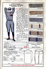
• Rawlings catalog, 1940, 5.5″ x 8.75″, 8 pages. Eight years later, Rawlings had moved to a smaller trim size with fewer swatches and no illustrations. Unspectacular, but still worthwhile due to the lettering and hosiery pages.
• Spalding softball catalog, 1940, 20″ x 27″, two-sided fold-out poster. It’s hard to show the full scope of this one, because it’s too big to scan, but this shot at least gives you some idea of how beautiful it is. And check out that amazing logo — is that a classic or what? Unfortunately, all the fold creases are tearing, so I’m thinking about getting this one mounted and framed.
• MacGregor catalog, circa late 1950s, 7″ x 10″, 28 pages. No swatches but still one of my favorites, thanks to the sci-fi-ish football designs, available with a huge array of striping and trim options. The basketball section is just as good, and the hosiery page features something I’ve never seen anyplace else: a little mini-stirrup for basketball!
• King-O’Shea catalog, circa late 1950s, 8.5″ x 11″, 32 pages. Similar to the MacGregor, but with a two-color design. Some very nice bits here, including a good range of basketball stripes, a choice of stirrup openings (!), and the excellent warm-up jackets page, where customers could opt for a sailor-style collar and chose from a dozen different striping patterns.
• Harv-Al catalog, 1966, 8.25″ x 11″, 78 pages. This Canadian catalog has some truly amazing stuff, including curling sweaters, 13 pages of totally boss jackets, and letter-embroidered girls’ basketball hose. Some weird equipment offerings, too: Check out the “Scoop Models” on this page (especially item No. 299). They’d even sell you a set of beanies!
• Unique catalog, 1970, 8.25″ x 10.5″, 16 pages. Another Canadian catalog, this one devoted entirely to hockey. Not all that remarkable, frankly, but I couldn’t resist the toque page, and a layout like this one is bound to set off a small endorphin rush.
• Champion catalog, 1971, 8.5″ x 11″, 60 pages. A real page-turner, from the football socks and the Lady Champion line to the amazing “Design Your Own Football Jerseys” spread (left page, right page).
So where do I find all these catalogs? eBay, mostly, although a few of them have come my way through other channels. As often happens with eBay niche bidding, I’ve become aware of other collectors who are often bidding against me again and again. One of these people, a guy named Mike Hersh, apparently has a huge collection. He does design work for Ralph Lauren clothing and uses the catalogs for research and reference. He lives in New York, and I’ve been trying to get him to let me come over so I can see what he’s got and maybe write about him, but so far no dice. Mike, if you’re reading this, we’re overdue for that summit meeting, buddy.
Years from now, will anyone be collecting the catalogs of today? It’s always hard to imagine contemporary design being collectable, but that seems especially true in the case of current uni catalogs. Reader Ryan Barto recently pointed me toward this page, where you can download all sorts of Nike catalogs. They’re not particularly appealing, and not just because of all the swoosh-o-rama bullshit. They lack any sense of charm or playfulness, which is what makes the old catalogs so nice.
But I suppose even a Nike catalog could look quaint 20 years from now, when viewed through the lens of nostalgia. And there’s something great about a striping chart, even in 2006.
Uni Watch News Ticker: The Sabres, desperately trying to quell the rapidly building negative reaction to their crummy new logo, attempted to generate a bit of goodwill yesterday by announcing the unveiling of a throwback third jersey. … In case you missed it, yesterday’s comments section included a logo anti-creep alert regarding Marlins pitcher Josh Johnson, whose cap didn’t have the MLB logo on the back on Wednesday night. … By coincidence, yesterday Yahoo Sports ran this All-Star Game photo, which shows that the MLB logo was missing from Johan Santana’s jersey. … Yesterday’s comments also included a lot of chatter about facial hair. You can find some background on that topic here. … Several NBA teams will have anniversary logos next season, including the Pacers, Nuggets, Cavs, and Sonics (clearly the best of the bunch). The Cleveland mark will appear on the team’s new throwback uni; not sure if the others will actually be worn on the court, although the league’s usual protocol is for such logos to appear only on warmup outfits. … I’ve got jury duty today, so talk amongst yourselves. Or better yet, quick, someone file a suit against Major League Baseball demanding the elimination of pajama pants — I’ll pretend to be impartial.
Two things jump out at me here…
IT looks like sometime between 1940 and 1950, “shirts” became “jerseys”. What prompted that?
Also, with all of the abuse poor MLB has been taking for the Cool Base jerseys, it looks like that train left the station back in 1932 when Rawlings had uniforms with “Ventilated Armpits and Crotch”. Cool Base jerseys… Cool “Jewels” pants.
It reminds me of this one incident in high school with some Icy Hot and a jock strap…
Wow, the old Sabres jersey is attractive! Why are designers/marketers (unfortunately, the two go hand-in-hand in sports nowadays) so unwilling to permanently implement great-looking uniforms from the past but, instead, only use them for nostalgia purposes, which (again, unfortunately) also ties into marketing.
NOOOOOOOOOOOOOOOOOOOOOOOOOOOOO!!!!!!
Tell me I did not see that Cavalier travesty. An all orange alt with the terrible Cavs logo with the ball going through the V. I don’t remember that being a uniform back then. The road unis were blue not orange.
And what are they commemorating? Another Cleveland Almost? We almost made it to the series where we almost could have won a title. Are the Browns planning an Ernest Byner commemorative patch? Is the Tribe going to wear a patch of Jose Mesa blowing up in the 9th inning of game 7? How about one where John Elway stomps the hearts of all Browns fans? Or maybe a Red Right 88 patch.
You know it is bad when your town celebrates anniversaries of “almost” with special unis and patches.
Those Sabres throwbacks are the sweetest looking hockey jersey I’ve ever seen…repent Buffalo and go full-time to the throwbacks!!!
BT
On the Sabres Jersey comment.
The NHL is changing over to the slim fit jersey in the next couple of years.
link
According to Larry Quinn,Sabres managing partner, in an interview on WGR550 yesterday; the new jersey design fits the look of the slimmer jersey better than the old jersey style(big and baggy)
Those “scoop” model baseball gloves from the Harv-Al catalog are eerily reminicent of the catching gloves used by hockey goalies…
link
Not too surprising, given that it’s a Canadian catalog, but still, I don’t know that I’ve ever seen anything like it used on a diamond.
Iver Johnson! Who knew? I think they moved more or less exclusively into firearms manufacture later on.
Not only is the orange on the Cavs’ throwback weird, but the typeface is wrong too. Not too sure, but I think the originals used link.
You can see a character map link.
And Paul, would yuo be interested in modern Japanese uniform catalogs? I used to have a couple floating around. They include swatches — the most interesting of which is the designed-for-pinstripes fabric where there are mesh holes on the white parts of the fabric, but no mesh on the colored stripes.
(And could you get rid of the security core required for posting? I lost a longer, more complicated version of this post thanks to it and had to go look up those typeface URLs all over again!)
I just realized how stupid the phrase “more or less exclusively” sounds.
Disregard my comment above about the Cavs “almost”. The Cavs were horrid in the season they are commemorating, but they drafted Daugherty and Harper that year as well as aquiring Mark Price. Wayne Embry also became the GM that year. So they aren’t commemorating an “almost”. They are commemorating the year the Cavs picked up the first pieces of the team that would deliver a few “almosts” and no titles. To me this is even worse.
Also I guess their primary unis that year were orange. They went to blue the following year.
Thought you might enjoy this comment from an Ian McShane(Deadwood)interview. Apparently, he hates purple too.
SI: You moved to Venice Beach in 2003, when you signed on for the Deadwood role. Have you become immersed in any of the Los Angeles teams?
McShane: My wife is American and she’s from Detroit. My teams are the Red Wings and Pistons. I am very sad that Brendan Shanahan has left the Red Wings and Ben Wallace has left the Pistons.
SI: A Hollywood guy who doesn’t like the Lakers?
McShane: I can’t watch a team that wears purple and gold. Excuse me, where do they get that color scheme from? Besides, Manchester [England, where McShane grew up] is a working-class town and I like the teams from Detroit.
In the Cubs Cards game last night there was one of the better Anti-logo creeps I have ever seen. First, Cards reliever Josh Hancock was wearing a Nike glove with all the swooshes blacked out by a sharpie. But, soon I realized that he had blacked out most of his name on the side of his glove, except the last 4 letters of his last name. So, maybe it is my juvenile sense of humor, but I found it hillarious that the only visible writing on his mitt is the word “cock”.
If throwback unis were worn full time, it wouldn’t be half as cool. It’s like a treat. Some of them are neat but wouldn’t be fun to see full time (the “sunrise” Astros jerseys are one of those examples). The Sabres throwbacks are good throwbacks, but if they wore them all the time, they would just look boring compared to other unis on the ice. This way, it makes it cool when they wear them. Also, is their any truth to the rumor that the Bills are going to use their throwback “third” jersey from last year as their primary this year?
JFL, that is an excellent point. I remember Hancock wearing a black Nike glove, but when he came onto the field, I noticed that all the white Swooshes were blacked out. I think maybe one of his teammates may have done the ‘cock’ thing as a prank. The US flag however, was prominently displayed on his webbing.
Anyone else find it ironic that the Sonics have a patch that celebrates their long connection to Seattle as they jump ship to Oklahoma City? Ya your staying put in Seattle……….riiiiiiiggggghhhht.
whiteshark…. I posted a question on the bills fan message boards about the rumor they were going back to the throwbacks full-time… no responses in over a week…
with the bills reporting for camp in the next few days I suppose the mystery will be solved.. I would venture a guess that NO the throwbacks will stay as a special 2-game alternate.. unfortunately…
I’m sure there would have been an announcement a long time ago….
[quote comment=”3561″]
Also I guess their primary unis that year were orange. They went to blue the following year.[/quote]
yeah, the cavs did indeed wear the link for a few years and then went to the blue road’s until Paul’s #4 Hall of Shame entry for the start of the gund arena era.
around town the past few years you see either Ron Haper 4’s or World B. Free 21’s on people’s backs.
Now we know where those long NBA shorts came from. The NBA must be getting their shorts from the Freeplay Catalog: Girls Basket Ball Pants!
For what it’s worth, my high school basketball team wore green-and-white striped stirrups under their white socks… in 1971! (We also wore green Converse “Chuck Taylor” canvas shoes… the height of “cool” back in the day… the team wasn’t very good, but they looked “Mahvelous!”
Regarding the Cavs’ “anniversary logo”:
“Celebrating an Era?” What the hell does that mean? I feel a rant brewing over this atrocity of a phrase, but it’s too hot right now (90 degrees in St. Paul at 10:20am).
[quote comment=”3566″]If throwback unis were worn full time, it wouldn’t be half as cool. It’s like a treat. Some of them are neat but wouldn’t be fun to see full time (the “sunrise” Astros jerseys are one of those examples). The Sabres throwbacks are good throwbacks, but if they wore them all the time, they would just look boring compared to other unis on the ice. This way, it makes it cool when they wear them. Also, is their any truth to the rumor that the Bills are going to use their throwback “third” jersey from last year as their primary this year?[/quote]
I disagree 100%. Part of the great thing about the NHL is the classic sweaters that rarely change…Montreal, Toronto, NY Rangers, Bruins, Blackhawks, etc. Buffalo’s 3rd falls into that category. They should leave the classic designs alone. By your reasoning, everyone should have the crappy looking sweaters that newer teams are peddling now…like Colorado, Phoenix (before the change to red), Mighty Ducks, etc. The only reason teams change so much is to increase sales of replica sweaters.
Does anyone else think that the Nuggets should have incorporated their prospector onto the annivesary logo? I miss that little guy, gives me lovely memories of that 1976 ABA final between Doc & Skywalker….. (he says w/ tears in eyes)
Looking at that new/old Sabres jersey reminds me that the Blues should also return to their roots and use the 60s/70s blue/gold jerseys and ditch the new crappier red bordering…. silly stuff.
I also don’t understand the Cavs anniversary patch. What exactly are they commemorating? 20 years of mediocrity?
I always thought those blue and gold Sabres jerseys were average-looking at best, but compared to the black and red ones and the proposed electric banana slug design, they’re downright classic-looking.
My favorite things from the catalogs:
– The “little fellow” holding that adult-size catcher’s mitt.
– The basket ball bloomers
– The “grey” moleskin fabric swatch is now brown
– Everything about the Harv-Al catalog
– THE STOCKING TOCQUE!
Also, to “Mark in Shiga” the security code is important to keep spammers from posting. Just copy your entire post to the clipboard before submitting it in case you enter the wrong code.
[quote comment=”3576″][quote comment=”3566″]If throwback unis were worn full time, it wouldn’t be half as cool. It’s like a treat. Some of them are neat but wouldn’t be fun to see full time (the “sunrise” Astros jerseys are one of those examples). The Sabres throwbacks are good throwbacks, but if they wore them all the time, they would just look boring compared to other unis on the ice. This way, it makes it cool when they wear them. Also, is their any truth to the rumor that the Bills are going to use their throwback “third” jersey from last year as their primary this year?[/quote]
I disagree 100%. Part of the great thing about the NHL is the classic sweaters that rarely change…Montreal, Toronto, NY Rangers, Bruins, Blackhawks, etc. Buffalo’s 3rd falls into that category. They should leave the classic designs alone. By your reasoning, everyone should have the crappy looking sweaters that newer teams are peddling now…like Colorado, Phoenix (before the change to red), Mighty Ducks, etc. The only reason teams change so much is to increase sales of replica sweaters.[/quote]
Toronto’s jerseys and logo have changed several times throughout their history, which you can read about
[quote comment=”3571″]Just yesterday I saw a gentleman at the Cleveland Browns training camp with an link.
Lars,
You really need to lay off the caffeine, or perhaps just follow some new teams. The Cavs aren’t concerned as much with commemorating as they are trying to sell more merchandise. Besides, how could you not remember the Cavs wearing orange? Haven’t you ever seen a picture of WBF or Ron Harper? Methinks you aren’t much of a fan in the first place.[/quote]
Lay off, man. I was 10 years old during the 1985-1986 season and I don’t remember those unis. For some reason I picture World B Free in the wine and gold stripes. There is a black hole in my Cavaliers memory of that orange era for some reason. And with how utterly horrible they were during it there really is little need to bring up memories of those years. As a ten year old I was probably a bandwagon fan. For some reason my memory is only of the blue unis. Forgive me for forgetting some BAD basketball teams.
Also the patch says “Celebrating an Era”. So I used the word comemmorating instead, sue me. I know it is all to sell merchandise, but my question is why choose that year? Why choose that team? Why not ride out LeBron a little more to sell jerseys instead of recalling a bad team that began a good run? Clevelanders don’t remember 1986 as a vintage Cavs year. You have arguably the brightest star in the NBA in LeBron(Wade is making a good run at that). Why reach to a past where they won nothing instead of doing something to evoke your bright future?
[quote comment=”3583″]Also the patch says “Celebrating an Era”. So I used the word comemmorating instead, sue me. I know it is all to sell merchandise, but my question is why choose that year? Why choose that team? Why not ride out LeBron a little more to sell jerseys instead of recalling a bad team that began a good run? Clevelanders don’t remember 1986 as a vintage Cavs year. You have arguably the brightest star in the NBA in LeBron(Wade is making a good run at that). Why reach to a past where they won nothing instead of doing something to evoke your bright future?[/quote]
My bad, I just tired of reading the negativity (especially when I was at Browns training camp yesterday). I am just as mystified as to what the team is actually celebrating, but Gilbert needs to make his money back on all those wine-colored seats he put in last year. Celebrating something is better than celebrating nothing, besides, the “Miracle of Richfield” throwbacks in 2004-05 set the precedent to celebrate “something.” I fear which uniform is the next one to celebrate, hopefully its not the 1994-97 versions.
As for LeBron, everyone already has that jersey, and last year, everyone got the blue LeBron jersey, and this year everyone will buy the neon orange Bron Bron jersey.
If anyone wants to learn more about the Cavalier uniform history (and do some research on one of the ugliest basketball uniforms of all time), visit link.
Sorry again Lars.
I’ve noticed something thats a little more logo concerned than uni’s but still noteworthy. The NBA has unveiled the new ball they are going to use from now on, seen here:
link
The new design has resulted in quite a problem, as now there are, by my count, 21 logos that are outdated (Hawks, Cavs, Celtics (sorta), Clippers, Pistons, Warriors, Pacers, Lakers, Heat, Nets, Knicks, Hornets, Magic, Mavericks, Sixers, Suns, Kings, Sonics, Raptors, Wizards, Jazz).
The NBA Development League, which will use the same ball, has a new team whose logo is accurate:
link
Think theres any possibility of the NBA updating the inaccurates logos? I have a feeling they won’t, considering they don’t seem to care about names anymore either (Utah JAZZ?).
[quote comment=”3586″]I have a feeling they won’t, considering they don’t seem to care about names anymore either (Utah JAZZ?).[/quote]
Los Angeles LAKERS?
And speaking of LA – the D Fenders? Cripes.
Reggie Bush alert: Roaming around si.com today, noticed link and thought “Man, that 2 looks really strange!”. Is it just me or does the gold in the 2 look awkward…almost too skinny or something?
It looks as if a child cut out the material for the “2”. This photo must have been taken right when the NFL refused Bush’s appeal to wear #5.
The top part of that 2 looks disproportionately small.
The 5 looks really odd as well. It’s not as noticably out-of-whack as the 2, but the top part seems disproportionately large.
It looks like the 2 was designed by link .
Also the gold seems too light to be bordered with white, not enough contrast.
DJL,
What was the atmosphere like when Bentley went down?
Saw some pics of the Browns wearing the gray fase masks and shed a little tear. I think they look fantastic. You can click thru a bunch.
link
make that “face” masks. I really can cpel.
Actually, its just a weird font where the horizontal and diagonal lines of the numbers are a different thickness than the vertical lines. If you’ll notice, all of the horizontal lines of the 2 and the 5 are sort of skinny, and the vertical lines of both numbers are much thicker.
Anyone see what happened just now during today’s Cards-Cubs game? Todd Walker checked into the game, but he came out wearing Neifi Perez’s #13 jersey. The game had to be paused as Walker had to run off the field and change into his actual #7 jersey. The announcers said, “The uniform police are going to be out to get him.”
[quote comment=”3598″]Actually, its just a weird font where the horizontal and diagonal lines of the numbers are a different thickness than the vertical lines. If you’ll notice, all of the horizontal lines of the 2 and the 5 are sort of skinny, and the vertical lines of both numbers are much thicker.[/quote]
I did notice that, It just looks bad. I can’t imagine why they would choose that font. What I think it strange is really the outline, it just doesn’t look right whether it be because it is too thick or because of the lack of contrast.
As a hockey nut, seeing the new “old” Sabres Jersey reminds me of my old Rod Hockey games. I had the sabres as one of my teams – and they were in the blue unis – I still miss the old Quebec Nordiques jersey – never really understood the logo all that well, but the fleur de lis on the bottom was CLASSIC. They don’t make them like that anymore – and here’s one out of left field – anyone remember the old USFL logos and names? I always liked the Memphis Showboats for one reason or another. Also, how about the inaugural WLAF teams and unis? Who can forget the NY/NJ Knights?
[quote comment=”3599″]Todd Walker checked into the game, but he came out wearing Neifi Perez’s #13 jersey. [/quote]
Oddly enough, that’s the second post I’ve seen here involving Neifi Perez and the wearing of someone else’s gear.
link
It’s a beautiful day for stirrups:
link
link
link
link
[quote comment=”3562″]Thought you might enjoy this comment from an Ian McShane(Deadwood)interview. Apparently, he hates purple too.
SI: You moved to Venice Beach in 2003, when you signed on for the Deadwood role. Have you become immersed in any of the Los Angeles teams?
McShane: My wife is American and she’s from Detroit. My teams are the Red Wings and Pistons. I am very sad that Brendan Shanahan has left the Red Wings and Ben Wallace has left the Pistons.
SI: A Hollywood guy who doesn’t like the Lakers?
McShane: I can’t watch a team that wears purple and gold. Excuse me, where do they get that color scheme from? Besides, Manchester [England, where McShane grew up] is a working-class town and I like the teams from Detroit.[/quote]
so not only does Ian McShane play one of the greatest characters on TV and have a cracking taste in uniforms, but he loves my Detroit teams as well! All hail LOVEJOY!
[quote comment=”3565″]In the Cubs Cards game last night there was one of the better Anti-logo creeps I have ever seen. First, Cards reliever Josh Hancock was wearing a Nike glove with all the swooshes blacked out by a sharpie. But, soon I realized that he had blacked out most of his name on the side of his glove, except the last 4 letters of his last name. So, maybe it is my juvenile sense of humor, but I found it hillarious that the only visible writing on his mitt is the word “cock”.[/quote]
Haha.. that’s a great catch, JFL. I was watching the game last night too, but I missed seeing Hancock’s glove. Next time Hancock comes in for the Cards I’m going to have to pay extra attention.
[quote comment=”3589″]Reggie Bush alert: Roaming around si.com today, noticed link and thought “Man, that 2 looks really strange!”. Is it just me or does the gold in the 2 look awkward…almost too skinny or something?[/quote]
I noticed that too. The numbers are completely off. I was thinking that it was probably a quickly done fake for the photo shoot. I checked the saints website and the uniforms,link, are the same as last year, with the same, normal font and the skinny white outline.
I think the weird thing about the 2 on Bush’s jersey is that the white outer layer has a sharp point in the upper right corner where the hook of the 2 is, but the gold inner layer has a sort of flat vertical surface. (Yeah, terrible explanation, but you see it?) It doesn’t match up at all.
And JTH, thanks for the reminder; I get lazy and don’t bother to copy it first. How do we set it so that if we hit ‘back’ on the browser, the text we entered before is saved? That would be pretty handy.
new Sabres logo resembles St. Louis Rams. The original jersey ranks as one of the all time best in the NHL!
[quote comment=”3559″] — the most interesting of which is the designed-for-pinstripes fabric where there are mesh holes on the white parts of the fabric, but no mesh on the colored stripes.[/quote]
I think Newcastle United did that with their home shirt a year or two ago. The white stripes were mesh, and the black stripes weren’t, or the other way around. It’s a pretty cool idea.
I am a Cavs fan and don’t understand that patch…It seems so arbitrary; “Celebrating the year we kinda started getting better after all those bad years”…
The orange jerseys, however, rule. I always liked those. When they switched to blue I always thought they were too similar to the Knicks.
I can;t believe that after yesterdays prolonged jock strap, loose lizard conversation that no one else has commented on all that extra action in Steve Carlton’s crotch!
Also, the old Sabres jerseys are the shit – they could easily be great everyday jerseys. But best original NHL jersey award still goes to the Canucks former road jersey (Love the blue and green combo)! Even the updated Navy version is hot – or is it that anythign is hot when compared the that blue and burgandy (stupid purple family!) exploading orca monstrosity!
[quote comment=”3589″]Reggie Bush alert: Roaming around si.com today, noticed link and thought “Man, that 2 looks really strange!”. Is it just me or does the gold in the 2 look awkward…almost too skinny or something?[/quote]
Looks like that whole jersey was done just for the photoshoot. Look at the NFL Equipment patch at the neckline; that looks like it was glued on or badly sewn on there. In fact, the patch doesn’t even look like it was cut properly; there’s a gray border on the NFL shield on the right side (Reggie’s left) but none on the left side. Maybe management was too cheap to pony up for new jerseys this year…..?
Pedro’s wearing his high black sox… looks like he got your check and letter.
[quote comment=”3623″]Pedro’s wearing his high black sox… looks like he got your check and letter.[/quote]
Yeah I saw that too. Did anyone else notice that Pedro’s battery mate Paul Lo Duca is also wearing his socks high?
maybe if paul sends letters/photos/and cash to the rest of MLB we’ll be in business!!!
great to see!!!
[quote comment=”3620″][quote comment=”3589″]Reggie Bush alert: Roaming around si.com today, noticed link and thought “Man, that 2 looks really strange!”. Is it just me or does the gold in the 2 look awkward…almost too skinny or something?[/quote]
Looks like that whole jersey was done just for the photoshoot. Look at the NFL Equipment patch at the neckline; that looks like it was glued on or badly sewn on there. In fact, the patch doesn’t even look like it was cut properly; there’s a gray border on the NFL shield on the right side (Reggie’s left) but none on the left side. Maybe management was too cheap to pony up for new jerseys this year…..?[/quote]
I was too busy being distracted by that awful camel toe…
*shudder*
[quote comment=”3630″]I was too busy being distracted by that awful camel toe…
*shudder*[/quote]
I had to look…. damnit…..
Enough with Bush already…
Hah, Bush has cameltoe…
Ya’ll think Pedro’s convinced other players to do the same? It would seem more likely for him to tell them to wear em low, that way, they make an extra 70-something bucks.
Although this has nothing to do with the topic, but as I was watching the Detroit Tigers game tonight, I noticed Todd Jones wears a camouflage undershirt. Has he always done this? Does anyone know?
Hi Paul-
You have an entire t-shirt line waiting to be exploited with these great spot illustrations.
link
I’ll take an XL of both. Send me the images, we’ll convert to a vector format and have these on Distant Replays in time for the holiday season.
Thanks-
T.
Steve Finley pinch ran for Moises Alou tonight. Would that make him the oldest pinch runner ever?
[quote comment=”3578″]Looking at that new/old Sabres jersey reminds me that the Blues should also return to their roots and use the 60s/70s blue/gold jerseys and ditch the new crappier red bordering…. silly stuff.[/quote]
Admittedly I’ve been out of the loop living in England for a bit so I haven’t seen a game since pre-lockout, but the Blues ditched the horrendous red striped jerseys a few years back. Unless they did something awful this year, I think the current ones are pretty sharp.
link
link
[quote comment=”3655″]Steve Finley pinch ran for Moises Alou tonight. Would that make him the oldest pinch runner ever?[/quote]
On Saturday, Carlos Delgado was hit by a pitch and had to leave the game. 48-yr-old Julio Franco pinch-ran for him — and stole a base!
Off topic but newly acquired Indians outfielder Shin-Soo Choo bats lefty but uses a double flap helmet.
Hello.
I am attempting to typeset something referencing an old Sears Roebuck catalogue and I was wondering if you could tell me some of the typefaces used in their catalogues. I am particularly interested in referencing the late 1950’s – early 1960’s, but anything you know about the typefaces used in any Sears Roebuck catalogues would be greatly appreciated.
All the best,
Mary Voorhees